Lunar New Year Travel Landing Page Template
Journey is a modular card-grid landing page built for a curated Lunar New Year travel concierge. It guides visitors through a comparison-driven scroll that contrasts ordinary trips with extraordinary festival experiences. A Before/After Slider opens the page, click-through calls to action drive bookings, and an Ink and Paper visual identity makes every section feel as considered as a hand-brushed scroll.
by Rocket studio
Quick summary
Journey is a single-page, click-through landing page for a premium Lunar New Year travel concierge. It uses a modular comparison card grid to show visitors the gap between a standard trip and a curated festival experience. The design follows a Luxe Minimal identity rooted in an Ink and Paper color system, built to earn the booking click before a visitor reaches the bottom.
Who this template is for
This template is designed for travel concierge brands and boutique tour operators who sell premium, culturally immersive itineraries around the Lunar New Year festival season. It speaks directly to clients who value authenticity over convenience packaging.
- Second-generation diaspora families who want their children to experience the Spring Festival firsthand
- Expat couples seeking an authentic homecoming without the logistics of planning it themselves
- Seasoned travelers who have explored Europe and Japan but have never experienced Chinese New Year from inside a traditional celebration
What problem this template solves
Selling a premium travel package online is hard when the gap between an ordinary trip and an extraordinary one is invisible to the visitor. Most travel pages list features without making the emotional difference felt. Journey solves that problem by building the entire page around a visible, scrollable contrast.
- Visitors struggle to justify a premium price when they cannot feel the difference between standard and curated
- Generic travel landing pages rely on text descriptions that fail to create desire or urgency
- Operators lose potential bookings because the page never builds anticipation before asking for the click
What you get with this template
You get a fully structured, single-page landing page layout designed to carry a visitor from curiosity to click-through without a single form field. Every section is purposeful, and every component earns its place in the conversion flow.
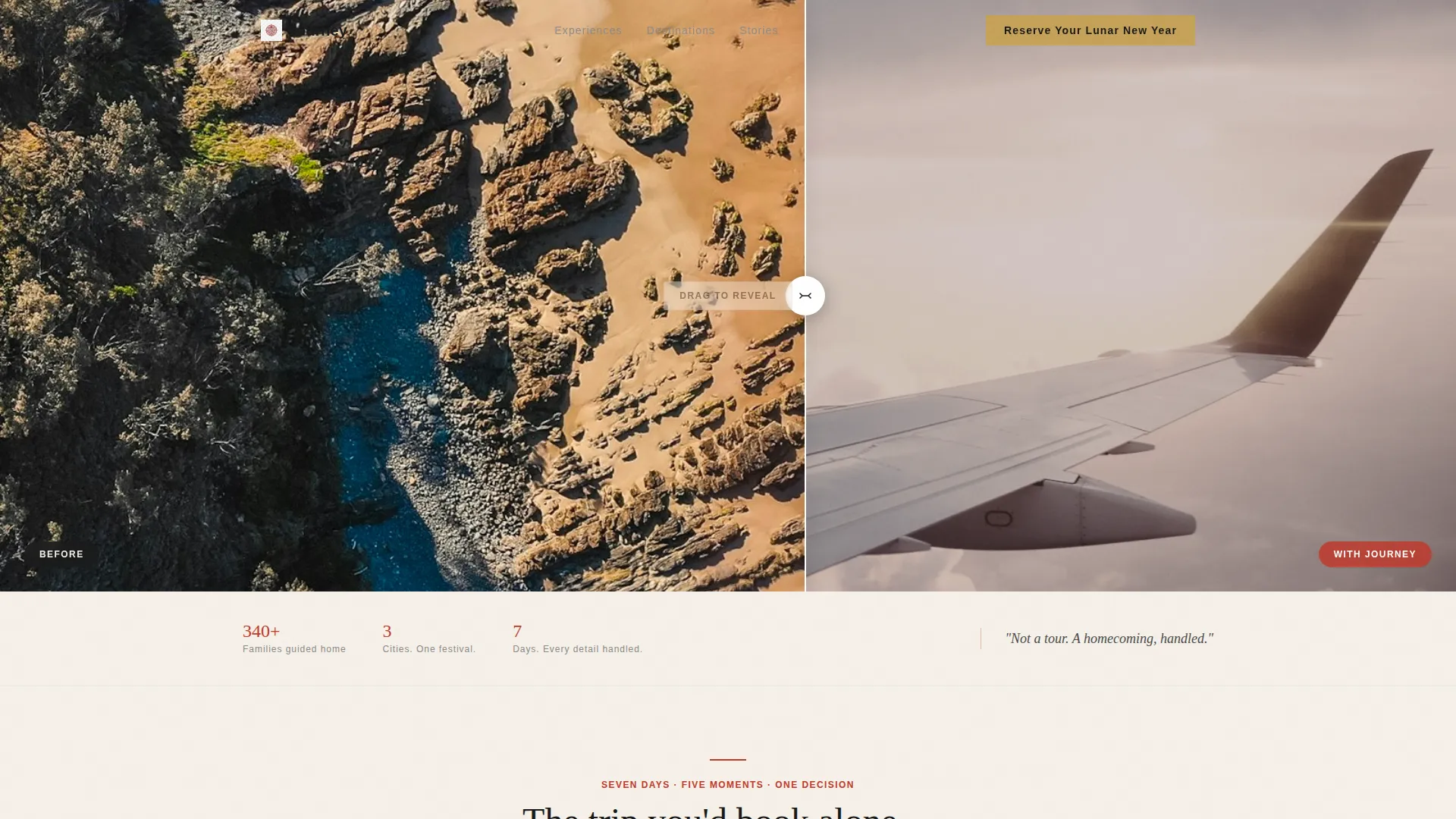
- A Before/After Slider header that lets the visitor physically pull the transformation into view
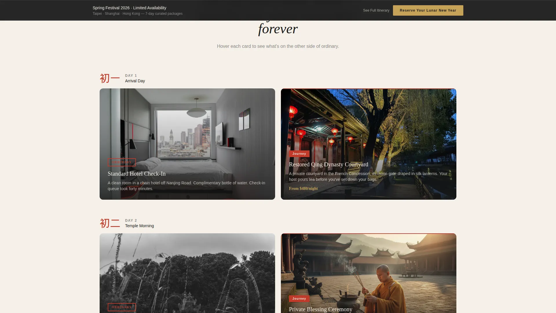
- A modular comparison card grid that escalates from arrival day through New Year's Eve, with hover-flip reveals and dual calls to action per card
- A sticky footer call to action and a primary gold-on-ink-black button system that repeats at the right moments without feeling repetitive
Feature list
A quick paragraph before the features: each component below comes directly from the template brief and is built into the layout as described.
Before/After Slider Header
The header opens with an interactive slider. The left side shows a gray airport terminal; the right reveals a crimson-draped courtyard with silk lanterns and a lion dance. Visitors drag the divider themselves, making the transformation personal and immediate. A headline fades in after the first interaction.
Modular Comparison Card Grid
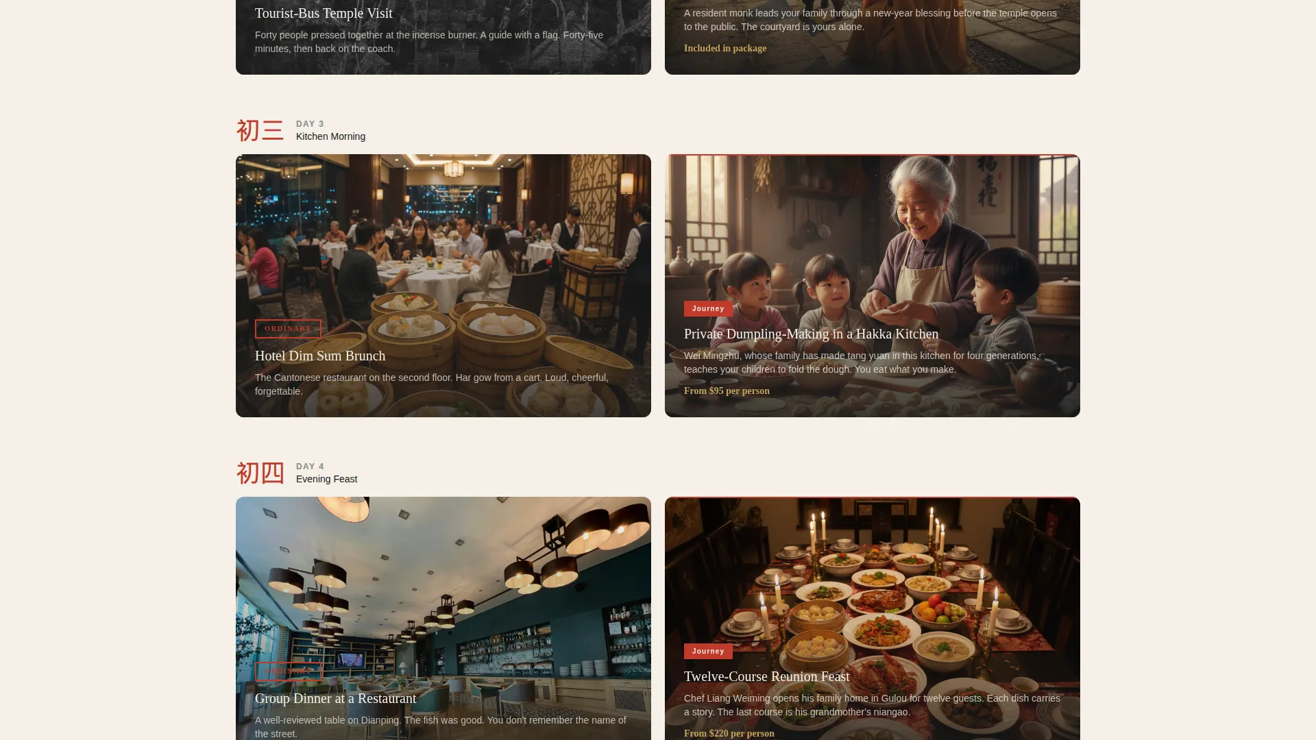
The page body is a card grid where each row presents two versions of the same travel moment. Standard experiences sit alongside curated alternatives, from a restored Qing dynasty courtyard stay to a private monk blessing ceremony. Cards flip on hover to reveal the upgraded experience in full.
Escalating Itinerary Structure
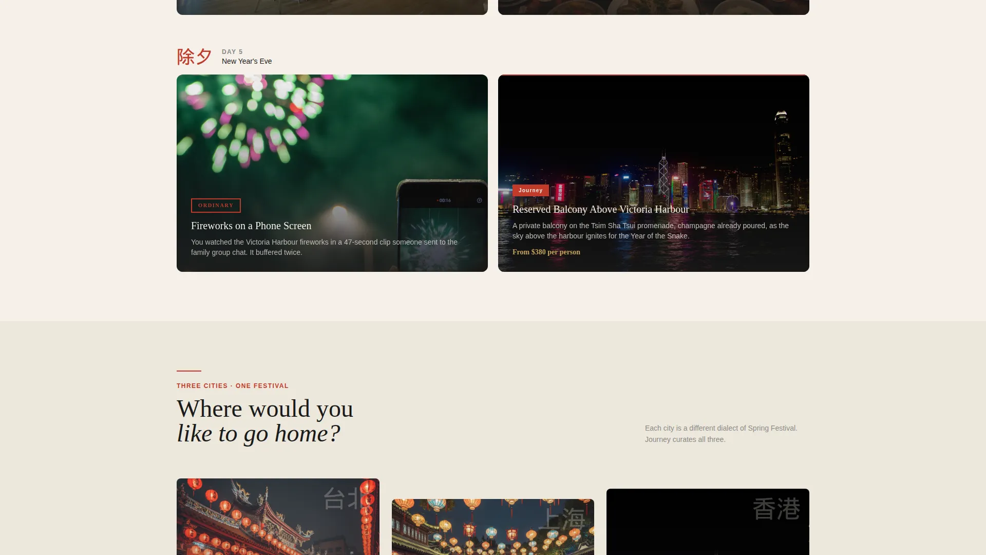
Card rows are ordered chronologically from arrival day to New Year's Eve. The sequence builds anticipation like a countdown, ending on a fireworks balcony card that makes clicking through feel like a personal promise rather than a transaction.
Click-Through call to action System
There are no forms on this page. The primary call to action, "Reserve Your Lunar New Year," appears in gold on ink-black buttons beneath the header and again as a sticky footer after the third card row. Each card also carries a secondary "See Full Itinerary" link that deep-links to the specific package detail page.
Ink and Paper Color System
The palette uses four intentional colors: aged xuan paper white for backgrounds, fresh sumi ink black for all typography, vermillion seal stamp red for focal points, and muted gold leaf reserved for interactive elements and price highlights. No color is decorative; each one carries a specific visual role.
Page sections overview
| Section | Purpose |
|---|---|
| Before/After Slider | Opens the page with an interactive transformation the visitor controls |
| Headline Fade-In | Delivers the core message after the first slider interaction |
| Primary call to action Block | Invites the first booking click directly beneath the header |
| Day One Cards | Starts the comparison grid with arrival-day experience contrast |
| Mid-Journey Cards | Deepens the contrast through temple visits and private dining moments |
| New Year's Eve Cards | Closes the grid with the fireworks balcony versus phone-screen finale |
| Sticky Footer call to action | Persists the booking prompt after the third card row without interrupting scroll |
Design & branding system
The visual identity is Luxe Minimal, described in the brief as feeling like a calligrapher's desk at dawn. White dominates every background surface. Black carries all body and heading typography. Red appears only where the eye must land. Gold is reserved exclusively for interactive elements and price highlights.
- Four-color Ink and Paper palette: aged xuan paper white (#F5F0E8), sumi ink black (#1A1A1A), vermillion seal stamp red (#C03A2B), and muted gold leaf (#C5A258)
- Card hover-flip animations reveal the upgraded experience with quiet confidence, consistent with the scroll-unfolds-a-brushed-scroll metaphor from the brief
- Gold calls to action and price elements contrast deliberately against ink-black button backgrounds, directing the eye without visual noise
Mobile & speed optimization
The modular card grid layout is built to reflow cleanly on smaller screens. Each card row is self-contained, which means the comparison structure stays readable whether a visitor is on a desktop browser or a mobile device.
- Modular grid structure allows card rows to stack vertically on narrow viewports without breaking the escalating narrative
- The sticky footer call to action remains accessible on mobile scroll, keeping the primary booking prompt visible throughout the page
- The Before/After Slider is touch-compatible, allowing mobile visitors to drag the transformation divider with a finger
How this template helps you convert
The entire page is engineered as a comparison machine. Every design and copy decision exists to make the gap between ordinary and extraordinary feel real and personal before the visitor reaches a call to action.
- The Before/After Slider creates an emotional before state the moment the visitor lands, making the upgraded experience feel earned rather than sold
- The escalating card grid builds desire row by row, so the final New Year's Eve fireworks card arrives when anticipation is already at its peak
- The dual call to action structure, one primary booking button and one itinerary deep-link per card, gives visitors two natural next steps without pressure, reducing friction at every decision point
Other information about this template
This template is built specifically for the Lunar New Year and Chinese New Year travel market, making it a strong fit for operators running Spring Festival itineraries across destinations such as Taipei, Shanghai, and Hong Kong. The Luxe Minimal theme and Gallery and Detail template style make it well-suited for high-value package presentation where visual credibility matters as much as the offer itself.
- The Flash Deal creative direction in the brief supports time-sensitive seasonal positioning, which fits well with the limited-availability nature of New Year festival packages
- The template style referenced in the matched context is Gallery and Detail, meaning each card is designed to showcase imagery alongside concise descriptive copy before the deep-link click
- The page is built as a click-through landing page with no embedded form, making it straightforward to connect to any external booking or package detail page
Theme
Luxe Minimal
Creative direction
Flash Deal
Color system
Citrus Burst
Style
Gallery + Detail
Direction
Quiz/Assessment
Page Sections
Before/after Slider Header
Modular Comparison Card Grid
Escalating Itinerary Narrative
Click-through Call to Action System
Ink and Paper Color System
Hover-flip Card Reveals
Related questions
Does this template include a booking form?
Can I use this template for travel packages beyond the Lunar New Year season?
How does the Before/After Slider work for visitors?
How many card rows does the template support?
Where does the gold color appear on the page?



