Small-Batch Cuba Tour Landing Page Template
The Travesa Small Batch Cuba Group Tour Landing Page Template is a gallery-plus-detail landing page built for small-batch adventure tour operators. It combines a collage-style hero, filterable tour cards, slide-open detail panels, and a "Hold My Seat" booking form to turn curious visitors into committed travelers within minutes of landing on the page.
by Rocket studio
Quick summary
This template gives Cuba-focused tour operators a ready-to-launch landing page that works as hard as a seasoned guide. Visitors browse character-driven tour cards, click into rich detail panels, and reserve a seat without leaving the page. Every section is built to build trust fast and reduce the time between first scroll and committed booking.
Who this template is for
This landing page is designed for small-batch travel operators who fill minibuses rather than coaches, handle the logistics so their customers do not have to, and sell texture over resort pools. It suits operators whose audience has already decided that ordinary travel is not enough.
- Solo travelers in their thirties and forties who have done Southeast Asia and want a new destination to explore
- Couples and friend groups searching for an authentic, locally rooted trip with logistics handled end to end
- Birthday group planners who need a car, casas particulares, and a local guide sorted before they arrive
What problem this template solves
Most travel operators lose visitors before the booking form even loads. People browsing for a Cuba group tour want to picture themselves there within seconds. A slow, generic website with a wall of text stops that imagination cold.
- Visitors cannot quickly find group size, duration, pace, and inclusions, so they search elsewhere
- No scarcity signal means people put the trip off for months until seats are gone
- A confusing site structure forces customers through too many pages, and most drop off before they sign up
What you get with this template
You get a fully structured, single-page experience that guides every visitor from first impression to committed seat reservation. The layout is opinionated by design: it front-loads sensory proof, then makes the booking path obvious.
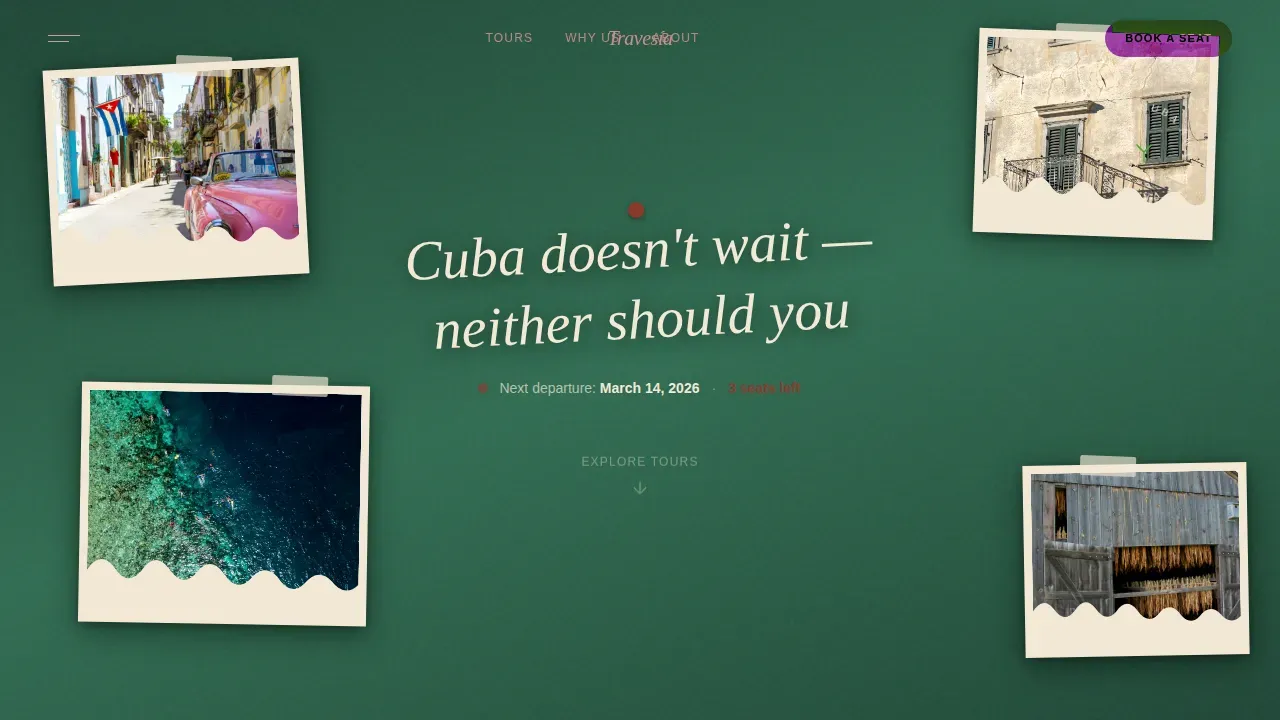
- A full-viewport collage hero with overlapping rotated photos, a handwritten-style headline, and a departure date with live seat count
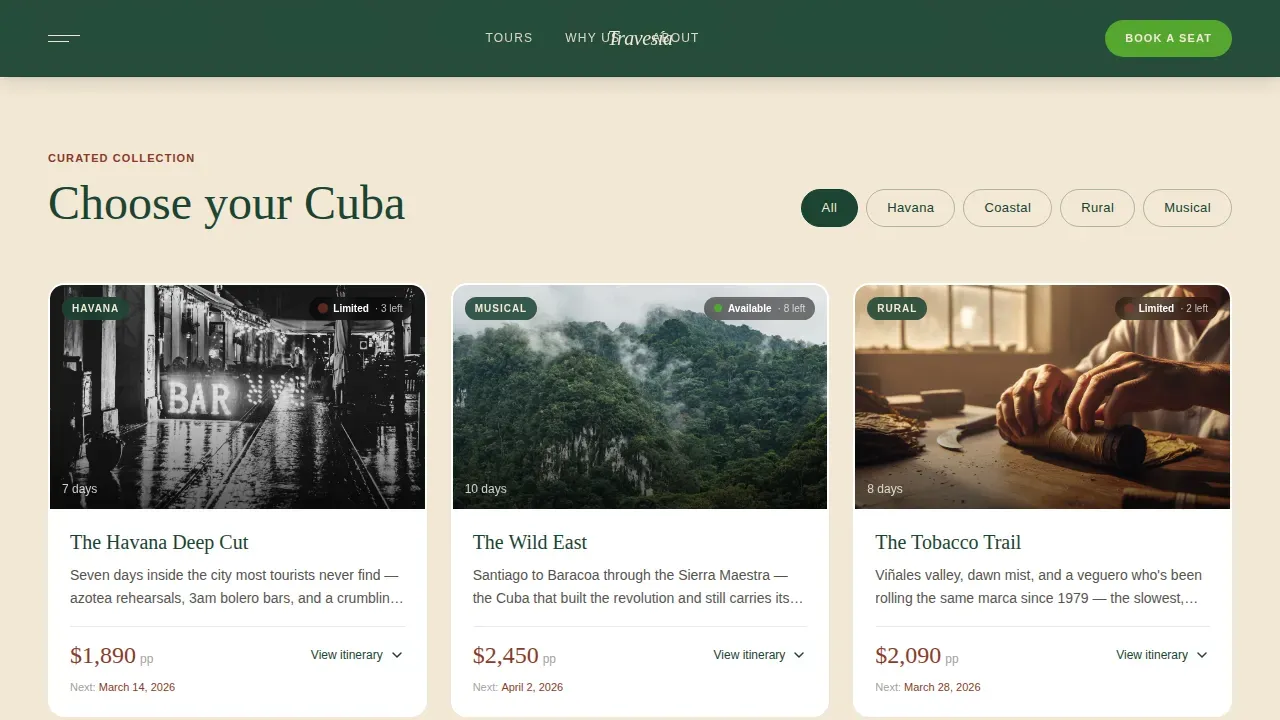
- A filterable tour gallery where each card slides open a detail panel showing a day-by-day itinerary, difficulty rating, and a mosaic of four to six location photos
- A "Hold My Seat" form inside every detail panel, plus a mobile sticky bar with a short quiz path for undecided visitors
Feature list
This template ships with six purpose-built components. Each one is designed to move a visitor one step closer to making a booking.
Collage Scrapbook Hero
The header fills the full viewport with overlapping photographs at slightly rotated angles, as if taped to a wall. A handwritten-style script headline sits across the collage at a casual three-degree tilt. Beneath it, the next departure date and available seat count are displayed in clean sans-serif type so visitors know at a glance whether to act now or check back.
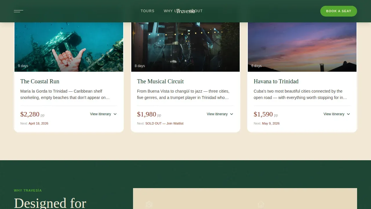
Character-Filtered Tour Gallery
Tours are organized not by date but by character: urban, coastal, rural, musical. Each card carries a hero image, a one-sentence hook, duration, price in dollars, and a colored availability pip. Browsing feels like choosing which Cuba you want rather than scrolling a booking spreadsheet.
Slide-Open Detail Panels
Clicking any tour card slides open a full detail panel without leaving the page. Inside, visitors find a day-by-day itinerary, included experiences, a difficulty rating covering walking hours and heat index, and a mosaic of multiple location photos. This rewards curiosity and gives customers enough texture to picture themselves on the trip.
Hold My Seat Booking Form
Every detail panel contains its own lightweight booking form with three fields: first name, email address, and preferred departure month. The form is short enough to complete in under two minutes and clear enough that visitors do not need to stop and re-read instructions.
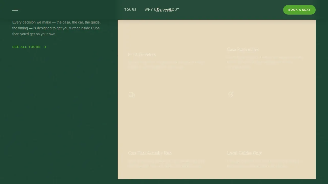
Why Travesía Amenity Grid
A two-by-two grid section outlines the core inclusions: small group sizes, casas particulares accommodation, a working vintage car, and local guides. Each cell is concise and visual, making it easy for visitors to confirm the trip covers what they care about most.
Proof Strip and Testimonial Block
A four-column stats strip shares departure counts, total travelers, and countries visited. A single featured testimonial with a traveler name and trip title sits below. Social proof in this format builds credibility without overwhelming the page.
Page sections overview
| Section | Purpose |
|---|---|
| Collage Hero | Hooks visitors instantly with scrapbook-style photography and departure urgency |
| Tour Gallery | Lets visitors browse and filter character-driven tour cards |
| Detail Panel | Reveals day-by-day itinerary, photos, and the Hold My Seat form |
| Why Travesía Grid | Communicates key inclusions across four visual amenity cells |
| Proof Strip | Shares departure stats and a featured traveler testimonial |
| Mobile Sticky Bar | Keeps the quiz conversion path accessible on smaller screens |
| Footer | Displays logo, tagline, and navigation links in a split layout |
Design & branding system
The visual identity follows an Adventure Terrain theme using a Rainforest color system. Every color choice feels earned, like hiking the Sierra Maestra at golden hour: dense canopy overhead, red earth underfoot, warm light cutting through the leaves.
- Backgrounds alternate between deep ceiba canopy green (#1B4332) and aged plantation cream (#F2E8D5); body text sits in near-black (#1A1A1A) on light sections and cream on dark sections
- Wet red earth (#8B3A2A) anchors prices, dates, and urgency badges such as "3 spots left"; bright royal palm green (#55A630) is reserved for call-to-action buttons and hover states
- Typography pairs Fraunces, a warm serif display face, with DM Sans for body copy, creating a handcrafted editorial feel that matches the sun-faded photo album visual style
Mobile & speed optimization
This template is built mobile-first, recognizing that the majority of travel searches happen on mobile devices. The layout adapts from a rich desktop collage experience to a focused single-column flow on smaller screens.
- A sticky bottom bar on mobile keeps the "Can't choose? Tell us what you love" quiz path visible at all times, so visitors who prefer to explore before committing always have a conversion option within reach
- All animations, including collage rotation, the scrolling marquee, the rotating badge, and the slide-open panel, are driven by native CSS only, avoiding heavy JavaScript libraries that would slow down the page load
- Touch-friendly buttons and a single-column card layout make it easy for visitors to browse tours, open detail panels, and fill in the booking form without pinching or zooming
How this template helps you convert
The page earns the booking by making trust visible before the form ever appears. By the time a visitor reaches "Hold My Seat," they have already seen real photography, read a specific itinerary, and noticed how few seats remain.
- Scarcity signals on every tour card, including colored availability pips and a seat count in the hero, turn browsing into a time-sensitive decision and push visitors to sign up sooner rather than waiting months.
- The slide-open detail panel delivers a digestible day-by-day itinerary, clear pricing in dollars, and included experiences, so customers can find every answer they need without visiting a separate page or sending an email.
- The mobile sticky quiz bar captures visitors who have not yet decided on a specific tour, turning undecided traffic into qualified leads by returning a personalized recommendation to their inbox.
Other information about this template
This template is ready to customize without rebuilding from scratch. Operators can update tour names, add or remove cards, swap photography, and set new departure dates in order to keep the page current across multiple booking months.
- The colors, fonts, and section order can all be customized to match an existing brand; the Rainforest color system is a strong starting point but not a hard requirement
- The Travesa Small Batch Cuba Group Tour Landing Page Template is designed to provide a starting point for operators who are ready to build a high-converting travel landing page without spending thousands of dollars on a custom build
- The page structure works well as a long-term site asset: operators can share the link directly with past travelers, add it to email campaigns, and use it to bring new audiences into the booking funnel across months and seasons
- Visitors who access the quiz path receive a personalized tour recommendation, giving the operator a secondary way to stay in touch with people who are not yet ready to book
- The template is built for English-language audiences using USD pricing, making it a practical fit for operators targeting US and UK travelers; teams working in other currencies can update the dollar amounts and stop there
- For context, casas particulares are private home rentals that let travelers stay with Cuban families rather than in a hotel, reflecting the local-first ethos the template communicates throughout
Theme
Adventure Terrain
Creative direction
Curated Collection
Color system
Rainforest
Style
Gallery + Detail
Direction
Marketplace/Multi
Page Sections
Collage Scrapbook Hero Section
Character-filtered Tour Gallery
Slide-open Detail Panels
Hold My Seat Booking Form
Mobile Sticky Quiz Bar
Proof Strip and Amenity Grid
Related questions
Can I customize the tour cards and itinerary details?
Does this template work for operators who run tours outside Cuba?
What does the Hold My Seat form collect?
How does the mobile quiz sticky bar work?
Can the page handle multiple departure months at once?