Certified Regional & Specialty Restaurant Professional Website Template
Kaiten is a masonry-layout landing page template designed for a haute conveyor belt sushi restaurant. It pairs a full-bleed macro hero with a scroll-driven before-and-after ingredient grid, a compact event registration form, and an email capture for a seasonal menu lookbook. The Desert Rose color system and Fraunces serif typography give every section a quiet, ceremonial elegance.
by Rocket studio
Quick summary
Kaiten is a single-page restaurant template built around the sensory rhythm of a conveyor belt sushi counter. The masonry layout tells a raw-to-plate visual story, guiding visitors from first impression to reservation without friction. Every design decision, the lacquer headlines, the blush card tiles, the gold-leaf call-to-action buttons, is calibrated to match the craft level of the food it represents.
Who this template is for
This template suits anyone who needs to present a conveyor belt sushi restaurant as a destination worth booking, not just a casual stop. It works equally well for new openings and established spots adding a reservation-focused web presence.
- Restaurateurs running an omakase-style conveyor belt sushi restaurant who want event bookings, not just walk-ins
- Corporate event planners and experience-seekers looking for private dining alternatives to standard venues
- Couples and food-focused clients who want to preview the full craft story before committing to a reservation
What problem this template solves
Most sushi restaurants online look the same. A generic photo carousel and a phone number do little to separate a hand-crafted kaiten zushi restaurant from a mall food-court belt sushi counter. Visitors who land on a flat, uninspired page do not feel the difference, so they do not book.
- The template closes the gap between the real dining experience and what a visitor sees on screen before they ever sit down at the counter
- It replaces passive browsing with an active scroll story, so customers understand the craft level before they reach the reservation form
- It provides two conversion paths, event registration and menu preview, to capture visitors at different stages of intent
What you get with this template
You get a fully structured, single-page masonry landing page ready to represent a high-end conveyor belt sushi restaurant. Every section is purpose-built, from the macro hero image frame to the footer split layout.
- A full-bleed hero section, a before-and-after masonry grid, a social proof block, an event registration form, an email capture module, and a split footer
- A Desert Rose color system with four defined palette values applied consistently across backgrounds, headlines, cards, and interactive elements
- Fraunces serif display type paired with DM Sans body text for a typographic hierarchy that feels intimate and considered
Feature list
Full-Bleed Macro Hero Section
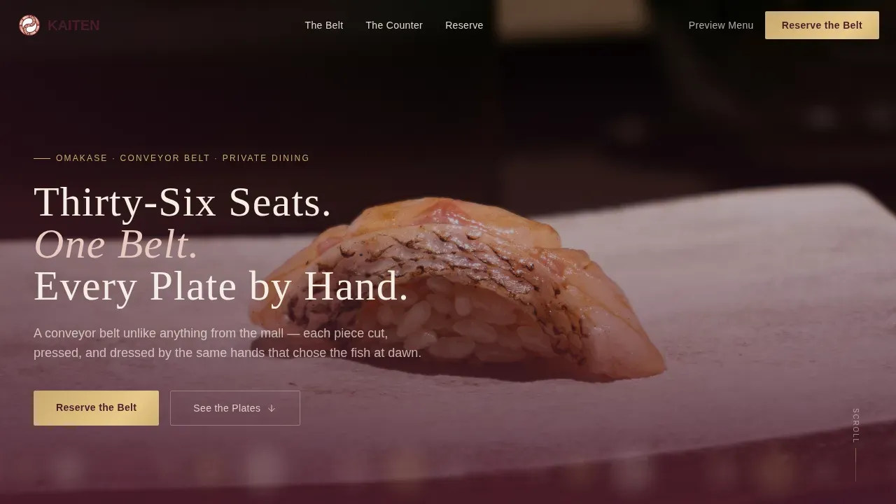
The hero fills the entire viewport with a single close-up frame, a piece of nigiri on a celadon plate, shallow depth of field dissolving the moving belt behind into bokeh. A sesame-cream headline letterpress-fades in after a deliberate pause, setting the tone before any scroll begins. The primary "Reserve the Belt" call-to-action button appears in gold leaf against the lacquer background.
Before/After Masonry Grid
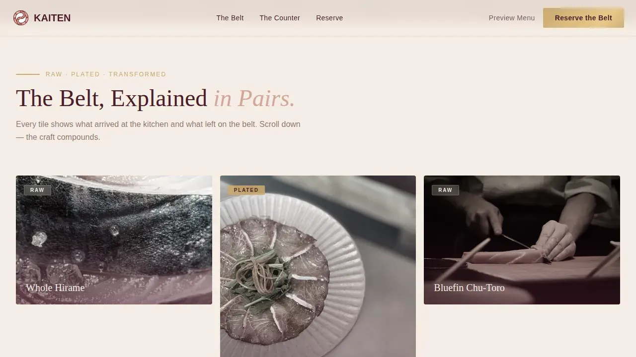
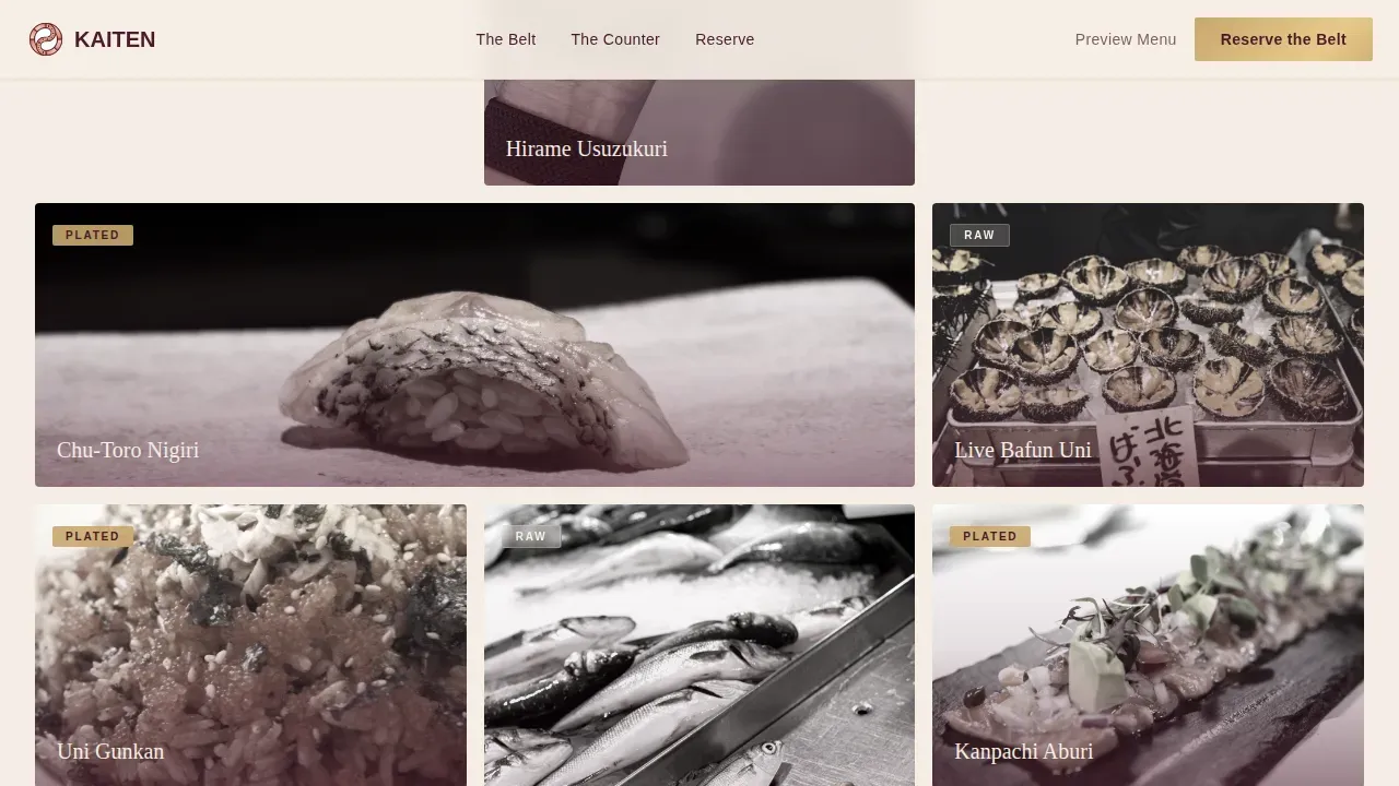
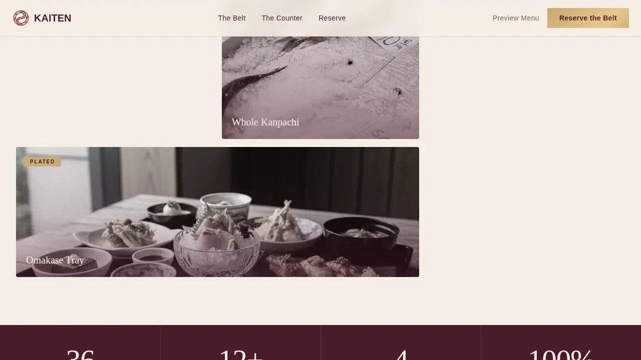
The masonry grid pairs raw ingredient tiles against their finished plate forms in escalating order of craft. A whole kanpachi slab on crushed ice sits beside the precise aburi nigiri it becomes. Live uni in its shell appears next to the wrapped gunkan. Each row raises the stakes, creating a silent visual argument that this belt sushi experience is something entirely different. Hover states reveal grayscale-to-color transitions, rewarding the curious visitor who pauses to look closer.
Social Proof Counter Block
The Counter section anchors trust with chef quotes, diner testimonials, and concrete metrics, thirty-six seats, seasonal course rotations, and years of craft. This section serves the same role that a sushi bar's visible prep counter serves in person: it shows the work openly so guests do not have to take quality on faith.
Event Registration Form
A compact form captures event date, party size via a dropdown scaled from two to thirty-six guests, and occasion type, omakase night, private buyout, or corporate tasting. The form is friction-light by design. By the time a visitor scrolls to it, the masonry grid has already made the case, so the only decision left is choosing a night.
Seasonal Menu Email Capture
A secondary conversion path lets visitors request a rotating seasonal PDF lookbook in exchange for their email address. The call-to-action reads "Preview the Seasonal Menu." This module serves guests who are not ready to commit to a date but want to stay connected to what the kitchen is creating each season.
Split Arc Footer
The footer follows a split layout with the logo and tagline on the left and navigation links on the right. It closes the page cleanly without visual noise, matching the restrained, deliberate tone of the rest of the template.
Page sections overview
| Section | Purpose |
|---|---|
| Hero full-bleed | Open with a macro nigiri frame and letterpress headline fade |
| Before/After grid | Scroll-driven raw-to-plate masonry story |
| The Counter | Social proof quotes and concrete restaurant metrics |
| Reserve the Belt | Event registration form with party and occasion fields |
| Preview Menu | Email capture for seasonal PDF lookbook |
| Split Arc footer | Logo and tagline left, navigation links right |
Design & branding system
The Desert Rose palette keeps every element deliberate and quietly ceremonial. Cream dominates the background, lacquer anchors navigation and headlines, blush warms the masonry card tiles, and gold appears only where the visitor is invited to interact.
- Four-value color system: sesame cream (#F5EDE3) background, urushi lacquer (#4A1C2B) headlines, dusted blush (#D4A59A) cards, gold leaf (#C9A96E) buttons and interactive borders
- Fraunces serif for display headings, DM Sans for body copy, a pairing that reads as both refined and legible
- High animation intensity: letterpress fade on the hero headline, scroll-reveal transitions across the grid, and grayscale-to-color hover states on masonry tiles
Mobile & speed optimization
The template is built desktop-first to honor the immersive counter experience, with responsive scaling that maintains the masonry structure and color system across all screen sizes. Scroll animations use Intersection Observer so they trigger only when elements enter the viewport, keeping transitions smooth without heavy overhead.
- CSS transitions handle hover states and color reveals efficiently across the masonry grid
- The form dropdowns and email capture module are touch-friendly and scale cleanly on smaller screens
- The full-bleed hero and masonry image tiles are designed to maintain visual impact at mobile viewport widths
How this template helps you convert
This template is structured so that conversion feels like a natural conclusion rather than an interruption. The scroll path does the persuasion work before the visitor ever reaches a form field.
- The macro hero establishes atmosphere immediately, visitors understand in seconds that this is not a familiar casual conveyor belt sushi restaurant, and the "Reserve the Belt" button is present from the very first frame
- The before-and-after masonry grid builds conviction plate by plate, so by the time a guest reaches the registration form, the experience already feels inevitable, the only question is which night to book
- The dual conversion paths, event form and menu email capture, ensure that visitors at different levels of readiness both have a clear next step, maximizing the number of customers the page retains
Other information about this template
This template draws its concept from the rich history of kaiten zushi in Japan. The first kaiten zushi restaurant, Mawaru Genroku Sushi, opened in Osaka in 1958 when Shiraishi Yoshiaki installed a conveyor belt to manage cost and improve efficiency in his standing sushi restaurant. From those practical roots in Osaka, belt sushi spread across Japan and eventually to Tokyo and beyond, becoming both casual everyday dining and, in its finest forms, a stage for serious sushi chefs.
The template acknowledges that context. A few details worth knowing for anyone building on this foundation:
- In traditional kaiten zushi restaurants, customers pick up fresh dishes as plates pass by on the belt, and used plates are stacked neatly at the table, different colored plates represent different price points, making it easy for customers to track the cost of their meal
- Wasabi is optional at many belt sushi establishments, and guests may request sushi made without it; self-service condiment stations typically offer wasabi, ginger, and powdered green tea or hot water for tea preparation
- Modern conveyor belt sushi restaurants often use IC chips embedded in plates to track freshness and protect food safety, automatically removing plates that have been on the belt too long
- The Shinkansen sushi train system, used in some high-end kaiten sushi formats, delivers made-to-order dishes directly to the table rather than cycling them on an open belt, a detail that could be referenced in the restaurant's menu copy to reinforce quality
- Food safety compliance is a genuine operational concern for any kaiten zushi restaurant, particularly in Western markets, and highlighting sourcing transparency on the landing page helps maintain guest trust
- Startup costs for a medium-sized kaiten sushi restaurant typically range from $250,000 to $500,000, making a compelling landing page an important part of protecting that investment from day one
- The rotary sushi model supports high turnover rates, which helps offset premium location costs in cities like Tokyo; seating capacity and per-seat efficiency both matter for revenue planning
- Chains like Sushiro and Kura-Zushi helped scale the kaiten zushi format across Japan, and international concepts have since brought belt sushi to broader audiences, this template is positioned to serve the upper end of that spectrum, where craft and ceremony are the differentiators
Theme
Haute Craft
Creative direction
Before/After Reveal
Color system
Desert Rose
Style
Masonry/Pinterest
Direction
Event Registration
Page Sections
Full-bleed Macro Hero with Letterpress Fade
Before/after Masonry Ingredient Grid
Social Proof Counter Section
Compact Event Registration Form
Seasonal Menu Email Capture Module
Split Arc Footer Layout
Related questions
What type of restaurant is this template designed for?
Can I use this template to accept online reservations?
Does the template include a menu section?
Is this template suitable for corporate event inquiries?
What makes this different from a generic restaurant template?



