Katazuke — Smart Junk Removal Landing Page Template
Katazuke is an editorial magazine landing page template built for a Tokyo junk removal service. It pairs ink-heavy serif typography with a warm Charcoal and Amber palette to build emotional trust through crew portraits, pull quotes, and before-and-after photo essays. A bilingual three-step booking form and a floating amber call-to-action button turn that trust into confirmed clearings.
by Rocket studio
Quick summary
Katazuke is a single-page editorial landing page template for a Tokyo-based residential junk removal service. It leads with award badge mastheads and crew profiles to earn trust before asking for a booking. The Charcoal and Amber design system, bilingual copy, and a three-step form make the page feel authoritative and approachable at the same time.
Who this template is for
This template is built for local service businesses in Tokyo that need to convert emotionally invested visitors into booked appointments. It is especially well suited to junk removal and apartment clearing operations targeting multiple audience types.
- Adult children aged 40 to 65 who are clearing a deceased parent's apartment and need reassurance before letting strangers inside
- Expat families on tight repatriation timelines who need a fast, reliable same-day clearing option
- Landlords managing abandoned units who want a professional, accountable crew they can contact quickly
What problem this template solves
Most junk removal pages lead with truck photos and price grids. That approach fails the visitors who carry the most emotional weight into the decision. Katazuke solves the trust gap by building credibility before logistics.
- Visitors do not know who will enter their home, so the template introduces real crew members with portraits and pull quotes before showing any form
- The booking process feels foreign to older Japanese users, so a LINE messaging secondary path reduces friction and meets them where they already communicate
- Generic pages feel cold during sensitive clearings, so this template uses ward-specific before-and-after captions and a magazine editorial voice to feel local and human
What you get with this template
You get a fully structured single-page layout with every section pre-built and ready to customize. The template covers trust-building, social proof, transparent process, and conversion in one continuous scroll.
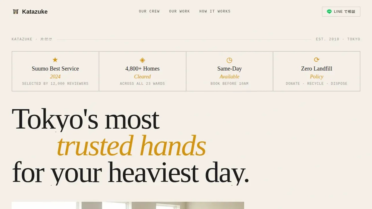
- A hero section with an editorial badge masthead row, a large display headline, and a cinematic image reveal with an amber overlay
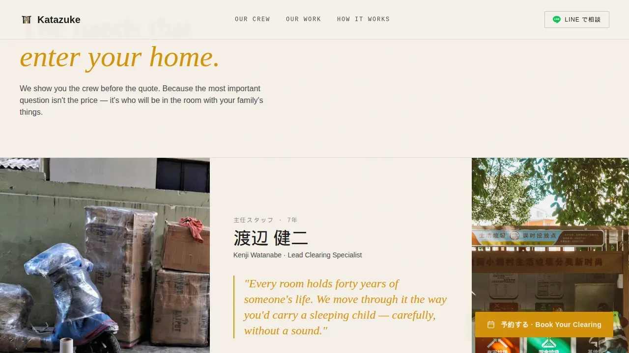
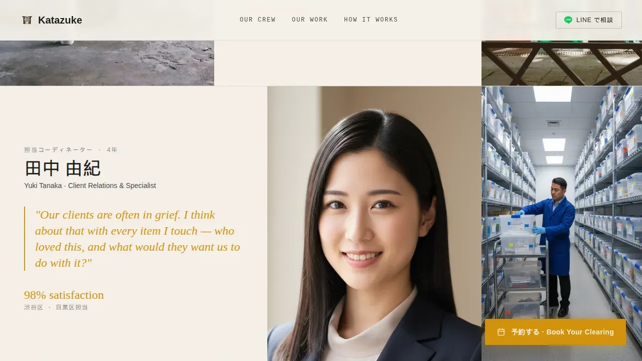
- Magazine-style team profile sections with portrait placeholders, pull-quote typography, and crew-focused mid-task photography slots
- Full-bleed before-and-after editorial photo blocks, a three-step asymmetric process card layout, a bilingual booking form with a LINE secondary call to action, and a linear single-row footer
Feature list
This section describes the core built-in components of the Katazuke template.
Editorial Badge Masthead Header
The header opens with a horizontal row of trust badges styled like magazine mastheads. Badges read "Suumo Best Service 2024," "4,800+ Homes Cleared," "Same-Day Available," and "Zero Landfill Policy." They sit in typeset silence against parchment, conferring authority without a competing hero image.
Crew Profile Sections
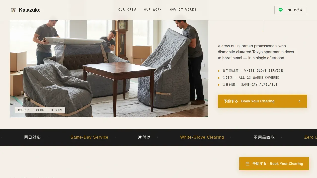
Each team profile block pairs a portrait photograph placeholder with a short pull quote written in the crew member's voice. The portraits show professionals mid-task, wrapping furniture, sorting recyclables, and bowing at the entrance. This design choice shifts the emotional focus from equipment to the people entering the client's home.
Before and After Photo Essays
Full-bleed room photography breaks the scroll between crew profiles. Each block is captioned with a Tokyo ward name and the time taken to complete the clearing. The editorial caption style borrows from print photo essays and gives the social proof a documentary credibility.
Three-Step Bilingual Booking Form
The booking form uses three steps: property type and size via a dropdown that matches Japanese real estate terms such as 1K, 2LDK, and 一戸建て; a calendar picker with same-day slots highlighted; and a free-text field for pre-arrival notes. The form appears in both Japanese and English to serve the full audience range.
Floating Amber Booking Button
After the first scroll, a floating amber call-to-action button stays pinned on screen. It reads "予約する・Book Your Clearing" in bilingual text. The amber color creates a high-contrast signal against the parchment and charcoal layout without disrupting the editorial restraint of the rest of the page.
LINE Messaging Secondary Path
A secondary call-to-action labeled "LINE で相談" offers visitors a messaging-first contact route. This reduces friction for older Japanese users who prefer LINE over web forms. Having two paths means fewer visitors leave the page without taking any action.
Page sections overview
| Section | Purpose |
|---|---|
| Badge Masthead Hero | Establish trust before the scroll begins |
| Team Profile Blocks | Introduce crew members with pull quotes |
| Before and After Essays | Show real clearing results by Tokyo ward |
| Process Cards | Explain the three-step clearing workflow |
| Bilingual Booking Form | Capture property details and preferred date |
| LINE Secondary call to action | Offer a messaging alternative to the form |
| Linear Footer Row | Provide contact and navigation at page end |
Design & branding system
The Katazuke template uses an Editorial Magazine theme built on a Charcoal and Amber color system. The palette is ink-heavy and intentional, referencing the feel of a well-printed design quarterly on cream stock.
- Core colors: newsprint black (#1A1A1A), warm ash gray (#4A4A48), aged parchment (#F5F0E8), and deep amber (#D4920B) used for pull quotes, hover states, and the booking button
- Typography: Fraunces for display headlines, DM Sans for body text, and JetBrains Mono for editorial captions and ward-specific labels
- Amber is used sparingly as a signal color so it retains full visual impact against the restrained parchment and charcoal backdrop
Mobile & speed optimization
The template is built mobile-first, reflecting the reality that the LINE demographic and older Japanese smartphone users will arrive on small screens. Every section is designed to read and function cleanly without a desktop viewport.
- The floating booking button is touch-friendly and stays visible throughout the scroll on mobile devices
- The LINE secondary call-to-action is prominently placed for one-tap access on smartphones
- Server Components handle static sections while Client Components manage the booking form and scroll-triggered animations, keeping interactive weight focused where it is needed
How this template helps you convert
The page is structured so that every section moves the visitor one step closer to a booking. Trust comes before logistics, and the form appears only after the visitor has already met the team.
- The badge masthead and editorial headline establish immediate credibility, so visitors feel confident before they read a single line of service copy
- Crew portraits and pull quotes build personal familiarity, making the prospect of letting professionals into a family home feel safe rather than transactional
- The bilingual form and LINE path together remove the last friction points for both digitally confident users and visitors who prefer direct messaging
Other information about this template
Katazuke is designed for the Tokyo residential clearing market and draws on Japanese interior and lifestyle aesthetics to feel culturally specific rather than generic. A few additional details are worth noting for anyone evaluating this template.
- Animations are powered by GSAP ScrollTrigger, covering image reveals, marquee elements, parallax motion, and staggered content entrances
- The page supports JPY currency display, Tokyo ward geography references, and Japanese and English bilingual copy across all key sections
- The asymmetric card layout for the process section avoids a standard numbered timeline and presents the three clearing steps in a visually distinct card format
- The footer follows Pattern 1, a linear single-row layout, keeping the page exit clean and uncluttered
Theme
Editorial Magazine
Creative direction
Team & People
Color system
Charcoal & Amber
Style
Editorial/Magazine
Direction
Booking/Scheduling
Page Sections
Editorial Badge Masthead Header
Crew Profile Sections with Pull Quotes
Full-bleed Before and After Photo Blocks
Three-step Bilingual Booking Form
Floating Amber Booking Button
LINE Messaging Secondary Path
Related questions
Can I use this template for a junk removal service outside Tokyo?
Does this template include the booking form logic and LINE integration?
How bilingual is the template out of the box?
Can I replace the before-and-after photography with my own images?
Is this template suitable for a solo operator rather than a full crew?



