Tonkatsu Restaurant Landing Page Template | Haute Craft
Katsu is a Haute Craft masonry landing page built for a fine-dining tonkatsu restaurant. The template converts curious guests into counter reservations through sensory visuals, a hand-drawn illustrative header, a masonry close-up grid, and an intimate event registration form. It blends Japanese minimalism with warm artisanal design to make every scroll feel like a course arriving at the table.
by Rocket studio
Quick summary
Katsu is a single-page masonry landing page template designed for a craft tonkatsu restaurant running monthly omakase-style tasting events. It leads with a hand-drawn anatomical illustration of the signature dish, unfolds through a sensory close-up grid, walks guests through the three-pass breading process, and closes with a curated reservation form. The Desert Rose color system and Fraunces serif typography give the page a warm, precise, fine-dining identity from the very first scroll.
Who this template is for
This template is built for restaurant operators, food-world creatives, and event hosts who want a landing page that earns a reservation rather than just asking for one. It speaks to the kind of guests who research before they dine and expect craft to be visible before they ever sit down.
- Fine-dining tonkatsu restaurants running intimate counter or tasting-event experiences
- Food editors, culinary event producers, and private dining hosts seeking a credibility-first digital presence
- Japanese cuisine concepts that want to communicate shokunin-level depth without relying on generic restaurant templates
What problem this template solves
Most restaurant landing pages look interchangeable. They rely on stock photography, a phone number, and a reservation button that feels transactional. When the food itself is the reason guests make a booking weeks in advance, the page needs to do more than list the menu. It needs to make the visitor feel something before they arrive.
- There is no visual language strong enough to communicate handcrafted food when a template reaches for generic layouts and cold typography
- Scarcity and event-driven dining are hard to convey when the page has no narrative flow or sensory design system
- Conversion suffers when the registration form feels disconnected from the experience the restaurant is actually selling
What you get with this template
The Katsu template delivers a complete single-page design system built specifically around a Japanese fine-dining restaurant making its case through craft and atmosphere. Every section earns its place. Nothing is decorative without purpose.
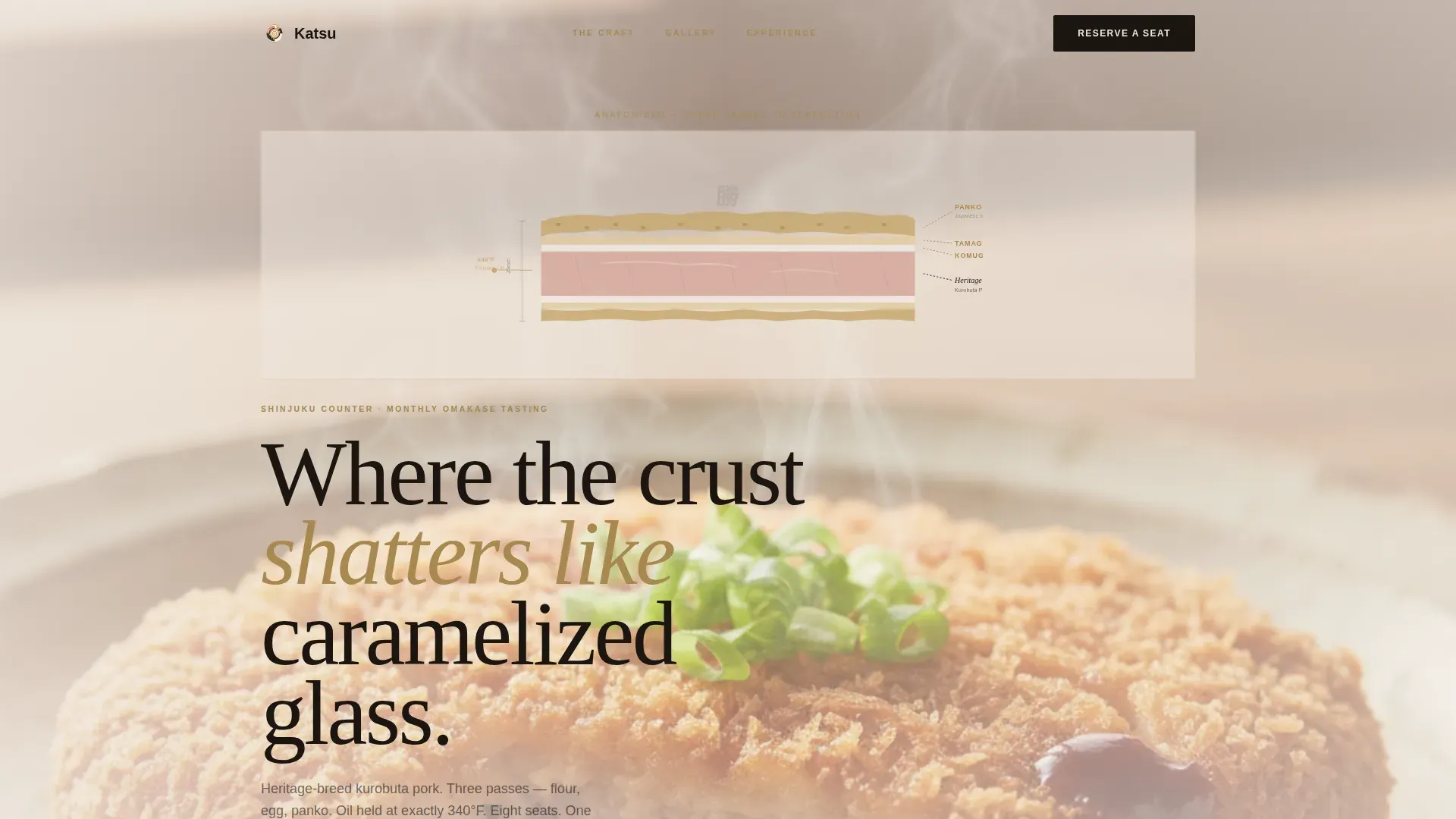
- A cinematic hero section with a custom hand-drawn tonkatsu cross-section illustration, massive Fraunces display typography, and a floating reservation card
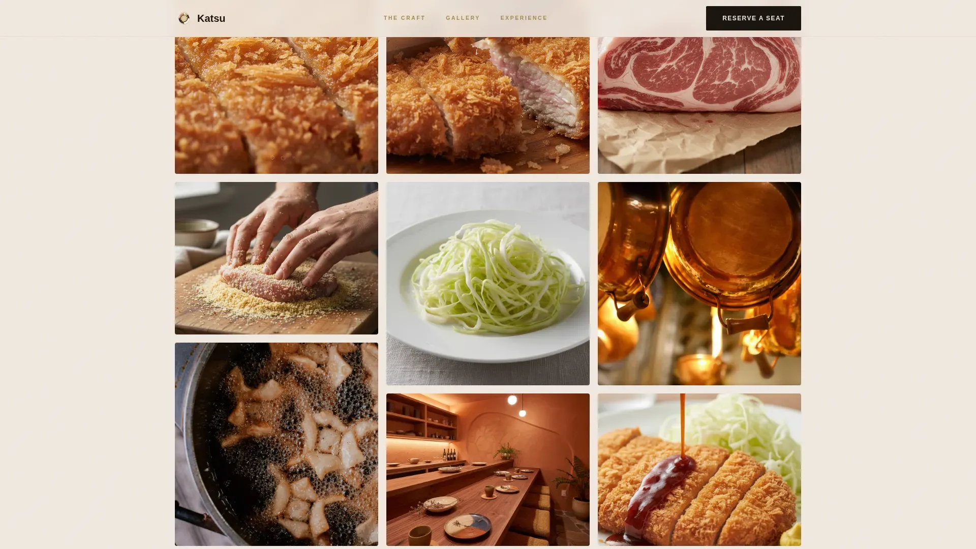
- A masonry sensory grid featuring extreme close-up tiles of oil bubbling around breadcrumbs, a knife pressing through crust, cabbage shredded into translucent ribbons, the chef's hands, and copper sauce pots
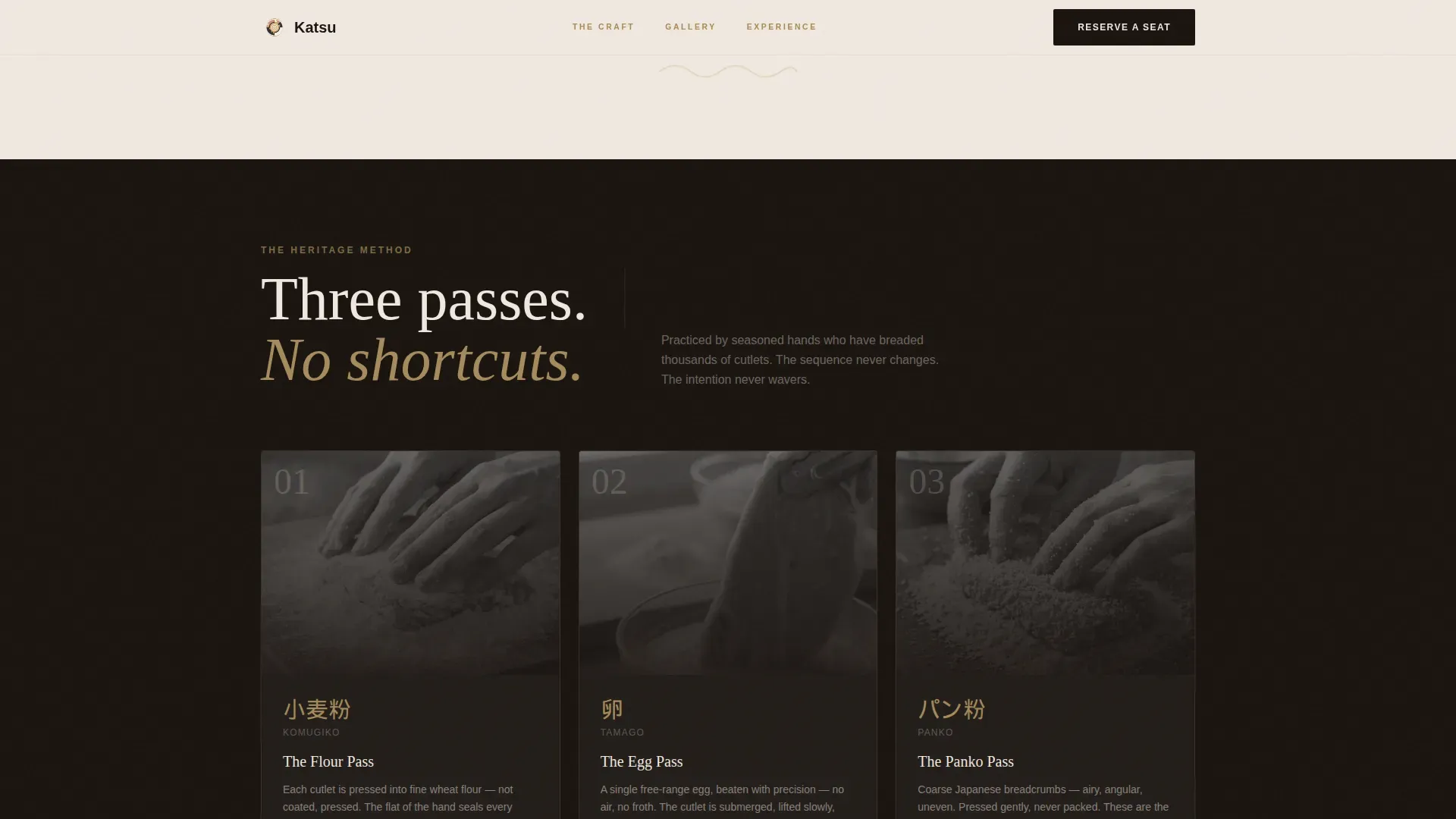
- A three-pass process anatomy section detailing flour, egg, and panko breading stages, a press and testimonials band with food editor quotes, a curated event registration form with date calendar and party size selector, and a linear single-row footer with location details and a final call to action
Feature list
The template's features reflect the full brief: high interactivity, sensory visual hierarchy, and a reservation-first conversion path. Each feature is a deliberate design decision that supports the restaurant's positioning.
Hand-Drawn Illustrative Header
The hero opens with a fine-ink-and-watercolor cross-section of the tonkatsu dish. Each layer is labeled in Japanese brush lettering and refined English serif, anatomizing the panko crust in gold, the egg membrane, and the blush-pink marbled pork. No photograph communicates this level of craft obsession. The illustration immediately signals that these chefs understand their food at a molecular level, making a stronger first impression than any plated shot could.
Masonry Sensory Close-Up Grid
The masonry grid unfolds like courses arriving at the table. First tiles are extreme close-ups: oil shimmering at 340 degrees Fahrenheit around breadcrumbs, a knife edge pressing through a shattering crust, cabbage being shredded into soft translucent ribbons. The grid then widens to show the counter, the chef's hands, and copper pots of house-made sauce. Each tile adds depth to a different sense, building hunger as the conversion engine. Micro-animations of steam rising and oil sizzling are implied through motion design.
Three-Pass Breading Process Section
The template includes a dedicated anatomy section that walks through the three breading passes: flour, egg, panko. This is where the craft story becomes explicit. Each pass is explained in a way that respects the reader's intelligence and mirrors the precision that shokunin-level chefs bring to every single dish. This section transforms technique into emotional justification for the ticket price.
Event Registration Form with Waitlist Toggle
The primary call to action anchors to a curated registration form that asks for preferred date from a calendar of upcoming sessions, party size from one to four, and any dietary notes. A secondary waitlist path captures email addresses for sold-out dates. The form is intimate by design: limited party size and a curated calendar communicate scarcity without the page needing to say a word about it directly.
Press and Testimonials Band
A dedicated section showcases food editor quotes and sensory testimonials. Social proof from critics and guests gives prospective diners the credibility signal they need before committing. This section can be styled with pull quotes set in Fraunces display type against the sesame black background, making each review feel like a headline rather than a footnote.
GSAP Scroll Reveals and Motion System
The template is built for high interactivity. GSAP-powered scroll reveals animate sections into view as the visitor descends the page. Masonry tiles respond to hover with reveal states. A steam rising SVG and oil sizzle micro-animations bring the food to life without requiring video. The animation system reinforces the sensory narrative at every stage of the scroll.
Page sections overview
| Section | Purpose |
|---|---|
| Hero with Illustration | Opens with custom ink-and-watercolor tonkatsu anatomy art, display typography, and a floating reservation card |
| Masonry Sensory Grid | Extreme close-up tiles of oil, crust, hands, and sauce pots; unfolds like arriving courses |
| Three Passes Process | Anatomy of flour, egg, and panko breading steps; communicates shokunin craft depth |
| Press and Testimonials | Food editor quotes and guest testimonials for credibility and social proof |
| Reservation Form | Curated calendar, party-size selector, dietary notes field, and waitlist toggle |
| Linear Footer | Location details, hours, and a final call-to-action in a single-row footer layout |
Design & branding system
The Desert Rose color system was designed to feel like a handmade raku bowl holding tonkatsu sauce: earthy warmth cradled in darkness, with gold catching light where the glaze cracked. Typography pairs Fraunces, a variable serif display face, with DM Sans for body text, balancing Japanese minimalism with Western fine-dining confidence.
- Sesame black (#1A1410) dominates backgrounds and primary typography; warm blush (#D4A59A) and panko gold (#C8A96E) activate on hover states and section dividers; aged ceramic white (#F0E8E0) opens the masonry grid so each card feels deliberately placed
- The illustration style, fine ink line work with watercolor wash, extends the visual tone beyond photography and into the territory of culinary editorial art
- Fraunces display type sets the emotional register: literary, warm, and precise; DM Sans keeps body copy readable and modern without undercutting the artisanal feel
Mobile & speed optimization
The template is designed desktop-first, reflecting the date-night couple and corporate host audience who primarily browse on larger screens. Full mobile support is included so the experience holds up across all devices without losing its sensory impact.
- GPU-accelerated animations keep motion smooth on desktop without degrading the masonry grid layout on smaller screens
- Optimized image handling in the masonry grid ensures close-up tiles load cleanly without blocking the scroll experience
- The reservation form, calendar picker, and waitlist toggle are all designed to function and feel intentional on mobile viewports
How this template helps you convert
This template treats hunger as the conversion engine. Every design decision from the illustrative header to the curated registration form is oriented toward making the visitor feel that this meal is worth planning around. The page does not ask for a reservation; it makes one feel inevitable.
- The masonry sensory grid creates a physical craving response before the visitor reaches the call to action, so the primary button "Reserve Your Seat at the Counter" arrives when desire is already high
- The registration form communicates scarcity through its own structure: a curated calendar of upcoming sessions and a party size cap of four signal that this is not a walk-in restaurant, and the waitlist path captures email from guests who find dates already sold
Other information about this template
This template draws on a broad tradition of Japanese dining culture to inform its editorial and structural decisions. Understanding that context helps explain why certain choices were made and what kind of audience this page is built to attract.
- Tonkatsu is a Japanese dish consisting of a breaded and deep-fried pork cutlet, typically served with shredded cabbage, rice, and a warm bowl of miso soup alongside tangy tonkatsu sauce; the dish balances flavor, texture, and cultural craft in one plate
- The shokunin philosophy, meaning artisan in Japanese, treats a lifetime of dedication as the minimum entry point for mastery; this template is built to communicate that depth visually, not just through copy
- Kaiseki is an elegant multi-course meal rooted in seasonal ingredients and meticulous culinary technique; kaiseki principles inform the page structure, where each section arrives like a new course
- The concept of omotenashi, the Japanese hospitality philosophy of anticipating guests' needs with warmth and restraint, is reflected in the registration form design: it asks only what it needs and signals care through its curation rather than its length
- Seasonal ingredients are central to the finest Japanese dining; the template's editorial framing supports highlighting how chefs in Japan source from local markets each season to ensure freshness and great food
- Restaurants drawing roots from Japan often reflect the philosophy of connecting food with the time of year; this template supports that framing through its section structure and copy placeholders
- The katsu haute craft tonkatsu restaurant landing page template is designed with enough flexibility to represent a range of positioning within the Japanese cuisine world, from an intimate Tokyo-style counter to a concept inspired by the warmth of a traditional ryokan
- This template works equally well for concepts in any city or country, whether the restaurant draws its roots from a specific region in Japan or presents a broader Japanese culinary world view
- Guests who dine at this level often bring friends for special occasions, plan around February or specific weeks in the dining calendar, and treat the evening as a dream-worthy event rather than a casual meal
- The page can support copy that references the four seasons as a structural dining philosophy, the joy of eating something made with complete attention, and the soft, gooey interior of a perfectly fried cutlet alongside its shattering crust
- For corporate hosts, the page communicates that the private dining amenities and table experience feel earned rather than purchased; the furniture of the counter and the nature of the space are implied through the visual system rather than stated directly
- The morning before a tasting event, the chef stands at the counter making each cutlet from the beginning; that ritual is what this template is built to sell

Theme
Haute Craft
Creative direction
Sensory Appeal
Color system
Desert Rose
Style
Masonry/Pinterest
Direction
Event Registration
Page Sections
Hand-drawn Anatomical Hero Illustration
Masonry Sensory Close-up Grid
Three-pass Breading Process Section
Event Registration Form with Waitlist Toggle
Press and Testimonials Band
GSAP Scroll Reveals and Motion System
Related questions
What kind of restaurant is this template designed for?
Can I customize the color palette and typography?
Does the template include the reservation form and waitlist feature?
Is the masonry grid layout easy to edit?
What sections are included in this single-page template?



