Middle Eastern Cuisine & Dining Booking Website Template
Kebap is a masonry-style landing page built for a Turkish coal-fired kebab house. It pairs full-viewport food photography with an earthy Agrarian Root palette to drive pickup orders and table bookings. The layout guides visitors through forty immersive tiles before presenting a single, confident call to action.
by Rocket studio
Quick summary
Kebap is a single-page design built for artisan Turkish grill restaurants. It leads with a cinematic macro food photograph, flows through a Pinterest-style masonry gallery, and pins a sticky "Order for Pickup" button to the bottom of every screen. The page earns trust through imagery and craft storytelling before asking for the order.
Who this template is for
This template suits restaurant owners and food operators who want their landing page to feel as considered as the food they serve.
- Turkish kebab houses, mangal grills, and Middle Eastern dining venues
- Food-first operators whose audience discovers them through social media photography
- Small restaurant teams who want a production-ready page without extensive coding
What problem this template solves
Most restaurant pages ask for the order before the visitor is hungry. This design flips that sequence entirely.
- Visitors scroll through rich food photography before seeing any call to action
- The masonry layout removes the pressure of a traditional menu list
- Craft storytelling tiles explain sourcing and method, building appetite and trust together
What you get with this template
The page is structured to sell through atmosphere first and transaction second. High-quality images of kebabs and artisan storytelling do the work together.
- Full-viewport macro hero with a delayed tagline reveal
- Masonry gallery with mixed food photography, dish name tiles, and craft story tiles
- Sticky "Order for Pickup" button and a secondary "Book a Table" text link
- Menu modal organised by grill, wrap, plate, and sides with add-to-cart tiles
Feature list
This template includes a carefully sequenced set of built-in sections and interactive components.
Full-Viewport Macro Hero
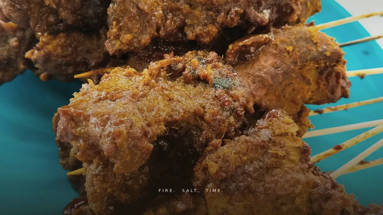
A near-contact photograph of an Adana kebab fills the entire screen. The tagline "Fire. Salt. Time." fades in after two seconds using a CSS animation, with no navigation competing for attention.
Pinterest-Style Masonry Gallery
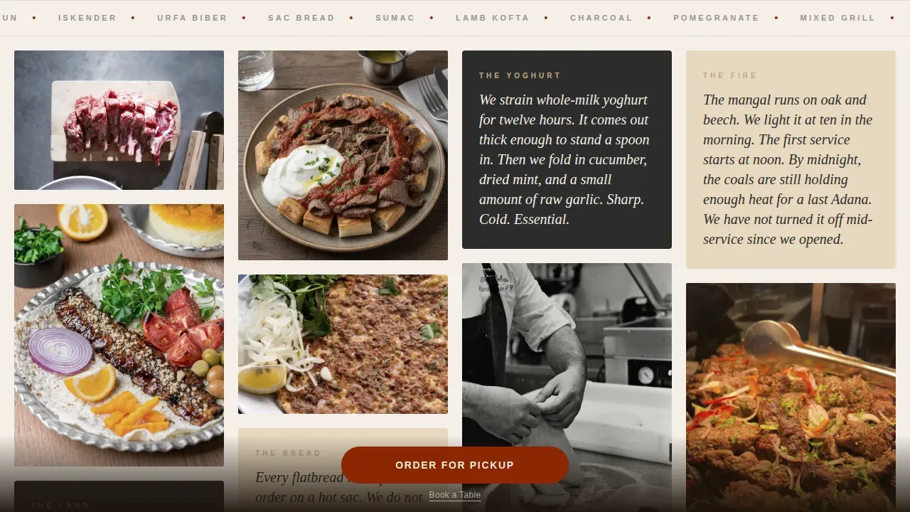
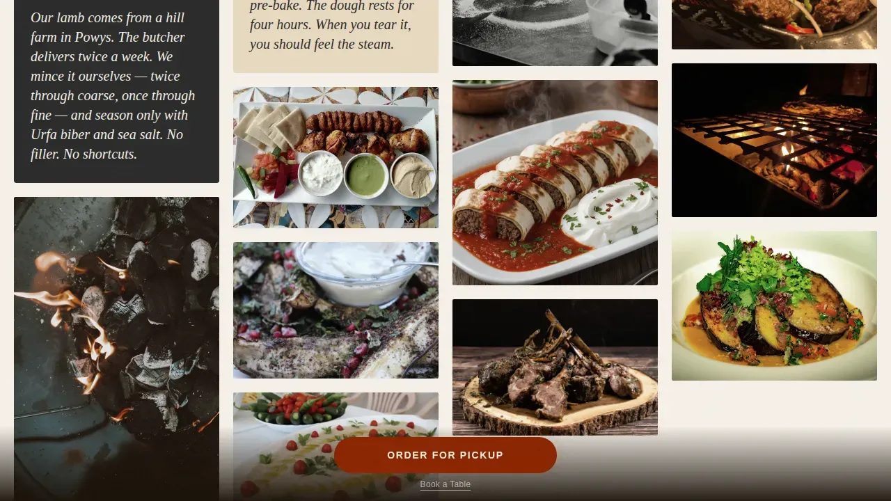
Tiles vary in height and width across the scroll. Every third image gives way to a short story tile covering ingredient sourcing, bread baking, or yogurt preparation. The rhythm keeps visitors browsing like an open kitchen walk.
Sticky Order Call to Action
An "Order for Pickup" button in sumac crimson stays pinned to the bottom of the viewport. It pulses gently when a visitor pauses on a food tile, prompting the order at the moment hunger peaks.
Menu Modal with Categories
Tapping the sticky button opens a modal organised into grill, wrap, plate, and sides. Each item shows a macro photograph, a one-line description, and an add-to-cart button. Prominent "Book a Table" and "View Menu" paths are also accessible.
Scrolling Spice Marquee
A continuous text banner runs between the hero and gallery sections. It scrolls dish and spice names across the screen, reinforcing the sensory identity of the restaurant before the gallery begins.
Story Interlude Section
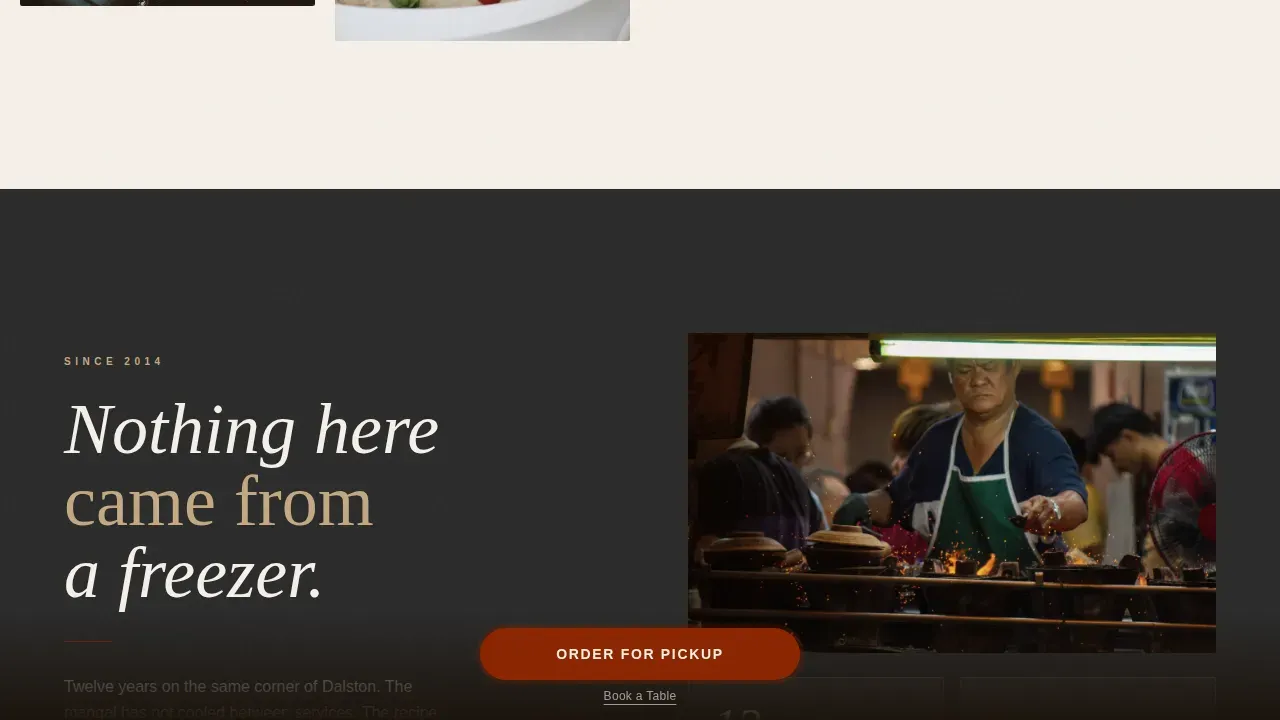
A two-column narrative block explains the charcoal method and ingredient quality in plain, honest language. This artisan storytelling section differentiates the restaurant from fast-food competitors and builds confidence before the order step.
Page sections overview
| Section | Purpose |
|---|---|
| Hero macro photo | Opens with full-viewport food close-up |
| Scrolling spice marquee | Reinforces dish and spice identity |
| Masonry gallery walk | Browsable food and story tiles |
| Story interlude | Two-column sourcing and craft narrative |
| Sticky order modal | Pinned call to action with menu categories |
| Arc Browser footer | Logo, tagline, and navigation links |
Design & branding system
The palette follows an Agrarian Root theme interpreted through a Japanese Zen colour system. Every tone is chosen to feel like a worn table wiped clean between services.
- Ceramic white (#F5F0E8) and deep charcoal (#2B2B2B) alternate as section backgrounds with text in opposing tones
- Washed clay (#C4A882) supports image frames and secondary text elements
- Sumac crimson (#8B2500) appears only on prices, buttons, and spice-dusted accents in photography
Mobile & speed optimization
The design is mobile-first throughout, reflecting its Instagram-discovered, late-night ordering audience. Images are lazy-loaded to keep the page responsive on small screens.
- Layout adjusts automatically for seamless viewing on smartphones
- Buttons are large enough for easy tapping, and the sticky call to action stays accessible at every scroll depth
- CSS-first animations are used wherever possible to reduce render load
How this template helps you convert
The page is structured so that hunger makes the decision before any explicit selling begins. Lifestyle photography builds a personal connection with the audience across every scroll step.
- Forty food photographs create appetite and trust before the visitor reaches the order button, reducing friction at the point of purchase.
- Customer testimonial tiles and dish origin stories embedded in the masonry gallery validate quality near the call to action, encouraging confident orders.
Other information about this template
This template is built for direct-to-consumer restaurant ordering in a London context, with UK English copy, GBP pricing, and 24-hour time formatting included. Kebab graphic design resources like high-quality illustrations and lifestyle photography can enhance marketing efforts beyond the page itself. Kebab illustrations are popular in street food advertisements, and templates featuring kebabs are available for a range of graphic design projects, including BBQ party announcements and promotional campaigns.
No-code design tools allow users to create websites and marketing materials without extensive coding skills. This template fits that model: no-code platforms let small restaurant teams build a production-ready page from a structured prompt without traditional programming. AI-powered no-code tools can help small businesses enhance their marketing campaigns and reach new customers through stronger search results visibility. A well-designed restaurant page can protect brand perception by presenting quality visuals before a visitor forms a first impression from search results alone. Keeping the website consistent with the food experience helps protect the restaurant's reputation across every channel, including search results.
- Typography: Fraunces serif display paired with DM Sans body text
- Animation: GSAP ScrollTrigger handles image reveals, marquee motion, and modal transitions
- Interactivity: Masonry hover reveals and add-to-cart tile behaviour are included
- Localization: UK English, GBP (£) currency, and 24-hour time format throughout
Theme
Agrarian Root
Creative direction
Gallery Walk
Color system
Japanese Zen
Style
Masonry/Pinterest
Direction
Direct Sales
Page Sections
Full-viewport Macro Hero
Pinterest-style Masonry Gallery
Sticky Order Call to Action
Menu Modal with Categories
Story Interlude Section
Scrolling Spice Marquee
Related questions
Can I edit the menu items and prices inside the modal?
Does the masonry gallery support my own food photography?
Is the 'Order for Pickup' button connected to a live ordering system?
Can I feature customer testimonials inside the masonry gallery?
Can this page design work for a different type of food business?