Bold Brutalist Japanese Builder Landing Page Template
Kenchiku is a bold brutalist landing page template built for Japanese construction firms and builders who communicate through craft, not marketing copy. The design system pairs deep charcoal backgrounds with an iridescent prismatic accent palette. A floating photo constellation header, staggered masonry project grid, and a three-step consultation configurator work together to convert serious clients into booked consultations.
by Rocket studio
Quick summary
Kenchiku is a masonry-style brutalist landing page template for Japanese builders and contractors operating in Tokyo, Kyoto, and beyond. It uses moody, unprocessed construction photography, a cursor-reactive floating header, iridescent hover states, and a tiered consultation booking system to let the quality of the work speak before a single word of sales copy appears.
Who this template is for
This landing page is designed for construction professionals whose work has outgrown a generic housing company portfolio site. It is built for practitioners who understand that the right client recognizes quality without a pitch.
- Property owners and private clients who want a bespoke new build or renovation in Tokyo or Kyoto, and who are tired of cookie-cutter proposals
- Architects and structural engineers who need a building partner fluent in both SE構法 (a timber structural system using engineered lumber frames) and reinforced concrete construction
- Developers converting machiya townhouses into boutique hospitality spaces, and commercial clients commissioning fit-outs that need to respect the history of a building while meeting current seismic standards
What problem this template solves
Most construction firm websites look identical. They lead with numbered stat blocks, cheerful testimonial sliders, and polished stock photography that could belong to any builder in any city. This landing page rejects that format entirely.
- The template replaces generic credibility signals with direct visual evidence: raw process photography, board-formed concrete detail shots, and project journal documentation that let the craft make the argument
- It eliminates the gap between how serious Japanese architecture firms present their buildings and how their digital presence actually looks, giving builders a landing page whose form matches the weight and precision of their physical work
- It provides a structured path from discovery to consultation booking without requiring visitors to navigate multiple pages or fill out vague contact forms
What you get with this template
You receive a fully structured single-page layout built around seven distinct content zones, each with its own visual logic and interaction behavior. The page is designed desktop-first, reflecting how architects and property owners typically research construction partners.
- A floating photo constellation header with cursor-reactive parallax, a staggered masonry project grid with iridescent hover states and bilingual Japanese category labels, full-width atmospheric interlude blocks, and a craft process section that alternates raw imagery with methodology text
- A three-step consultation configurator modal that guides visitors through project type selection, square meterage and location input, and consultation tier choice, with three clearly priced tiers: Site Reading at ¥55,000, Full Proposal at ¥220,000, and Design-Build Retainer priced on scope
- A secondary lead-capture path offering a downloadable PDF project journal of a completed build in exchange for an email address, giving prospective clients proof of process before they commit to a consultation
Feature list
This landing page template includes a set of carefully defined interactive and structural features. Each one is grounded in the brief and built to serve a specific function within the sales flow.
Floating Photo Constellation Header
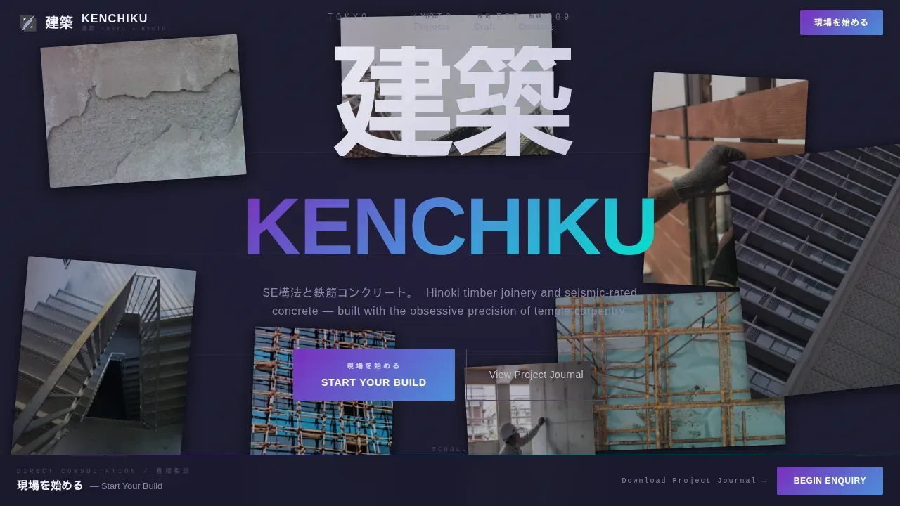
Seven or eight construction images are suspended at varying depths and slight rotations against the deep charcoal background. The cluster drifts with barely perceptible parallax as the cursor moves across the screen. Images include gloved hands pressing cedar into place, the geometric shadow play inside a board-formed concrete stairwell, and aerial shots of rebar grids before a pour. The firm name is set in a massive compressed grotesque typeface that slices horizontally through the floating cluster. This header structure establishes the visual weight and space of the landing page before a single section scrolls into view.
Staggered Masonry Project Grid
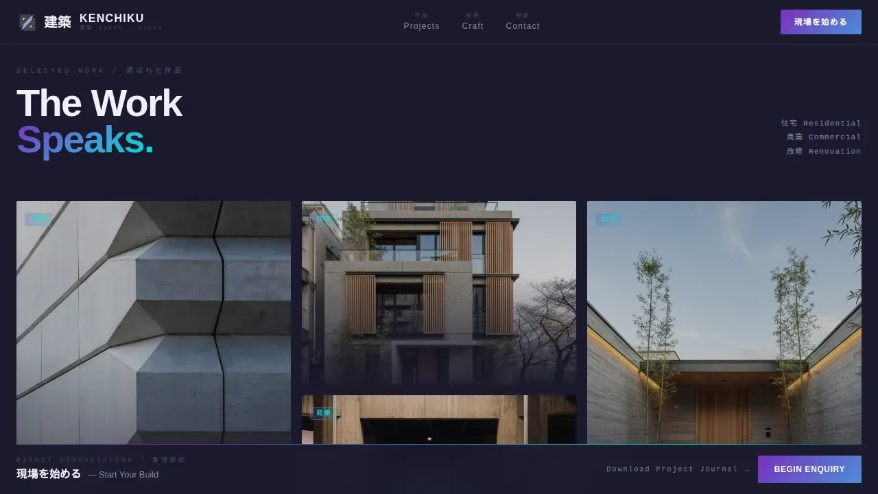
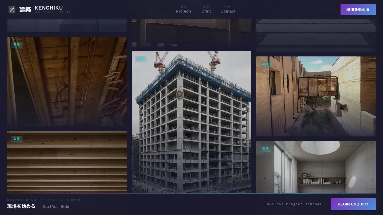
Project cards load in staggered clusters as users scroll. Each card is a moody, low-key construction photograph tagged with one of three iridescent Japanese category labels: 住宅 (residential), 商業 (commercial), or 改修 (renovation). Hovering a card triggers a prismatic border bloom and reveals a one-line poetic project descriptor. The grid form mirrors modular grid systems found in metabolism and traditional Japanese proportions, creating structural honesty through visual repetition.
Atmospheric Interlude Blocks
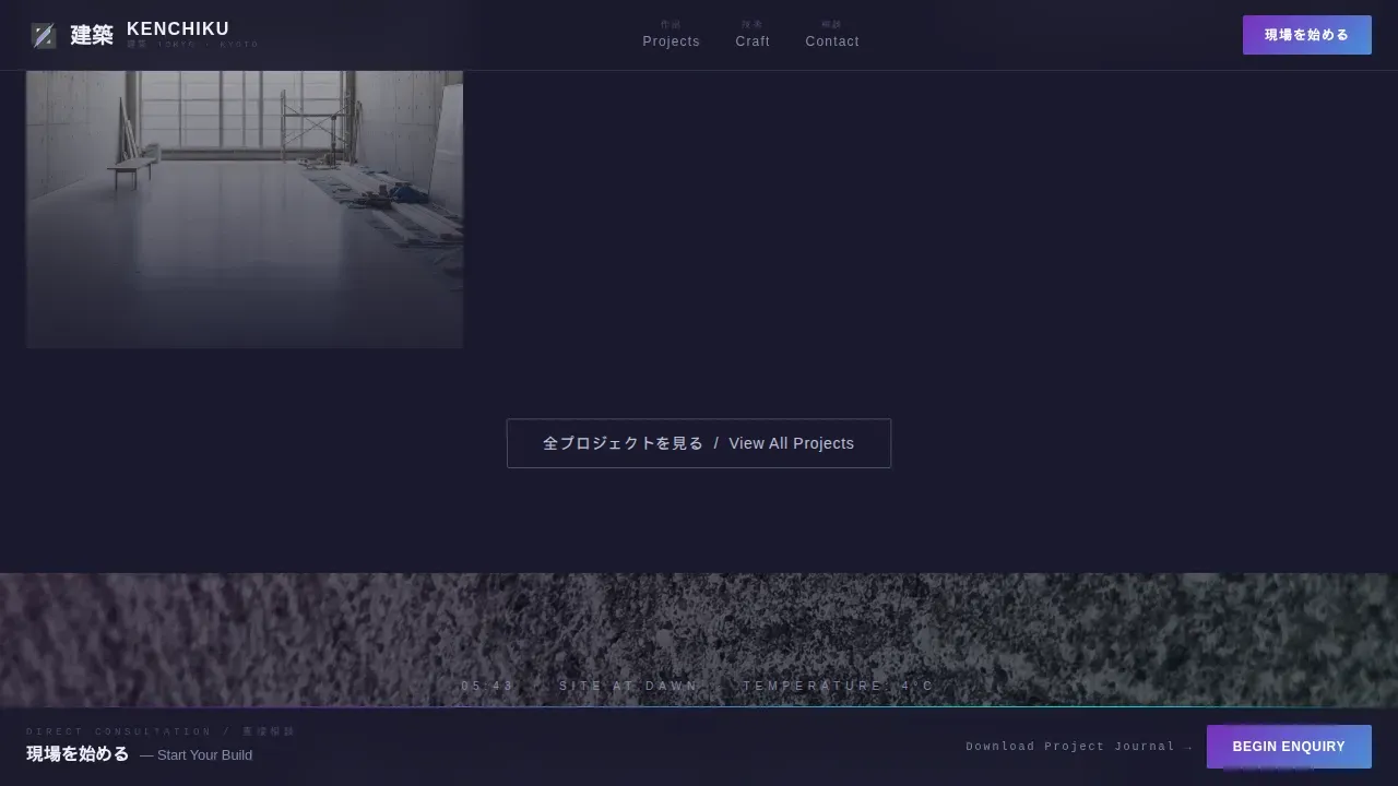
Between project card clusters, full-width interlude sections appear. These feature macro shots of concrete grain texture, typographic fragments describing a construction site at dawn, and time-lapse scaffolding imagery. These interludes deepen the atmosphere as visitors scroll, moving from finished exteriors to raw process documentation. The mood of the page descends in weight and texture as the scroll progresses, making the craft itself the primary argument for the firm's capabilities.
Three-Step Consultation Configurator
The primary call to action, reading "現場を始める / Start Your Build" in bilingual stacked typography, appears both as a persistent bottom bar after the third scroll fold and as a full-width closing block. Clicking it opens a streamlined three-step configurator modal. Step one lets the visitor select project type. Step two collects approximate square meterage and ward or city. Step three presents three consultation tiers with clear pricing and scope descriptions. The configurator guides users through a decision without overwhelming them with open-ended form fields.
PDF Project Journal Lead Capture
A secondary conversion path allows visitors to download a detailed PDF journal documenting a completed build, in exchange for their email address. This gives prospective clients direct access to the firm's process documentation and decision-making before they commit to a paid consultation. It functions as proof of craft and lowers the barrier to initial engagement.
AI Iridescent Interaction System
The iridescent color system is built entirely around interaction. The deep charcoal background and mercury silver typography remain static and heavy at rest. Prismatic violet bleeding into electric teal appears only on hover states, loading transitions, and accent borders. This means the color reward comes from the visitor's own curiosity and movement. The palette feels like oil on wet concrete after rain: industrial and unyielding until light catches it, then something almost alive shimmers through.
Page sections overview
| Section | Purpose |
|---|---|
| Floating header constellation | Establishes visual identity and draws visitors into the world of the firm through cursor-reactive depth and compressed display typography |
| Masonry project grid | Showcases completed buildings through moody photography and iridescent category labels with hover-reveal project descriptors |
| Atmospheric interlude one | Delivers a full-width concrete macro texture break between project clusters to deepen the mood and slow the scroll |
| Craft process section | Alternates raw site photography with methodology text to show the construction process and reinforce technical credibility |
| Atmospheric interlude two | Introduces typographic fragments and time-lapse scaffolding imagery as further atmospheric context between content zones |
| Consultation configurator block | Presents the primary call to action with a three-step booking modal and three consultation tier options with clear JPY pricing |
| PDF journal capture | Offers a secondary lead path through a downloadable project journal in exchange for an email address |
| Footer | Delivers minimal contact and navigation information using the Superhuman Minimal footer pattern |
Design & branding system
The visual identity of this landing page is rooted in bold brutalism applied through a carefully controlled iridescent accent system. The design philosophy prioritizes raw materiality, structural honesty, and high-density visual information over decorative polish. This approach reflects the principles seen in contemporary Japanese architecture, where the relation between material and structure is made explicit rather than concealed.
- The dominant background is deep shutter-board charcoal (#1A1A2E), with mercury silver (#C0C0D8) used for all body typography and structural grid lines. Cards float in matte graphite. The iridescent gradient, running from prismatic violet (#7B2FBE) into electric teal (#00E5CC), appears exclusively on interaction states
- Display typography uses DM Sans in a heavy compressed form to create the oversized industrial headers essential to brutalist landing page design. Body text uses Manrope for legibility and contrast. The use of stark, bold, sans-serif typography is consistent with the characteristics of Japanese brutalist architectural communication
- Unprocessed construction photography is the primary visual material. Images are never framed, bordered, or treated with softening filters. Colors follow a monochromatic base with strategic high-contrast iridescent accents, avoiding shadows and unnecessary gradients that would undermine the raw aesthetic
Mobile & speed optimization
The template is designed desktop-first, reflecting how architects, developers, and property owners typically research construction partners during working hours. The layout has a mobile-responsive fallback so the landing page remains functional and legible across screen sizes.
- Animations are built using GPU-accelerated transforms only, keeping rendering efficient even for the cursor-reactive parallax constellation and staggered card reveal sequences
- Section visibility is triggered using IntersectionObserver, so content loads into view progressively as users scroll rather than all at once, reducing the initial rendering load on the page
How this template helps you convert
The landing page is structured to move a skeptical, high-value client from initial curiosity to a confirmed consultation booking. It does this without relying on testimonials, numbered stat blocks, or marketing language that sophisticated buyers immediately discount.
- The floating photo constellation and staggered masonry grid present visual evidence of quality before any sales claim is made. Serious clients recognize craft. The page earns trust through photography and process documentation rather than asserting it through copy, which is especially important for an audience that includes working architects and developers who can read the details in a construction photograph
- The persistent bottom-bar call to action and full-width closing configurator block create two clear moments of conversion pressure without being aggressive. The three-step configurator reduces decision friction by breaking the booking process into manageable steps. The PDF journal download offers a lower-commitment entry point for visitors who are not yet ready to book, capturing their email and continuing the relationship through a document that demonstrates process depth and craft precision
Other information about this template
This landing page draws its visual and conceptual language from a lineage of Japanese architecture that prioritizes the honest expression of materials, structural logic, and spatial weight over surface decoration. Understanding that lineage helps clarify why the design system is built the way it is.
- Contemporary Japanese architecture reflects a blend of traditional Japanese aesthetics and modern design principles that developed across the twentieth century and continues to evolve in Japan today. The relation between raw concrete and timber in Japanese buildings has a history stretching back to modernism's arrival in Japan and its collision with temple carpentry traditions
- The spirit of figures like Tadao Ando, whose buildings in Osaka and across Japan embrace raw concrete as both structure and surface, is embedded in the visual logic of this template. Ando's approach, influenced by Le Corbusier's concept of the building as a pure object in light, gave Japanese architects a new generation of perspectives on how buildings relate to their natural and urban context
- Shin Takamatsu's work in Kyoto during the 1980s represents a distinct wave of post-modernism in Japanese architecture, characterized by machinelike complexity and bold geometric form. Shin Takamatsu embraced a style that was deliberately confrontational toward the city fabric around it, treating buildings as sculptural objects. The template's iridescent interaction system echoes Shin Takamatsu's interest in surfaces that shift meaning depending on light and angle
- Toyo Ito's explorations of lightness, transparency, and new wave urbanism offer a different set of characteristics. Where Shin Takamatsu and Tadao Ando embraced weight and mass, Toyo Ito pursued dematerialization. The template holds both impulses in tension: heavy backgrounds and raw textures on one side, iridescent prismatic shimmer on the other. Toyo Ito's influence is present in the way the page finally reveals color only through motion and curiosity
- Hiromi Fujii's deconstructive approach to form and space, developed through projects in the 1970s and 1980s, pushed the boundaries of how Japanese architects could store and communicate spatial complexity on paper and in built form. Hiromi Fujii's work remains a reference point for designers who want to push beyond conventional grid systems
- The template's masonry grid system mimics the repetitive geometric patterns found in Metabolism, the Japanese architectural movement of the 1960s that treated buildings as interchangeable cube units in an evolving urban organism. That modular logic is present in the staggered card layout and the structural grid lines that run through the page
- Cultural references embedded in the bilingual labeling system, the JPY pricing structure, and the geographic focus on Tokyo and Kyoto give the template a grounded sense of place. Japanese culture values precision, restraint, and the communication of quality through evidence rather than assertion. This landing page reflects those values in every design decision
- Japanese society's expectations around professional presentation are high, particularly in architecture and construction. The template meets those expectations by treating the landing page itself as a built object: every element has a function, every relation between elements is deliberate, and nothing is present without reason
- The template is available through no-code platform tools, so users can customize and launch it without traditional programming skills. AI-powered no-code platforms can generate production-ready pages from natural language prompts, and this template is built to work within those workflows. No-code development accelerates the process for non-technical users who want to launch quickly without sacrificing design quality
- The design philosophy of this landing page aligns with the broader principles of raw software design: honesty and transparency over polished embellishment, straightforward communication over marketing jargon, and a commitment to building a digital presence that lasts and remains relevant as the firm's recent works accumulate over time
- To the extent that a landing page can present the dimensions and form of a construction firm's identity, this template does it through the weight of its background, the precision of its typography, and the restraint of its color system. The page does not explain quality. It presents evidence of quality and lets users draw their own conclusions
Theme
Bold Brutalist
Creative direction
Atmosphere & Mood
Color system
AI Iridescent
Style
Masonry/Pinterest
Direction
Direct Sales
Page Sections
Cursor-reactive Floating Photo Header
Staggered Masonry Project Grid
Atmospheric Interlude Sections
Three-step Consultation Configurator
PDF Project Journal Lead Capture
AI Iridescent Interaction System
Related questions
Who is this landing page template built for?
Can I customize the consultation tiers and pricing in the configurator?
Does the template support bilingual Japanese and English content?
What kind of photography works best with this template?
Is the PDF project journal download section required?



