Bold Brutalist Motion Designer Landing Page
Keyframe is a bold brutalist landing page template built for motion designers who lead with work, not words. It pairs a looping animated header with an asymmetric masonry grid that mixes projects, blog posts, and process breakdowns into one scroll. The AI iridescent color system and raw monospaced typography make every section feel like a live creative artifact.
by Rocket studio
Quick summary
Keyframe is a single-page portfolio and blog template for motion designers. It opens with a viewport-filling animated illustration, then flows into an asymmetric masonry grid that blends project thumbnails, blog posts, and behind-the-scenes content. The design follows a bold brutalist aesthetic with an iridescent color system built on void black, synthetic violet, molten cyan, and plasma pink.
Who this template is for
This template is built for independent motion designers running a one-person studio. It speaks directly to creatives who produce motion work for brands and want their site to feel like a credential before a single word is read.
- Freelance motion designers who blend client work with editorial content
- One-person studios pitching to creative directors, funded startup founders, and editorial teams
- Motion creatives who want a portfolio that doubles as a living blog and process journal
What problem this template solves
Most portfolio templates separate work from personality. They present a grid of thumbnails and a contact form, then leave the visitor to connect the dots. That creates distance exactly when you need a creative director to feel an instant pull.
- Generic portfolio layouts flatten range and hide creative voice behind uniform card sizes
- Separate blog and portfolio pages break the scroll and dilute impact
- Standard designs give no sense of process, taste, or studio sensibility before a visitor decides to reach out
What you get with this template
You get a complete single-page layout that treats the scroll itself as a creative statement. Projects, writing, and process content coexist in one uninterrupted flow, so visitors never leave the page to understand what you do and how you think.
- A viewport-filling animated header where abstract letterforms assemble, dissolve, and reassemble
- An asymmetric masonry grid with hover-activated two-second motion loops on every project card
- A persistent floating contact pill anchored in the bottom-right corner throughout the entire scroll
Feature list
This template delivers a tightly scoped set of purposeful features. Every element earns its place by serving the core goal: prove taste and range before asking for anything.
Animated Viewport Header
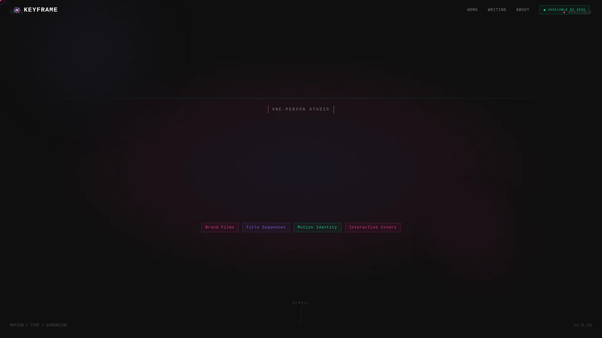
The header is a looping, hand-crafted motion piece that fills the entire screen. Abstract letterforms draw themselves in plasma pink, fill with molten cyan, then shatter into violet particles before reforming. The animation functions as the primary credential, not decoration.
Asymmetric Masonry Grid
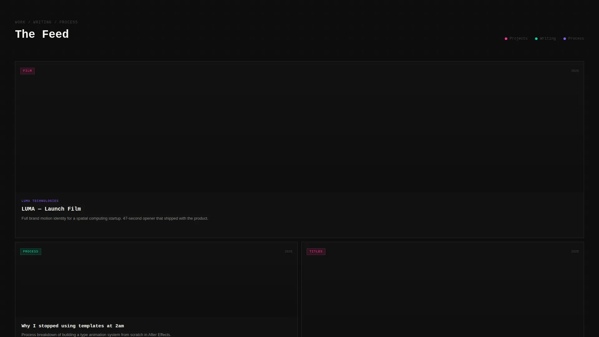
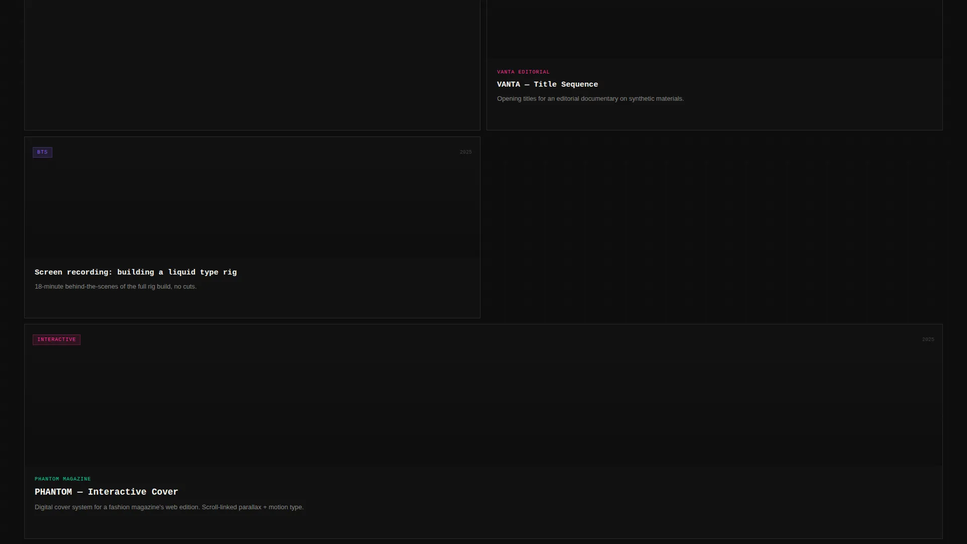
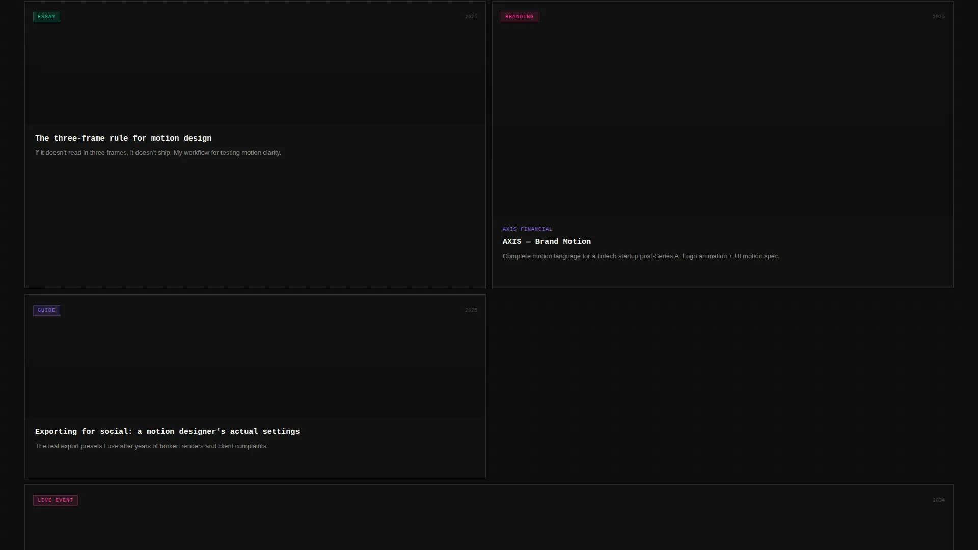
The grid uses unpredictable card scaling to create an intentionally uneven rhythm. Some cards span two columns; others stay as tight thumbnails. This brutalist refusal to conform gives the layout a lived-in, editorial quality that catalog-style grids cannot replicate.
Hover-Activated Motion Previews
Each project card plays a two-second loop of the actual deliverable on hover. Visitors see the work in motion before clicking through. This preview behavior keeps the page honest and builds trust without requiring any written pitch.
Embedded Click-Through Architecture
The primary call to action is the grid itself. Every card routes to a dedicated case study or blog post. There is no separate pitch section. The page earns the click by delivering undeniable work within the first three rows.
Persistent Floating Contact Pill
A floating pill element anchored in the bottom-right reads "Let's Make Something" in monospaced caps. It stays visible throughout the entire scroll, providing a low-friction path to contact without interrupting the browsing experience.
Mixed Content Grid
Blog posts, process breakdowns, and behind-the-scenes screen recordings are shuffled between project thumbnails inside the same masonry grid. This mixed content approach makes the scroll feel like entering a creative brain rather than browsing a catalog.
Page sections overview
| Section | Purpose |
|---|---|
| Animated Header | Fills viewport with looping letterform animation as primary credential |
| Tagline Row | Displays oversized mono type line "I make things move" below the fold |
| Masonry Grid | Combines projects, blog posts, and process content in asymmetric scroll |
| Floating Contact Pill | Persistent bottom-right element linking to contact page throughout scroll |
Design & branding system
The visual identity is built on a bold brutalist foundation charged with an AI iridescent color system. The palette feels like light refracting through a fractured surface: unstable, digital, and impossible to ignore.
- Void black (#0D0D0D) serves as the dominant canvas, with synthetic violet (#8B5CF6), molten cyan (#06D6A0), and plasma pink (#FF2E97) shifting across gradients, borders, and hover states
- Typography is set large and raw in monospaced or grotesque weights, giving text a code-terminal directness against the dark background
- Iridescent accents bleed across card edges and cursor trails, creating the sensation of dragging a thumb across a holographic surface where every angle catches a different color
Mobile & speed optimization
The template is structured to carry its visual weight without sacrificing scroll performance on smaller screens. The masonry grid and animated header are designed for the full experience while remaining functional across device sizes.
- Card scaling and column behavior in the masonry grid adapt to narrower viewports without breaking the asymmetric rhythm
- Hover-triggered motion previews translate to tap interactions on touch devices, keeping the preview mechanic accessible on mobile
- The floating contact pill remains anchored and visible on all screen sizes, preserving the low-friction contact path throughout mobile scroll
How this template helps you convert
This template converts by showing before it tells. There is no pitch copy, no testimonial carousel, no hero button asking for a click. The design trusts the work to do the persuading.
- The animated header creates an immediate emotional impression. A creative director scrolling at 1 a.m. knows within seconds whether this studio speaks their language, which removes the barrier of further research.
- The mixed masonry grid proves both range and depth. Projects sit alongside process notes and blog content, so visitors understand how you think, not just what you ship. That context is what turns a browser into a serious inquiry.
Other information about this template
This template is categorized under Portfolio and Agency, with a focused niche in motion designer blog and portfolio work. It sits at the intersection of personal brand building and editorial content publishing.
- The template style is masonry, inspired by Pinterest-style grid layouts adapted for brutalist creative portfolios
- The landing page direction is click-through, meaning conversion happens inside the content grid rather than at a dedicated conversion section
- The header concept is an animated illustration, a custom looping motion piece that doubles as the designer's most visible credential
- The creative direction follows a creator spotlight approach, centering the individual's voice, process, and range above any formal studio presentation
- The color system is classified as AI iridescent, referencing the synthetic, GPU-adjacent quality of the shifting gradient palette
Theme
Bold Brutalist
Creative direction
Creator Spotlight
Color system
AI Iridescent
Style
Masonry/Pinterest
Direction
Click-Through
Page Sections
Animated Viewport Header
Asymmetric Masonry Grid
Hover-activated Motion Previews
Mixed Content Grid Flow
Persistent Floating Contact Pill
Click-through Grid Architecture
Related questions
Can I add my own motion pieces to the masonry grid?
Does the animated header require custom animation skills to edit?
Is this template suitable for a designer who also writes about their process?
How does the contact flow work without a dedicated contact section?
Is this template designed for a single-page layout or a multi-page site?



