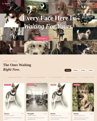
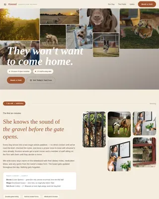
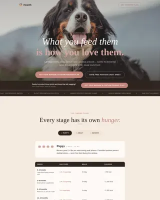
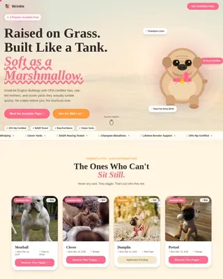
Raw Pet Food Landing Page Template | Gallery + Detail
Kibble is a Gallery + Detail landing page template built for raw and fresh pet food brands. It leads with a bold 4.9-star review score, pulls visitors through an ingredient-reveal gallery, and drives every click toward a meal builder quiz. The Organic Flow design and Botanical color palette make the page feel as honest and appetizing as the food itself.
by Rocket studio
Quick summary
Kibble is a single-page Click-Through template designed for raw and fresh pet food brands. It opens on a review-forward hero, moves through an interactive gallery of meal cards, and ends every scroll path at one destination: "Build Their Bowl." The Botanical palette and Organic Flow theme give every section the warmth of a farmers market at golden hour.
Who this template is for
This template is built for founders and marketers who sell raw or minimally processed pet food and need a page that earns trust before asking for a click.
- Raw pet food brands selling portioned muscle meat, organ blends, or bone-ground meal mixes
- Fresh pet food startups that want a gallery-forward page without a long product catalog
- Direct-to-consumer pet food businesses ready to funnel visitors into a personalized meal builder
What problem this template solves
Most pet food brand pages look like a pharmacy aisle: flat, clinical, and unconvincing. Kibble solves the trust gap for ingredient-conscious pet owners who read every label before buying.
- Visitors arrive skeptical and need social proof before they will explore product details
- Raw feeding customers want ingredient transparency, not a wall of marketing copy
- A standard product page can't match the curiosity-driven experience that converts raw food shoppers
What you get with this template
You get a fully structured, single-page layout that covers everything from hero review score to meal-card detail panels. Every section is designed to carry the visitor one step closer to the meal builder.
- A hero section with a rotating review score overlay and slow-motion gallery of real meal moments
- Interactive meal cards with hover ingredient reveals and sourcing map animations
- A mid-page mystery box spin-wheel section and a sticky "Build Their Bowl" bottom bar that activates after the third gallery row
Feature list
This template ships with a focused set of interactive and visual components, all grounded in the source brief below.
Review Score Hero
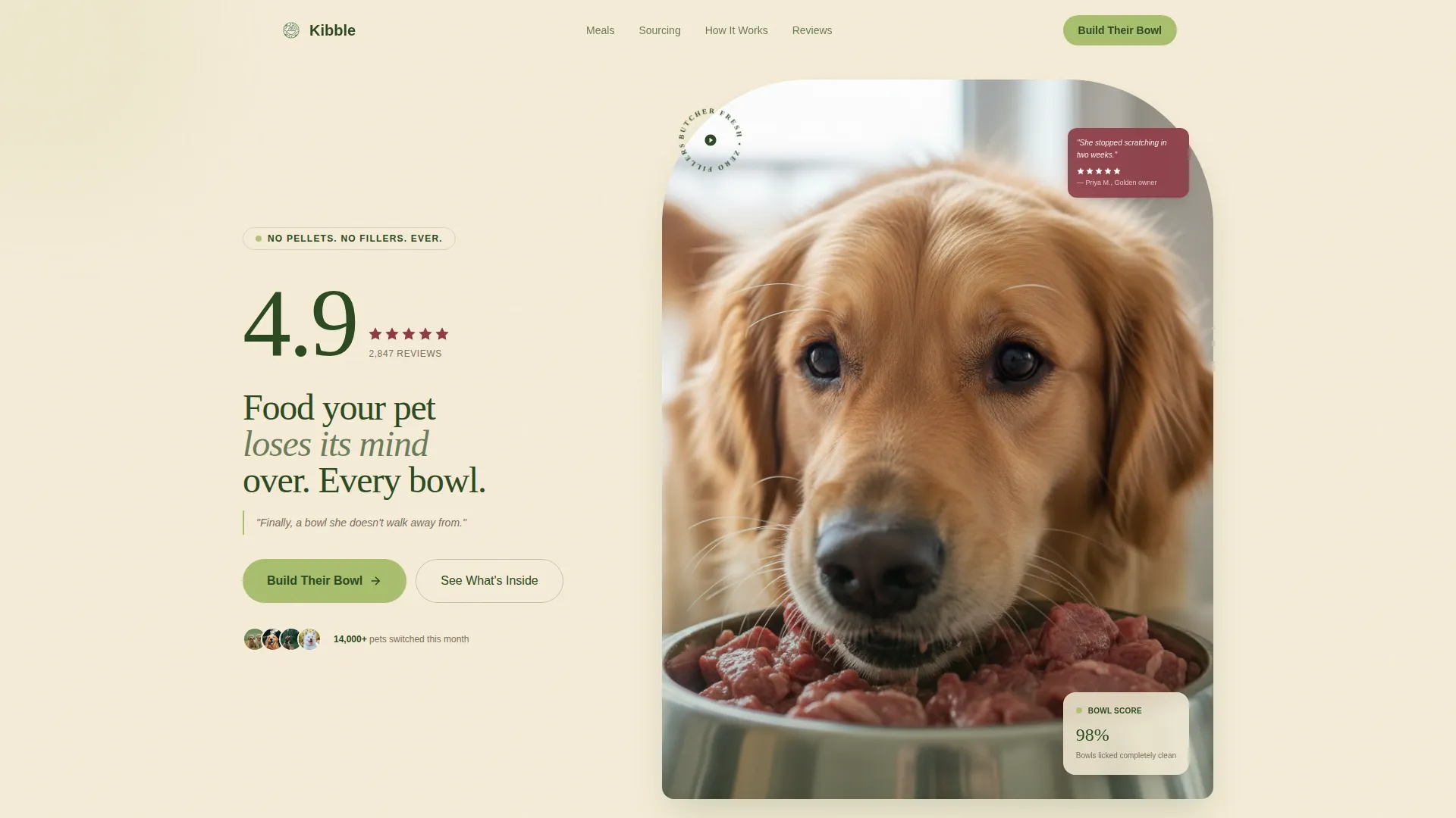
The header opens on a large, hand-drawn-style 4.9-star rating displayed over a slow-motion gallery of dogs eating from raw bowls. A rotating quote ticker beneath the score cycles real customer lines, creating immediate social proof before the visitor scrolls a single pixel.
Hover Ingredient Reveal Cards
Each meal photo in the gallery grid hides a recipe-card panel behind a hover state. When a visitor pauses on a protein, the ingredients fan out in a layered animation. This keeps curiosity high and replaces a heavy product description page.
Sourcing Map Animation
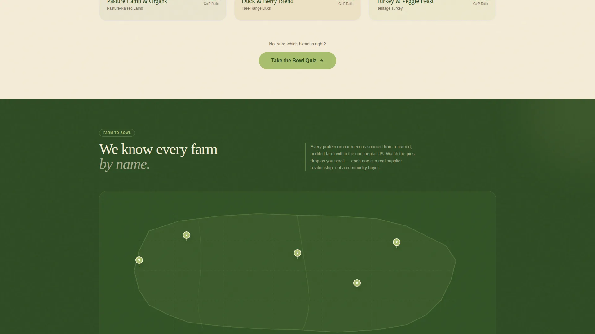
Scrolling past a protein triggers a small animation: a location pin drops onto a hand-illustrated map showing the sourcing farm. It adds origin transparency without a lengthy "Our Story" section interrupting the browse flow.
Mystery Box Spin Wheel
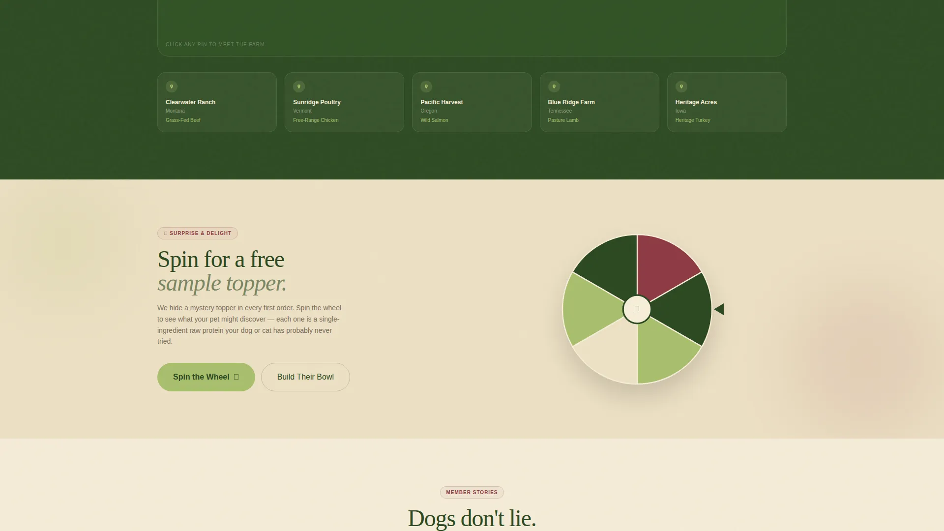
A mid-page section breaks the scroll rhythm entirely. Visitors spin a wheel for a chance at a sample topper. This interactive moment injects play into the experience and re-engages visitors who might otherwise drop off in the middle of the page.
Sticky "Build Their Bowl" Bar
After the third gallery row, a persistent bottom bar locks onto the screen carrying the primary call to action. The bar ensures the meal builder entry point is always one tap away, no matter how deep the visitor scrolls.
Expandable Meal Detail Panels
Secondary calls to action on individual meal cards read "See What's Inside." Tapping one opens a full detail panel with ingredient and sourcing information. Each panel closes with its own "Add to Plan" button, keeping the purchase path short and direct.
Page sections overview
| Section | Purpose |
|---|---|
| Hero Review Gallery | Open with social proof and visual appetite appeal |
| Rotating Quote Ticker | Reinforce trust with real customer voices |
| Meal Gallery Grid | Browse proteins with hover ingredient reveals |
| Sourcing Map Strip | Show farm origin through scroll-triggered animation |
| Mystery Spin Wheel | Re-engage mid-scroll visitors with an interactive moment |
| Meal Detail Panels | Deliver full ingredient context with "Add to Plan" action |
| Sticky call to action Bar | Keep the meal builder one tap away at all times |
Design & branding system
The Botanical color system and Organic Flow theme work together to make the page feel like a well-lit farmers market stall rather than a clinical product site.
- Deep kale green (#2D4A22) anchors headlines and navigation; warm oat cream (#F5ECD7) dominates the background like unbleached butcher paper
- Crushed berry (#8E3B46) marks trust signals and review stars; spring shoot green (#A8BF6E) colors every button and interactive highlight
- The visual language uses overhead food photography with natural window light, hand-drawn-style rating graphics, and hand-illustrated map elements to keep the aesthetic grounded and human
Mobile & speed optimization
The layout is structured to stay clear and tappable on small screens, where most late-night ingredient searches happen.
- The sticky "Build Their Bowl" bar is designed for thumb reach, sitting at the bottom of the viewport on all screen sizes
- Gallery cards reflow from a multi-column grid to a single-column scroll on mobile, keeping hover reveals accessible as tap reveals
- Full-width detail panels and the spin-wheel section are built to occupy the full mobile viewport, maintaining visual impact without requiring horizontal scrolling
How this template helps you convert
The page is built around a deliberate curiosity loop: lead with proof, reward exploration, and close with a low-friction action.
- The review score hero and rotating customer quotes establish credibility in the first viewport, reducing the skepticism that raw food buyers bring to a new brand.
- Ingredient reveals, sourcing animations, and the spin-wheel section reward scroll depth with genuine discovery, keeping engagement high through the middle of the page.
- The sticky bottom bar and per-card "Add to Plan" buttons mean the path to the meal builder is never more than one tap away, removing friction at the moment of decision.
Other information about this template
This template is purpose-built for the raw and fresh pet food niche and reflects the specific buying behavior of ingredient-conscious pet owners.
- The page type is a Click-Through landing page; there is no on-page form or checkout flow
- The primary call to action lands on an off-page interactive quiz asking for breed, weight, and protein preference
- The template style is Gallery + Detail, combining a browsable grid with expandable full-width panels for a rhythm that suits both casual browsers and committed researchers
- The Organic Flow theme and Botanical palette are matched to this niche specifically, signaling natural sourcing and clean ingredients without a single word of copy
- This template is suited to brands selling to dog and cat owners, including raw-feeding households, grain-free converts, and pet owners transitioning away from processed kibble diets

Theme
Organic Flow
Creative direction
Surprise & Delight
Color system
Botanical
Style
Gallery + Detail
Direction
Click-Through
Page Sections
Review Score Hero with Quote Ticker
Hover Ingredient Reveal Gallery
Scroll-triggered Sourcing Map
Mid-page Mystery Spin Wheel
Sticky Meal Builder Call to Action Bar
Expandable Meal Detail Panels
Related questions
Does this template include the meal builder quiz?
Can I use this template if I sell both dog and cat food?
Is the spin-wheel section required, or can I remove it?
What makes this different from a standard product page?
Does this template work for a new brand with limited reviews?