Dog Cost Calculator Website Template
Kibble is a masonry-style landing page template built for Labrador Retriever diet and nutrition guides. It combines a Day-in-the-Life scroll structure with interactive calculator tiles, ingredient deep-dive cards, and a two-path lead generation form. The earthy Botanical color system and close-up food photography make nutrition feel approachable, personal, and genuinely useful for Lab owners at every experience level.
by Rocket studio
Quick summary
Kibble is a single-page masonry landing page template designed for Labrador Retriever diet and nutrition guides. It walks visitors through a full day of feeding decisions, from morning portioning to evening formulations. The layout combines interactive tiles, flip-card ingredient pins, and a two-path lead generation form that converts browsers into subscribers without ever feeling pushy.
Who this template is for
This template suits anyone publishing a practical nutrition guide for Labrador Retriever owners. The content structure supports a wide range of reader intent, from basic feeding questions to advanced macro adjustments.
- First-time Lab owners searching for age-specific portion guidance
- Experienced handlers managing nutrition for working or field trial dogs
- Pet nutrition coaches or vet-adjacent educators building an email list around Lab health
What problem this template solves
Lab owners rarely lack concern; they lack organized, trustworthy guidance. Most nutrition pages dump information in flat text blocks that feel clinical and hard to act on. This template solves the readability and trust problem before the conversion problem.
- Scattered feeding advice gets replaced by a structured, time-of-day flow that mirrors how owners actually think about meals
- Generic contact forms get replaced by a three-step personalization sequence that ties the ask to real value already delivered
- Passive reading gets replaced by interactive calculator tiles and flip-card ingredient pins that reward engagement
What you get with this template
You get a fully structured masonry landing page with every visual and functional element described in the brief. The layout is organized around four time-block sections that guide the visitor from breakfast portioning through to the evening feeding ritual.
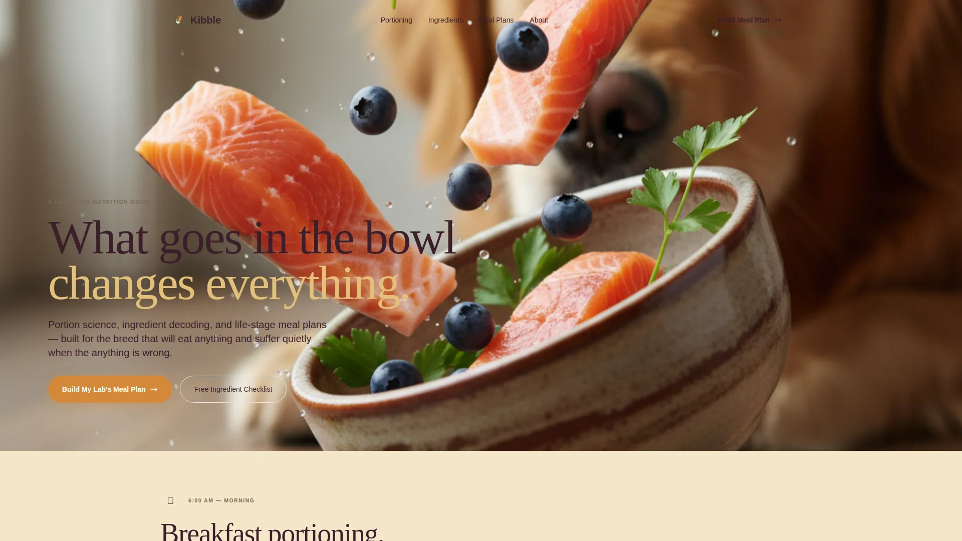
- A macro close-up header with a serif headline overlay and edge-to-edge food photography
- Masonry grid cards in varied sizes including interactive calculator tiles, swipeable snack cards, and flip-animation ingredient pins
- A two-path lead generation module with a three-step meal plan form and a lower-commitment checklist download option
Feature list
This template includes purpose-built components that make nutritional content scannable, interactive, and conversion-ready.
Masonry Grid Layout
The Pinterest-style grid uses cards in mixed sizes, tall, wide, and thumbnail-small. This keeps the scroll feeling like browsing a living cookbook rather than reading a flat manual.
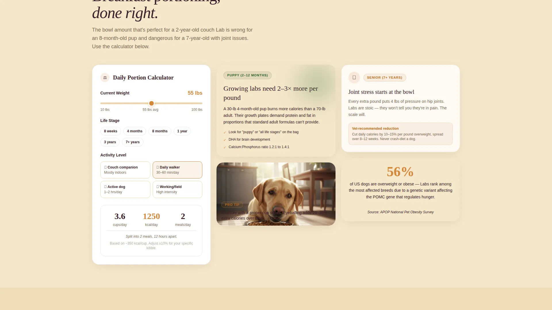
Interactive Portioning Calculator Tiles
Calculator tiles pinned inside the morning section let visitors input their Lab's age and weight to get real portion guidance. Visitors receive genuine value before any contact information is requested.
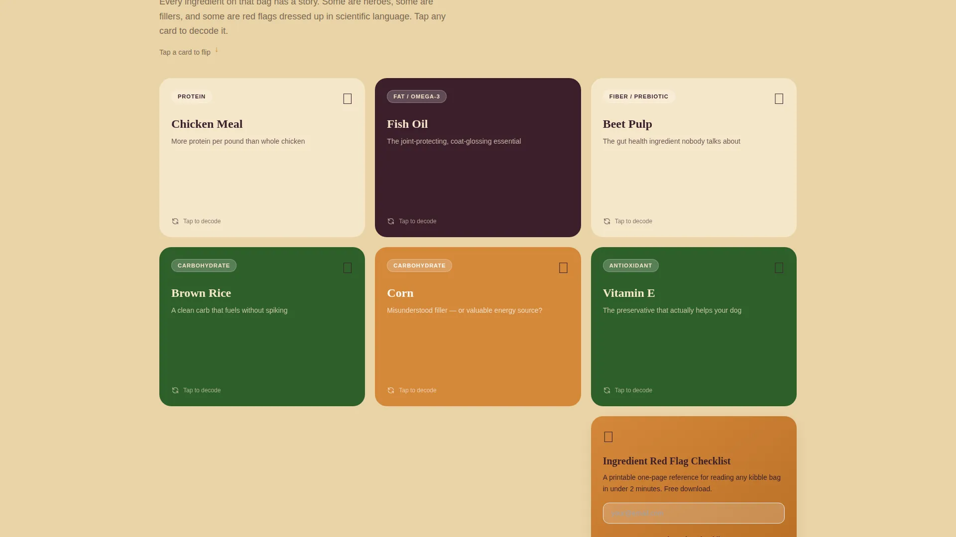
Flip-Animation Ingredient Pins
Each ingredient card in the afternoon section displays a single item, such as chicken meal, brown rice, or fish oil. A flip animation reveals both the benefits and the red flags for that ingredient.
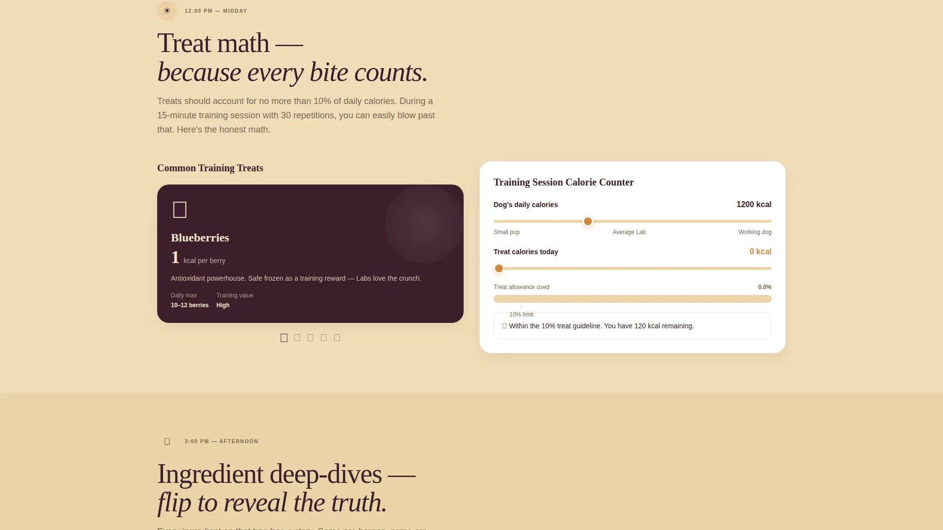
Swipeable Treat and Snack Cards
The midday section includes swipeable snack cards that show how training rewards subtract from a dog's daily calorie budget. The interaction makes treat math feel tangible rather than abstract.
Time-Block Background Tint Progression
The page background shifts subtly from cool morning cream to golden-hour amber as the visitor scrolls through each time block. This gives the page a natural rhythm that reinforces the Day-in-the-Life structure.
Two-Path Lead Generation Module
The primary path is a three-step form that builds a custom meal plan PDF using the Lab's name, age, weight, and activity level. The secondary path offers a free Ingredient Red Flag Checklist in exchange for an email address alone, reducing friction for hesitant visitors.
Page sections overview
| Section | Purpose |
|---|---|
| Edge-to-Edge Header | Establishes visual identity with macro food photography and serif headline |
| Morning Portioning Block | Presents age and weight-based breakfast guidance via calculator tiles |
| Midday Treat Math | Shows calorie impact of training rewards through swipeable snack cards |
| Afternoon Ingredient Pins | Delivers single-ingredient deep-dives using flip-animation Pinterest-style cards |
| Evening Dinner Formulations | Covers dinner guidance and the last-meal ritual to close the day-in-the-life arc |
| Lead Generation Form | Captures emails through a three-step personalized meal plan form |
| Checklist Download Path | Offers a lower-commitment Ingredient Red Flag Checklist for email-only signup |
Design & branding system
The visual identity follows an Organic Flow theme built on a Botanical color system. Every color choice is grounded in real food reference, making the palette feel edible rather than decorative.
- Deep kale green (#2D5F2B) frames section dividers and icon clusters; warm oat cream (#F5E6CA) dominates backgrounds for a linen-tablecloth feel; sun-dried sweet potato orange (#D4883A) activates interactive cards and hover states; rich blackberry (#3B1F2B) anchors headlines with typographic weight
- A single serif typeface carries the headline overlay on the header, while the overall type system balances editorial warmth with practical readability
- The header uses a shallow depth-of-field macro photograph, blueberries, salmon cubes, parsley, and a soft-focus chocolate Lab eye bleeding edge to edge with no border or gradient
Mobile & speed optimization
The masonry grid and time-block scroll structure are designed with varied card sizes that adapt naturally to narrower viewports. The layout priorities are clarity and touch-friendly interaction.
- Swipeable snack cards and flip-animation ingredient pins are built for touch interaction, making the midday and afternoon sections feel native on mobile screens
- The floating "Build My Lab's Meal Plan" call-to-action button appears after the header scroll on all screen sizes, keeping the primary conversion path reachable without requiring a full-page scroll
How this template helps you convert
The conversion strategy earns trust through genuine content delivery before asking for anything. The sequence is deliberate and removes hesitation at every step.
- Interactive calculator tiles in the morning section give visitors real portioning value upfront, so by the time the lead form appears, the visitor has already benefited from the page and trusts the source
- The two-path form module removes the all-or-nothing barrier: visitors who are not ready for the full meal plan can still enter through the lower-commitment checklist download, growing the email list either way
Other information about this template
This template is built specifically for the Labrador Retriever diet and nutrition niche and is not a generic pet care layout. Every structural and visual decision is tied to how Lab owners search for and process feeding information.
- The template style is Masonry/Pinterest, making it well suited for content-rich nutrition guides where varied card sizes improve scannability
- The Organic Flow theme and Botanical color system are baked into the design, so no significant restyling is needed to match the niche's earthy, food-forward aesthetic
- The lead generation direction supports both high-intent visitors (full meal plan form) and browse-mode visitors (checklist download), which broadens list-building potential without diluting the primary offer
- The template is categorized under Pet and Animal, specifically Labrador Retriever Services, making it a focused starting point for anyone building authority in this niche
Theme
Organic Flow
Creative direction
Day-in-the-Life
Color system
Botanical
Style
Masonry/Pinterest
Direction
Lead Generation
Page Sections
Masonry Pinterest-style Grid
Interactive Portioning Calculator Tiles
Flip-animation Ingredient Pins
Swipeable Treat and Snack Cards
Time-block Background Tint Progression
Two-path Lead Generation Module
Related questions
Who is this landing page template designed for?
What makes the masonry layout different from a standard page template?
How does the lead generation form work?
Does this template include the actual nutrition calculations?
Can I adapt the color system if my brand uses different colors?