Advanced Subscription Box Services Portfolio & Case Study Website Template
Kibble is a playful, single-page landing page template built for a doorstep dog food subscription service. It guides visitors from curiosity to checkout through a comparison-driven gallery, an inline three-step quiz, and bold tangerine call-to-action buttons. Warm geometric visuals and breed-specific messaging make every scroll feel personal and purchase-ready.
by Rocket studio
Quick summary
Kibble is a high-energy landing page template designed for a vet-formulated, portioned dog food subscription. The layout walks visitors through a visual comparison journey, then funnels them into a personalized inline quiz that ends with a subscription price and a single purchase button. It is built to convert pet owners at the moment they are most ready to switch.
Who this template is for
This template suits founders and marketers running a direct-to-consumer dog food subscription. It speaks clearly to emotionally motivated buyers who care about ingredients and convenience.
- First-time puppy parents researching ingredient lists and protein sources
- Owners of senior dogs managing grain sensitivities or dietary restrictions
- Busy multi-dog households who need reliable, automatic restocking every four weeks
What problem this template solves
Generic pet food pages give visitors no reason to commit. They show a product shot, list a price, and hope for the best. Kibble replaces that passive layout with a structured argument that builds trust section by section.
- Vague ingredient labels erode buyer confidence before they ever reach checkout
- Disorganized feeding routines and forgotten reorders push owners back to grocery-store alternatives
- No personalization means visitors cannot see how the product fits their specific dog
What you get with this template
The template delivers a complete, ready-to-customize single-page layout with every section pre-built and logically ordered. Nothing is left as a placeholder you have to figure out yourself.
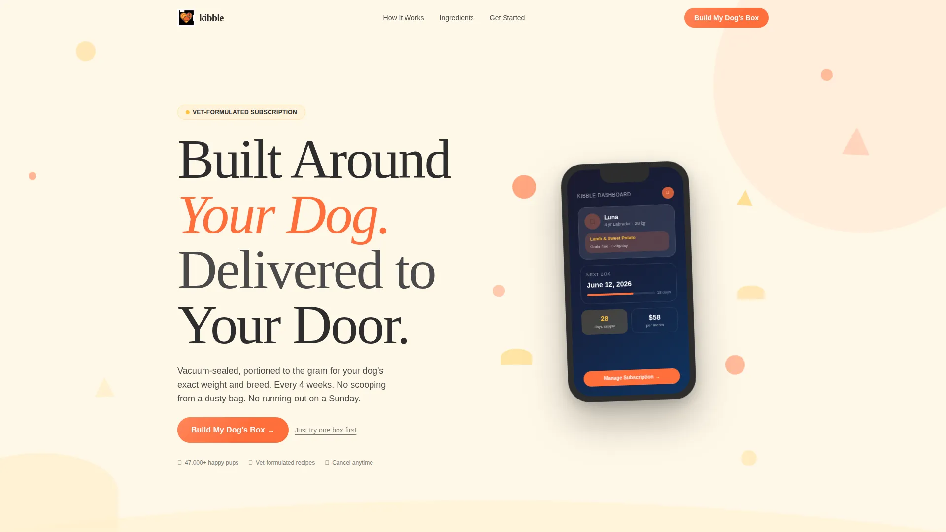
- An animated header with a device mockup showing a live subscription dashboard example
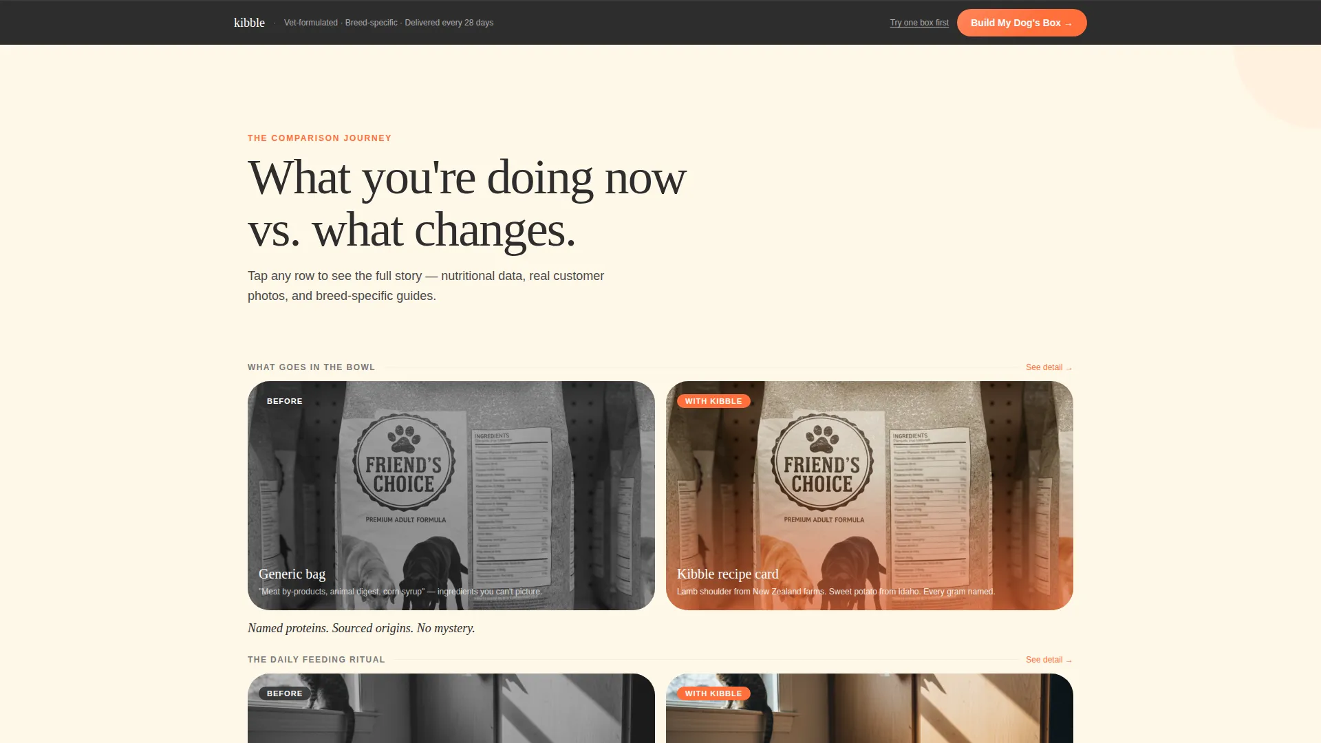
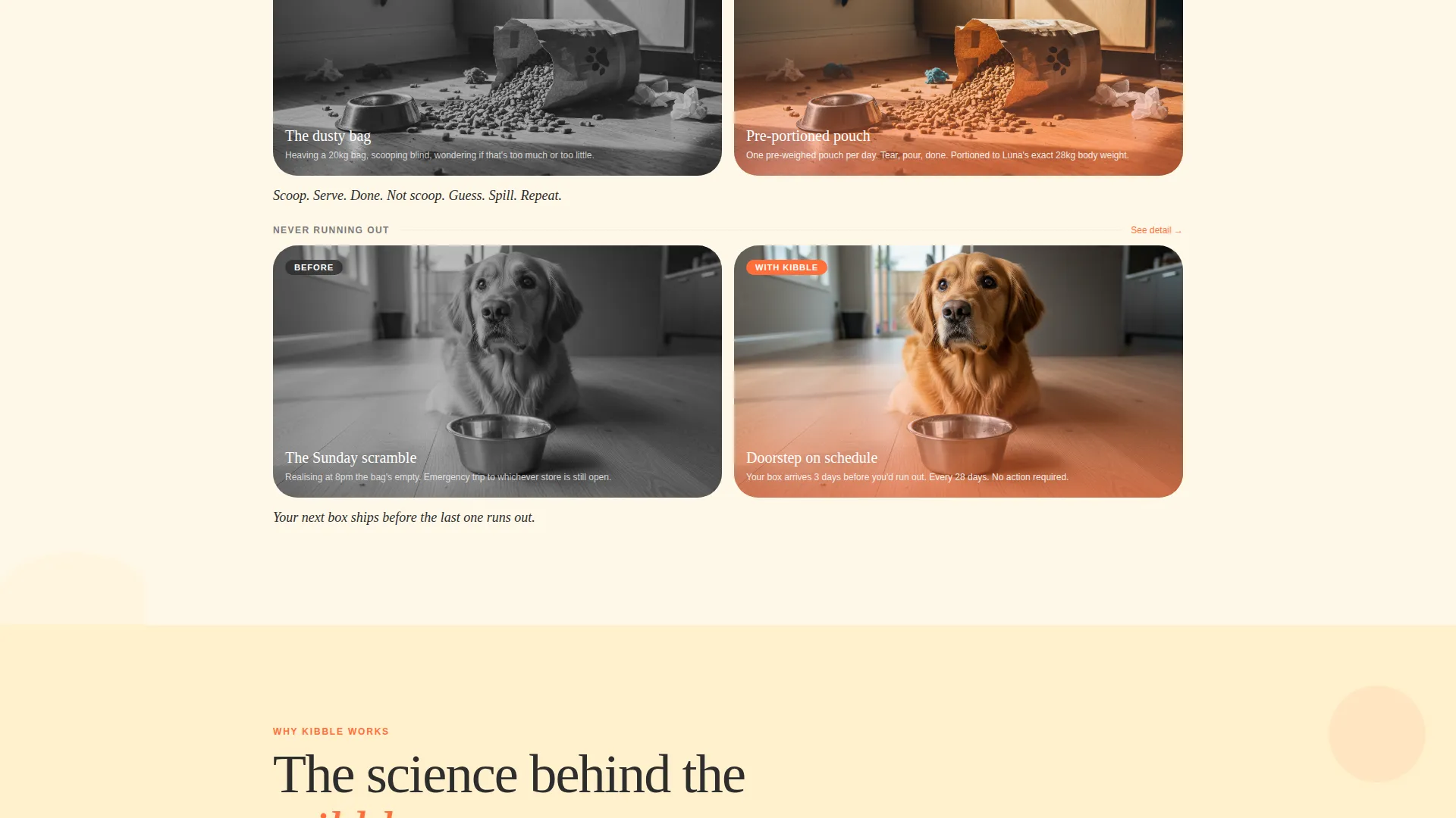
- A three-row comparison gallery where each tile expands into a detail panel with nutritional data, customer photos, and breed-specific feeding guides
- A three-step inline quiz that outputs a personalized box summary with price and next delivery date
Feature list
This template is built around components that do real persuasive work. Each one serves a specific role in moving a visitor from curious to committed.
Animated Device Mockup Header
A phone screen floats at a slight angle and displays a sample subscription dashboard. Geometric shapes in tangerine and golden yolk orbit the device. A half-circle of kibble pieces fans out from the screen edge, bridging the digital and physical product experience in a single visual.
Comparison Gallery with Expandable Detail Panels
Three gallery rows place the visitor's current routine side by side with the subscription alternative. Topics move from ingredients to feeding habits to reorder reliability. Each tile expands into a detail panel showing nutritional data, real customer photos, and breed-specific feeding guides.
Three-Step Inline Quiz
The quiz collects the dog's name, breed, weight, age, protein preference, and sensitivities across three focused screens. The final screen displays a personalized box summary complete with a monthly price and the next delivery date. A single call-to-action button closes the flow.
Sticky Bottom Call-to-Action Bar
After the second comparison row, a tangerine sticky bar appears at the bottom of the screen. It keeps the primary "Build My Dog's Box" action visible without interrupting the reading experience. This persistent prompt reduces drop-off during longer scroll sessions.
Trial Box Secondary Path
Every primary call-to-action includes an underlined text link offering a lower-commitment one-time trial box. This secondary path lets hesitant visitors enter the funnel without the pressure of a full subscription commitment.
Playful Geometric Visual System
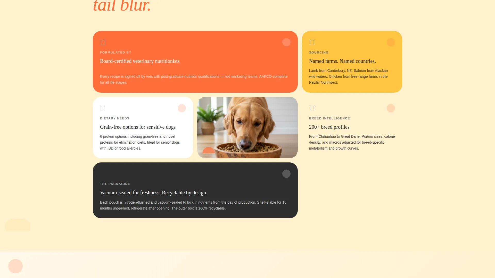
Circles, rounded triangles, and half-moons tile behind product shots and section dividers. This pattern language runs consistently from header to footer, giving the page a cohesive brand feel that stands out in a crowded pet product space.
Page sections overview
| Section | Purpose |
|---|---|
| Header with Mockup | Introduces the subscription with an animated device dashboard and hero headline |
| Primary call to action Block | Places the first "Build My Dog's Box" button directly below the header |
| Comparison Row One | Contrasts generic labels with named-protein ingredient cards and sourcing origins |
| Comparison Row Two | Contrasts messy feeding routines with a clean, portioned scoop-and-serve moment |
| Comparison Row Three | Contrasts forgotten reorders with a scheduled doorstep delivery box |
| Sticky call to action Bar | Keeps the primary action visible after the second comparison row |
| Inline Quiz Flow | Collects dog profile details across three steps and outputs a personalized summary |
| Personalized Box Summary | Displays the selected plan, monthly price, and next delivery date before final purchase |
Design & branding system
The visual identity is built on a Playful Geometric theme driven by a warm, citrus-forward color palette. Every color choice serves a specific functional role on the page.
- Tangerine pop (#FF6F3C) owns every button, price callout, and interactive element to create a clear visual hierarchy
- Golden yolk (#FFC542) warms section backgrounds and supports geometric shape fills, while warm cream (#FFF8E8) holds the body areas for easy reading
- Deep charcoal (#2D2D2D) anchors all body text and heading type, keeping legibility strong against the bright palette
Mobile & speed optimization
The template is structured with a single-page, section-led flow that naturally adapts to smaller screens. The quiz, gallery tiles, and sticky bar are all designed to work within a compact vertical layout.
- The comparison gallery tiles stack vertically on mobile so each before-and-after pair reads clearly without horizontal scrolling
- The sticky bottom call-to-action bar is especially effective on mobile, where thumb reach makes bottom-anchored buttons easier to tap
- The inline quiz uses a one-question-per-screen format that keeps the interaction simple and focused on any device size
How this template helps you convert
Every section earns the next scroll. The layout applies a deliberate logic: establish emotion first, then layer in practical proof, then make the purchase feel personal and low-risk.
- The comparison gallery builds a case through three escalating stakes, ingredients, routine, and reliability, so visitors arrive at the quiz already persuaded rather than undecided.
- The three-step inline quiz turns a generic price point into a personalized recommendation, making the final "Start Subscription" button feel like a conclusion rather than a cold ask.
- The trial box secondary path reduces friction for hesitant buyers, keeping them inside the funnel instead of bouncing when the full subscription feels like too much commitment.
Other information about this template
Kibble fits naturally into a direct-to-consumer pet brand launch or a redesign of an existing subscription sales page. It is equally useful as a standalone campaign page or the primary storefront for a new product line.
- The template is categorized under Retail and E-Commerce, specifically within the Subscription Box Services subcategory
- The page type is a single landing page, not a multi-page website, so all content and conversion steps live within one scrollable experience
- The comparison-journey creative direction makes this template adaptable beyond dog food, any subscription product with a clear before-and-after story can adopt the same structure with copy and image updates
Theme
Neo-Retro
Creative direction
Curated Collection
Color system
Lavender Dream
Style
Overlap/Layered
Direction
Marketplace/Multi
Page Sections
Animated Device Mockup Header
Comparison Gallery with Detail Panels
Three-step Inline Quiz
Sticky Bottom Call-to-action Bar
Trial Box Secondary Path
Playful Geometric Visual System
Related questions
Can I customize the quiz steps and questions?
Does the template support both a subscription and a one-time purchase option?
How many comparison rows does the gallery include?
Is this template suitable for a subscription product outside of pet food?
Where does the sticky call-to-action bar appear on the page?



