Japanese Dining Pricing Website Template
This landing page template is built for intimate Japanese supper clubs and omakase dining experiences. It uses an asymmetric card grid layout, a Japanese Zen color system, and a click-through structure designed to carry visitors toward a reservation with desire already built. No form, no menu, no pricing, just atmosphere, storytelling, and a single clear call to action.
by Rocket studio
Quick summary
This template delivers a single-page, atmosphere-first landing page for omakase and Japanese supper club dining concepts. An asymmetric Gallery Walk card grid, a cinematic lifestyle hero, and a floating reservation call to action work together to create an experience that feels as considered as the meal itself. Curiosity does the closing.
Who this template is for
This landing page template is ideal for any intimate Japanese restaurant or supper club that leads with atmosphere over information. It suits reservation-only concepts where exclusivity is part of the offer.
- Omakase chefs and supper club operators running small, counter-seated dining experiences
- Japanese restaurant owners whose restaurant website needs to feel as refined as the food
- Hospitality designers building a beautiful website for a sushi restaurant or fine-dining concept
What problem this template solves
A standard restaurant website template gives visitors too much too soon. Menus, pricing, and wide interior shots flatten the mystique that makes an omakase dining experience worth booking. This template withholds strategically.
- It builds appetite and desire before a visitor ever reaches the reservation button
- It replaces a conventional restaurant page with a visual story told through food photography
- It removes form friction entirely, sending customers to an existing reservation platform instead
What you get with this template
You get a fully structured, single-page landing page built around the omakase intimate Japanese supper club landing page template concept. Every section is designed to carry a visitor emotionally through the evening before they book it.
- A full-bleed cinematic hero with a letter-by-letter serif headline animation
- An asymmetric modular card grid (Gallery Walk) with hanging-scroll and cinematic card proportions
- A floating pickled-plum call-to-action pill, a mood progression section, and a full-width reservation card
Feature list
This template is built around a small number of considered design and layout decisions. Each one serves the restaurant's storytelling intent directly.
Cinematic Lifestyle Hero
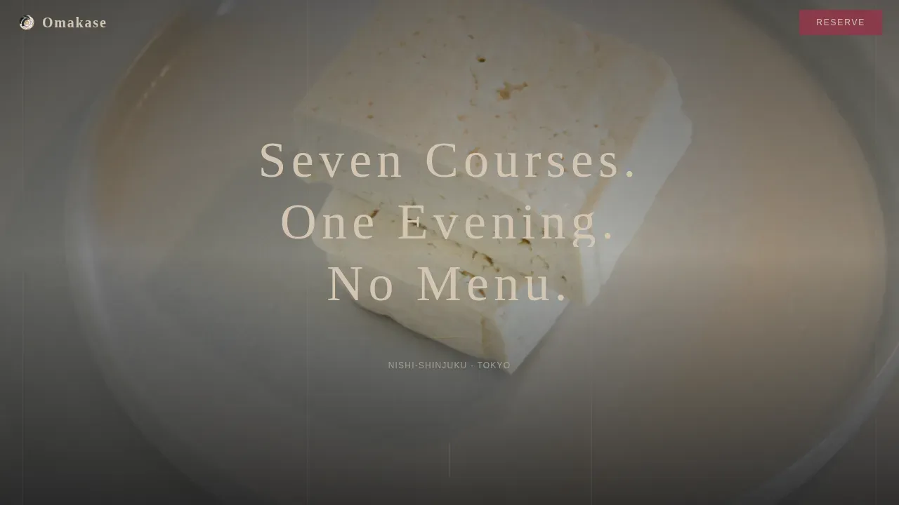
The hero section is a wide, softly desaturated lifestyle photograph shot from the guest's perspective. A shallow depth-of-field image fills the viewport. A thin serif headline animates letter by letter, like ink soaking into washi paper. It sets the tone before a single card loads.
Asymmetric Gallery Walk Card Grid
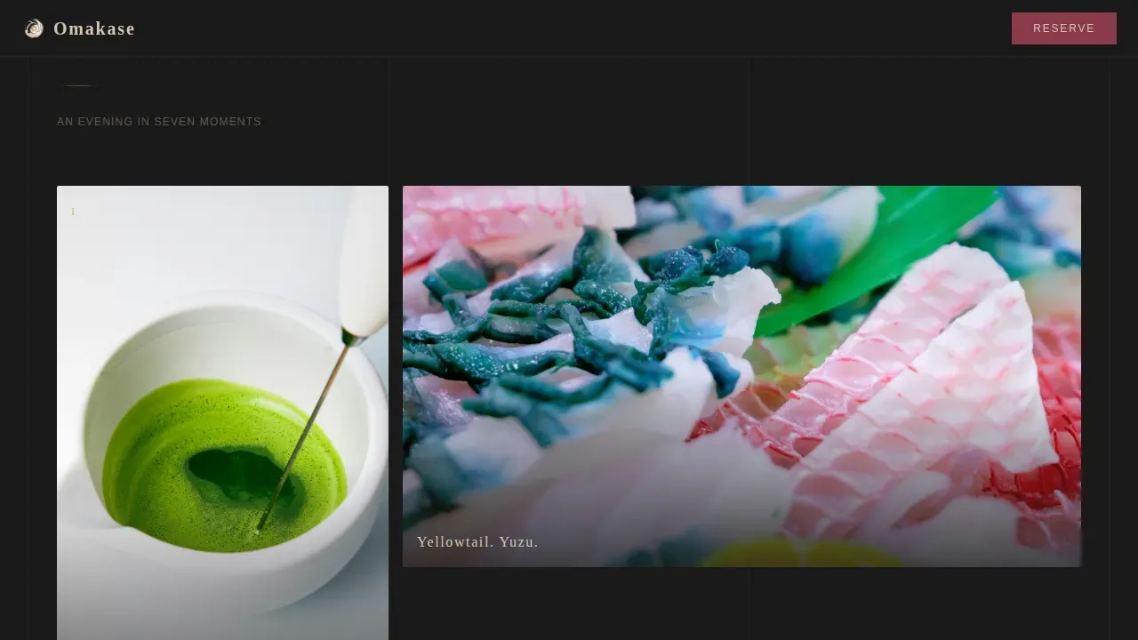
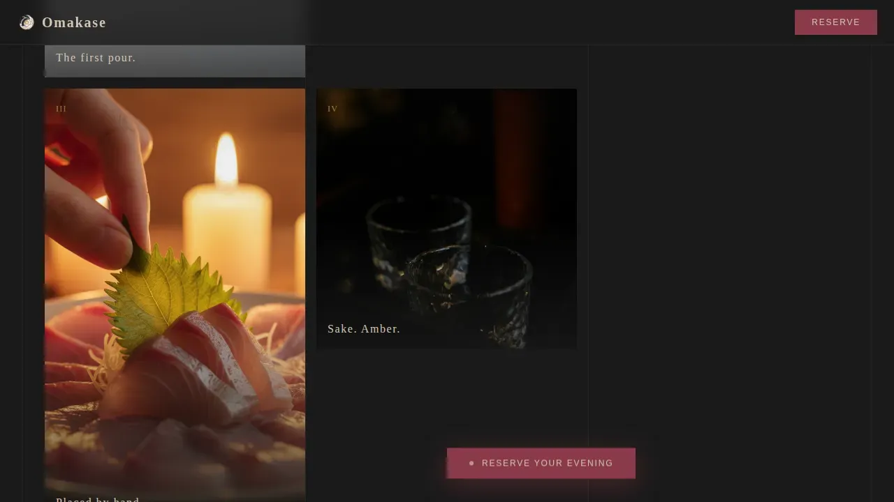
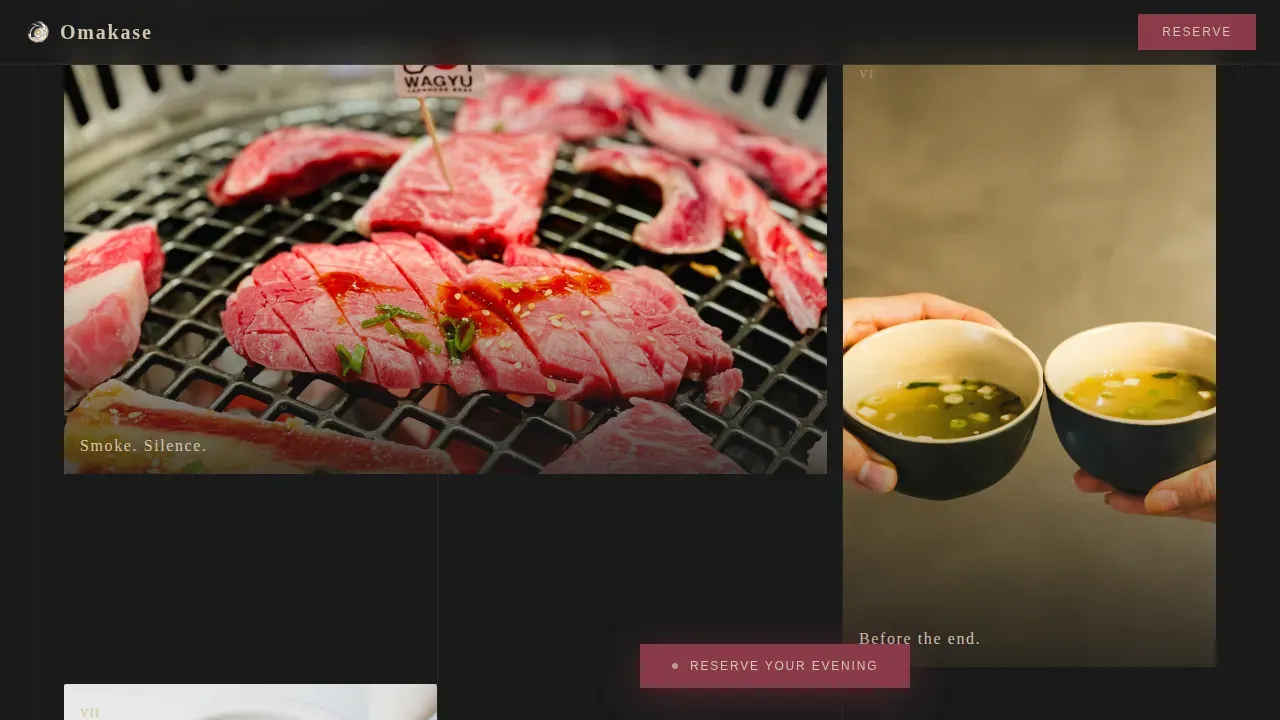
The modular card grid is the heart of this landing page. Cards vary between tall, narrow hanging-scroll proportions and wide cinematic formats. Each card is a single moment in the meal, dashi being poured, shiso placed on sashimi, a sake cup mid-pour. No card carries more than six words. The scroll becomes a quiet procession through the evening.
Floating Reservation Call to Action
After the third card, a pickled-plum pill button floats gently at the bottom of the viewport. It persists as visitors scroll deeper. This design choice keeps the path to reservations visible without interrupting the visual story. A clear booking button placed prominently helps facilitate reservations for omakase experiences.
Mood Progression Lighting Sequence
As visitors scroll, the photography shifts from golden-hour arrival tones to amber intimacy of the final course. This lighting progression is built into the card sequence. It pulls visitors emotionally through a dinner they have not yet booked.
Full-Width Reservation Card
Near the end of the page, a full-width card displays only the restaurant's address, hours, and the primary call-to-action button. No form, no distractions. The restraint is intentional, it reflects the atmosphere of the dining experience itself.
Superhuman Minimal Footer
The footer follows a Pattern 4 Superhuman Extreme Minimal layout. It keeps the page clean and exits gracefully without competing with the reservation card above it.
Page sections overview
| Section | Purpose |
|---|---|
| Hero lifestyle shot | Sets atmosphere with cinematic photo and animated headline |
| Gallery Walk grid | Tells the meal's story through asymmetric food photography cards |
| Floating call to action pill | Keeps reservation path visible as visitors scroll deeper |
| Mood progression cards | Shifts lighting emotionally from arrival to final course |
| Full-width reservation | Displays address, hours, and primary call-to-action button |
| Minimal footer | Closes the page cleanly with zero visual clutter |
Design & branding system
The design draws on a Japanese Zen color system, using tones that feel handmade rather than digital. High-quality visuals like close-up shots of dishes or the chef's hands are effective in capturing the atmosphere of an omakase experience, and the color system supports them without competing.
- Sumi ink black (#1A1A1A) and unglazed ceramic warm (#D4C5B2) alternate as background tones, with text always in the opposite value
- Tatami gold (#C4AE5C) anchors the typographic identity; pickled plum (#8B3A4A) is reserved for hover states and active links only
- Fraunces thin serif handles all headlines; DM Sans handles body labels and supporting content
Mobile & speed optimization
The template is built desktop-first with graceful mobile adaptation. Animations use GPU-accelerated transforms to keep scroll performance smooth. Native CSS smooth scroll and Intersection Observer handle card reveal behavior without heavy dependencies.
- Scroll-reveal cards and parallax depth effects adapt cleanly across screen sizes
- The floating call-to-action pill repositions naturally on smaller viewports
- Card proportions reflow from asymmetric desktop layouts to stacked mobile columns
How this template helps you convert
This landing page earns its conversion through restraint. It withholds the full menu, interior wide shots, and pricing intentionally. Desire and curiosity do the work that a form would otherwise try to force.
- The Gallery Walk card sequence builds emotional investment across the scroll, arriving visitors at the reservation card already wanting to book
- The floating call-to-action button keeps the reservation path visible at every point in the page without interrupting the visual story
- The full-width reservation card closes with address, hours, and a single button, making the next step unmistakably clear
Other information about this template
This template is a versatile starting point. You can customize colors, swap illustrations, update fonts, and add your own food photography to fit your restaurant's branding without touching the underlying code structure.
- The template works well as a base for any sushi restaurant, Japanese restaurant, or fine-dining concept that wants a click-through landing page built around atmosphere rather than information overload
- You can adapt the card content to display seasonal menus, chef profiles, or coming events while keeping the overall design intent intact
- The page is built with clean HTML and is straightforward to explore and customize within WordPress themes or standalone HTML environments
- Widget-style modular cards make it easier to manage individual content blocks without rewriting the full page layout
- Search visibility improves naturally when the page content, fonts, and site structure are tailored to reflect the restaurant's unique identity
- The design themes and color system can be adjusted to fit various types of Japanese cuisine, from a sushi restaurant counter experience to a broader Japanese restaurant tasting concept
- Things like card copy, photography choices, and call-to-action labels are all easy to tailor without specialist code knowledge
Theme
Organic Flow
Creative direction
Gallery Walk
Color system
Japanese Zen
Style
Card Grid (Modular)
Direction
Click-Through
Page Sections
Cinematic Lifestyle Hero with Animated Headline
Asymmetric Gallery Walk Card Grid
Floating Pickled-plum Call to Action Pill
Mood Progression Lighting Sequence
Full-width Reservation Card
Superhuman Minimal Footer
Related questions
What type of restaurant is this template designed for?
Does this landing page include a reservation form?
Can I customize the colors and fonts without coding skills?
What does 'omakase' mean in the context of this template?
Is this template compatible with WordPress or HTML environments?



