Authentic Korean Restaurant Landing Page Template
Banchan is a gallery-and-detail landing page template built for authentic Korean fast casual restaurants. It guides visitors through a sensory scroll journey, from macro food photography to dish origin stories, before presenting a streamlined table reservation form. Warm earthenware colors, scroll-linked animations, and a mobile-pinned call to action turn hungry browsers into confirmed guests.
by Rocket studio
Quick summary
Banchan is a single-page template designed for Korean fast casual dining. It opens with an extreme close-up food photograph, moves visitors through an interactive dish gallery with expand-to-detail panels, and closes with a focused reservation form. The design system draws from fermented earthenware aesthetics, keeping the experience warm, tactile, and appetite-driven from first scroll to final tap.
Who this template is for
This template suits restaurant owners and operators who want their online presence to feel as honest and specific as their food. It works best when the story behind the menu is just as compelling as the menu itself.
- Korean fast casual restaurants serving rice bowls, kimchi stews, and banchan lineups
- Independent dining spots with farm-sourced or house-fermented ingredients worth showing off
- New restaurant launches or rebrands needing a high-impact single page that drives reservations
What problem this template solves
Most restaurant pages show a static menu and a phone number. That approach does nothing to build appetite or trust before a guest walks in. Banchan solves the gap between browsing and booking by turning the scroll into an experience.
- Visitors leave generic restaurant pages without acting because nothing made them feel the food
- Downtown lunch crowds and busy families need fast, clear reasons to choose one spot over another
- A buried or confusing reservation path loses guests who were already interested
What you get with this template
You get a fully structured, single-page layout that moves from hero image to gallery to origin stories to reservation form in one deliberate flow. Every section has a clear job, and nothing is decorative without purpose.
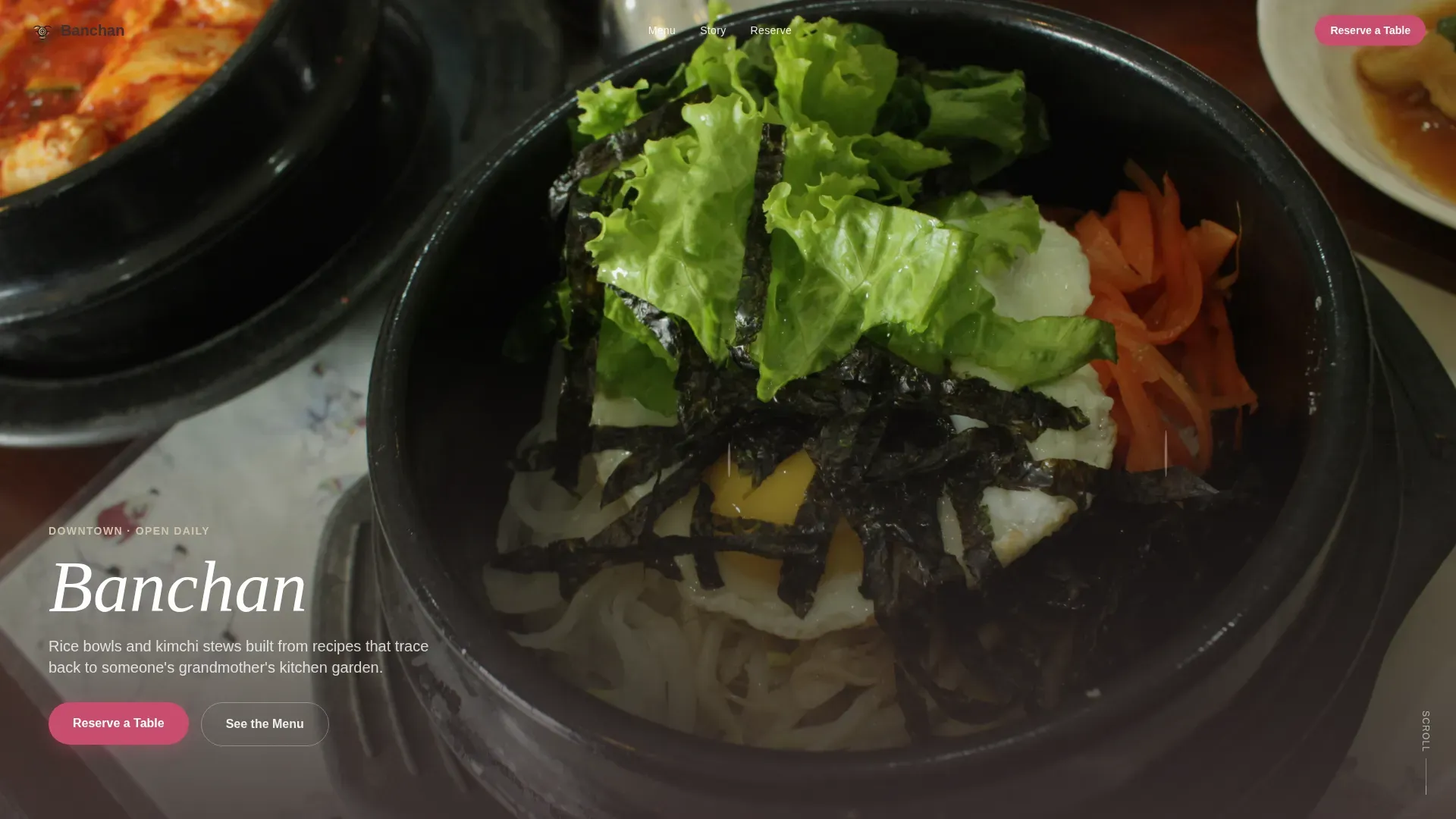
- A macro close-up hero section with delayed text reveal and a prominent call to action
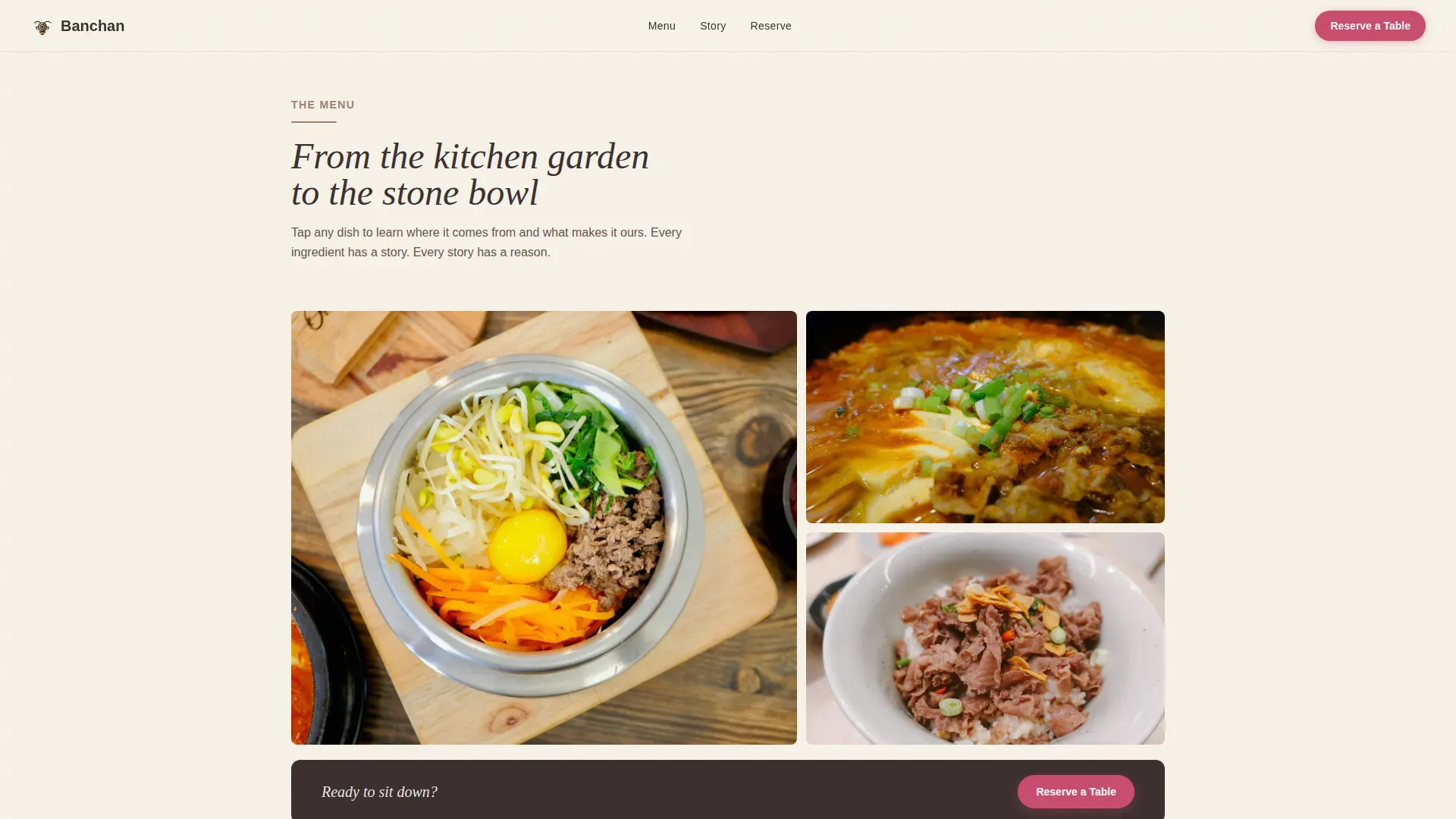
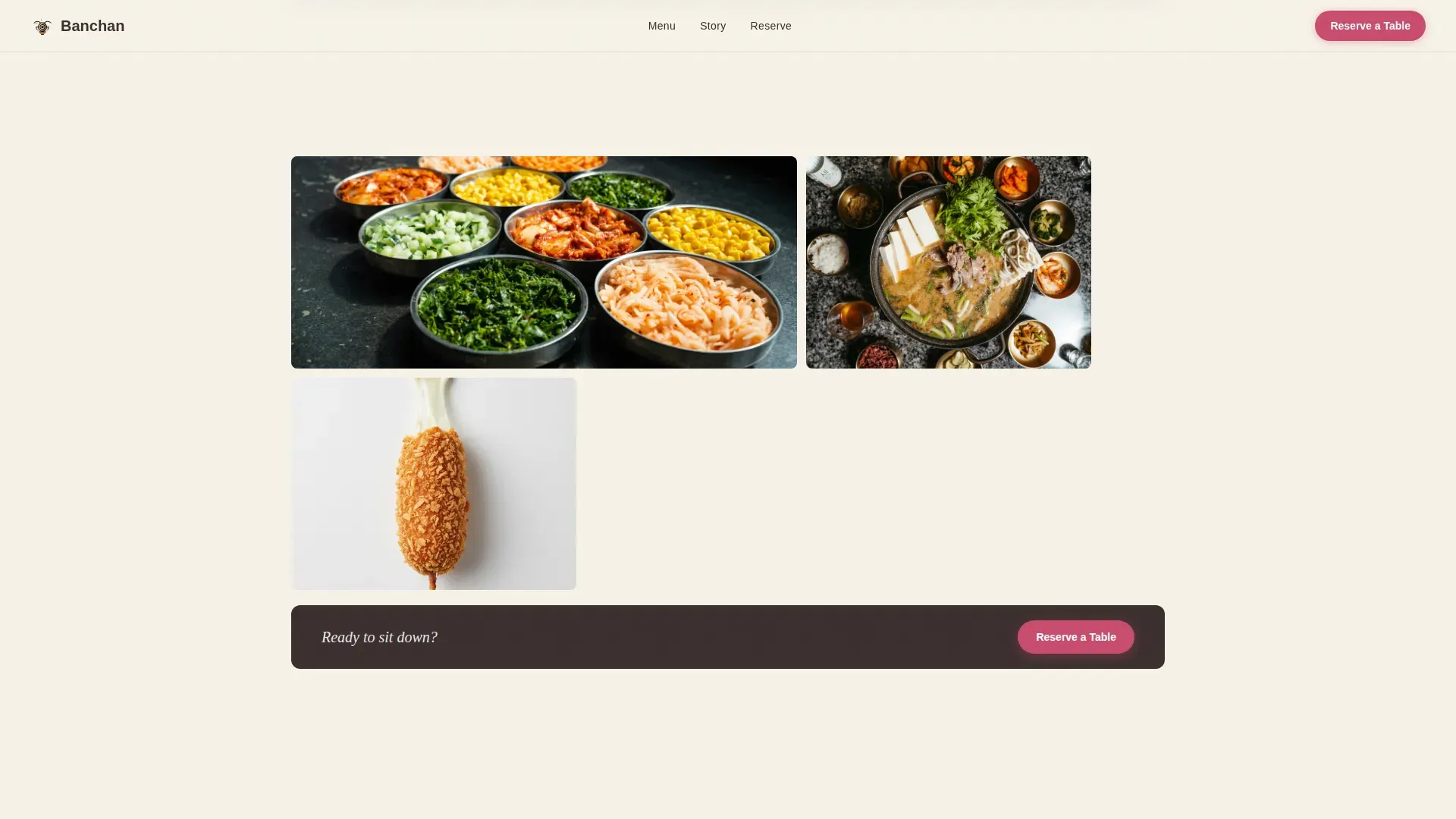
- An asymmetric gallery grid with expand-to-detail panels showing dish names, ingredient provenance, and one-line origin stories
- A reservation form covering party size toggles, date, preferred time slot, and an optional dietary notes field, plus a live estimated wait widget link
Feature list
This template ships with a focused set of interactive and visual components drawn directly from the brief. Each one is built around a specific moment in the visitor's experience.
Macro Close-Up Hero Section
The header opens with an extreme close-up food photograph, styled around the moment a dolsot bibimbap egg yolk breaks. A shallow depth-of-field effect blurs the background into warm steam and earthenware tones. Text is intentionally delayed on load, letting the image land first before the headline appears.
Scroll-Linked Gallery with Detail Panels
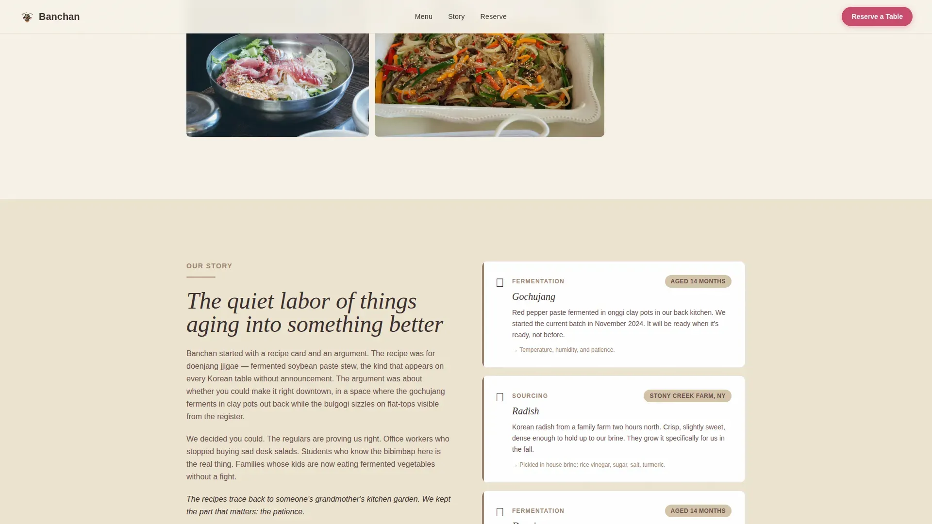
The gallery uses an asymmetric bento grid layout with staggered scroll-reveal animations. Each image expands into a detail panel that shows the dish name, a one-line family or farm origin story, and the specific ingredient that makes it distinct, such as a doenjang aged fourteen months or radish sourced from a named upstate farm.
Ingredient Provenance Cards
Dedicated origin story cards highlight where key ingredients come from and how they are prepared. These cards build trust with food-curious guests by grounding the menu in real sourcing details rather than generic descriptions.
Reservation Form with Time Slot Toggles
The booking section includes a slim, focused form. Guests choose party size using toggle buttons from one to eight, select a date, pick a preferred time slot from lunch rush, afternoon calm, or dinner, and optionally add dietary notes or large-party requests. A secondary link below the form connects to a live estimated wait widget for walk-in guests.
Mobile-Pinned Reservation Call to Action
On mobile viewports, the primary "Reserve a Table" button stays pinned to the bottom of the screen throughout the scroll. The call to action also repeats after every third gallery detail panel, so the path to booking stays visible without interrupting the browsing experience.
Menu Highlights Section
A dedicated section spotlights the core menu categories: rice bowls, kimchi stews, and the banchan lineup. This section reinforces what the restaurant serves before the guest reaches the reservation form.
Page sections overview
| Section | Purpose |
|---|---|
| Hero Close-Up | Immersive food photography with delayed headline reveal and primary call to action |
| Gallery Grid | Asymmetric dish photography with expand-to-detail panels for each menu item |
| Origin Story Cards | Ingredient provenance and family or farm sourcing details per dish |
| Menu Highlights | Showcases rice bowls, kimchi stews, and the full banchan lineup |
| Reservation Form | Party size, date, time slot selection, dietary notes, and wait widget link |
| Footer | Linear single-row footer with essential restaurant information |
Design & branding system
The visual identity follows an Agrarian Root theme, rooted in the textures and tones of traditional Korean earthenware. Every color choice references something physical: clay, sesame, fermented earth, and the bright flash of pickled radish.
- Sun-dried clay (#A0826D) frames photography sections and acts as a divider between content blocks
- Toasted sesame (#D4C4A8) washes across background areas, giving the page the feel of a linen surface in warm light
- Fermented earth (#3B2F2F) anchors all body text and navigation for deep, readable contrast
- Pickled radish (#C94C6E) is reserved strictly for buttons and highlighted text, directing attention only where action is needed
- Typography pairs DM Sans for body copy and interface labels with Fraunces, a serif face, for dish names and editorial headlines
Mobile & speed optimization
The template is built mobile-first, with the reservation call to action pinned to the bottom of the viewport on smaller screens. Image-heavy sections use lazy loading and staggered reveal animations to keep the experience smooth as content loads.
- The pinned reservation button ensures the booking path is always one tap away on mobile
- Lazy loading and staggered scroll reveals manage the performance of a photography-dense layout
- Scroll-linked animations trigger progressively, so the page feels alive without demanding everything at once
How this template helps you convert
The template is designed so that by the time a visitor reaches the reservation form, the decision is already made. The scroll journey does the persuasion work before the form ever appears.
- The macro close-up hero creates immediate appetite and emotional connection before any text is read, pulling the visitor into the experience from the first second.
- The gallery detail panels build trust progressively, each dish reveal adding specificity about sourcing and craft until the visitor feels they already know the food.
- The mobile-pinned call to action and repeated "Reserve a Table" prompts after every third gallery panel reduce friction at the exact moments when interest is highest.
Other information about this template
This template is a strong fit for restaurants that want their digital presence to reflect the same care and specificity they put into the kitchen. A few additional details worth knowing before you use it.
- The template is localized for the United States market, with English copy and USD pricing context
- Animation intensity is high throughout, including scroll-linked section reveals, gallery expand panels, and the delayed hero text effect
- The footer follows a linear single-row pattern, keeping the bottom of the page clean and uncluttered
- The overall template style is Gallery plus Detail, meaning photography leads and text supports rather than the other way around
- The page is designed for a downtown dining context, serving office workers on a lunch window, college students on a budget, and young families looking for food that is genuinely good
Theme
Agrarian Root
Creative direction
Taste & Aroma
Color system
Warm Stone
Style
Gallery + Detail
Direction
Booking/Scheduling
Page Sections
Macro Close-up Hero with Delayed Text Reveal
Asymmetric Gallery Grid with Expand Panels
Ingredient Provenance Cards
Reservation Form with Toggle Controls
Mobile-pinned Reservation Call to Action
Menu Highlights Section
Related questions
Can I update the gallery images and dish details to match my own menu?
How does the reservation form work?
Is this template suitable for a restaurant without house-fermented ingredients?
Does the mobile layout keep the reservation button visible while scrolling?