Inclusive Adoption Community Landing Page Template
Gather is a warm, zigzag landing page template built for adoptive and foster parent blog communities. It pairs real essay previews with downloadable resource teasers across alternating sections, guiding visitors toward a single email sign-up called "Join the Kitchen Table." The Community Hearth design, soft lavender palette, and Photo Grid Mosaic header create an immediately welcoming space where readers feel seen before they are ever asked for anything.
by Rocket studio
Quick summary
Gather is a single-page, click-through landing page template designed for adoptive, foster, and kinship parent blog communities. It uses a zigzag alternating layout to move visitors through emotional essay previews and practical resource teasers, ending each section with a warm amber call to action button. The primary goal of the entire page is one focused sign-up: "Join the Kitchen Table," a first-name-and-email community letter.
Who this template is for
This landing page was built for blog creators who serve the foster and adoptive parenting community. It fits anyone who wants a dedicated landing space that immediately communicates warmth, trust, and practical value to readers who are mid-process and emotionally invested.
- Foster parent bloggers launching or refreshing a community-focused site
- Adoptive family writers who want to convert visitors into email community members
- Kinship caregiver advocates building a resource-and-story hub for parents who became caregivers overnight
What problem this template solves
Generic blog templates fail this audience. A parent scrolling at midnight after a hard court day does not need a cold, corporate layout. They need a landing page that speaks directly to their experience from the first headline. Most standard templates do not create the emotional connection or the sense of community belonging that makes someone hand over their email address willingly.
- Readers arrive from social media or search engines with high emotional need and low patience for friction
- Standard blog homepages scatter attention across too many options, raising the bounce rate and lowering sign ups
- Community-driven content requires trust building elements that generic templates skip entirely
What you get with this template
You get a fully structured, single-page landing page ready to receive visitors and convert them into email community members. The layout is section-led and scroll-driven, with no extra navigation to distract. Every element supports the primary call to action while giving readers generous content previews that build credibility and emotional resonance before asking for anything.
- A Photo Grid Mosaic hero section with a plum-type headline and primary call to action button
- Six distinct content sections covering morning through evening, each with a warm amber call to action button
- A dedicated "Join the Kitchen Table" email sign-up close with a clean signup form requiring only a first name and email
Feature list
This landing page template is built around a clear set of features grounded in the brief. Each one serves the single goal of guiding visitors toward a confident, willing email sign-up.
Photo Grid Mosaic Hero Section
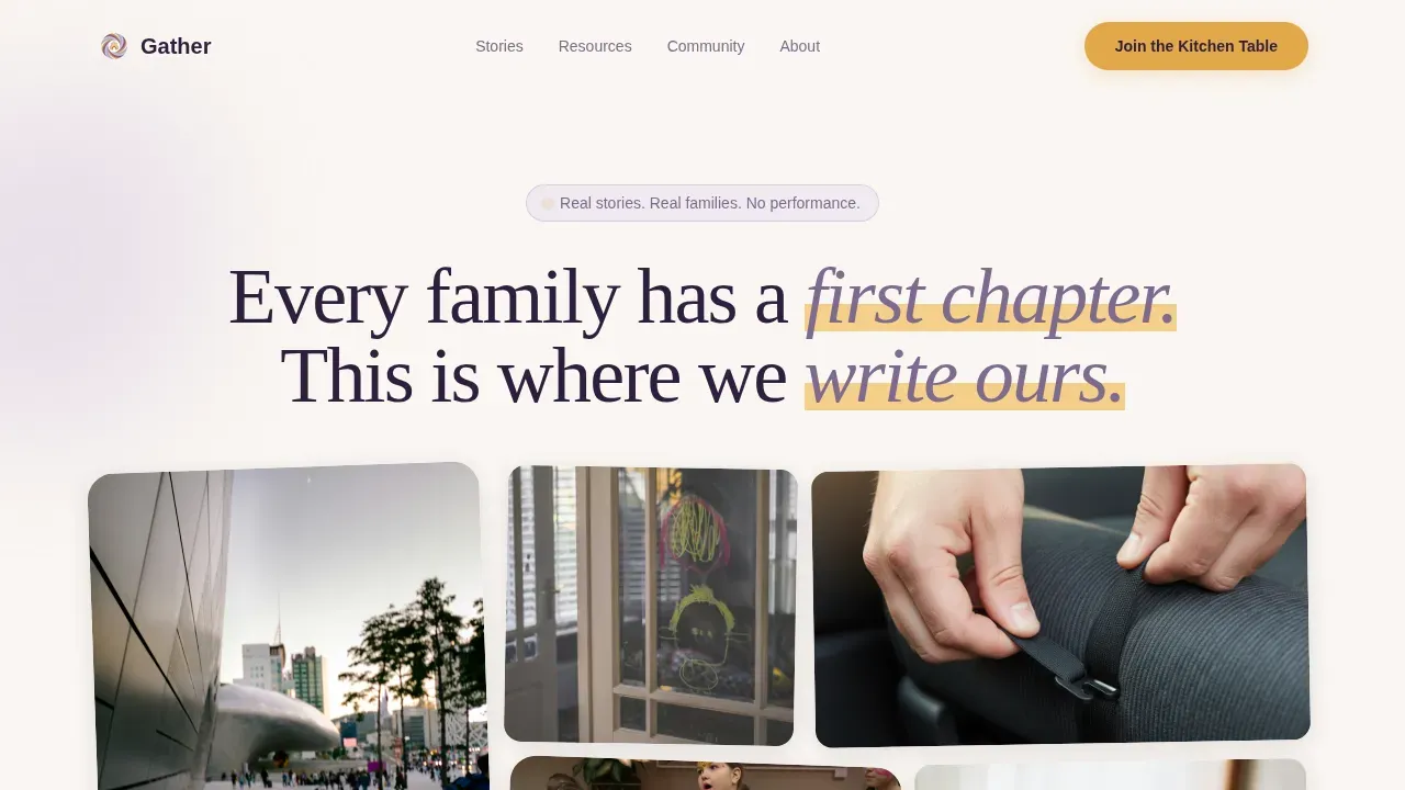
The hero section opens with a quilt-like arrangement of candid family photographs. Images vary in size and corner treatment, arranged with intentional asymmetry that reads as scrapbooked rather than polished. The hero headline sits over the mosaic in plum type, and the primary call to action "Join the Kitchen Table" is pinned here from the first scroll. A strong hero section like this immediately sets the emotional tone and captures visitor attention before any other page content loads.
Zigzag Alternating Essay and Resource Sections
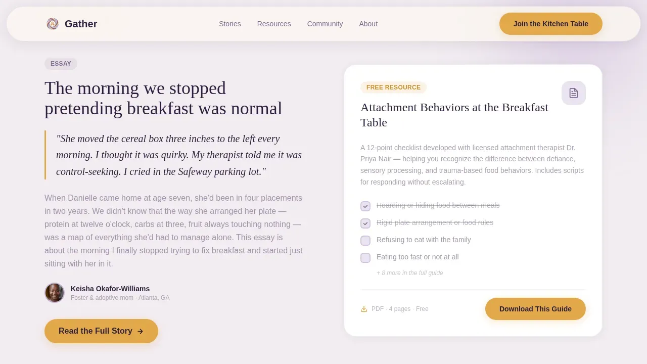
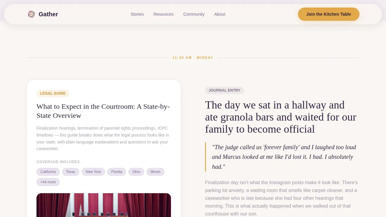
The core layout alternates between parent narrative content on one side and practical downloadable resources on the other. A morning routine essay sits across from an attachment checklist. A court-day journal entry pairs with a state-by-state legal guide. An evening bedtime reflection faces a recommended book list. This zigzag structure keeps guiding visitors forward through the page in a natural, story-led rhythm. Each pairing ends with a warm amber call to action button reading "Read the Full Story" or "Download This Guide."
Community Voices Testimonials Bento
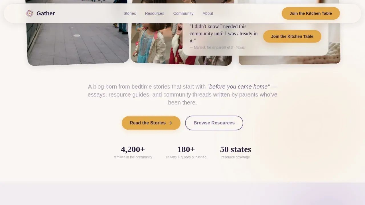
The afternoon section uses a bento-style layout to display pull quotes and parent testimonials with real names. Social proof is critical on a community landing page, and this section delivers it through authentic voices rather than anonymous ratings. Adding testimonials in this format helps build trust with readers who are evaluating whether this community is right for them. Compelling visuals alongside real quotes strengthen emotional engagement and reinforce credibility across the page.
"Join the Kitchen Table" Email Sign-Up Close
The page closes with a dedicated landing section built entirely around the email community sign-up. The signup form requires only a first name and email address, keeping the barrier to entry low. The framing positions the sign-up not as a newsletter but as a weekly letter from someone who understands. A short description, clear labels on each form field, and a warm amber call to action button make the conversion step feel natural rather than transactional.
Lavender Dream Color System with Amber Accents
The Lavender Dream palette uses soft lavender for alternating section backgrounds, warm linen white to breathe between them, dusted plum for all headlines and body text, and honeyed amber reserved strictly for buttons, highlights, and pull-quote borders. This system creates a consistent visual message across the entire page. The color logic makes the call to action button stand out without feeling aggressive, and the soft tones build a sense of safety that is especially meaningful for this audience.
Mobile-First Scroll Animation System
The template is built with mobile-first priority, recognizing that the core audience scrolls at midnight on a phone. Scroll reveals, stagger animations, and gentle float effects are set at a medium intensity so they feel natural rather than distracting. Hover states are applied to call to action buttons and navigation elements. The email form is touch-friendly with clear labels, and the signup form layout collapses gracefully on smaller screens.
Page sections overview
| Section | Purpose |
|---|---|
| Hero Mosaic Header | Introduces the community, pins the primary call to action, and captures visitor attention with candid family imagery |
| Morning Essay Zigzag | Pairs a parent narrative with a practical resource, guiding visitors into the blog's emotional and useful tone |
| Midday Court Zigzag | Alternates a court-day journal entry with a state-by-state legal guide, balancing emotion and practical help |
| Community Voices Bento | Displays pull quotes and parent testimonials to deliver social proof and build trust mid-scroll |
| Evening Reflection Zigzag | Closes the day-in-the-life arc with a bedtime essay preview and a recommended reading list |
| Kitchen Table Sign-Up | Dedicated email community close with a clear signup form, short description, and primary call to action |
| Site Footer | Horizontal flow footer with navigation links and community context |
Design & branding system
The visual identity follows a Community Hearth theme built to feel like a child's bedroom at dusk: soft, safe, and deliberately unhurried. The design of this community landing page reflects the community's values and mission at every scroll point. Strong visuals grounded in authentic family photography replace stock imagery, making the site feel relatable and real. The typography pairing of Fraunces serif headlines with DM Sans body text adds editorial weight without institutional coldness.
- Lavender Dream palette: soft lavender (#C3AED6), dusted plum (#7E6B8F), warm linen white (#FAF6F2), honeyed amber (#E2A84B) for all interactive elements
- Fraunces for display and hero headline use; DM Sans for all body and form copy
- Asymmetric scrapbook-style photo grid in the hero section; rounded corners and intentional size variation across image blocks throughout the page
Mobile & speed optimization
The template is built mobile-first, prioritizing the midnight phone-scroller who is the primary user of this landing page. Mobile optimization ensures accessibility across devices and protects the conversion rate from mobile traffic loss. Loading speed directly impacts bounce rate, and image optimization is built into the template so the photo-heavy hero section does not slow the first scroll. Smooth CSS scroll behavior supports the animation system without adding render-blocking weight.
- Images are optimized for fast loading across the photo grid and zigzag sections, keeping the bounce rate low on mobile connections
- Scroll reveal, stagger, and gentle float animations run at medium intensity with no performance cost to first paint
- The signup form is touch-optimized with large tap targets, clear labels, and a single-tap call to action button
How this template helps you convert
A focused landing page works by removing navigation distractions, narrowing visitor attention to one goal, and presenting a clear call to action at every key moment. This template applies that principle with warmth. The emotional arc moves users from connection to trust to willingness, so the sign-up at the bottom feels earned rather than demanded. Clear messaging defines the goal within seconds of arrival, and every section reinforces it.
- The hero section immediately communicates the community's purpose with a strong headline and a pinned primary call to action, capturing warm leads before visitors scroll past the fold
- Each zigzag section delivers a generous content preview with detailed copy that earns trust and creates urgency to read more, ending with a clear call to action button that guides the click
- The social proof bento and the dedicated sign-up close work together as trust building elements, turning emotionally engaged readers into email sign ups by removing hesitation and making the next step feel obvious
Other information about this template
This template is suited to any blog creator who wants an effective landing page that balances emotional resonance with practical conversion structure. A community landing page is a powerful signal to attract the right people to your community, and your community landing page can be a make-or-break factor for long-term growth. The design and page content here reflect what high converting landing pages have in common: clear messaging, visible trust signals, strong visuals, and a single focused call to action that makes sense for the audience.
A warm and inviting blog landing page for an adoptive parent community should prioritize soft, welcoming visuals and easy navigation to supportive content. This template does exactly that. The user friendly layout keeps visitors moving forward without confusion, and the user engagement built into the scroll animation system keeps them reading rather than leaving. Encouraging visitors to join a community rather than subscribe to a list is a meaningful distinction, and the "Kitchen Table" framing reflects that throughout all landing page copy.
A landing page removes distractions, keeps the message aligned with the traffic source, and focuses attention on a single call to action. Using a landing page builder that supports drag-and-drop editing, payment integrations where needed, and A/B testing allows creators to make data driven decisions over time. Templates can provide a strong structure to communicate messages clearly and focus visitors on a single goal, and this one is built with that structure from the first section to the last.
Landing pages can be optimized for search engines to grow organic traffic and support long-term sustainability for the blog. The template supports clear headline hierarchy and semantic structure that helps search engines read page content correctly. High converting landing pages require continuous effort, and this template gives creators the structural foundation to test, refine, and build credibility over time.
The Gather warm community adoptive parent blog landing page template reflects the intersection of Community Hearth theme design, Day-in-the-Life creative direction, Photo Grid Mosaic header concept, and Click-Through landing direction. Creators who want to organize content by stages such as "Curious," "Paperwork," "Waiting," and "Home" can adapt the zigzag sections to match those journey phases, helping new users feel supported at every step.
- A soft color palette using pastels and warm creams evokes a sense of safety, which is essential for this audience
- Community-first features like the "Join Our Group" style sign-up button and organized resource categories are built into the section structure
- The personalized community close section acts as an "About Us" moment, welcoming visitors to the community before asking them to commit
- Trust badges, community member counts, and real parent names in testimonials function as visible trust indicators that build credibility and lower barriers to action
- The cta placement across each zigzag section ensures no visitor has to scroll far to find their next step
- Digital marketing campaigns driving traffic from social media or email can send visitors directly to this dedicated landing page for maximum conversion rate efficiency
- A countdown timer block can be added to create urgency around limited community events or sign-up windows
- The click through landing structure means every section functions as its own conversion moment, not just the close
- Adding testimonials from real community members and displaying social proof throughout the page reinforces trust signals that reduce hesitation
- The page is designed to convert visitors into paying customers of the blog's premium content or warm leads for future community offers
- Clear calls to action, a strong call that speaks directly to the reader's current moment, and a primary call to action repeated in the hero section and the close all work together to drive measurable results
- New course launches, resource library expansions, or event sign ups can all be promoted through the existing section structure without rebuilding the page
Theme
Community Hearth
Creative direction
Day-in-the-Life
Color system
Lavender Dream
Style
Zigzag/Alternating
Direction
Click-Through
Page Sections
Photo Grid Mosaic Hero Section
Zigzag Alternating Essay and Resource Layout
Community Voices Testimonials Bento
Kitchen Table Email Sign-up Close
Lavender Dream Color and Typography System
Mobile-first Scroll Animation System
Related questions
Can I use this template for a foster parent email list, not just an adoptive parent blog?
Does the template include the email signup form functionality?
How does the zigzag layout help with sign ups compared to a standard blog homepage?
Is the landing page optimized for mobile users?
Can I adapt the page sections to reflect different stages of the adoption journey?