Vibrant Grocery Landing Page Template
Kirana is a vibrant grocery landing page template built for neighborhood general stores ready to take orders online. It uses a warm citrus color palette, scroll-triggered before-and-after reveal sections, and a price-anchored hero to show real savings upfront. The quick-order flow, repeat-order shortcut, and mobile-pinned call-to-action make it easy for locals to buy without friction.
by Rocket studio
Quick summary
Kirana is a single-page grocery landing page template designed for neighborhood general stores going digital. It opens with a bold price-board hero, walks visitors through scroll-triggered reveal sections, and closes every section pair with a direct order call-to-action. The layout is dense with color, honest about savings, and built to convert regulars into repeat online customers.
Who this template is for
This template is made for kirana store owners and local grocery retailers who want a fast, direct way to take orders online without building a complex platform. It suits shops that already have a loyal neighborhood customer base and want to move that relationship onto a screen.
- Kirana and general store owners serving apartment residents and working couples
- Small grocery retailers who want doorstep delivery orders via a simple mobile-first page
- Hostel-area shops and local provision stores looking to offer WhatsApp-style quick ordering
What problem this template solves
Running a neighborhood store means customers still call, scribble chits, and show up at the counter. Managing that informally works until orders pile up, receipts get lost, and delivery timings slip. This template gives the store a digital face that feels as familiar as the physical shop, without asking customers to learn something new.
- Removes the gap between a WhatsApp order message and a real structured order flow
- Replaces loose paper receipts and guesswork with a clean itemized running total
- Shows exact rupee savings before asking for any commitment, reducing hesitation at checkout
What you get with this template
You get a fully structured, single-page landing page that guides visitors from deal discovery to checkout using scroll-triggered reveals. Every section is purpose-built around the kirana shopping experience, from aisle-style browsing to a pinned mobile order bar.
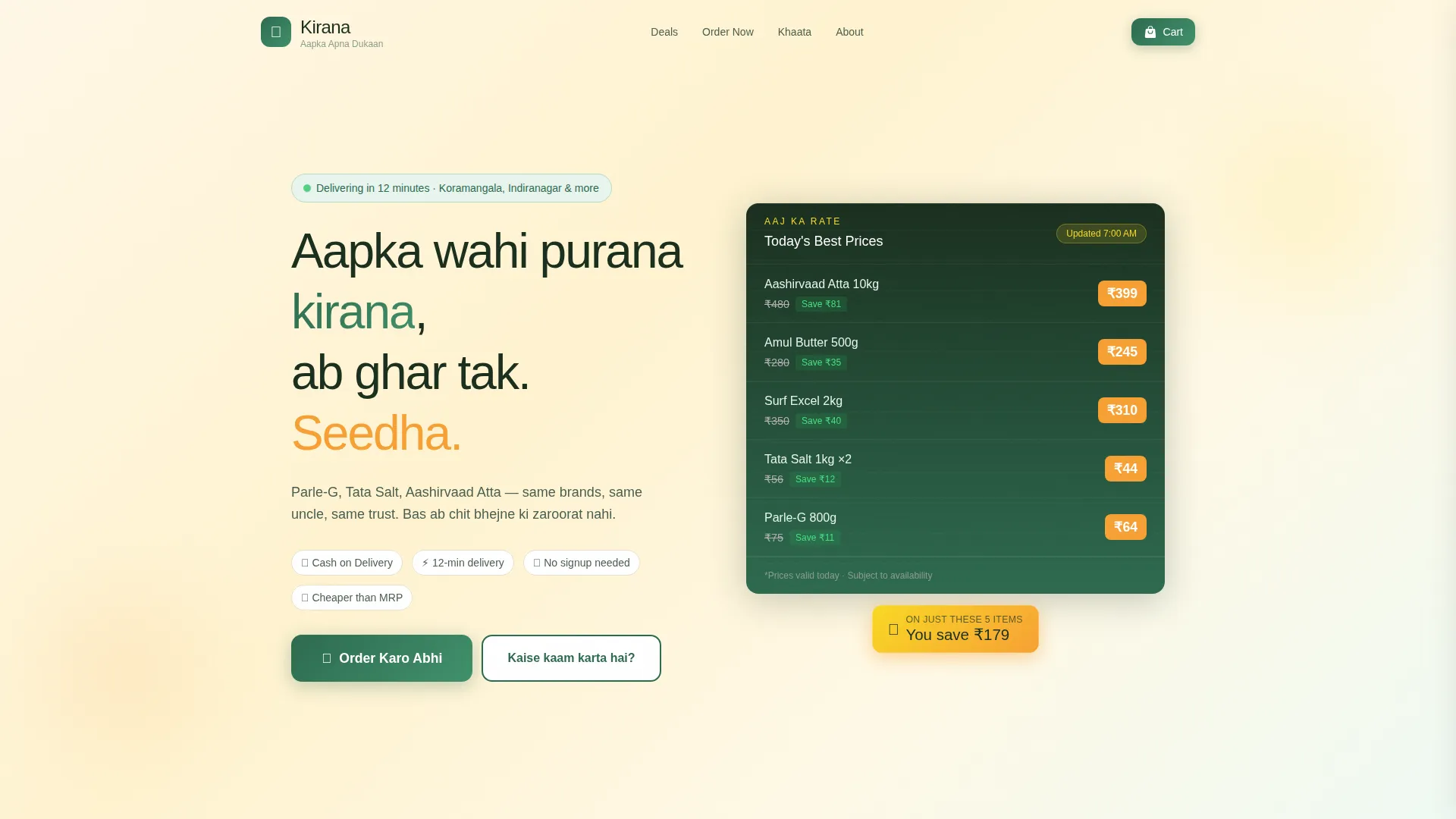
- A price-anchored hero section displaying top deals with struck-through original prices and a live savings counter
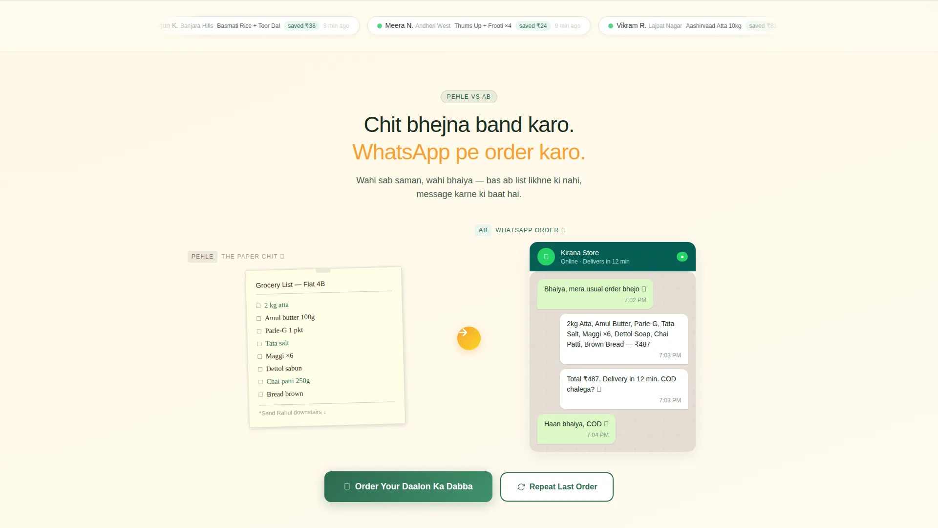
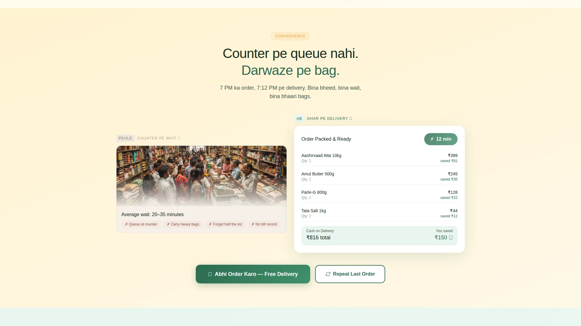
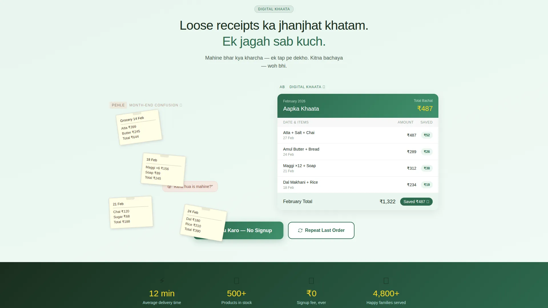
- Three scroll-triggered before-and-after reveal pairs covering ordering, delivery, and spending tracking
- A quick-order flow with locality dropdown, aisle-organized browsing, real-time cart totals, and a repeat-last-order shortcut
Feature list
Price-Anchored Hero Board
The hero opens like a shopkeeper's rate card. Product names are typeset bold and large, struck-through original prices sit beside new prices in faded gray, and a small animated savings counter tallies the total saved across highlighted items. No lifestyle photography is needed; the numbers do the work.
Scroll-Triggered Before and After Reveals
Each scroll section pairs an old habit with its modern equivalent using a horizontal wipe animation. A crumpled paper chit slides against a clean order chat. A crowded counter transforms into a packed delivery bag. Loose receipts give way to an itemized digital spending summary. Visitors trigger each transition by scrolling.
Aisle-Organized Quick-Order Flow
The order flow is structured exactly like a physical store layout: dal-rice-atta first, then snacks and biscuits, then soap and shampoo, then cold drinks. Customers pick their locality from a dropdown, tap items to add them, and watch a running total update with savings shown in real time.
Repeat Last Order Shortcut
Returning customers can tap a single button to pull their previous basket instantly. This removes the need to browse again for regular monthly purchases and makes the page feel like a store that already knows you.
Mobile-Pinned Order Call-to-Action
On mobile, the primary call-to-action stays pinned as a floating bottom bar throughout the entire scroll. It stays visible at every section so customers never have to scroll back up to place an order.
Cash-on-Delivery Default with Minimal Signup
The checkout path requires only a phone number. Cash on delivery is the default payment option. There is no signup wall, no email form, and no multi-step registration blocking the first order.
Page sections overview
| Section | Purpose |
|---|---|
| Price Hero Board | Shows today's top deals with live savings counter |
| Chit versus. Chat Reveal | Contrasts paper order chit with WhatsApp-style order chat |
| Counter versus. Doorstep Reveal | Shows crowded counter transforming into home delivery |
| Receipts versus. Khaata Reveal | Replaces loose receipts with itemized digital spending view |
| Order call to action Block | Prompts order action after each reveal pair |
| Quick-Order Flow | Locality picker, aisle browsing, and live cart total |
| Repeat Order Path | One-tap shortcut to reload the previous basket |
| Mobile Floating Bar | Pinned bottom call-to-action for mobile visitors |
Design & branding system
The visual identity uses a Soft Gradient theme built on a Citrus Burst color system. Backgrounds wash from warm mango-pulp orange to pale nimbu-pani yellow in gentle gradients, shifting warmer with each scroll section. Text sits in deep grocery-bag green, and price callouts appear as bold orange badges that mimic handwritten rate cards taped to real shelves.
- Core palette: mango orange (#F7A034), nimbu yellow (#F9D923), fresh white (#FEFEFE), and grocery green (#2D6A4F) for calls-to-action and price tags
- Price badges are styled to resemble hand-chalked shelf labels, keeping the visual language rooted in the kirana aesthetic
- Gradient backgrounds grow progressively warmer section by section, reinforcing the sense of a familiar store revealing new convenience
Mobile & speed optimization
The template is designed with mobile-first behavior throughout. The floating bottom bar keeps the call-to-action reachable with a thumb at all times. The quick-order flow uses single-tap item selection so customers can add items without zooming or scrolling sideways.
- Scroll-triggered animations are driven by the visitor's own scroll, keeping the experience responsive and in the user's control
- The order flow is touch-friendly with large tap targets and a real-time running total that updates without page reloads
- Locality selection uses a simple dropdown optimized for small screens, reducing input effort for first-time and returning customers
How this template helps you convert
Every design decision in this template points toward a completed order. The page removes common friction points before they can slow a customer down.
- Savings are shown upfront on the hero, so visitors already see value before they read a single line of body copy.
- The before-and-after reveals build trust by making the convenience tangible, not abstract, across ordering, delivery, and spending clarity.
- Cash on delivery as the default and a phone number as the only required field means the path from interest to order confirmation stays as short as possible.
Other information about this template
This template sits in the Retail and E-Commerce category under the Indian Specialty Retail subcategory. It is designed specifically for the kirana and neighborhood general store segment, where trust is built on familiarity and speed rather than polished branding.
- The page style follows a scroll-reveal progressive structure, making it suitable for stores that want a storytelling flow without a multi-page build
- The Citrus Burst color system and Soft Gradient theme are pre-configured and ready to customize with your store's name, locality list, and product prices
- This template works well for stores that already handle orders over WhatsApp and want a more structured, branded alternative on the same device their customers already use
Theme
Neo-Retro
Creative direction
Unboxing Experience
Color system
Cloud Canvas
Style
Bento Grid
Direction
Quiz/Assessment
Page Sections
Price-anchored Hero Board
Scroll-triggered Before and After Reveals
Aisle-organized Quick-order Flow
Repeat Last Order Shortcut
Mobile-pinned Order Call-to-action
Minimal Checkout with Cash on Delivery
Related questions
Can I update the product names and prices in the hero section?
Does the order flow support multiple localities or delivery zones?
Is a customer account required to place an order?
Can returning customers reuse their previous order?
How does the scroll reveal animation work?



