Modern Quick Service Studio Landing Page Template
Griddle is a bold brutalist fast food design studio landing page built on an asymmetric 60/40 grid. It pairs deep violet and electric magenta with ultra-condensed typography, cursor-driven parallax, and a three-step waitlist form. The page is built for architecture studios and hospitality design firms ready to capture serious fast food restaurant clients before intake opens.
by Rocket studio
Quick summary
Griddle is a single-page brutalist landing page template for a fast food restaurant design studio. It uses a 60/40 asymmetric grid, an Electric Indigo color system, and a pinned waitlist form to convert franchise owners, independent operators, and food hall developers into signed-up leads before the next project intake opens.
Who this template is for
This landing page is built for architecture and hospitality design studios that work in the fast food restaurant space. It speaks directly to operators who understand that a restaurant's physical environment is part of its brand.
- Franchise owners expanding into new markets who need a design partner that delivers differentiation
- Independent operators launching flagship fast food restaurant locations with serious ambition
- Food hall developers who treat every food restaurant space as an experiential anchor
What problem this template solves
Most design studio websites look like pitch decks. They list services and show thumbnails. They do not make a fast food restaurant operator feel the stakes of working with the wrong team. This landing page solves that problem by leading with finished work and earning the signup before asking for it.
- Operators scroll past generic food website design and never engage with the studio's real capability
- A restaurant landing page with no urgency mechanism fails to convert even interested visitors into leads
- Studios lose intake slots to slower-moving competitors because their page does not create a clear moment to act
What you get with this template
This template gives you a complete, section-led landing page ready to present a fast food restaurant design studio at full force. Every component is defined in the brief and built to show, not tell.
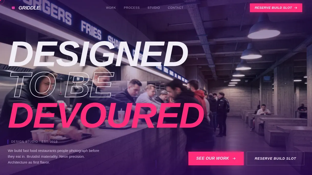
- A Type Over Image hero with stamped ultra-condensed display type colliding with a full-bleed restaurant interior photograph
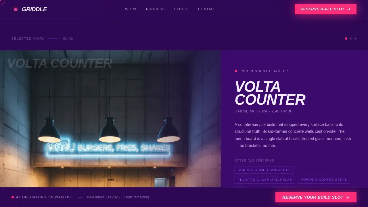
- A 60/40 project explorer where the wide column cycles through portfolio photography with cursor parallax and the narrow column holds copy, material callouts, and plan diagrams
- A pinned bottom waitlist form that expands to a three-step micro-form capturing concept stage, location count, and preferred build quarter, topped by a live waitlist position counter
Feature list
This landing page template is built around specific, prompt-defined components. Each one is designed to do real work on the page.
Type Over Image Hero
The hero stamps "DESIGNED TO BE DEVOURED" in an ultra-condensed grotesque typeface across a wide-angle restaurant interior photograph. The type collides with the image rather than sitting above it, treating the photograph as raw texture. This is the boldest first impression available to a fast food design studio.
Asymmetric 60/40 Project Explorer
The 60% column displays full-bleed restaurant photography that responds to cursor position with subtle parallax. The 40% column holds tight copy, material callouts, and small plan diagrams that animate on scroll entry. Each section represents a different restaurant project, and visitors can open a lightbox explorer showing construction sequences, material palettes, and 360-degree interior captures.
Manifesto Typographic Interstitials
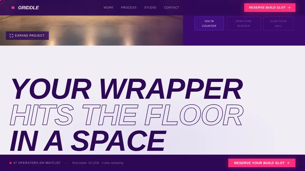
Between project sections, full-width typographic statements break the page rhythm. Lines like "YOUR WRAPPER HITS THE FLOOR IN A SPACE WE DESIGNED" read as manifesto copy, not marketing. Oversized typography creates a direct, impossible-to-ignore effect that reinforces the studio's point of view.
Three-Step Pinned Waitlist Form
A single-field email capture stays pinned to the bottom of the viewport on scroll. On click, it expands to reveal three steps: concept stage selection, location count, and preferred build quarter. A live counter above the form shows the current waitlist position number, creating urgency without fabricating scarcity.
Client Type and Process Section
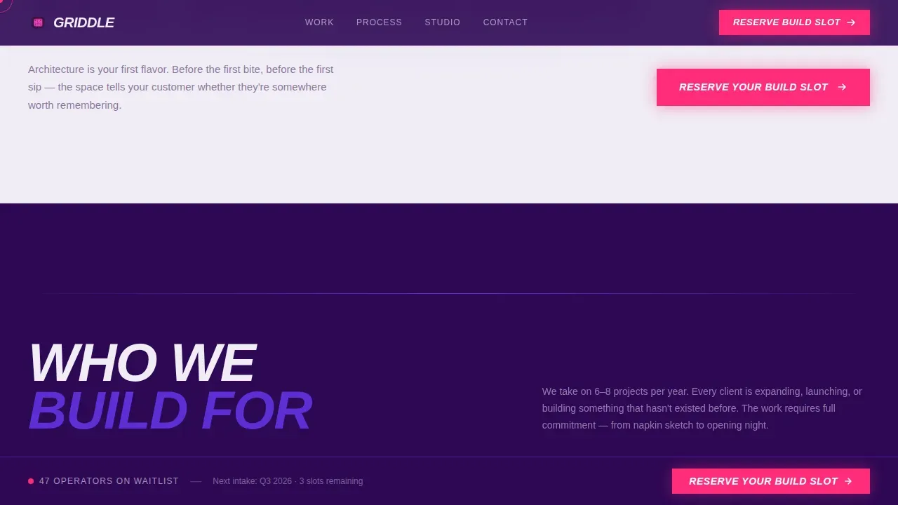
Three client profiles are presented with material callouts. Franchise owners, independent operators, and food hall developers each get a description that speaks to their specific context. This section helps every type of restaurant operator self-identify and feel seen.
Page sections overview
| Section | Purpose |
|---|---|
| Hero header | Stamp display type over a restaurant interior photograph |
| Project explorer | Cycle portfolio projects in a 60/40 parallax grid |
| Manifesto interstitial | Break page rhythm with full-width typographic statements |
| Client types and process | Present three operator profiles with material callouts |
| Waitlist call to action | Expand pinned form to a three-step lead capture with live counter |
| Footer | Minimal horizontal layout with studio links |
Design & branding system
The design system is rooted in Electric Indigo and built to feel like a blacklight hitting raw concrete. Backgrounds alternate between deep violet and exposed white, never gray. The palette rejects polished, safe food website design in favor of something unapologetically direct.
- Deep slab violet (#2E0854) anchors the 60% column; crackling indigo (#5B2FD4) activates hover states and section dividers; exposed white (#F0ECF5) carries all body type
- Electric magenta (#FF2D7B) is reserved exclusively for interactive triggers and the waitlist call to action, making every action point impossible to miss
- Display type uses an ultra-condensed grotesque; body copy uses a clean humanist sans-serif; raw, untreated food photography is presented without soft filters, drop shadows, or rounded corners
Mobile & speed optimization
This template is built desktop-first, reflecting how franchise owners and developers review studio work. The layout is fully responsive so the restaurant landing page remains usable across screen sizes. Brutalist page design benefits from minimal styling overhead, which keeps asset weight low.
- Cursor parallax and scroll-triggered animations are handled by client-side components, keeping static sections lean
- The asymmetric grid collapses cleanly for smaller screens without losing the visual hierarchy
- The pinned waitlist form remains accessible and functional at every breakpoint
How this template helps you convert
A fast food restaurant design studio landing page only works if it makes operators feel the cost of missing out. This page earns the signup by showing finished work first and then presenting a clear, low-friction path to join the waitlist.
- The project explorer builds desire before the call to action appears, so visitors arrive at the form already convinced by the portfolio
- The live waitlist counter signals real demand, and the three-step form qualifies leads by concept stage, location count, and build quarter without adding friction
Other information about this template
This template is a strong fit for any food restaurant design studio wanting to launch a production-ready landing page quickly. No-code solutions allow users to build and customize websites without traditional programming skills, reducing the time and cost of getting live. The page design is compatible with standard page builders, making it straightforward to adapt.
- The Griddle bold brutalist fast food design studio landing page template is one of the most distinct restaurant landing page options available for hospitality design studios in the fast food category
- Food web templates like this one are ideal for any food business or design studio wanting to upgrade an existing website or launch a new one without employing a developer
- Backend integration is essential for food websites that eventually need to manage lead data and customer relationship workflows; the waitlist form structure in this template supports that kind of integration
- This restaurant landing page works equally well as a portfolio showcase for a cafe design studio, a drink-focused concept space, or any food restaurant brand with architectural ambitions
- Websites using a brutalist page design approach load faster due to minimal styling and fewer heavy assets, which supports both user retention and discoverability
- The template includes everything you need to present the studio and sell the waitlist experience to operators across all three target profiles
Theme
Bold Brutalist
Creative direction
Interactive Explorer
Color system
Electric Indigo
Style
Asymmetric Grid (60/40)
Direction
Waitlist/Coming Soon
Page Sections
Type Over Image Hero Section
60/40 Asymmetric Project Explorer
Manifesto Typographic Interstitials
Three-step Pinned Waitlist Form
Client Type and Process Profiles
Related questions
Can this landing page be used for a cafe or drink concept studio?
Does this template require coding skills to customize?
How does the live waitlist counter work?
Is this template suitable for a multi-location franchise operator?
Can food photography be used without heavy editing?



