Memorable Kickboxing App Landing Page Template
Strike is a nature-inspired kickboxing app landing page designed for fighters, cardio class enthusiasts, and coaches who want real training data. It uses a scroll-reveal layout to show how the app turns raw sessions into combo heat maps, power curves, and recovery graphs. The freemium sign-up flow makes downloading your first tracked round feel effortless.
by Rocket studio
Quick summary
Strike is a scroll-reveal landing page built for a kickboxing training tracker app. The design draws on a forest-dawn palette and progressive animation to guide visitors from raw, untracked chaos toward visible, data-driven clarity. Every section earns the next click, leaving the freemium call to action for the moment a visitor truly understands what the app delivers.
Who this template is for
This template speaks directly to people who leave every class with questions they cannot answer. Did the combo land cleaner this week? Is recovery time improving? The page was built for three distinct groups who share one thing: they want their training to mean more than sweat.
- Amateur fighters preparing for their first smoker or competitive bout, who are data-curious and want structured programs to track their progress over a full fight camp.
- Saturday cardio kickboxers who love the class environment but are searching for visible improvement metrics that explain the difference between a bad hook and a clean one.
- Coaches managing a team or stable of multiple fighters who need session logs, combo records, and recovery details organized automatically across their whole group.
What problem this template solves
Most fighters leave training with nothing but a memory that fades by the time they reach their car. Scribbled notes get lost, forgotten sessions leave gaps, and no pattern ever becomes visible. There is no way to explain progress to a coach or to yourself. The Strike template solves the presentation problem for apps that exist to fix exactly this.
- Raw, untracked logs create a sense of wasted effort, even when the body is improving. Visitors recognize that story immediately.
- Coaches cannot talk about what they cannot see. Session data that lives only in someone's head helps no one on the team.
- Fighters searching for a way to protect their development across weeks of camp need a tool that does the record-keeping for them, automatically.
What you get with this template
You get a fully structured, single-scroll landing page with six purpose-built sections and a clear freemium conversion path. Every design decision, from the portrait hero to the animated transformation layer, is grounded in the goal of making the app's value undeniable before asking for a sign-up.
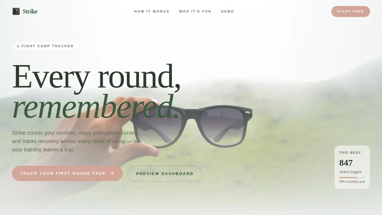
- A cinematic hero section with a vertical portrait composition, mist-fade headline, and strong visual identity designed to convey calm power.
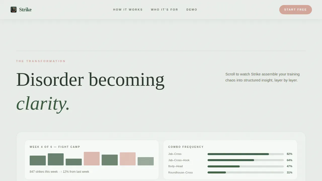
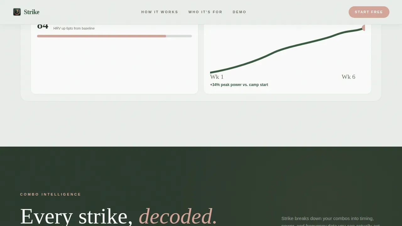
- A scroll-triggered transformation sequence where disorder assembles into app interface clarity, including heat maps, recovery graphs, and six-week progression arcs.
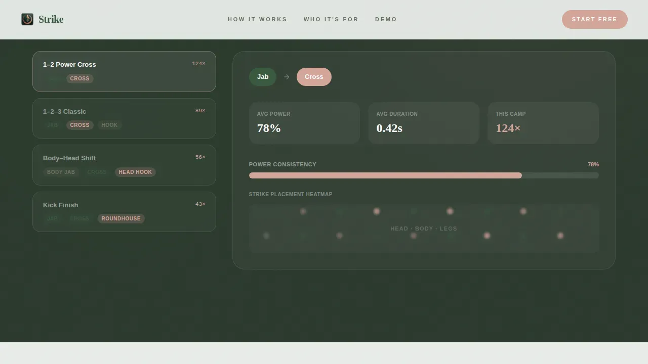
- A combo breakdown section with animated strike sequences, a testimonials block with fighter proof screenshots, a freemium sign-up form, and a linear single-row footer.
Feature list
This template is designed to deliver a specific experience. Each section has a defined purpose, and each design element was chosen to support conversion without noise.
Scroll-Triggered Transformation Reveal
The page opens on a raw, chaotic training log and, as the visitor scrolls, the app interface assembles itself around that disorder. Heat maps appear, recovery graphs rise, and six-week power arcs climb into view. This before-and-after structure unfolds sequentially rather than side by side, making the transformation feel earned. The animation is driven by scroll position, so each insight arrives at the right moment.
Interactive Combo Breakdown Section
This section slows the scroll pace intentionally, letting animated strike sequences play out one move at a time. Jab, cross, leg kick, body shot: each technique appears in sequence to help the visitor understand what combo-level data actually looks like inside the app. It is a functional demo, not a static screenshot, and it helps coaches and fighters alike find the meaning behind the numbers.
Freemium Sign-Up Form with Training-Level Selector
The primary call to action appears after the combo breakdown, once the visitor has already seen what the data looks like. The form asks for only an email address and a training-level selection: beginner, intermediate, or competitor. This low-friction entry point makes downloading your first tracked round feel like a gift rather than a gate. A secondary path invites hesitant visitors to preview a sample dashboard before committing.
Three-Card Audience Section
An asymmetric bento-card layout presents the three target groups: the amateur fighter, the cardio class regular, and the coach managing a full team. Each card is written as a short story with a specific situation, making every person who lands on the page feel that the app was built for them. This section does real conversion work by removing doubt about fit.
Fighter Testimonials with Tracked Improvement Data
Social proof arrives in the form of real fighter testimonials accompanied by tracked improvement screenshots showing specific percentage gains. Each testimonial includes a training-level badge and named attribution. This format pushes credibility beyond generic quotes by letting the data do the talking alongside the words.
Nature-Inspired Visual Identity System
The full color system, typography pairing, and texture language are built into the template. Fog gray backgrounds, deep moss text, river stone accents, and bloom coral calls to action create a palette that feels organic and focused. Fraunces serif headlines pair with DM Sans body type to balance editorial weight with clean readability across every section.
Page sections overview
| Section | Purpose |
|---|---|
| Hero Portrait | Open with atmosphere and headline |
| Transformation Reveal | Show disorder becoming data clarity |
| Combo Breakdown | Animate strike sequences and heat maps |
| Who It's For | Match visitors to three audience cards |
| Testimonials and Sign-Up | Build trust and capture freemium sign-ups |
| Linear Footer | Close with a clean single-row footer |
Design & branding system
The visual identity was designed to feel like a forest trail at dawn: organic calm wrapped around something powerful underneath. Every color choice, type decision, and texture reference supports that mood without sacrificing clarity or energy. A bold, minimal approach keeps the brand message sharp.
- Color system uses four values: fog gray (#E8ECE9) for backgrounds, deep moss (#3A5A40) for primary text and structure, river stone (#6B705C) for supporting elements, and bloom coral (#D4A59A) reserved exclusively for calls to action and progress indicators.
- Typography pairs Fraunces, a warm serif face, for headlines with DM Sans, a clean sans-serif, for body copy and interface labels, creating a balance of editorial strength and everyday readability.
- Texture and motion language draws from wet bark, mist gradients, and clip-path scroll reveals, giving the page a sense of life and movement that feels grounded, not flashy.
Mobile & speed optimization
This template was designed mobile-first, which makes sense for an audience that checks data between rounds on a phone. Over 60% of searches happen on mobile devices, and fighters are rarely at a desk when they want to log a session. The layout scales cleanly to desktop for coaches who review session logs after class.
- Large, tappable call-to-action buttons and a focused single-column scroll flow make the freemium sign-up easy to complete on any screen size without pinching or zooming.
- Static sections use server-rendered components for fast initial load, while animated sections use client components to keep the scroll-reveal experience smooth without blocking the first paint.
- The standard navigation menu is removed from the header so the visitor's full attention stays on the core action: downloading the app or exploring the dashboard preview.
How this template helps you convert
The page is built to earn the click before it asks for one. It never leads with the form. It leads with the problem, then the transformation, then the data, and only then the freemium offer. That sequence protects conversion by making the sign-up feel logical rather than premature.
- The scroll-triggered reveal creates progressive familiarity. By the time a visitor reaches the call to action, they have already watched their own training problem get solved on screen, which lowers resistance and builds genuine interest.
- The secondary "Preview Your Dashboard" path gives hesitant visitors a no-commitment way to explore sample fight camp data, so no one leaves the page without experiencing the product in some form.
Other information about this template
This landing page draws from disciplines well established in martial arts app design and combat sports coaching. Coaches who manage large teams find that structured training programs with clear session logs reduce the time spent making sense of handwritten notes. The page is designed to speak that language confidently.
- The strike every round remembered kickboxing app landing page template is built specifically for the striking arts niche, not adapted from a generic fitness template, which makes the messaging feel accurate to fighters and coaches who know boxing well.
- Research in martial arts coaching suggests that understanding the purpose behind each combo helps athletes execute under pressure. The combo breakdown section reflects that insight, explaining each technique sequence rather than just displaying it.
- Coaches and team members who are searching for a log-based approach to boxing and kickboxing programs will find the audience cards and testimonial block directly relevant to how they already think about progress.
- The template supports a bold, focused visual identity: three or fewer colors in key interface moments, clean type, and no cluttered navigation, all consistent with effective branding practice for martial arts and boxing programs.
- Fans of data-driven training life and fighters who post their progress publicly will find the tracked improvement screenshot format compelling, since it gives them something worth sharing with their co-training partners and gym group.
- Coaches can reference the dashboard preview and combo data formats to talk through training plans with their fighters, using the app as a shared record rather than a one-person log.
Theme
Nature-Inspired
Creative direction
Before/After Reveal
Color system
Soft Mist
Style
Scroll Reveal (Progressive)
Direction
Freemium/Trial
Page Sections
Scroll-triggered Transformation Animation
Animated Combo Breakdown Section
Freemium Sign-up with Training-level Selector
Three-card Audience Identification Layout
Fighter Testimonials with Improvement Screenshots
Nature-inspired Visual Identity System
Related questions
Who is this landing page template designed for?
Can coaches use this template to present programs to their team?
Does the template include the interactive dashboard preview path?
What makes this different from a generic fitness landing page?
Is this template suitable for a mobile-first audience?