Curated Neckwear Subscription Box Landing Page
Knot is a single-page landing page template built for a curated neckwear subscription box. It pairs a layered Marketplace Grid layout with a Cloud Canvas color system to guide visitors from a candid photo wall hero through a side-by-side tier comparison, animated fabric reveals, and a clear upsell path, all styled to feel as considered as the ties inside the box.
by Rocket studio
Quick summary
Knot is a landing page template designed for a monthly ties and bowties subscription box. It uses overlapping card layouts, a UGC photo wall header, and a scroll-driven tier comparison to move visitors from curiosity to conversion. The design feels like a well-kept garment drawer: calm, considered, and quietly confident about every piece it presents.
Who this template is for
This template is built for subscription box brands selling curated neckwear to style-conscious buyers. It works equally well for first-time launches and established boxes looking to push tier upgrades.
- Subscription box founders selling monthly ties, bowties, or accessories
- Wedding and event planners offering coordinated neckwear packages
- Pattern-driven collectors who treat neckwear the way sneaker enthusiasts treat limited releases
What problem this template solves
Selling a subscription upgrade is harder than selling a first box. Visitors need to see, feel, and believe that the higher tier is worth the price gap before they click. A generic product page cannot do that job.
- Basic subscription pages fail to show the physical difference between tier levels
- New visitors lack context for why curated neckwear is worth a recurring commitment
- Upsell flows that rely only on text lose buyers who need to see the extra value
What you get with this template
This template gives you a complete single-page conversion layout built around the neckwear subscription experience. Every section is designed to earn trust and guide a decision, not just display product details.
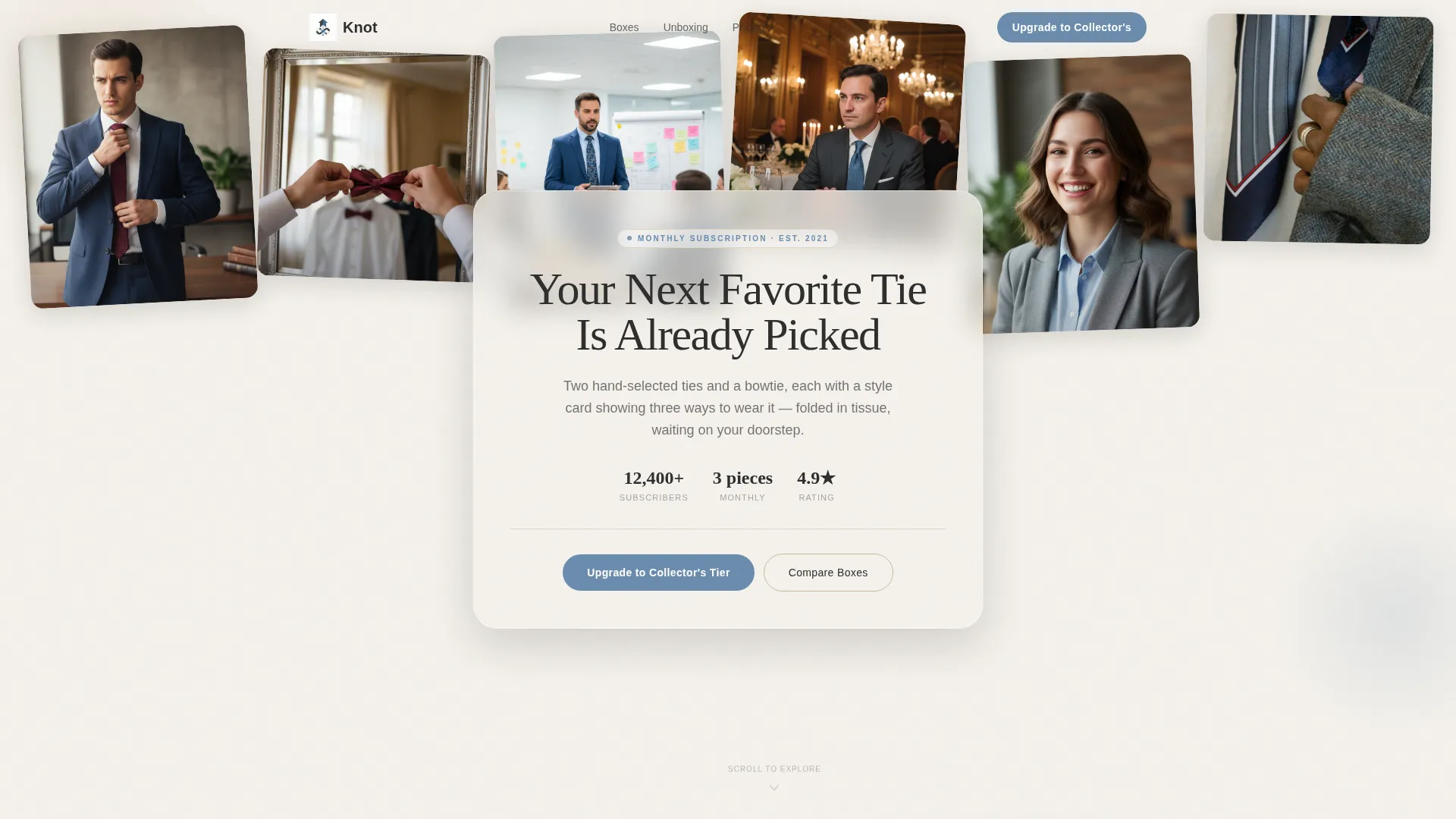
- A UGC photo wall header with a parallax scroll effect and a typewriter headline overlay
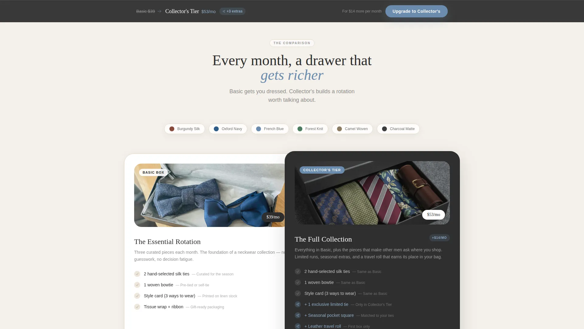
- A scroll-driven comparison journey showing Basic Box versus Collector's Tier with layered, overlapping cards
- A sticky bottom bar call to action and a two-step plan selector built for both new visitors and returning subscribers
Feature list
This template ships with purpose-built sections and interaction patterns drawn directly from the subscription upgrade experience. Each feature below reflects a specific design or layout choice described in the brief.
UGC Photo Wall Header
A mosaic of candid subscriber photos pins at slightly overlapping angles across the full header. A frosted overlay card carries the headline "Your Next Favorite Tie Is Already Picked," which types itself in as the page loads. The images feel warm-lit and unstaged, making the hero feel human rather than promotional.
Scroll-Driven Tier Comparison
As visitors scroll, layered cards physically overlap to reveal what the Collector's Tier adds over the Basic Box: a third exclusive tie, a seasonal pocket square, and a leather travel roll. Fabric swatch animations appear mid-scroll, giving textures an almost tactile presence on screen.
Side-by-Side Unboxing Video Block
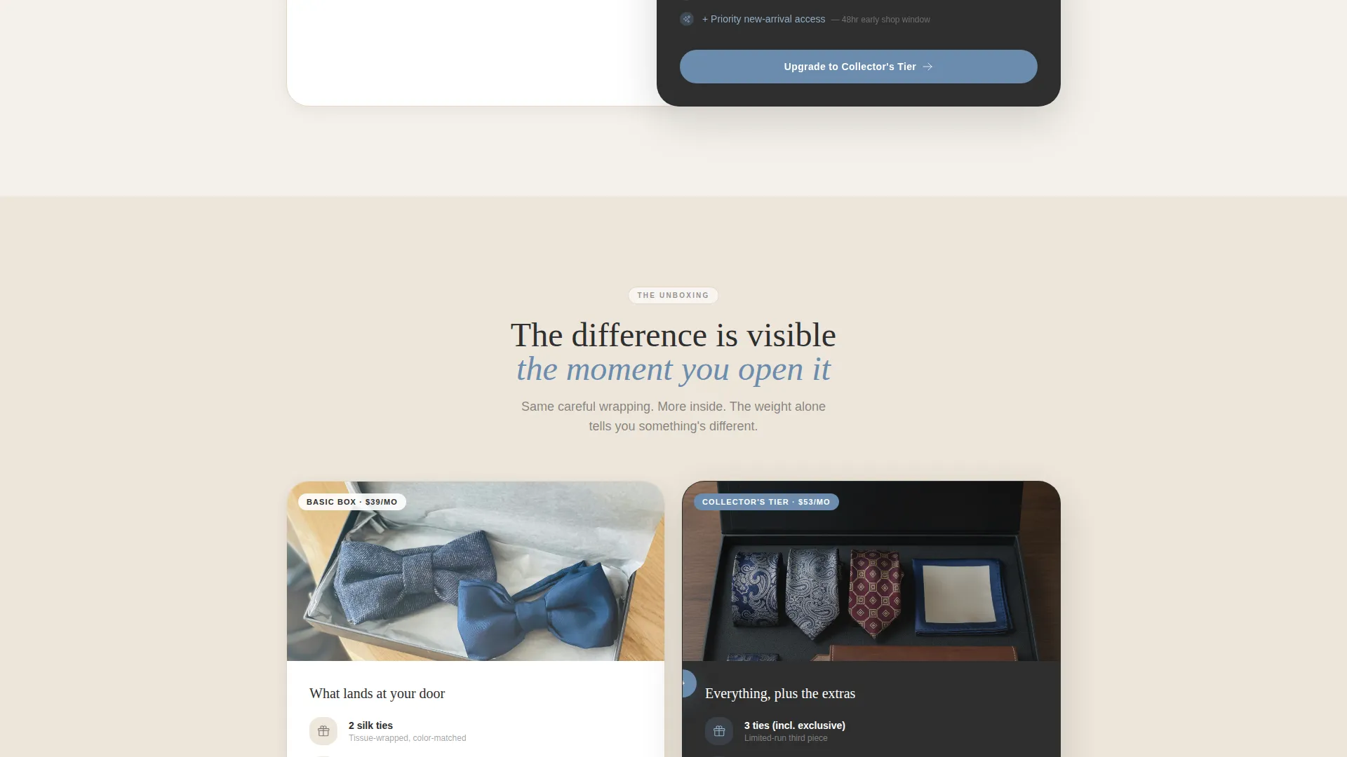
A video section plays Basic on the left and Collector's on the right simultaneously. The visual contrast in weight, wrapping, and extras communicates the value difference without a single line of persuasive copy needed.
Upgrade-Optimized call to action System
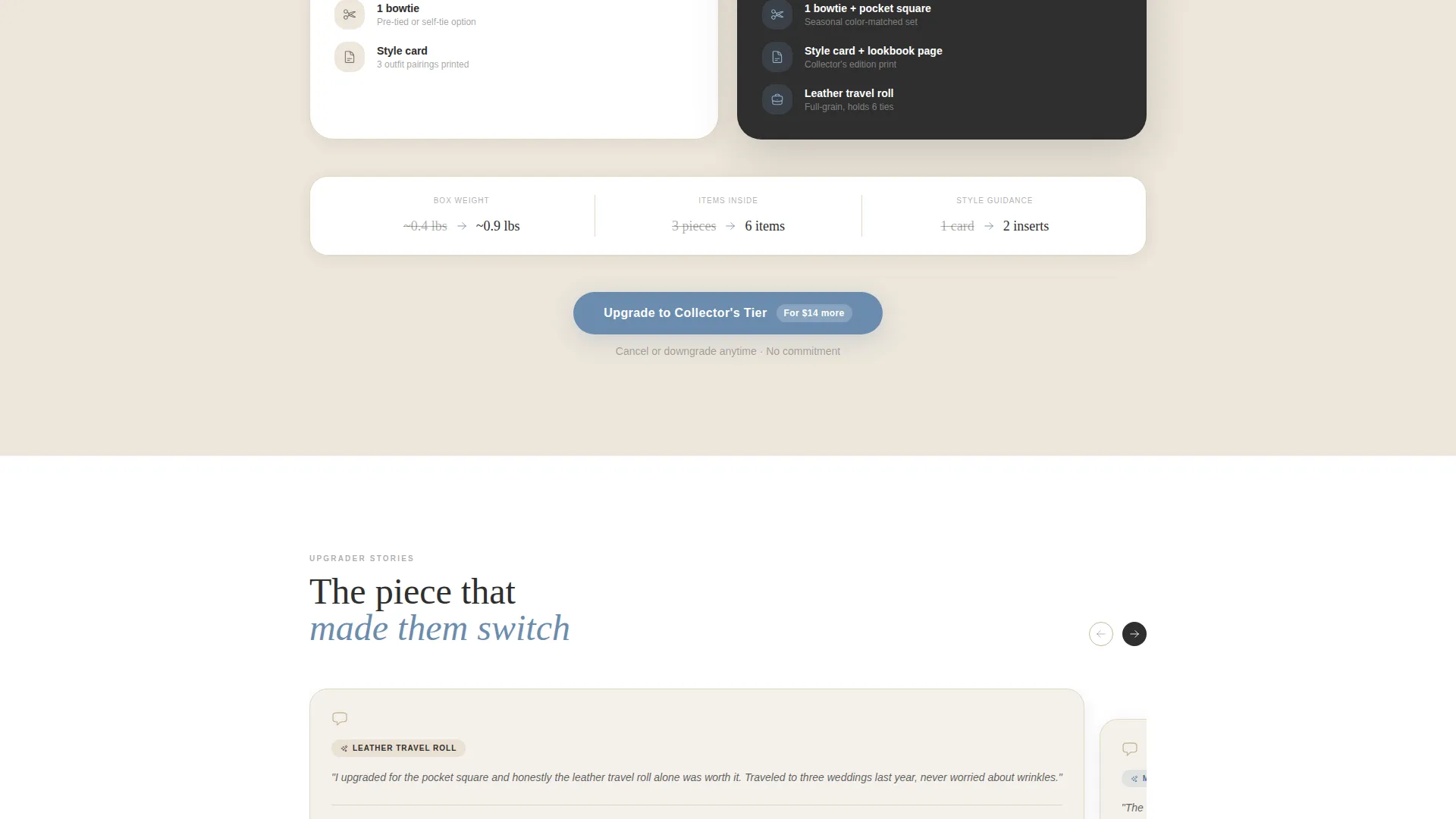
The primary call to action reads "Upgrade to Collector's Tier" in French blue. It appears first below the comparison section, then again as a sticky bottom bar after the page midpoint. A secondary path labeled "Gift an Upgrade" serves subscribers buying for someone else.
Two-Step Plan Selector
New visitors choose Basic first through a two-step selector, then immediately see the Collector's tier with a "For $14 more" anchoring line. Returning subscribers see their renewal date and a one-click toggle, keeping the flow relevant for each audience segment.
Testimonial Offset Cards
Upgrader testimonials slide in on offset, overlapping cards mid-page. Each quote references the specific piece that made the subscriber switch tiers, grounding social proof in product detail rather than vague praise.
Page sections overview
| Section | Purpose |
|---|---|
| UGC Photo Wall | Hero with candid subscriber mosaic and typewriter headline |
| Frosted Headline Card | Overlay anchoring the page's primary value statement |
| Basic Box Intro | Introduces the entry-level subscription and its contents |
| Collector's Tier Reveal | Shows layered card additions exclusive to the upper tier |
| Fabric Swatch Animation | Scroll-triggered texture reveal for tactile product feel |
| Unboxing Video Block | Side-by-side video comparing both tier unboxing experiences |
| Upgrader Testimonials | Offset quote cards citing specific pieces that drove the switch |
| Two-Step Plan Selector | Guides new visitors from Basic choice to Collector's offer |
| Subscriber Renewal Toggle | One-click upgrade path for returning Basic subscribers |
| Sticky Upgrade Bar | Persistent bottom call to action appearing after the page midpoint |
| Gift an Upgrade Path | Secondary conversion flow for subscribers gifting to others |
Design & branding system
The visual identity follows a Cloud Canvas color system styled around a tailor's worktable at golden hour. Parchment and soft white layer as backgrounds, charcoal anchors all body text, and French blue draws the eye to every clickable surface.
- Soft cumulus white (#F4F1EB) and warm parchment (#E3D5C3) layer as background and card surfaces
- Charcoal suiting (#2E2E2E) handles all primary typography for clear, grounded readability
- Muted French blue (#6B8CAE) marks every button, toggle, and interactive highlight across the page
Mobile & speed optimization
The overlapping card layout and layered scroll effects are structured to remain readable and visually clear on smaller screens. The stacked section flow adapts naturally to vertical scrolling without losing the comparison hierarchy.
- Layered cards restack cleanly on mobile so tier differences remain visually distinct
- The sticky upgrade bar stays accessible at the bottom of the screen throughout the scroll journey
- The two-step plan selector collapses into a tap-friendly vertical flow on narrow viewports
How this template helps you convert
Every section in this template exists to reduce the perceived risk of upgrading and make the added value physically visible before the click.
- The scroll-driven comparison and side-by-side unboxing video show the Collector's Tier difference in real, photographed product terms, so the price gap feels small against the visible gap in experience.
- The two-step plan selector and subscriber renewal toggle serve different visitor types with relevant paths, reducing friction for both first-time buyers and returning members ready to upgrade.
Other information about this template
This template sits within the Retail and E-Commerce category, aligned to ties and bowties subscription retail. A few additional details worth knowing before you build with it:
- The Marketplace Grid theme and overlapping card layout are drawn from the matched intersection context for this niche
- Style cards included in the box concept show three ways to wear each piece, a detail the page's section copy can reflect directly
- The template is designed for a single-page flow, not a multi-page site structure
- Each photographed extra item in the Collector's Tier is positioned and contextualized to make the price anchoring line feel earned
Theme
Marketplace Grid
Creative direction
Flash Deal
Color system
Citrus Burst
Style
Masonry/Pinterest
Direction
Marketplace/Multi
Page Sections
UGC Photo Wall Hero
Scroll-driven Tier Comparison
Side-by-side Unboxing Video
Upgrade-optimized Call to Action System
Two-step Plan Selector with Renewal Toggle
Testimonial Offset Cards
Related questions
Who is this landing page template designed for?
Does the template support both new visitors and existing subscribers?
Can I use this template to offer a gift subscription path?
What makes the tier comparison different from a standard pricing table?
Is this template suitable for a single product or only for subscriptions?



