Aquarium Training School Landing Page Template
Koi is a family-first aquarium training school landing page template built around a modular card grid. It pairs a full-bleed hero photograph with a staggered gallery walk of class cards, guiding visitors from beginner nano-tank lessons to advanced crystal shrimp breeding. The design uses a Japanese Zen color system to create a calm, unhurried browsing experience that turns curious families into enrolled students.
by Rocket studio
Quick summary
Koi is a single-page landing page template designed for hands-on aquarium training schools that serve families and hobbyists. It opens with a full-bleed hero photograph and a fade-in headline, then flows into a staggered modular card grid where each card presents one class as a frozen moment in time. The layout progresses from beginner to advanced, guiding visitors naturally toward enrollment.
Who this template is for
This template is built for aquarium educators, small training schools, and hobbyist instructors who want to offer structured classes to families and beginners. If you run weekend workshops, homeschool biology sessions, or multi-level fish-keeping courses, this landing page gives you a clear, beautiful way to present your full catalog and invite people in.
- Parents looking for screen-free weekend activities who want to view classes at a glance and click through to enrollment pages
- Homeschool families building living biology curricula who need to see course structure, age ranges, and what each class covers
- Frustrated hobbyists who have lost fish and are finally ready to understand water chemistry, filtration, and feeding before they try again
What problem this template solves
Most aquarium schools lose potential students before the first click. The website feels clinical, the class list is buried in a table, and nothing communicates the quiet joy of kneeling beside a child at a glowing tank. Visitors arrive curious and leave unmoved. Common beginner fears, including losing expensive fish to poor water quality and feeling unable to understand technical equipment, go completely unaddressed on the page.
This template solves the emotional and structural gap between curiosity and commitment.
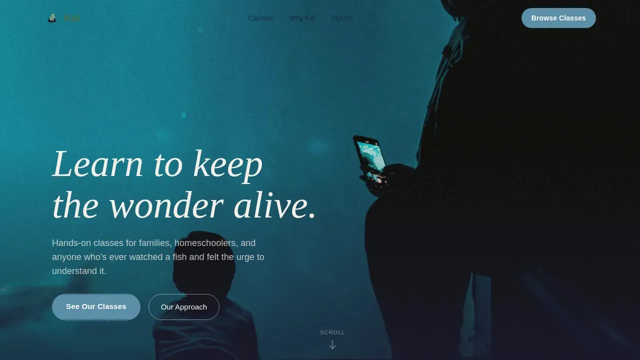
- It leads with an intimate hero image that creates an immediate emotional connection, showing a parent and child together at a planted aquarium
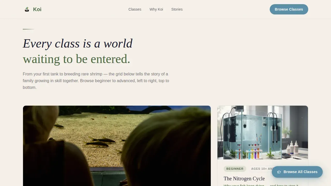
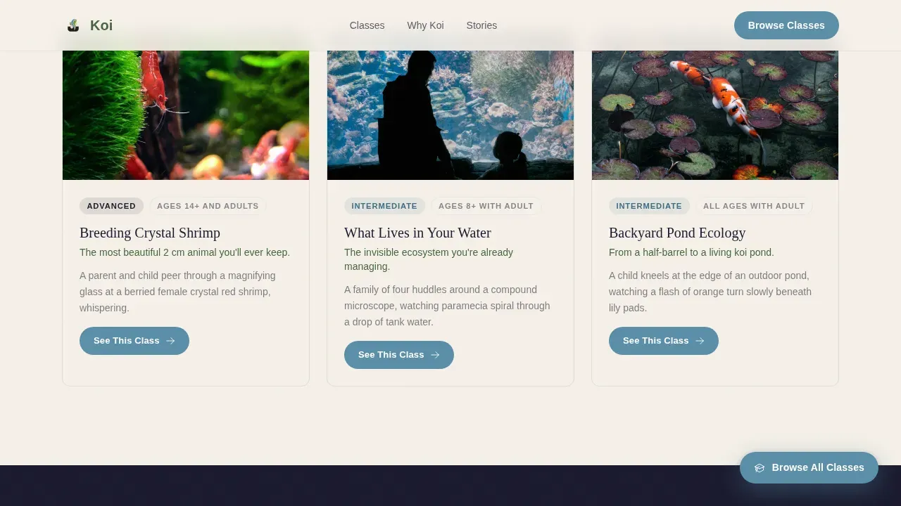
- It organizes classes into a visual gallery walk so visitors can view the full learning journey from nano-tank cycling to crystal shrimp breeding without feeling overwhelmed
- It surfaces the details that matter, including age range, what the student takes home, and a direct call-to-action on every card, so no question is left unanswered before submitting an enrollment
What you get with this template
The template delivers a complete, production-ready landing page structure. Every section is pre-built and visually cohesive, so you can focus on adding your own class content, instructor bios, and photography without rebuilding the layout from scratch.
- A full-bleed hero section with a fade-in headline and scroll cue, a staggered modular class card grid, a split-layout "Why Koi" section with stats, a testimonial slider, a call-to-action banner, and a horizontal flow footer
- Japanese Zen typography pairing using Fraunces for display headings and DM Sans for body text, creating an unhurried, gallery-like reading experience
- A persistent floating "Browse All Classes" button in living water blue, hover-reveal card details, staggered scroll animations, and bubble-rise card entrances built for high interactivity
Feature list
This template was designed with a specific set of built-in capabilities that directly serve aquarium training schools. Each feature connects a visual moment to a conversion action, making the page feel like an invitation rather than a sales pitch.
Full-Bleed Hero with Fade-In Headline
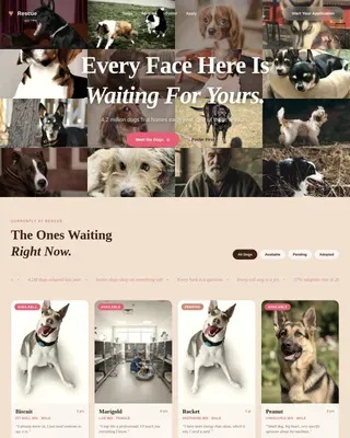
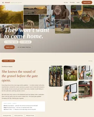
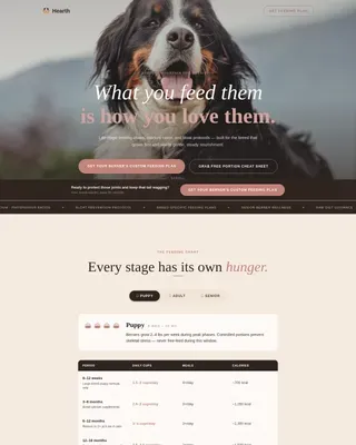
The hero section fills the entire viewport with a warmly lit photograph. No text appears for the first beat. Then a single headline fades in over the image: "Learn to keep the wonder alive." A scroll cue invites the visitor downward. This opening creates the emotional pull that a benefit-driven headline alone cannot achieve, making the visitor feel present before they read a single word about your classes.
Staggered Modular Class Card Grid
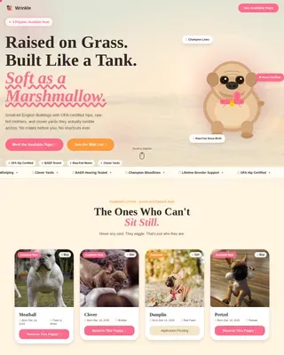
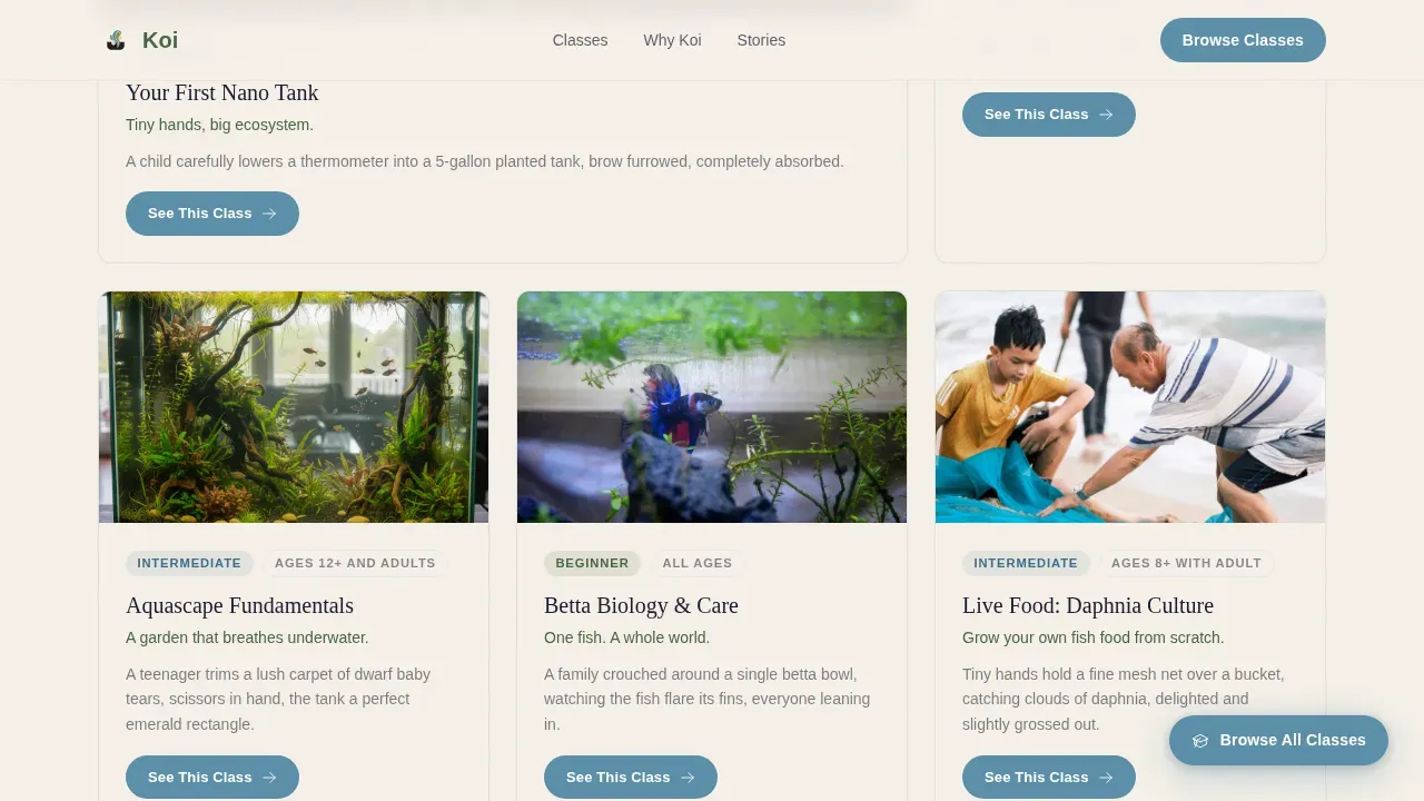
The class grid is the heart of the template. Each card is a self-contained world, presenting one class or workshop as a frozen visual moment. Cards are arranged from beginner to advanced, left to right and top to bottom, so the grid itself tells the story of a family growing in skill together. As visitors scroll, cards surface in staggered animation, each one rising like a bubble. The rhythm is deliberate and unhurried. No card competes with another for attention. This gallery walk structure makes it easy to view the full curriculum at once without cognitive overload.
Hover-Reveal Card Details
Hovering over any class card lifts it gently and reveals three pieces of information: the full class details, the age range, and a single compelling line about what the student will take home. A "See This Class" call-to-action button routes directly to a dedicated enrollment page. This progressive disclosure approach respects the visitor's attention, offering depth only when they signal interest. It also keeps the grid clean and skimmable at a glance.
Persistent Floating Call-to-Action Button
A floating "Browse All Classes" button remains visible in living water blue as the visitor scrolls through the entire page. It stays anchored to the viewport so that anyone who is ready to view the full catalog can click at any moment, without scrolling back to the top. This persistent element is especially effective on mobile, where families browse on phones and want efficient access to the next step.
Testimonial Slider with Photo and Quote
The testimonials section uses a photo-plus-quote slider format. Real family voices and photos from students who have successfully built their first aquarium or completed a course provide social proof at the moment when a visitor is weighing whether to enroll. Quotes, reviews, and student stories build the trust that instructor credentials alone cannot fully establish.
Call-to-Action Banner and Footer
A warm, full-bleed call-to-action banner near the bottom of the page reiterates the enrollment invitation. This ensures that visitors who scrolled through the entire page are met with a clear, prominent prompt before they leave. The footer follows a horizontal flow pattern that keeps navigation tidy and accessible. Both sections reinforce the page's core message: you are invited in, not sold to.
Page sections overview
| Section | Purpose |
|---|---|
| Full-Bleed Hero | Opens with a warmly lit family photograph and a fade-in headline to create emotional connection before any class details appear |
| Class Card Grid | Displays the full course catalog as a staggered visual gallery walk, progressing from beginner to advanced |
| Why Koi Split | Asymmetric layout with stats and intimate copy that answers the visitor's silent question: "Is this school right for me?" |
| Testimonial Slider | Photo-and-quote slider featuring real family voices and stories from students who completed courses |
| Enrollment call to action Banner | Full-bleed warm invitation section that reiterates the call to enroll, capturing visitors at the bottom of the page |
| Horizontal Flow Footer | Clean footer using a horizontal pattern that organizes links, contact details, and navigation without clutter |
Design & branding system
The visual identity follows a Japanese Zen philosophy applied to a warm, family-oriented context. Every color decision, spacing choice, and typographic pairing was made to feel like a Japanese garden at dawn: wet stone, soft moss, and still water reflecting nothing but sky. The palette communicates calm expertise, not clinical instruction.
- Four core colors structure the page: deep koi pond black (#1A1A2E) for dark backgrounds, moss stone green (#4A6741) for accents and structural elements, raked sand warm white (#F5F0E8) for light background sections, and living water blue (#5B8FA8) reserved exclusively for buttons and hover states
- Backgrounds alternate between warm white and pond black so that each section feels like a breath, and cards float with generous padding that lets each module breathe like space between stepping stones
- Typography uses Fraunces for display headings, giving the school a warm and literary character, while DM Sans keeps body text clean, readable, and efficient at all sizes
Mobile & speed optimization
The template is built mobile-first, which reflects how most families actually browse. Parents discover new activities on their phones, often while sitting beside their children. A page that performs well on mobile does not just load faster. It communicates respect for the visitor's time and environment.
- The class card grid reflows into a single-column layout on smaller screens, preserving the staggered reveal animation and hover-lift behavior in a touch-friendly format
- Server Components handle the static grid structure for reliable initial rendering, while Client Components manage the scroll-linked animations, floating button, and hover reveals, keeping interactivity robust without sacrificing load consistency
- The persistent floating "Browse All Classes" button is especially useful on mobile, where scrolling back to a navigation menu feels like a barrier to clicking through
How this template helps you convert
Every structural decision in this template serves one goal: turning a curious visitor into a student who submits an enrollment. The page earns the click by pairing the beauty of the result with the intimacy of the learning moment. Visitors do not feel sold to. They feel invited.
- The hero section leads with emotion before it asks for anything, using a high-quality photograph to create the kind of immediate visual trust that text alone cannot build in the first few seconds
- The class card grid uses progressive disclosure and a clear benefit-driven reveal on hover, so visitors see exactly what they will learn, who the class is for, and how to enroll, all before they have to click anything
- The call-to-action banner at the bottom of the page reiterates the enrollment invitation for visitors who scrolled all the way through, ensuring the page captures interest at every stage of the decision rather than only at the top
Other information about this template
This section covers practical details, additional context, and usage notes that help you understand how to deploy and customize the template for your school's specific needs.
The Koi family first aquarium training school landing page template was designed to address a clear gap in the aquarium education market. Most schools rely on generic website builders that produce pages feeling blocked from any real sense of atmosphere or warmth. This template solves that by treating each page section as a curated environment rather than a form to fill in.
When you build your class cards, make sure logistics such as course duration, format, and price are clearly stated. Visitors who cannot find this information quickly feel blocked and leave without submitting a registration. Each card's hover-reveal is a good place to surface these details alongside the age range and the takeaway line.
Instructor credentials matter deeply to families evaluating a new school. The "Why Koi" split section is the right place to include instructor photos, brief bios, and any relevant certifications. A photo and a brief bio highlight experience in a way that builds trust faster than a list of qualifications alone. Families want to see the people who will be teaching their children.
The testimonial slider supports quotes, photos, and even short video embeds from students who have successfully built their first aquarium or kept koi through a full year. These voices carry weight because they reflect the journey your prospective students are about to begin. A parent seeing another parent's story log their child's first successful water test is more persuasive than any headline.
Consider adding bonus content offers such as a downloadable koi care checklist or a seasonal guide for pond maintenance. These resources give hesitant visitors a reason to submit their email address before they are ready to enroll in a full class. A simple registration form with Name and Email fields keeps the barrier to entry low and helps you build a communication list over time.
The template's color system and layout are well-suited for schools that also participate in community resources for aquarium enthusiasts. If your school runs public events, partners with local clubs focused on fish keeping and pond management, or hosts family engagement days, the page structure can support those announcements within the class grid or the call-to-action banner without breaking the design.
For schools in any country that need to localize the page, the layout uses English copy, USD pricing, and MM/DD/YYYY date formatting by default. Dates displayed in formats like January 15 are easy to read and match common expectations for class schedules and registration deadlines.
This template is well-suited for schools that operate across multiple buildings or indoor facilities. Whether your classes happen in a community center, a dedicated school house, or a shared public space, the card grid adapts to present each class location as part of the card's detail reveal.
If you plan to launch your school's site quickly, no-code and low-code platforms that support this template allow you to create a production-ready page from natural-language prompts without traditional programming skills. This makes it accessible even to instructors who are expert fish keepers but not website builders. Subscription-based platforms can provide scalable solutions as your class catalog grows.
The page's communication structure is designed to guide visitors through a natural decision journey. Each section speaks to a different stage: awareness at the hero, exploration through the grid, trust through the "Why Koi" section and testimonials, and commitment at the call-to-action banner. This layered communication approach reflects how real people make decisions, especially parents who are evaluating activities for their children.
The template's infocomm structure, meaning the way information flows and is communicated across the page, was planned to reflect the gallery walk creative direction. This is not a page that shouts. It invites. Every element, from the staggered card reveals to the floating button, is designed around a visitor who is browsing with curiosity rather than a sense of urgency.
The page's visual language is especially effective for schools that want to connect with the broader worship of aquatic life as both art and science. Koi keeping sits at the intersection of biology, patience, and beauty. The template honors that intersection by making every section feel considered and unhurried.
From a durability standpoint, the template's modular card structure means you can add new classes, remove old ones, or reorder the grid without rebuilding the page. This makes the layout future-proof for schools whose catalogs grow over a year or more. The robust card system handles adding new workshops cleanly and keeps the visual hierarchy intact.
The page's log of section states, hover interactions, and scroll positions is managed through Client Components. This gives you visibility into how the animated elements behave during development and makes it straightforward to adjust timing for the bubble-rise reveal or the fade-in hero text.
For schools that promote their classes on social media, the page's visual identity is immediately recognizable when shared. A screenshot of the hero or a single card translates well as a post visual. Sharing a link to the page on a school's social channels allows families to view the full class catalog directly from their feed. This makes the page a natural extension of your social promotion strategy, whether you are sharing on community boards or through direct outreach.
The template protects the visual integrity of your brand by keeping the living water blue color strictly reserved for interactive elements. This means visitors always know what is clickable. Every button, every hover state, and every floating element shares the same blue, creating a consistent and reliable visual language across the entire page.
- The page was designed with site performance in mind, using Server Components for the static grid and Client Components only where animation and interactivity are needed
- The public-facing floating button remains visible in living water blue throughout the scroll, ensuring the call to action is never blocked from view
- Infocomm planning across sections ensures the communication flow from hero to footer is logical, warm, and conversion-ready
- The template is built to protect the design system's integrity even when you replace placeholder content with your own class photography and copy
- Staff members such as lead instructors and workshop facilitators can each have a profile within the "Why Koi" section, using a photo and brief bio to build personal connection with prospective students
- The page's efficient layout keeps each section visually distinct, using alternating background colors rather than dividers, so the experience of scrolling feels like moving through a curated gallery rather than reading a document
- Adding a year of founding or a milestone student count to the stats block in the "Why Koi" section builds credibility quickly and gives visitors a concrete sense of the school's track record
- The template's robust card system makes it straightforward to offer multiple class formats, from single-session workshops to multi-week courses, without creating visual clutter on the page
Theme
Family First
Creative direction
Gallery Walk
Color system
Japanese Zen
Style
Card Grid (Modular)
Direction
Click-Through
Page Sections
Full-bleed Hero with Fade-in Headline
Staggered Modular Class Card Grid
Hover-reveal Card Details
Persistent Floating Call-to-action Button
Testimonial Slider with Photo and Quote
Call-to-action Banner and Horizontal Flow Footer
Related questions
Does the template include space for course details like price and duration?
How does the template handle beginner-focused content without overwhelming new visitors?
Can I add instructor bios and credentials to this template?
Is this template suitable for schools that serve both children and adult hobbyists?
What happens at the bottom of the page for visitors who scroll all the way through?