Korean Cloud Kitchen Landing Page Template
The Banchan Haute Craft Korean Cloud Kitchen landing page template is a sensory-first, card-grid layout built for ghost kitchen operators who want every scroll to feel like lifting the lid off a stone pot. It targets late-night solo orders, office team lunches, and homesick expat cravings, all through an immersive Sunset Gradient design, a nine-tile mosaic header, and a built-in scheduling drawer that makes ordering feel inevitable.
by Rocket studio
Quick summary
Banchan is a single-page cloud kitchen template built on a modular card grid. It uses a Haute Craft visual identity, a Sunset Gradient color system, and a Taste and Aroma creative direction to move visitors from curiosity to an order in one uninterrupted scroll. The page centers on a Photo Grid Mosaic header and a floating booking drawer that handles solo delivery and team lunch scheduling alike.
Who this template is for
This template is built for cloud kitchen operators and ghost kitchen brands that center their entire offer on delivery and takeout. It works for Korean food concepts that want to project authenticity without a physical dining room, and for any restaurant team that needs a high-converting booking page fast. It is also a strong starting point for no-code users who want to create a professional site without writing code.
- Solo-order cloud kitchens serving late-night delivery customers who search for fast, real Korean food on their phones
- Office catering managers who need to schedule team lunches, set a headcount, and find a reliable cloud kitchen in town
- Korean expat communities hunting for home-style dishes like doenjang jjigae that carry genuine craft and sourcing credibility
What problem this template solves
Most cloud kitchen websites look like menu directories. They list dishes but never make the visitor feel anything. Visitors search, scroll a flat page, and close the tab without ordering. That is a hard challenge for any ghost kitchen trying to compete in a crowded delivery market.
This template solves that by leading with sensory experience before text. The mosaic header, the heat spectrum cards, and the fermentation craft story all work together to create an emotional connection before the visitor even reads the menu. By the time they reach the scheduling drawer, ordering is not a decision, it is a reflex.
- Flat, text-heavy menus that fail to communicate the taste, texture, or craft of the food
- Missing booking paths that force visitors to leave the site and search a third-party app instead of ordering directly
- No credibility signals for quality-conscious customers who want sourcing proof and fermentation timelines before they trust a cloud kitchen
What you get with this template
This template gives you a complete, ready-to-use landing page built specifically for cloud kitchen ordering and scheduling. Every section is designed to do a job: the header earns attention, the card grids build appetite, the craft section builds trust, and the scheduling drawer closes the order. You do not start from zero, you start with a structured, fully styled page that makes your restaurant feel premium from the first tile.
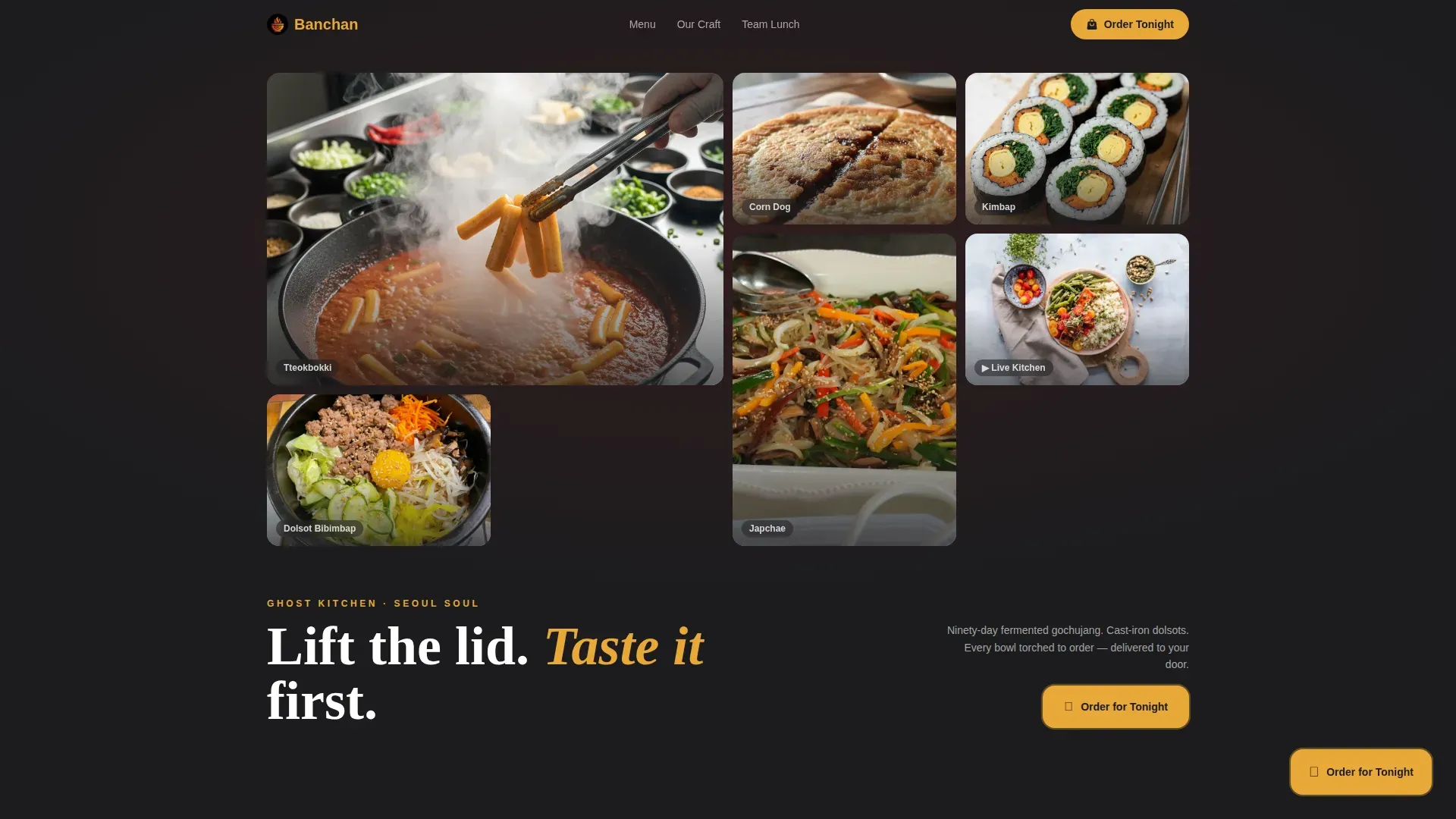
- Nine-tile Photo Grid Mosaic header with one video tile showing broth being ladled, steam CSS overlays, and asymmetric food photography that acts as a visual menu before a single word loads
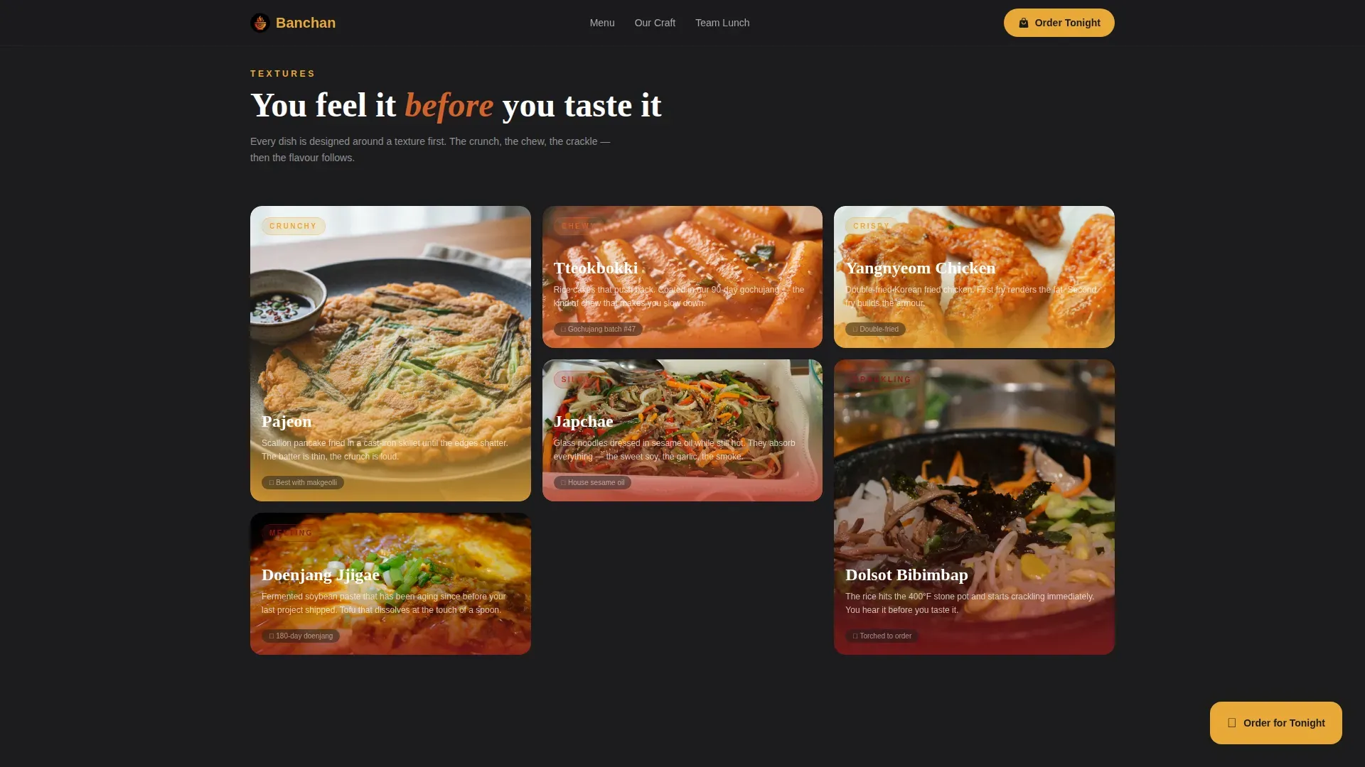
- Modular card grid sections covering textures, a heat spectrum visualizer, and a fermentation craft story, each row targeting a different sense to keep visitors engaged through every scroll step
- Floating scheduling drawer with 30-minute delivery window slots, heat preference selection (mild, proper, or punishment), and a separate team lunch path with a date picker, headcount field, and dietary notes textarea
Feature list
This template ships with six core features, each grounded in the source brief. Together they form a complete sensory-ordering system for a cloud kitchen that takes its craft seriously.
Nine-Tile Photo Grid Mosaic Header
The header is not a single hero image. It is a nine-tile asymmetric mosaic of tightly cropped food photography: tteokbokki glaze, kimbap cross-sections, japchae sheen, blistered Korean corn dog skin. One tile plays a muted video loop of broth being ladled. Steam overlays on each tile make the header feel alive. This mosaic is the menu before the menu, every tile is a different craving, and it earns the click before any copy loads.
Taste and Aroma Card Grid Sections
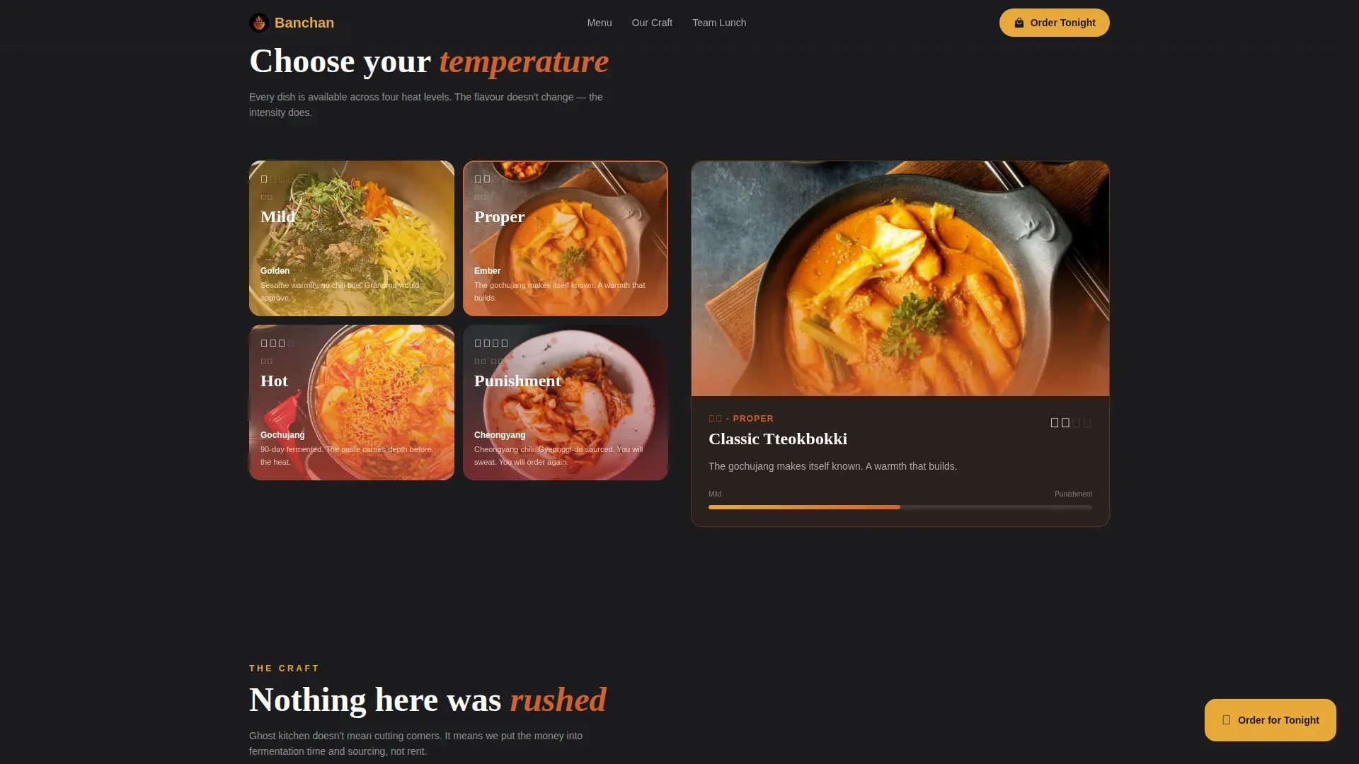
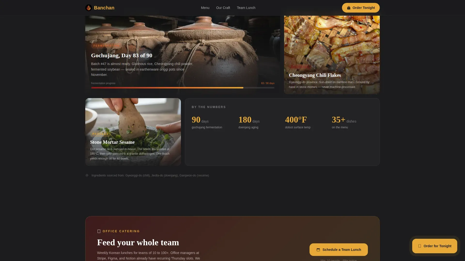
Three distinct card grid rows drive the scroll. The first row centers on textures: crunchy, chewy, crispy sensory cards that make visitors almost feel the food. The second row is a heat spectrum visualizer where cards shift in color intensity from sesame gold to deep gochujang red, showing heat levels as a visual gradient. The third row is the craft story: fermentation timelines, sourcing shots of Cheongyang chili flakes, and a hand grinding sesame in a stone mortar. Each row targets a different sense and keeps the visitor moving forward.
Floating "Order for Tonight" Call-to-Action Button
A sesame gold floating button stays pinned on screen through every scroll step. Tapping it opens a scheduling drawer slide-up that lets visitors pick a 30-minute delivery window, set their party size, and choose their heat preference. This makes the order path frictionless. The visitor never has to search for a way to order, the button is always in the light, always ready.
Team Lunch Scheduling Path
Alongside the solo order path, the drawer includes a separate tab for team lunch scheduling. Office managers can pick a date, enter a headcount, and add dietary notes in a textarea. This makes the template useful for both the late-night individual and the office manager organizing a weekly lunch for forty. Two audiences, one drawer, zero extra pages.
Sunset Gradient Haute Craft Visual Identity
The design is built on a four-color Sunset Gradient system: deep gochujang red (#8B1A1A), molten kimchi orange (#D4622B), golden sesame (#E8A838), and charcoal dolsot black (#1C1C1E). Cards sit on the charcoal base with gradient edges that shift from red to gold. This color system uses a cultural palette inspired by Korea to stimulate appetite and set the cloud kitchen apart from generic restaurant websites. Typography uses Fraunces for display headings and DM Sans for body and interface text.
Fermentation and Sourcing Credibility Blocks
The craft story section functions as social proof built into the page structure. Fermentation timestamps like "Gochujang batch #47, day 83 of 90" appear as credibility markers. Sourcing callouts name specific origins: Cheongyang chili flakes from Gyeonggi-do. Expat testimonial cards reinforce authenticity for visitors who know exactly what the food should taste and smell like. This level of transparency around ingredients and process helps build trust in a category where customers cannot see the kitchen.
Page sections overview
| Section | Purpose |
|---|---|
| Photo Grid Mosaic | Nine-tile asymmetric header with one video tile and steam overlays to open with full sensory impact |
| Texture Card Grid | Modular crunchy, chewy, crispy sensory cards that make visitors feel the food before reading the menu |
| Heat Spectrum Cards | Color-shifting cards from sesame gold to gochujang red that visualize heat levels as a gradient |
| Craft Story Section | Fermentation timelines, sourcing photography, and stone mortar imagery to establish authentic cloud kitchen credibility |
| Scheduling Drawer call to action | Floating "Order for Tonight" button that opens a slide-up drawer with delivery slots, heat preference, and team lunch path |
| Minimal Footer | Ultra-minimal horizontal flow footer that keeps the page clean and focused on conversion |
Design & branding system
The visual identity follows a Haute Craft direction that feels like watching the sun drop behind a Seoul rooftop bar, warm light sliding from amber to ember across lacquered wood and dark ceramic. Every design choice is intentional. The color system communicates heat, craft, and appetite before the visitor reads a single word. The typography pairing keeps the page readable on any device while maintaining a refined, premium feel.
- Color palette: charcoal dolsot black (#1C1C1E) as the base, gochujang red (#8B1A1A) and kimchi orange (#D4622B) for heat and intensity, sesame gold (#E8A838) for interactive elements and the floating call-to-action, each shade drawn from real Korean pantry and ceramic references
- Typography system: Fraunces serif for display headings that carry editorial weight, DM Sans for clean body text and interface labels, a pairing that makes the menu feel both classic and fresh
- Animation and interactivity: mosaic tile hover reveals, heat card color transitions, floating button pulse, scroll-linked card stagger, and steam CSS animation, all set to create a high-interactivity experience without slowing the page down
Mobile & speed optimization
Over 59% of food searches happen on mobile. This template is built mobile-first because the primary ordering audience is a late-night developer on a phone at midnight, not a desktop user at a desk. Large, tap-friendly buttons and a slide-up scheduling drawer make the ordering flow easy to complete on a small screen. The design scales up to desktop excellence for office managers who search for catering options during the work day.
- Mobile-first card grid layout with tap-friendly buttons, a floating call-to-action that is always visible, and a scheduling drawer optimized for thumb reach on any device
- Lazy-loaded images and a muted autoplay video tile so the mosaic header loads in stages rather than all at once, keeping the page light and responsive for late-night mobile users
How this template helps you convert
A high-converting landing page for a Korean cloud kitchen must emphasize freshness, authenticity, and convenience at every scroll step. This template builds the conversion path into the page structure itself, so visitors never have to search for a next step, the next step is always visible and always easy.
- The mosaic header earns the click before copy loads, nine food tiles and one live video create appetite at first sight, so visitors are already leaning toward an order before they read a word about the menu or the restaurant
- The sensory card grid sections hold attention through the full scroll, each row targets a different sense, which makes visitors feel the food through the screen and keeps them engaged long enough to reach the scheduling call-to-action at the bottom
- The floating scheduling drawer removes every barrier to ordering, visitors choose a delivery window, set a heat level, or start a team lunch booking from a single persistent button that stays in view on every device throughout the entire page experience
Other information about this template
This template sits in the Food and Beverage category, specifically the Korean Cloud Kitchen niche. It is built as a card grid single-page layout and designed for operators who want to launch a professional cloud kitchen website quickly without needing a development team. The Banchan Haute Craft Korean Cloud Kitchen landing page template brings together every element a ghost kitchen needs to start converting visitors into loyal customers from day one.
Digital marketing strategies are essential for promoting cloud kitchens in a competitive delivery market. This template supports those strategies by making the landing page itself a marketing asset. Engaging content like the video tile and food photography can attract customers and be repurposed across social media platforms to reach new audiences. Customer reviews and testimonials carry significant weight in this category, which is why expat testimonial cards and fermentation timestamps are built into the craft story section as first-class content rather than afterthoughts.
Partnerships with food delivery services can enhance the reach of a cloud kitchen. This template is designed to work alongside those partnerships by giving the brand a home base, a site that feels more premium than a third-party listing page. Visitors who find the brand through a delivery app can search for the cloud kitchen website and land on a page that builds deeper trust and encourages direct ordering.
Cloud kitchens focus on delivery and takeout, so the restaurant does not need a physical dining space to project a world-class brand. This template makes that possible. The Banchan concept proves that a ghost kitchen can feel as refined and desirable as any full-service restaurant in town, simply by centering the design around sensory storytelling and craft transparency.
No-code tools allow users to create websites without needing extensive programming knowledge. This template is built for that world: it can be customized to fit specific business needs without developer overhead, which reduces the time and cost associated with website development. No-code platforms make it easy for small to medium cloud kitchen businesses to launch quickly and start sharing their offerings with the right audience from day one.
- The template supports both English dish names and Hangeul labels to establish authenticity for Korean expat visitors and first-time customers alike
- Promotions such as Banchan Starter Sets or Weekly Subscription Boxes can be surfaced within the card grid sections to encourage higher order values and build recurring customer loyalty
- A subscription model for banchan side dishes can be highlighted as a separate offering for customers who love the food and want it delivered on a set schedule every week
- The page is localized for the United States market, with USD pricing and Korean dish names that include English descriptions so visitors at every familiarity level can find what they are looking for
- Social media links can be incorporated into the minimal footer to help engage customers and promote the cloud kitchen brand beyond the landing page
- The color system and craft story content work together as a complete digital storefront that visually transports the user to an authentic Korean dining experience without wasting a single scroll
Theme
Haute Craft
Creative direction
Taste & Aroma
Color system
Sunset Gradient
Style
Card Grid (Modular)
Direction
Booking/Scheduling
Page Sections
Nine-tile Photo Grid Mosaic Header
Taste and Aroma Sensory Card Grid
Floating Scheduling Drawer with Heat Preference
Fermentation and Sourcing Credibility Blocks
Sunset Gradient Haute Craft Visual Identity
Expat Testimonial and Social Proof Cards
Related questions
Who is this template designed for?
Does this template include a scheduling and ordering system?
Can I customize the colors and typography for my own cloud kitchen brand?
What sections does this landing page include?
Is this template suitable for both mobile and desktop users?



