Thai Dining Booking Website Template
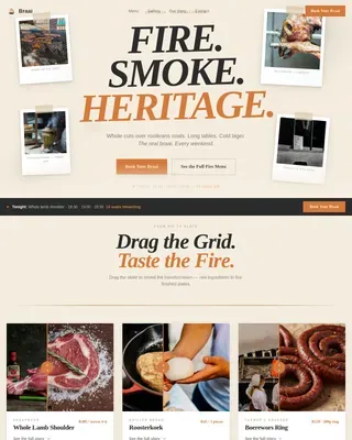
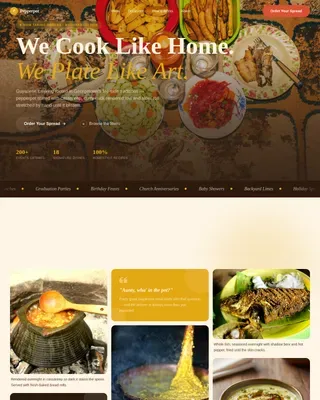
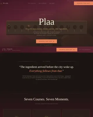
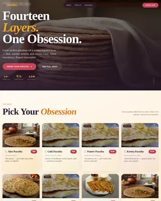
Krathong is an immersive Thai pop-up restaurant landing page built on a modular card grid. It blends candlelit editorial photography, chiaroscuro dish cards, and urgency-driven event booking into one atmospheric single-page experience. Designed for direct seat reservations, it guides design-conscious food lovers from first impression to checkout with minimal friction.
by Rocket studio
Quick summary
Krathong is a single-page landing page template for a rotating Thai pop-up restaurant. It combines full-bleed overhead photography, a modular dish card grid, and direct booking event cards to turn first-time visitors into confirmed dinner guests. The layout is mobile-first, tactile in feel, and built around urgency signals that move seats fast.
Who this template is for
This template is built for operators who want every pixel to earn its place at the table. If your dining concept lives and dies by atmosphere and word of mouth, this layout gives you the tools to communicate that before a single fork is lifted.
- Pop-up restaurant hosts who rotate menus, venues, or residency schedules seasonally
- Independent chefs and culinary creatives selling limited-seat tasting experiences directly to guests
- Food event producers who need a booking-ready page that also works as a brand statement
What problem this template solves
Most event pages feel like spreadsheets with a date and a PayPal link. They fail to communicate the mood, the craft, or the reason a guest should choose this dinner over every other option that weekend. Krathong closes that gap.
- Visitors arrive on a page that immediately feels like the experience itself, not a transaction form
- Seat scarcity and sold-out signals are built into the event card layout, creating natural urgency without pushy copy
- A secondary waitlist capture path keeps sold-out dates working as lead generators instead of dead ends
What you get with this template
The template delivers a complete single-page flow, from a cinematic hero to a footer with essential links. Every section serves a specific role in moving a visitor from discovery to reservation.
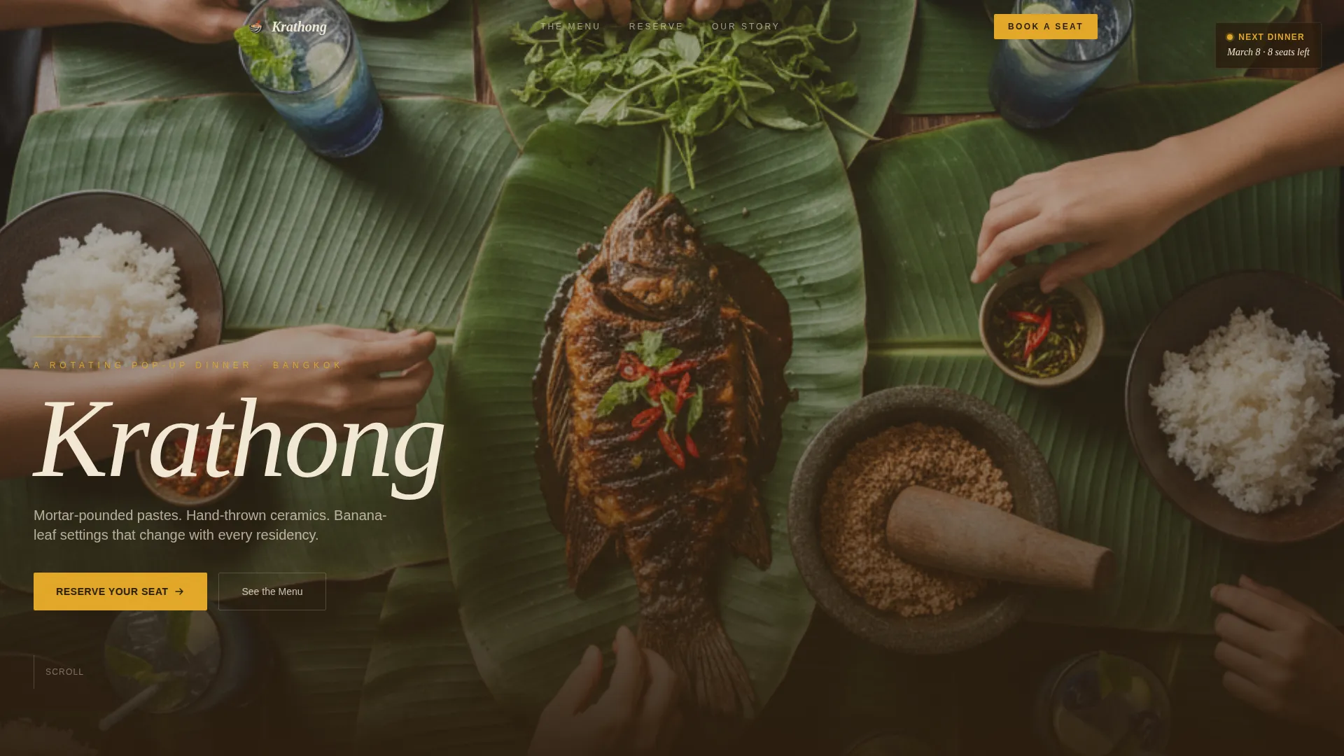
- A full-bleed overhead hero photo section with a fade-in serif headline and no distracting navigation
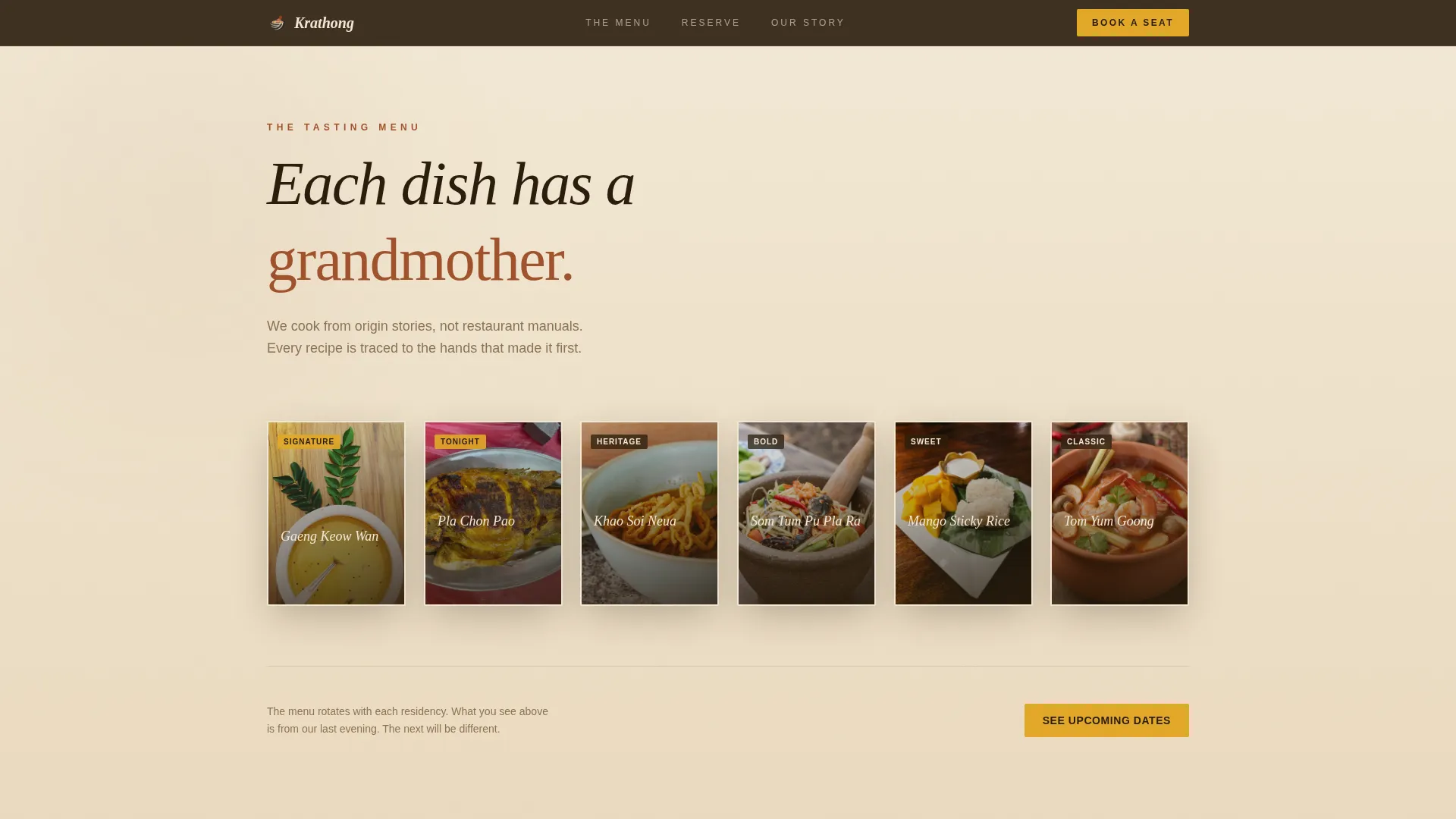
- A modular chiaroscuro dish card grid with one-line origin stories and card hover reveal interactions
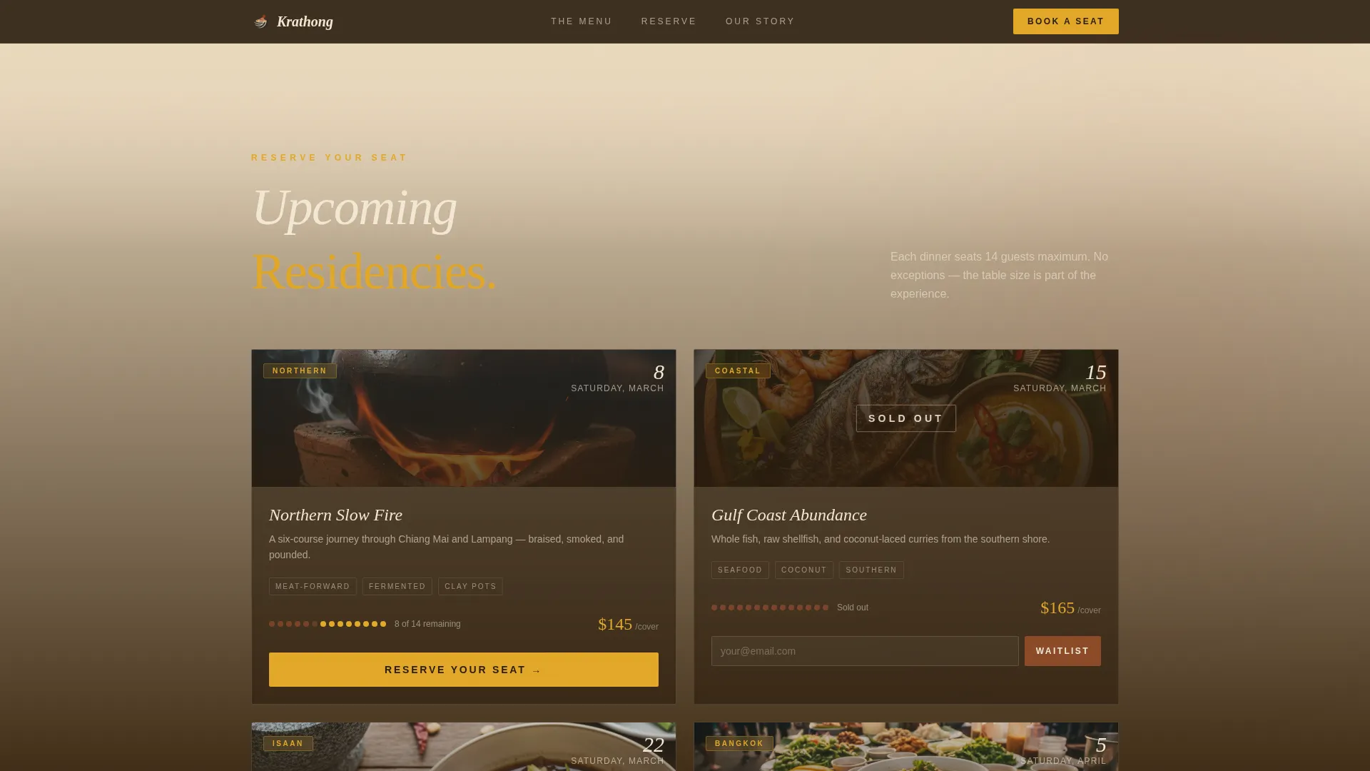
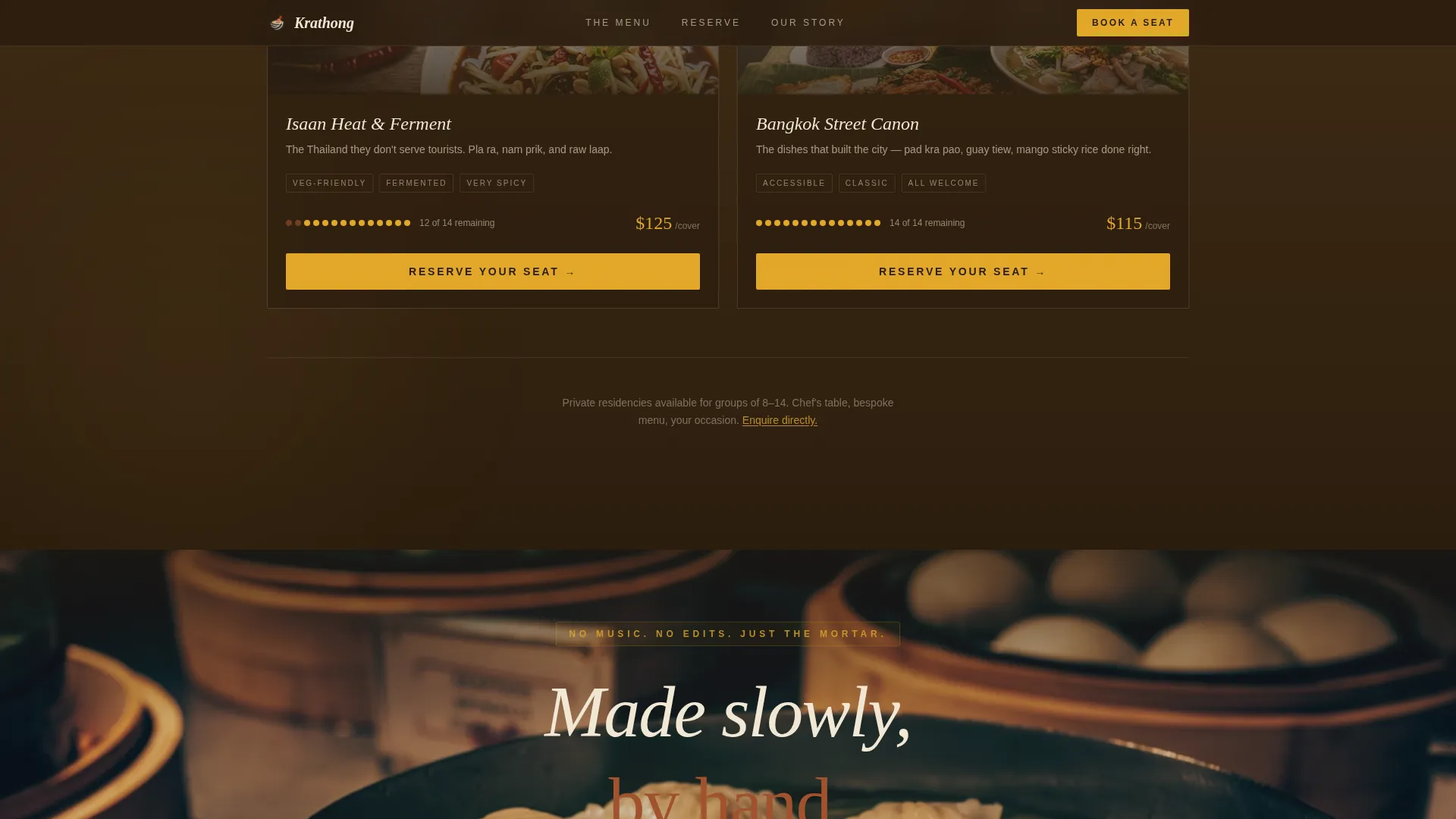
- Upcoming event bento cards with seat count, price per cover, a turmeric-gold reserve button, and a waitlist capture for sold-out dates
Feature list
This template is built around a set of focused, purpose-built components. Each one is described below.
Cinematic Full-Bleed Hero
The hero occupies the full viewport with an overhead table photograph taken mid-service. The pop-up name appears in a thin serif typeface that fades in along the bottom edge. There is no navigation bar, which keeps the immersive opening scene completely uninterrupted.
Modular Chiaroscuro Dish Card Grid
Each dish card features dramatic low-light photography against raw wood, paired with a single line tracing the dish's origin. Cards rearrange dynamically by upcoming event date. Hover interactions reveal additional detail, and the background shifts gradually from parchment to deep charcoal as the visitor scrolls deeper into the page.
ASMR Full-Width Video Break
Midway through the page, a full-width video card interrupts the grid with an unscored, close-up recording of som tum being pounded in a mortar. The absence of music lets the natural sound carry full sensory weight.
Direct Booking Event Cards
Each upcoming dinner date lives on its own bento-style card showing seat count, price per cover, and a prominent reserve button in turmeric gold. Clicking opens a minimal modal checkout for guest count, dietary flags, and payment.
Waitlist Email Capture
Every sold-out event card includes a waitlist entry point placed directly beneath the sold-out badge. This converts scarcity into an active lead list rather than a closed door.
Testimonials and Arc-Split Footer
A guest testimonial section provides intimate social proof from past dinners. The footer follows an arc-split pattern with the logo and tagline on the left and essential navigation links on the right.
Page sections overview
| Section | Purpose |
|---|---|
| Full-Bleed Hero | Sets atmosphere, introduces the pop-up name with a fade-in serif |
| Dish Card Grid | Showcases menu dishes with origin stories and hover reveals |
| Upcoming Events | Displays dinner dates with seat count, price, and booking action |
| ASMR Video Break | Delivers a full-width sensory moment that deepens engagement |
| Guest Testimonials | Builds trust through intimate, first-person quotes from past guests |
| Waitlist Capture | Converts sold-out urgency into email leads for future events |
| Arc-Split Footer | Closes the page with branding, tagline, and essential links |
Design & branding system
The visual identity is built around a Haute Craft aesthetic: editorial, tactile, and deliberately imperfect in the most considered way. Every color and typeface choice supports the feeling that this food was made slowly, by hand, for a very specific kind of guest.
- Color palette uses unbleached parchment (#F2E8D5) as the base, fired terracotta rust (#A0522D) for structural accents, charred coconut shell (#2B1D0E) for deep backgrounds and text, and bright turmeric (#E2A829) reserved for buttons, price tags, and hover states
- Typography pairs Fraunces, a variable serif display face, for headlines and dish names with DM Sans for all body copy, menus, and interface labels
- Scroll-triggered parallax shifts the background progressively from parchment to charcoal, mimicking the transition from afternoon prep light to evening service
Mobile & speed optimization
The template is built mobile-first because the primary audience browses on their phones at events, in transit, and while deciding on weekend plans. The layout adapts gracefully at every breakpoint without sacrificing the visual quality that makes the template work.
- The modular card grid reflows cleanly from multi-column desktop to single-column mobile without losing the chiaroscuro photography impact
- GSAP ScrollTrigger animations are applied selectively, with static server components handling content delivery and client components managing animation and interactivity
- Modal-style booking and card hover reveals are touch-optimized so the reservation flow works as smoothly on a phone as on a desktop
How this template helps you convert
Every structural decision in this template points toward one outcome: a guest clicking "Reserve Your Seat" before they close the tab.
- The hero communicates atmosphere before any text is read, which pre-qualifies visitors who feel aligned with the experience and primes them to commit
- Seat count and price are visible directly on each event card, removing friction and letting urgency do its job without additional copywriting
- The waitlist placement beneath every sold-out badge ensures that even guests who miss a date stay connected and return for the next one
Other information about this template
This template is a strong fit for culinary concepts that rely on storytelling as much as on the food itself. The structure supports rotating event schedules without requiring a full rebuild between residencies.
- The card grid layout is modular, meaning sections can be reordered or expanded as the pop-up schedule grows
- Dietary flag options in the booking modal cover vegetarian, shellfish, and peanut preferences out of the box
- The arc-split footer pattern keeps the page feeling editorial rather than transactional at close
- English language copy and USD pricing are the default configuration, with Bangkok and global event contexts both supported by the layout
- The FAQ accordion component is available within the interactive layer of the page for guest questions about format, policy, or menu details
Theme
Haute Craft
Creative direction
Immersive Visual
Color system
Parchment & Rust
Style
Card Grid (Modular)
Direction
Direct Sales
Page Sections
Cinematic Full-bleed Hero Section
Chiaroscuro Dish Card Grid
ASMR Full-width Video Card
Urgency-driven Event Booking Cards
Sold-out Waitlist Capture
Testimonials and Arc-split Footer
Related questions
Can I update the event cards each time I host a new dinner?
Does the template handle both reservations and waitlist signups?
What does the booking modal collect from guests?
Is this template suitable for a chef running multiple pop-up events per month?
How does the page communicate urgency without aggressive copy?