Rustic Slovenian Restaurant Landing Page Template
Krma is a single-column landing page template built for a heritage Slovenian restaurant. It scrolls through the story of the land, the family, and the kitchen before offering three conversion paths: table reservation, pantry shop, and event hosting. The Parchment and Rust color system and Fraunces serif typography give every section the warmth of a well-worn recipe card.
by Rocket studio
Quick summary
Krma is a story-first landing page template for a Slovenian hearth restaurant. It uses a scrolling Origin Story structure to build trust across six sections, then converts visitors through three parallel paths: reserve a table, order pantry goods, or host a gathering. The design feels warm, aged, and editorial from the first full-bleed image to the footer.
Who this template is for
This template is built for heritage and experiential dining restaurants that lead with story before they lead with a menu. It suits independent operators who want their online presence to feel as considered as the meal itself.
- Restaurant owners running a heritage, farm-to-table, or regional cuisine venue
- Hospitality operators who need a reservation form, a small shop, and an event inquiry path on one page
- Food and travel writers or cultural venues wanting an editorial, narrative-led restaurant page
What problem this template solves
Most restaurant templates treat the page as a digital menu board. They list dishes, show a phone number, and call it done. A place with a genuine story loses its most persuasive asset when squeezed into that format.
- Visitors arrive without context and leave before they feel anything
- A restaurant with multiple revenue paths (dining, retail, events) has no clean way to surface all three at once
- Rustic, artisan, and heritage venues look inconsistent when forced into generic, modern-minimal templates
What you get with this template
You get a fully structured single-column landing page that unfolds the restaurant's story in six deliberate sections. Every design decision reinforces the warmth and authenticity of the brand before the visitor reaches a call to action.
- A six-section narrative layout moving from hero image through land, family, kitchen, guest voices, and three conversion paths
- A three-path conversion section with a reservation form, a pantry shop link, and an event inquiry form built into one cohesive block
- A Parchment and Rust visual system with aged cream backgrounds, rust headlines, charcoal body text, and sage accent states
Feature list
This template is built around a set of focused, prompt-backed capabilities that serve both storytelling and conversion goals.
Full-Bleed Cinematic Hero
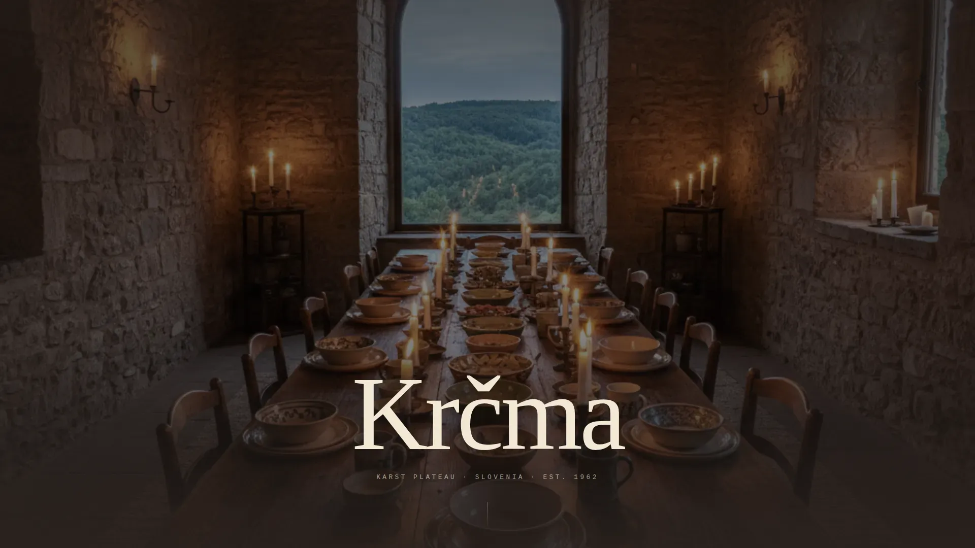
A doorway-perspective dining room photograph fills the entire viewport. The restaurant name appears in serifed cream type over the image, as if carved into the photograph. There is no navigation bar and no logo competing for attention.
Scrolling Origin Story Structure
Six content sections unroll like chapters in a family memoir. The sequence moves from the land and its farms through generational family photographs and into the kitchen, building emotional depth before any conversion moment appears.
Three-Path Conversion Block
After the story lands, visitors choose their own next step. A reservation form with a seating preference toggle, a pantry shop with cart functionality, and an event inquiry form with occasion type and guest count fields are presented as three parallel, equal-weight paths.
Persistent Reservation Bar
A quiet rust-colored bar stays pinned at the bottom of the viewport throughout the entire scroll. It keeps the primary call to action reachable without interrupting the reading experience.
Staggered Kitchen Gallery
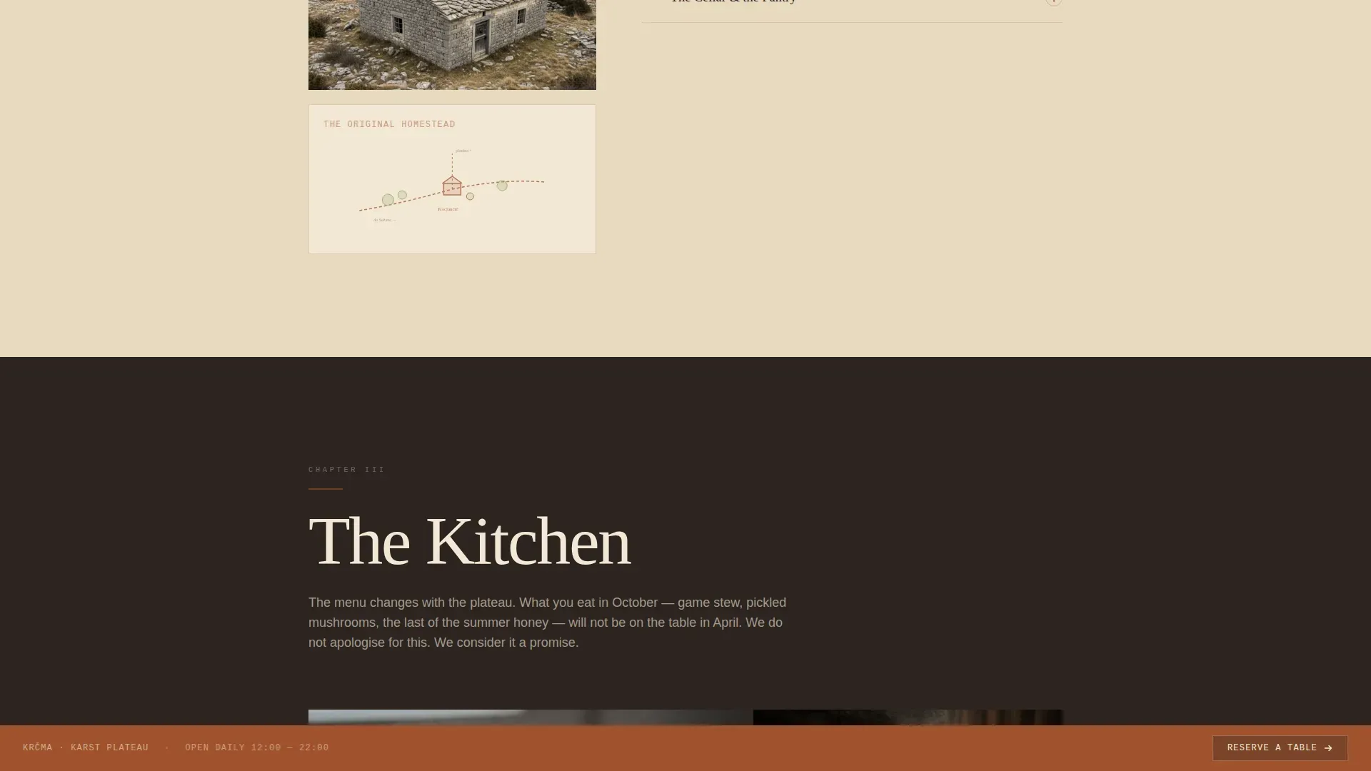
Close-up texture photography of dishes, dough, and smoked ingredients is arranged in a staggered gallery layout. A seasonal menu preview sits alongside it, keeping the food itself visually central.
Named Guest Testimonials
A dedicated section presents specific testimonials with guest names and occasion context. This grounds social proof in real dining moments rather than anonymous star ratings.
Page sections overview
| Section | Purpose |
|---|---|
| Hero Image | Opens the page with a full-bleed dining room photograph and the restaurant name in serifed type |
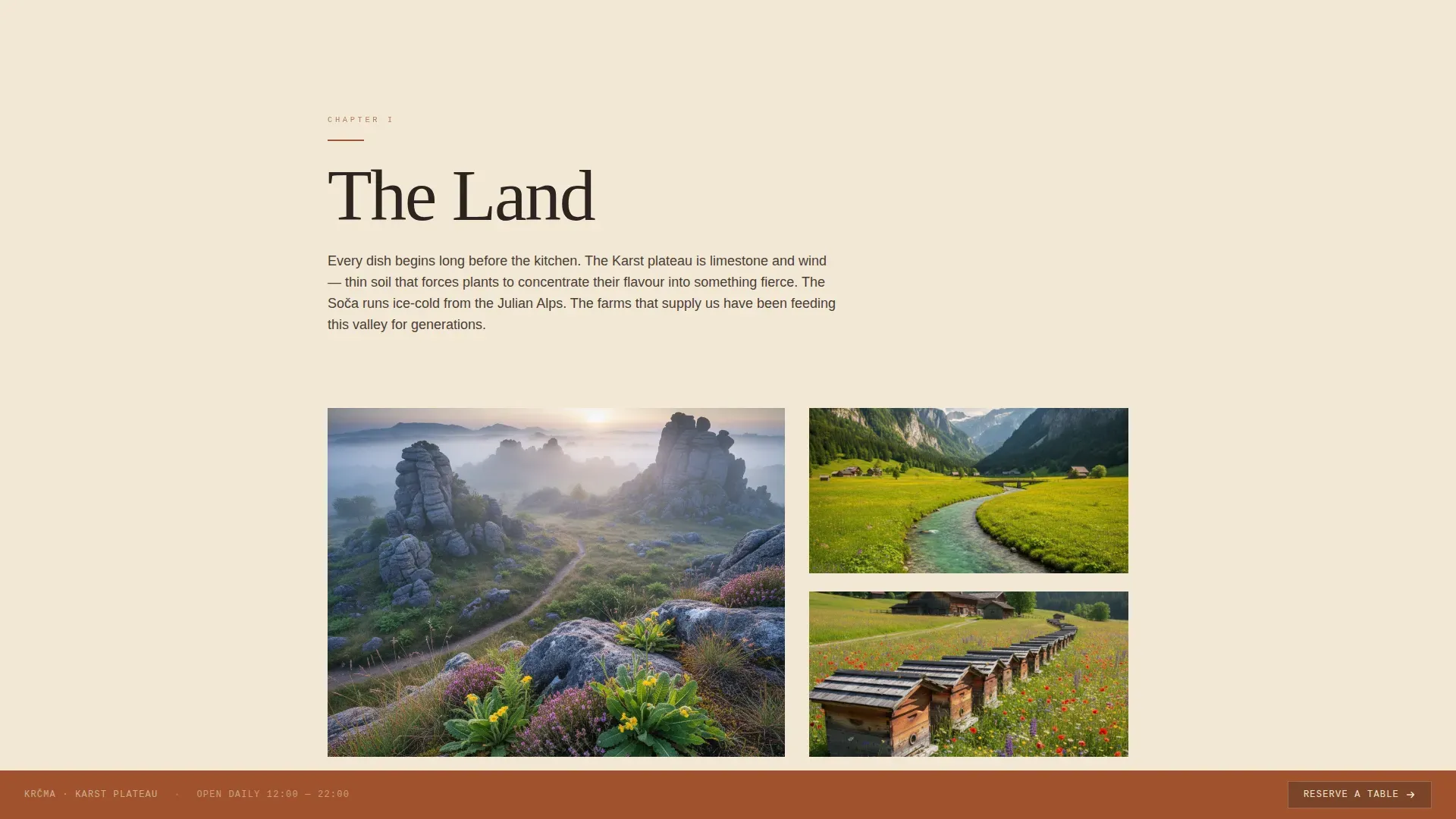
| The Land | Tells the sourcing story of the Karst plateau and named supply farms |
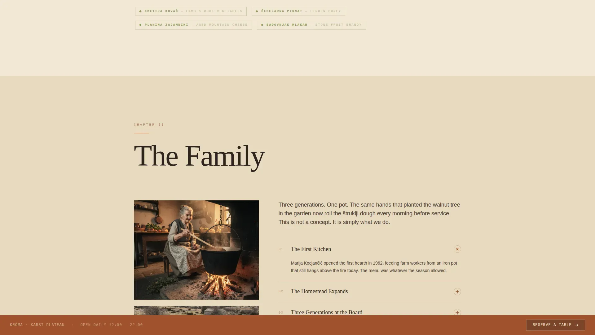
| The Family | Presents generational photographs, a hand-drawn map feel, and a methodology accordion |
| The Kitchen | Shows staggered dish texture photography alongside a seasonal menu preview |
| Guest Voices | Displays named testimonials with specific occasions and quotes |
| Three Paths | Presents the reserve, pantry, and host conversion forms in one parallel block |
| Minimal Footer | Closes the page with a horizontal flow footer pattern |
Design & branding system
The visual identity follows a Pastoral Calm theme. Every color, typeface, and spacing choice reinforces the feeling of a hand-written recipe card found inside a grandmother's cupboard.
- Color system: aged linen cream (#F2E8D5) dominates backgrounds, iron-oxide rust (#A0522D) carries headlines and borders, charred hearthstone (#2C2420) grounds body text, and dried-herb sage (#8A9A5B) appears on hover states and seasonal tags
- Typography: Fraunces serif for headlines, DM Sans for body text, and JetBrains Mono for labels and small callouts
- Interaction layer: scroll-reveal section animations, image hover transitions, and accordion interactions in the family section keep the page alive without feeling flashy
Mobile & speed optimization
The template is built desktop-first but ships with full mobile responsiveness across all six sections. The layout reflows cleanly so the storytelling sequence holds its meaning at any screen size.
- Single-column flow adapts naturally to narrow viewports without breaking the narrative order
- Native CSS smooth scroll and Intersection Observer-based reveals keep the animation layer lightweight
- The persistent reservation bar and three-path conversion block restack cleanly for touch interaction on smaller screens
How this template helps you convert
The page is structured so that trust is built before any ask is made. By the time a visitor reaches the Three Paths section, they have already experienced the land, the family, and the kitchen.
- The Origin Story sequence earns emotional investment early, so the reservation form feels like a natural conclusion rather than an interruption
- Three parallel conversion paths let different visitor types (diners, gift buyers, event planners) each find a relevant next step without friction
- The pinned rust reservation bar keeps the primary conversion action present throughout the entire scroll without aggressive interruption
Other information about this template
This template is designed for the specific intersection of heritage dining, Central European cuisine, and experiential restaurant marketing. A few additional details worth knowing before you use it.
- Currency and date formatting are configured for European convention, using EUR and day-month-year order, with Slovenian place names used throughout the demo content
- The demo content references the Karst plateau, the Soča valley, and dishes including štruklji, žganci, and game stew, giving the template an immediately usable regional context
- The footer follows a horizontal flow pattern and is intentionally minimal, keeping visual weight at the top of the page where the story lives
Theme
Pastoral Calm
Creative direction
Origin Story
Color system
Parchment & Rust
Style
Single Column Flow
Direction
Marketplace/Multi
Page Sections
Full-bleed Cinematic Hero Section
Six-chapter Origin Story Layout
Three-path Conversion Section
Persistent Viewport Reservation Bar
Staggered Kitchen Gallery and Menu Preview
Named Social Proof Section
Related questions
Can I use this template for a restaurant outside Slovenia?
What are the three conversion paths in this template?
Does the pinned reservation bar appear on mobile screens?
Is this a single page or a multi-page template?
What typography and color system does this template use?



