Elite Karate Community & Marketplace Landing Page
Kumite is a full-width landing page template built for a karate fan community and marketplace. It combines immersive slow-motion video, live stat counters, product listings with provenance detail, and a dual-path signup flow. The design draws from an industrial raw aesthetic: deep black backgrounds, concrete gray structure, electric lime calls to action, and voltage pink live indicators.
by Rocket studio
Quick summary
Kumite is a single-page community and marketplace landing page for karate enthusiasts. It opens with slow-motion tournament footage, escalates through live stat counters, trending product cards, and discussion feeds, and closes with a high-conversion dual-path signup. The visual identity is industrial raw: black, concrete gray, electric lime, and voltage pink working together like neon strips inside a honbu dojo.
Who this template is for
This template is built for the hardcore end of karate culture. It serves people who collect, compete, film, and argue about the sport at a level most casual fans never reach.
- Collectors and sellers trading vintage gi patches, tournament programs, and rare memorabilia
- Community builders running karate discussion spaces, video archives, or fan-led marketplaces
- Organizers wanting a high-impact landing page that speaks directly to serious karate practitioners
What problem this template solves
Generic community templates feel sterile next to the intensity of karate culture. They fail to communicate urgency, authenticity, or the raw energy that keeps obsessive fans coming back daily.
- Bland layouts do not reflect the physicality and discipline behind the sport
- Most marketplace pages bury social proof and make the signup feel optional rather than urgent
- A single onboarding path wastes buyers who are not sellers, and vice versa
What you get with this template
You get a complete, fully designed landing page built around the specific culture of competitive karate. Every section has a defined role and a clear visual hierarchy.
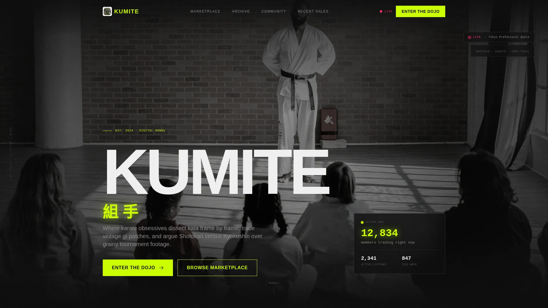
- A full-screen slow-motion video header with a community stat counter burned into the frame
- A live numbers section that opens the scroll with animated figures instead of a welcome paragraph
- Trending marketplace cards, a discussion feed, a video archive teaser, and member-curated collection galleries
Feature list
This template is built around visual intensity and conversion clarity. Every feature listed here is present in the template as described in the source brief.
Full-Screen Video Header
The header fills the viewport edge to edge with desaturated slow-motion tournament footage. Impact moments, a gyaku-zuki landing on a chest protector, chalk dust off a makiwara, a sweep rotating a body through air, are cut tight. The community logo and a single animated member count burn in electric lime against the near-monochrome footage.
Animated Live Stat Wall
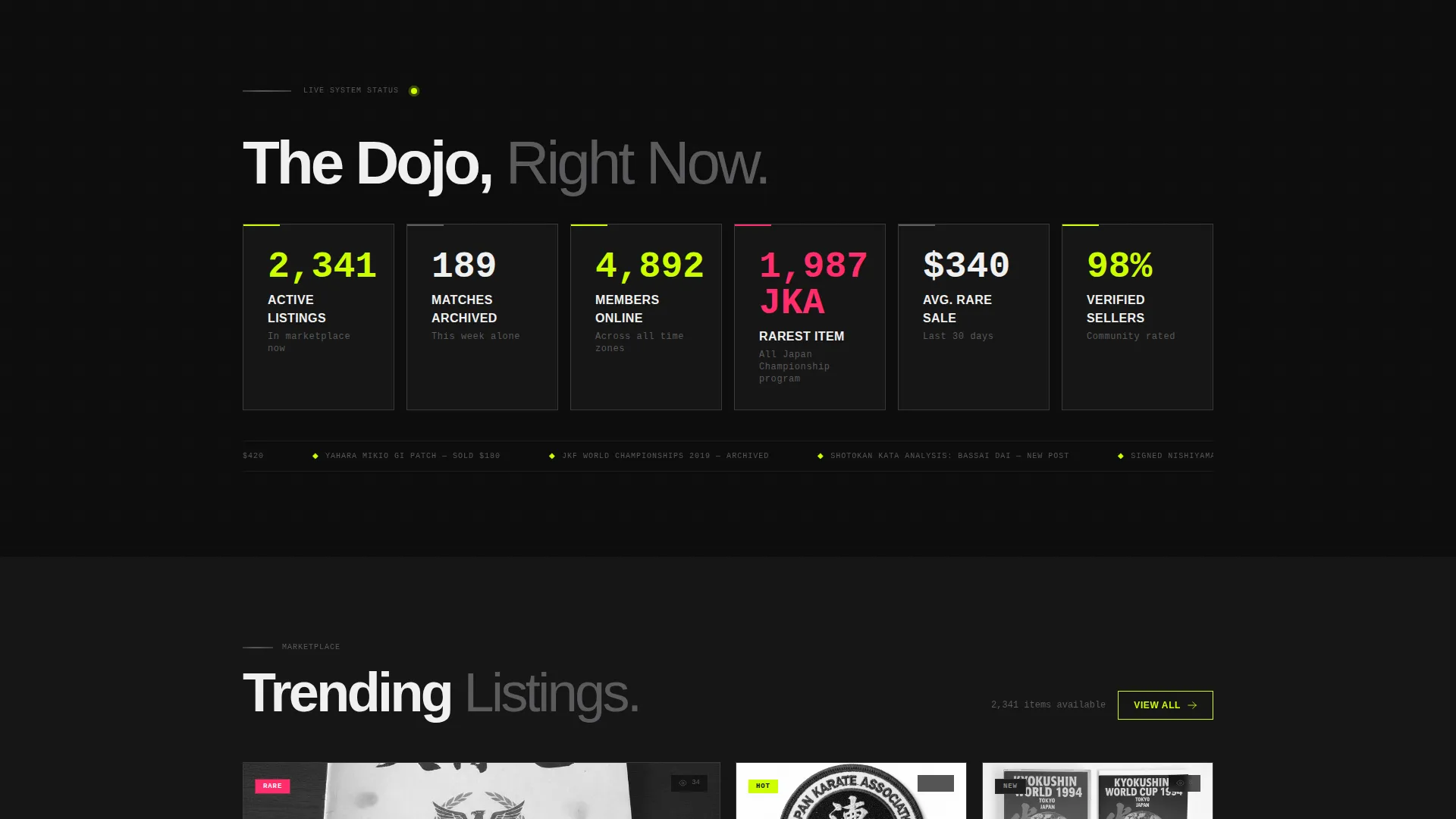
Immediately below the header, a wall of live-style numbers greets the visitor. Active listings, matches archived this week, members online, and the rarest item currently for sale each animate upward on scroll entry like a scoreboard resetting after a bout. This section replaces a traditional welcome message with proof.
Trending Marketplace Cards
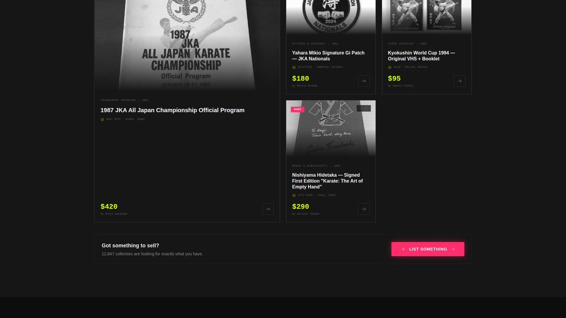
Product listings appear as full-bleed cards showing provenance details alongside the item. Each card is structured to surface context, not just price. A voltage pink "List Something" call to action pins to the bottom of every marketplace section for returning sellers.
Live Discussion Feed
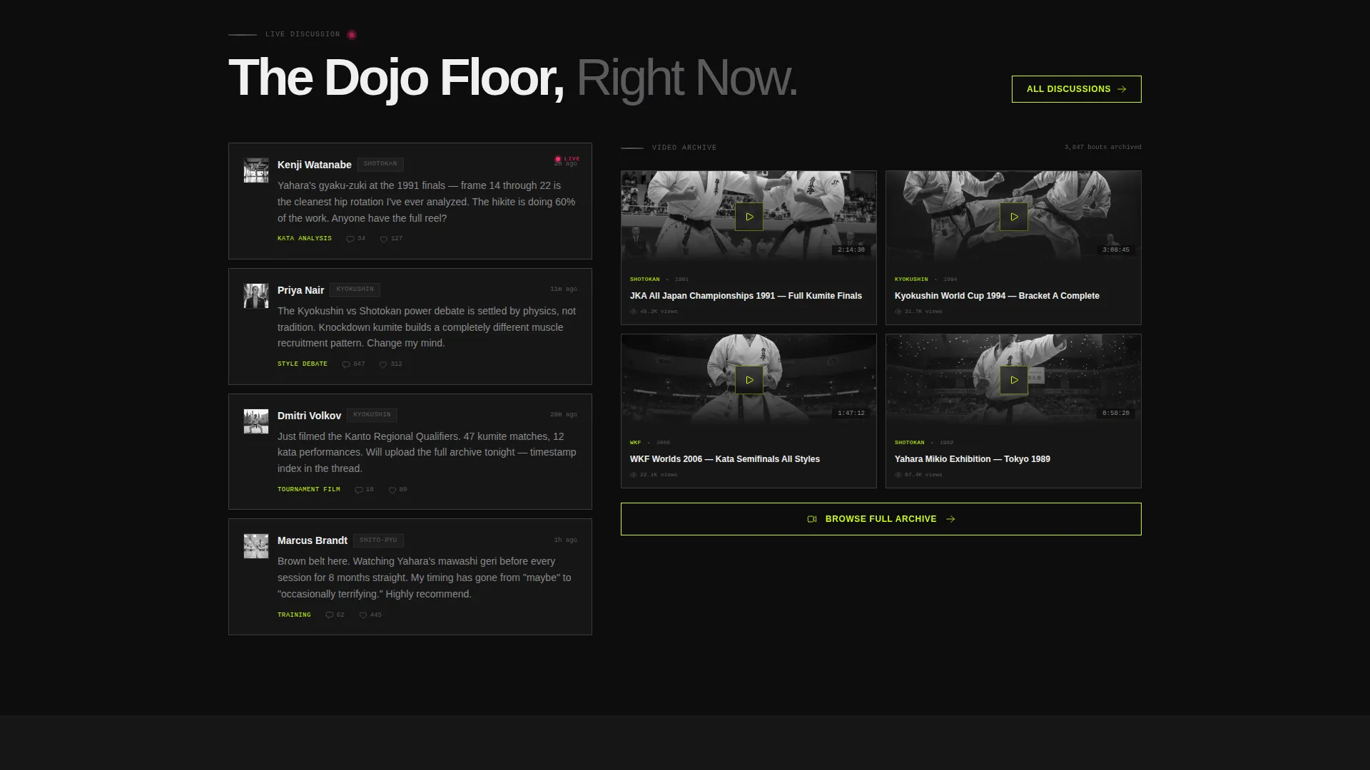
A timestamped tournament commentary feed sits alongside the marketplace sections. It gives the page a pulse, showing visitors that real people are active right now. This feed reinforces the community angle without pulling focus from the conversion path.
Dual-Path Signup Flow
The primary call to action, "Enter the Dojo" in electric lime, opens a one-tap signup. The user enters only an email and selects either "Here to Buy/Sell" or "Here to Watch/Talk." This splits traffic into marketplace or community onboarding from the first interaction.
Recent Sales Carousel
A rotating carousel below the fold shows the highest-value recent sales with final prices visible. This builds social proof and creates genuine urgency. Seeing real sale prices makes the signup feel like a door closing every second the visitor waits.
Page sections overview
| Section | Purpose |
|---|---|
| Full-Screen Header | Opens with slow-motion footage and stat counter |
| Live Stats Wall | Replaces welcome copy with animated live numbers |
| Marketplace Listings | Trending product cards with provenance details |
| Discussion Feed | Timestamped live tournament commentary |
| Video Archive Teaser | Thumbnail grid of legendary archived bouts |
| Member Collections | Gallery-style curated member collection display |
| Recent Sales Carousel | High-value sale proof with final prices shown |
| Dual-Path Signup | One-tap email entry with buyer or community split |
Design & branding system
The visual identity is Industrial Raw, built to feel like a warehouse rave held inside a training hall. Every color has a specific role, and nothing is decorative without purpose.
- Deep foundry black (#0D0D0D) dominates all backgrounds; concrete gray (#3A3A3C) structures cards, rules, and section dividers
- Electric lime (#CCFF00) is reserved for primary calls to action, stat highlights, and anything the eye must land on first
- Voltage pink (#FF2D6B) pulses only on live indicators, sale badges, and alert states, keeping its urgency value intact
Mobile & speed optimization
The template is built with full-width immersive sections that reflow cleanly for smaller viewports. Visual hierarchy is preserved on mobile through deliberate color contrast and minimal layout complexity.
- Full-bleed cards, video headers, and stat walls are structured to remain legible at any common screen width
- Electric lime and voltage pink maintain strong contrast against dark backgrounds across devices
- Section transitions using hard concrete gray horizontal rules keep the rhythm readable on both desktop and mobile
How this template helps you convert
Every design decision in this template moves the visitor toward one of two actions: signing up or listing something. Nothing on the page is neutral.
- The animated stat wall opens the scroll with live proof, replacing passive welcome text with numbers that create immediate credibility and curiosity.
- The dual-path signup removes friction by asking only for an email and one choice, routing buyers and community members into the right experience from the start.
- The recent sales carousel with visible final prices turns social proof into urgency, making inaction feel like a missed opportunity rather than a safe default.
Other information about this template
This template is suited to any karate community or marketplace that wants its landing page to match the intensity of the sport it serves. It works as a standalone launch page, a membership drive page, or the front door to an existing platform.
- The template style follows a full-page immersive structure with hard section breaks and escalating content density
- The neon shock color system and industrial raw theme are consistent throughout, requiring no additional design customization to feel complete
- The page is designed for a karate community and marketplace context, making it a strong fit for subcategory use cases across competitive karate, collector communities, and fan-run training discussion spaces
Theme
Festival Energy
Creative direction
Community Gallery
Color system
Cinematic Dark
Style
Storybook/Full-Page
Direction
Event Registration
Page Sections
Full-screen Video Header
Animated Live Stat Wall
Trending Marketplace Cards
Dual-path Signup Flow
Live Discussion Feed
Recent Sales Carousel
Related questions
Who is this landing page template designed for?
Can I use this template for both a marketplace and a community?
What does the video header section require?
How does the recent sales carousel support conversions?
Is this template easy to adapt to my own brand?