Neo-Retro Yakitori Bar Landing Page Template
A gallery and detail landing page built for an intimate yakitori bar, this template layers a UGC photo wall header, skewer-by-skewer storytelling sections, and a sticky ordering module into one smoke-amber digital experience. It brings the counter culture of a charcoal izakaya to any screen, making guests compose their meal before they ever arrive.
by Rocket studio
Quick summary
This is a single-page gallery and detail template for a yakitori bar. It opens with a mosaic of guest photos, walks visitors through each skewer cut with sommelier-style tasting notes, and closes with an embedded set-builder for pre-orders and reservations. Every section builds appetite and intent at the same time.
Who this template is for
This template suits any operator running a focused, counter-style Japanese grill where the food and the ritual are the whole story. It works equally well at launch or as a refresh for an existing bar that has outgrown a basic menu page.
- Yakitori and kushiyaki bar owners who want to sell pre-ordered skewer sets online
- Food-focused restaurant teams targeting urban diners, late-night regulars, and omakase-adjacent guests
- Designers and agencies building immersive dining experiences for Japanese cuisine and izakaya concepts
What problem this template solves
Most restaurant pages show a static menu and a phone number. This template solves the gap between a guest finding you online and a guest arriving hungry and decided. By the time someone reaches the order module, they have already read each skewer's story and formed a clear picture of the night ahead.
- Guests arrive with no context, scroll a flat menu, and leave without reserving
- Food photography sits scattered across social media rather than working inside a single, converting page
- Operators have no way to capture pre-orders or build party-size and date context before service begins
What you get with this template
You get a complete, single-page layout that moves from sensory storytelling to direct action without friction. Every section is structured and ready for your content, your photography, and your skewer list.
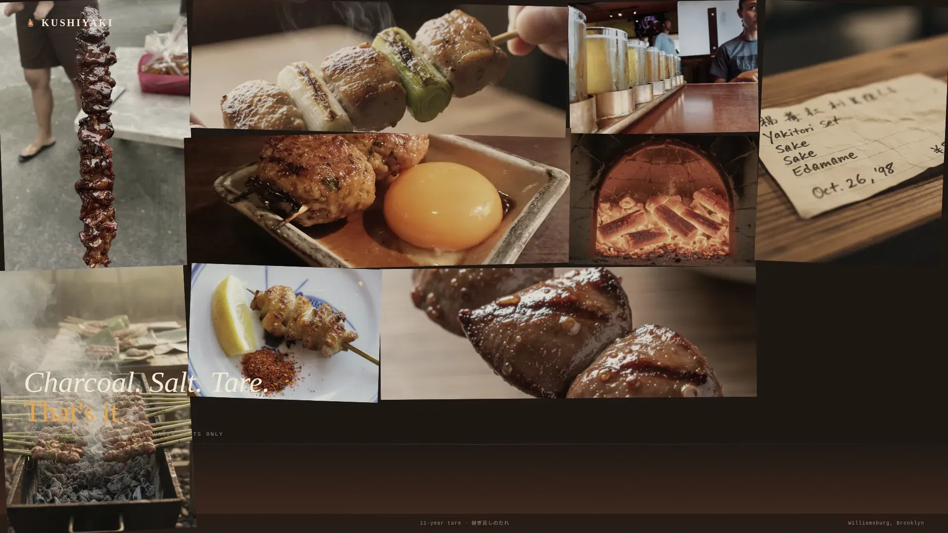
- A UGC photo wall header with logotype placement and a tagline fade-in animation
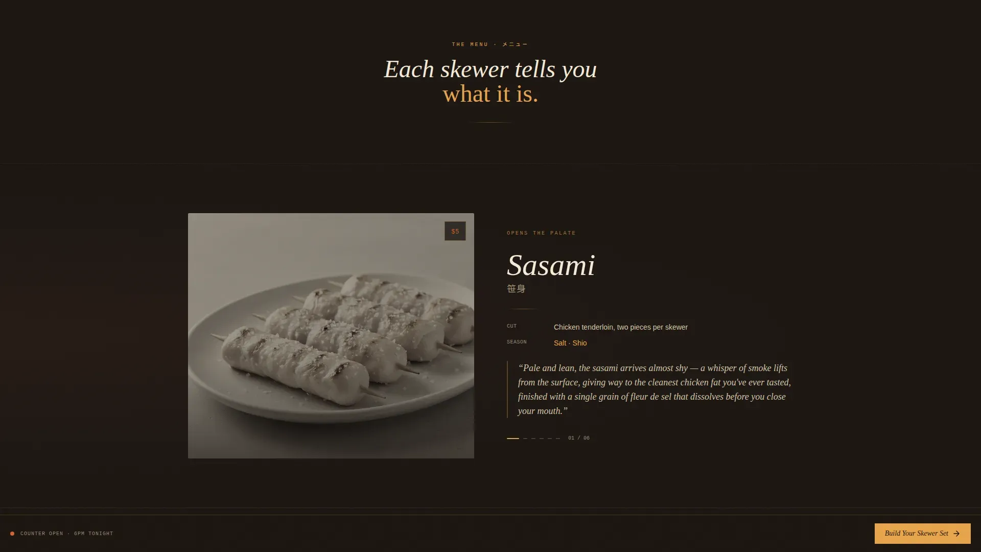
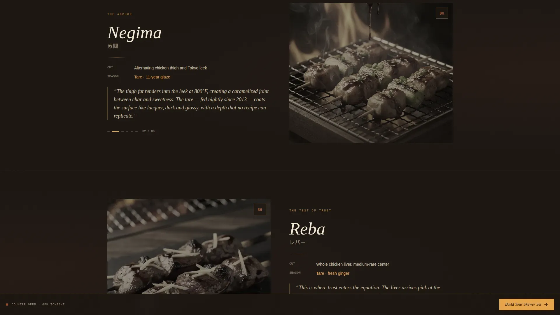
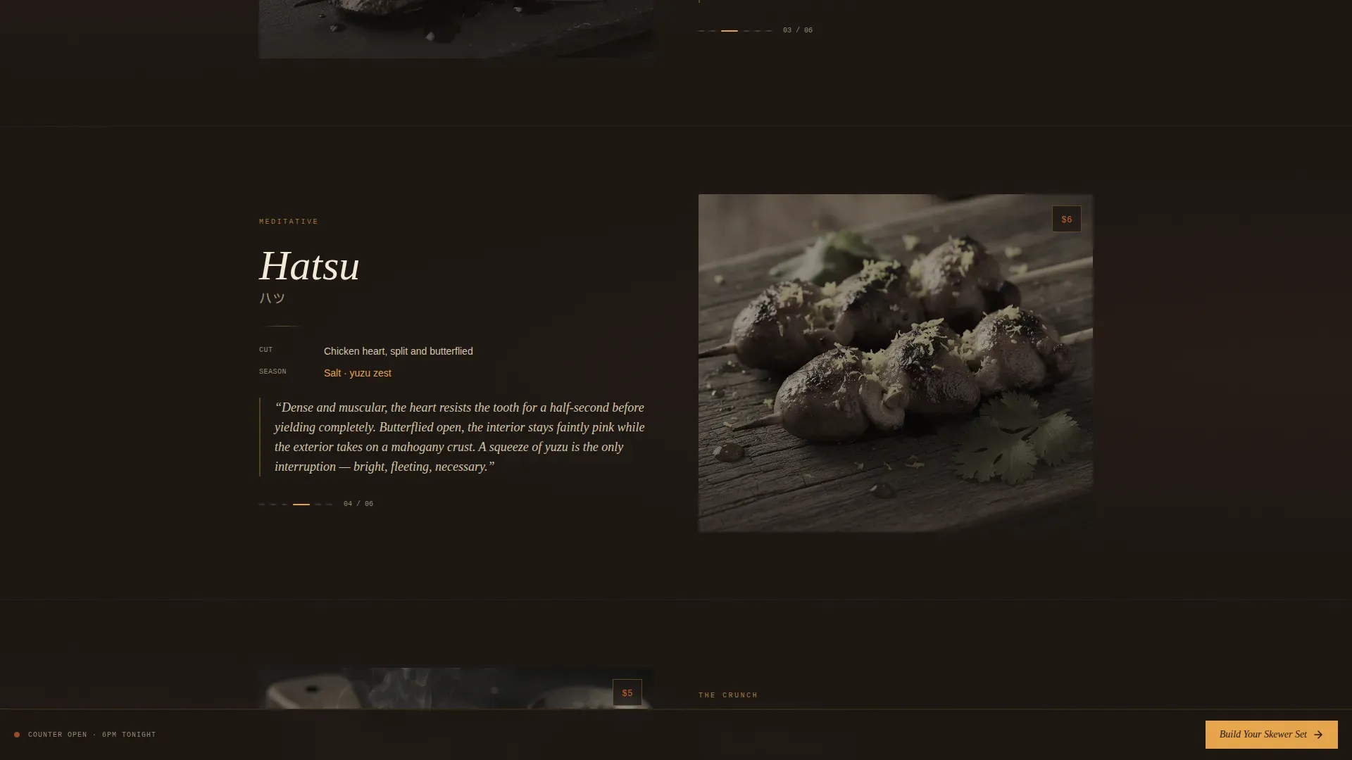
- Alternating skewer story sections with tight-crop photography, cut descriptions, and sommelier-style tasting notes
- Full-bleed atmospheric interlude sections for binchotan, smoke, and counter photography
- A tasting notes grid with price callouts in flame orange
- A sticky "Build Your Skewer Set" bottom bar that opens a visual skewer selector drawer with date picker, party size toggle, and a reservation confirmation button
Feature list
A brief paragraph introduces the features: each component below is drawn directly from the template brief and designed to earn guest trust before the order screen appears.
UGC Photo Wall Header
A dense, overlapping mosaic of guest photos fills the header. Images are grain-filtered and subtly desaturated for visual cohesion. The bar's logotype sits in cream at the top left, and a single tagline fades in over the wall rather than competing with the photography.
Skewer Story Sections
Each skewer gets its own alternating photo-and-text layout. The section covers the cut, the seasoning approach, whether the preparation uses salt or tare, and a one-sentence tasting note written in the style of a wine description. The scroll sequence builds a full meal from start to finish.
Atmospheric Interlude Blocks
Full-bleed photography breaks the rhythm between skewer sections. These interlude blocks show hands fanning binchotan, steam rising from torikotsu soup, and a cedar counter worn by time. They hold attention and let the visual quality of the space speak between menu items.
Sticky Ordering Module
A persistent bottom bar reading "Build Your Skewer Set" stays visible throughout the scroll. Tapping it opens a drawer where guests choose an 8, 12, or 16-piece omakase set or build a custom assortment. Each skewer card shows the gallery image, name in English and Japanese script, and price. A date-and-time picker and party size selector follow before the confirmation button.
Tasting Notes Grid
A dedicated grid section presents all skewers with their sommelier-style descriptions and price callouts marked in yakitori-flame orange. This section reinforces quality perception and helps guests who are still deciding feel confident before they commit.
Neo-Retro Visual System
The template uses a Sunset Mesa color palette and a three-font typographic system. Display headings use a slender bold serif. Body copy uses a clean sans-serif. Prices and labels use a monospaced font. All type sits in postcard cream against deep charcoal and cedar backgrounds, allowing the amber and orange accents to read clearly.
Page sections overview
| Section | Purpose |
|---|---|
| UGC Photo Wall | Opens with guest photos and logotype |
| Skewer Story Blocks | Builds appetite skewer by skewer |
| Atmospheric Interludes | Adds mood between menu sections |
| Tasting Notes Grid | Shows all skewers with pricing |
| Sticky Order Bar | Anchors pre-order and reservation flow |
| Skewer Selector Drawer | Lets guests build or choose their set |
| Footer | Minimal contact and closing details |
Design & branding system
The visual identity is built on a Sunset Mesa palette that evokes a 1970s Shinjuku izakaya photograph. Deep charcoal and cedar browns form the background range, postcard cream carries the body text, and lantern amber washes over section dividers. Flame orange marks every interactive element and price callout. The grain overlay and tungsten warmth are baked into the aesthetic at the layout level, not added as afterthoughts.
- Colors: charcoal smoke (#1A1410), lantern amber (#E8A44A), aged cedar brown (#6B3A2A), postcard cream (#F5EBD8), flame orange (#D4622B)
- Typography: Fraunces for serif display headings, DM Sans for body paragraphs, IBM Plex Mono for prices and labels
- Texture: SVG grain filter applied as an overlay across sections to unify the photo-heavy layout
Mobile & speed optimization
Most diners will find this page on a phone, often while coming home from another bar or planning a night out on the train. The layout is mobile-first throughout, with thumb-reachable controls and a sticky order bar that stays accessible without scrolling back up.
- Scroll-snap behavior on skewer story sections keeps swipe navigation clean and intentional
- Images are lazy-loaded so the page starts fast and continues to load assets as the guest scrolls
- The sticky bottom bar and drawer are sized for one-handed use on standard mobile screens
How this template helps you convert
The template is designed so that every scroll action increases purchase intent. Guests are not presented with a bare order form. They are walked through a sensory experience that makes ordering feel like the natural conclusion of the page.
- The photo wall and tagline create immediate atmosphere, allowing a guest to feel the space before reading a single menu item
- Each skewer story section deepens hunger and familiarity, so guests arrive at the order module already decided on their favourite cuts
- The sticky bar keeps the conversion action visible at all times, reducing the friction of finding a "Book Now" button after reading
Other information about this template
This template is built for the intersection of Japanese cuisine, counter dining culture, and direct online sales. A few additional things worth knowing before you use it.
- The Kushiyaki Neo-Retro Yakitori Bar landing page template combines nostalgic atmosphere with modern web design in one ready-to-adapt layout
- Kushiyaki refers to grilled skewered food and can include a range of ingredients beyond chicken, such as beef, pork, and vegetables; yakitori is the chicken-specific form grilled over charcoal
- The skewer card design supports English names alongside Japanese script accents, keeping the menu appealing and readable for a wide audience
- Photos of actual dishes convert 25% better than text-only menus, which is why every skewer in this template leads with a tight-crop photograph before the description
- A clear value proposition in under 15 words is found right at the top: "Charcoal. Salt. Tare. That's it." sets the tone without overexplaining
- The design aims to evoke an intimate, high-quality, and trendy dining experience consistent with the way natural materials, warm lighting, and open-kitchen aesthetics are used in modern yakitori bar interiors
- Operators coming from an izakaya or sushi background will find the section rhythm familiar: it mirrors the way a tasting menu builds from lighter items like sashimi to richer, more satisfying finishes
- For bars that serve broader menus including sushi, sashimi, or premium items like scallop, lobster, or beef skewers, the skewer card components can be adapted to show the full range without changing the layout structure
- An affordable entry point for a polished digital presence, this template removes the need to build a custom immersive dining page from scratch
- The happy outcome for any bar using this template is a guest who arrives informed, excited, and already committed to their order
Theme
Neo-Retro
Creative direction
Taste & Aroma
Color system
Sunset Mesa
Style
Gallery + Detail
Direction
Direct Sales
Page Sections
UGC Photo Wall Header
Skewer Story Sections
Sticky Ordering Module
Tasting Notes Grid with Price Callouts
Atmospheric Interlude Blocks
Neo-retro Sunset Mesa Visual System
Related questions
Can I adapt the skewer sections for a menu that includes beef, lobster, or scallop items?
Does this template support Japanese script for skewer names?
Is the ordering module connected to a payment or reservation platform?
How does the UGC photo wall work in practice?
Can a sushi or broader Japanese dining concept use this template?



