Turkey Travel Specialist Blog Website Template
Kıyı is an immersive masonry landing page built for Turkey's coastal travel guides and blogs. It blends panoramic photography, illustrated route maps, and short looping video clips into a tide-like grid that feels alive. Downloadable regional guide bundles sell directly through a slide-out checkout, keeping the path from discovery to purchase short and frictionless.
by Rocket studio
Quick summary
Kıyı is a single-page masonry landing page designed to showcase and sell Turkey coastal travel guides. A full-width cliff-top header photograph sets the scene immediately. The grid below mixes destination photos, route maps, pull-quote cards, and short video clips. Two purchase tiers let visitors buy a single regional guide or the complete Turkey coast collection in one fast slide-out checkout.
Who this template is for
This template suits anyone who creates and sells travel content focused on Turkey's coastline. It works for solo content creators, small travel publishers, and bloggers building a direct-sales revenue stream from their writing.
- Honeymooners planning a Blue Voyage route between Bodrum and Fethiye
- Solo backpackers hunting unmarked beaches east of Antalya
- Expat families mapping an Aegean road trip with young children
What problem this template solves
Most travel blog layouts treat every post the same way. A flat grid of equal thumbnails cannot show the difference between a foggy Black Sea cliff and a turquoise Aegean cove. Visitors scan quickly, feel no pull, and leave before they reach a buy button.
- Content loses its sense of place inside a generic grid
- Visitors have no clear route from free browsing to a paid purchase
- Regional variety across 8,333 kilometers of coastline stays invisible in a flat layout
What you get with this template
You get a fully designed single-page layout with every visual and commercial element already in place. The structure is ready to receive your own photographs, copy, and downloadable files without starting from zero.
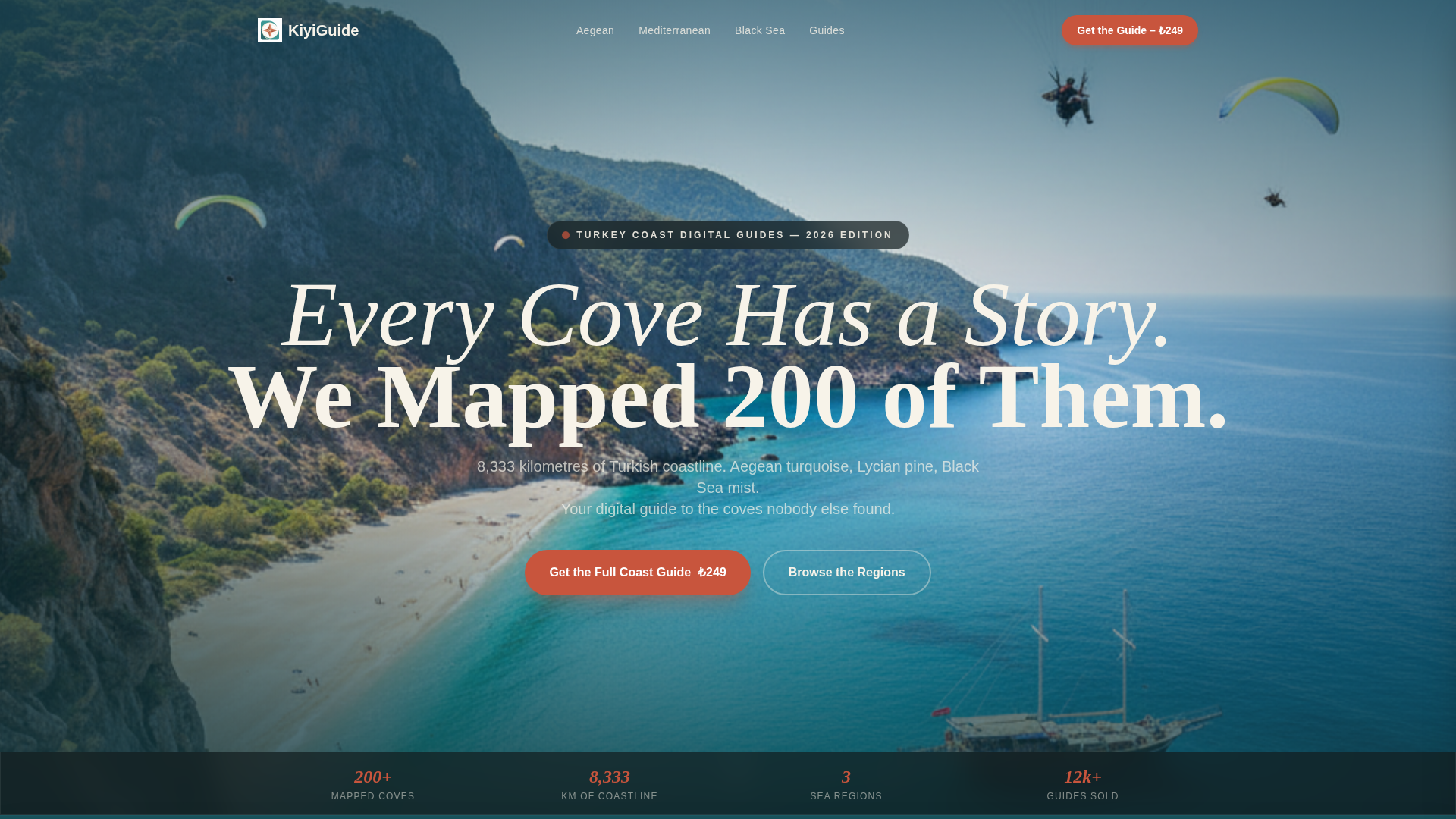
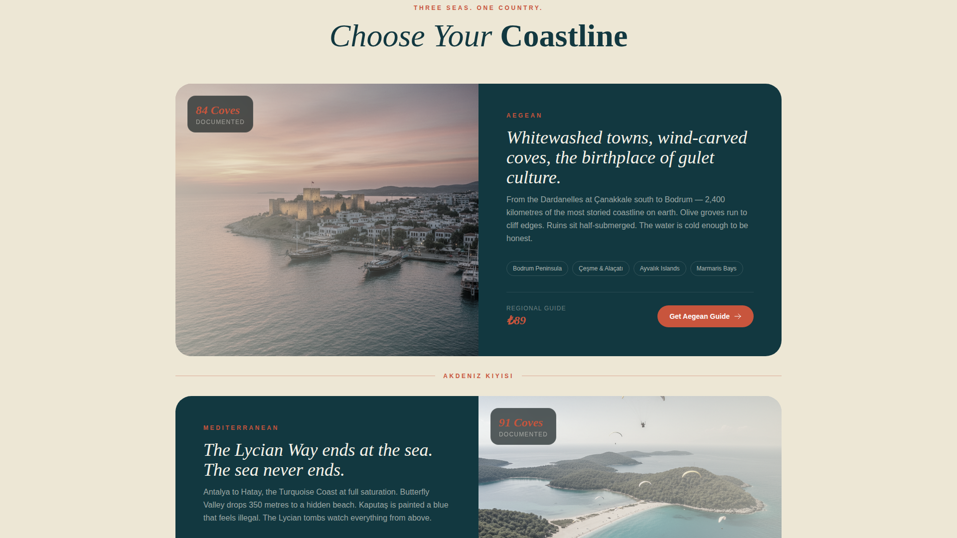
- A panoramic 21:9 header with a fade-in headline over the coastal photograph
- A masonry tile grid organized by region with terracotta divider lines and weathered serif region names
- A slide-out checkout panel with email field, region selection checkboxes, and payment in three fields
Feature list
This template ships with a clear set of built-in design and sales components. Each one is purpose-built for coastal travel content that needs to sell as well as inspire.
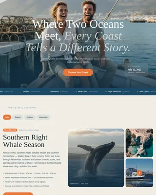
Panoramic Cliff-Top Header
The header runs full-width at a 21:9 aspect ratio with no side margins. A single fade-in headline appears over the water, setting tone and expectation before the visitor scrolls an inch.
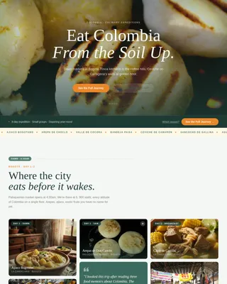
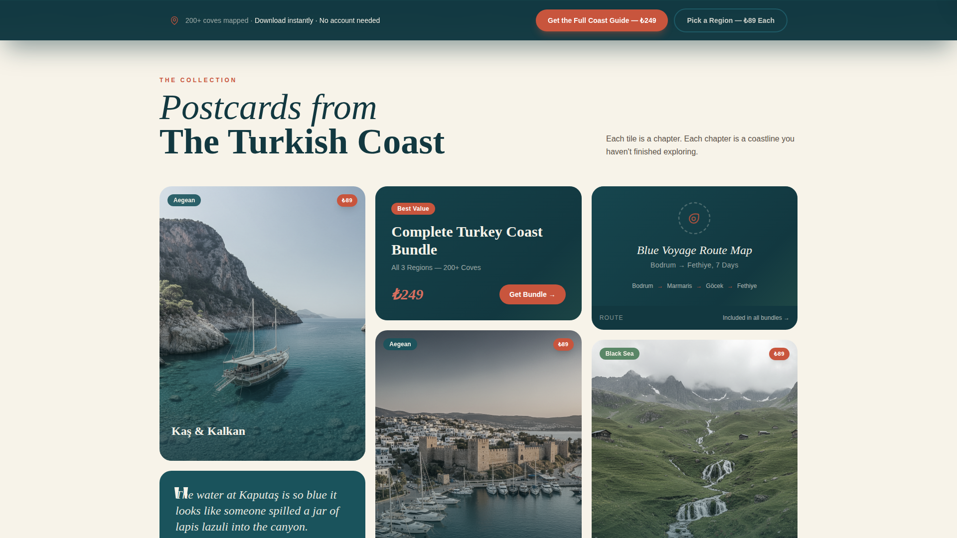
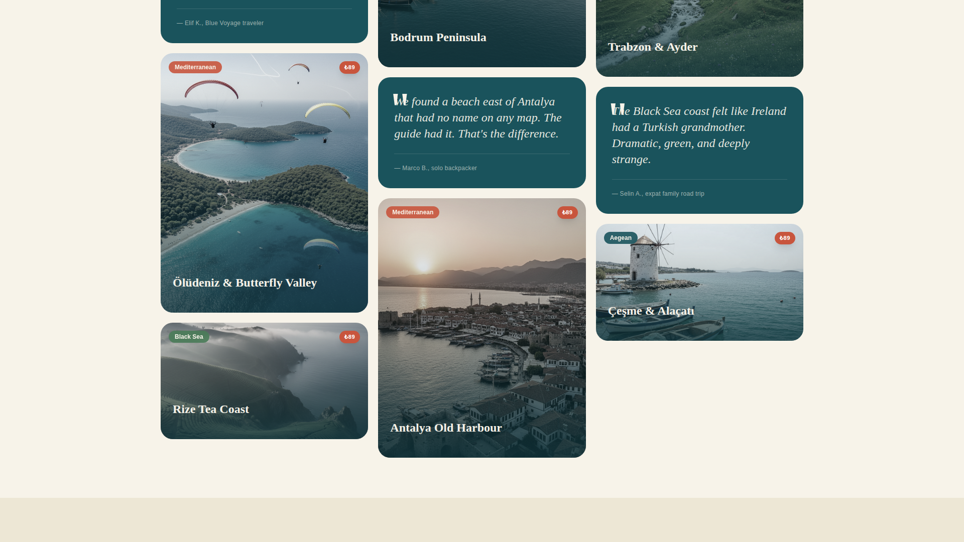
Masonry Tile Grid
The grid loads tiles at varied aspect ratios, mixing destination photography, illustrated route maps, short looping video clips of waves entering sea caves, and pull-quote cards. Thin terracotta divider lines and weathered serif region labels separate the Aegean, Mediterranean, and Black Sea zones as the visitor scrolls.
Sticky Purchase Bar
After the third row of masonry tiles, a terracotta sticky bar appears with the primary call to action for the full coast guide bundle. An outlined teal secondary button for individual regional guides sits beside it, keeping both price points visible without interrupting the browsing experience.
Price-Tagged Tile Chips
Each purchasable guide tile carries a small price chip in its corner. Visitors can see what each piece of content costs before they commit to opening a checkout panel, reducing hesitation at the point of purchase.
Slide-Out Single-Page Checkout
The checkout slides in from the edge of the screen. It asks for an email address, region selection via checkboxes, and payment. Three fields total, no account creation required, keeping drop-off low.
Free Sample Auto-Download
When a visitor spends more than forty seconds on the page, the Lycian Way sample chapter downloads automatically. This gives the reader something real before any purchase is requested.
Page sections overview
| Section | Purpose |
|---|---|
| Full-Width Header | Panoramic coastal photo with fade-in headline |
| Masonry Tile Grid | Browsable guide tiles organized by region |
| Sticky Purchase Bar | Persistent dual call-to-action after third grid row |
| Slide-Out Checkout | Three-field purchase panel with region selection |
| Free Sample Trigger | Auto-download after forty seconds on page |
Design & branding system
The color palette takes its cues from a ceramic plate of grilled fish on a harbor-side wooden table. Mediterranean warmth sits inside something cool and clean, giving the layout personality without noise.
- Deep Bosphorus teal (#1A535C) dominates section backgrounds and card borders
- Sun-bleached driftwood white (#F7F3E9) breathes between masonry tiles, and Lycian pine green (#4A7C59) anchors the navigation and footer
- Warm terracotta (#C8553D) activates every button, price chip, hover state, and the sticky purchase bar
Mobile & speed optimization
The masonry layout is designed to reflow gracefully at smaller screen widths. Tile proportions, typography, and the sticky bar all adapt so the browsing and buying experience holds together on a phone as well as a wide desktop monitor.
- Varied tile aspect ratios restack into a readable single-column flow on mobile screens
- The slide-out checkout panel fits a phone viewport without horizontal scrolling
- The sticky purchase bar remains visible and tappable as mobile visitors scroll through the grid
How this template helps you convert
The page is structured to move a curious visitor toward a purchase without pressure. Every design decision nudges forward momentum.
- The free sample chapter downloads at forty seconds, giving visitors proof of quality before they see a price, which builds trust and makes the paid offer feel like a natural next step.
- The sticky terracotta bar keeps both price points visible after the third tile row, so a visitor who is ready to buy never has to scroll back to find a button.
Other information about this template
This template is built specifically for the Turkey travel guide and blog niche. It covers the full scope of Turkey's coastline content, from the Aegean and Mediterranean shores to the Black Sea region.
- The template style is Masonry/Pinterest, suited to content-rich travel publishers selling multiple regional titles
- The immersive visual creative direction and panoramic header concept are baked into the layout structure
- The Alpine Fresh color system and Marine and Coastal theme work together to keep the page feeling like a travel experience rather than a product catalogue
- The direct sales landing page direction means no third-party storefront is needed; the checkout is self-contained within the page
Theme
Marine & Coastal
Creative direction
Immersive Visual
Color system
Alpine Fresh
Style
Masonry/Pinterest
Direction
Direct Sales
Page Sections
Panoramic Coastal Header
Region-organized Masonry Grid
Sticky Dual-cta Purchase Bar
Corner Price Chip on Tiles
Slide-out Single-page Checkout
Timed Free Sample Download
Related questions
Can I sell individual regional guides and a full bundle from the same page?
Do buyers need to create an account to purchase?
How does the free sample chapter download work?
Can I use my own photographs and route maps in the masonry grid?
Which coastline regions does the template layout support?