Specialist Industrial & Warehouse Design Portfolio & Case Study Website Template
Labspace is a manifesto-style landing page template built for R&D facility architecture firms. It uses a confrontational full-viewport hero, split-screen belief statements with visual proof, and a portfolio grid to build conviction with biotech and pharmaceutical clients. The Electric Indigo color system and scroll-linked animations create an atmosphere as precise and rare as the labs it represents.
by Rocket studio
Quick summary
Labspace is a storybook landing page template for R&D facility architecture firms. It leads with a confrontational deep-indigo hero headline, moves through a sequence of split-viewport manifesto sections, and closes with a portfolio grid and a persistent plasma-blue call-to-action bar. Every scroll beat is designed to build conviction before the visitor ever clicks.
Who this template is for
This template is built for premium architecture and design firms whose work lives at the intersection of science and space. If your projects include biosafety suites, ISO-classified cleanrooms, or open-bench research facilities, this page was made to represent that work honestly and powerfully.
- Biotech-focused architecture firms pitching Series B and Series D clients ready to move from garage labs to purpose-built campuses
- Pharmaceutical facilities practices helping clients consolidate aging multi-site operations into one cohesive research environment
- University and research institution design teams recruiting principal investigators and interdisciplinary faculty with compelling built-environment proof
What problem this template solves
Most architecture firm websites dilute a specialized practice into a generic portfolio gallery. For R&D facility designers, that is a costly mismatch. Decision-makers like a Chief Science Officer or a Vice President of Facilities are not browsing for inspiration. They are qualifying a firm against a very specific set of beliefs about how science buildings should work.
- Generic portfolio layouts fail to communicate a firm's design philosophy before the visitor leaves
- Standard contact-form pages create friction for senior decision-makers who are still in early conviction-building mode
- Visually undifferentiated presentations make it impossible to signal expertise in negative-pressure corridors, ISO classifications, or computational biology bench layouts
What you get with this template
This template gives you a complete, single-page manifesto structure that moves a qualified visitor from curiosity to conviction to click. Every section has a defined role in that journey, and no section wastes the visitor's attention.
- A confrontational full-viewport hero section with a centered giant headline on deep indigo, and a pulsing plasma-blue scroll arrow
- Three split-viewport manifesto sections, each pairing an oversized belief statement with architectural photography or technical drawing proof
- An asymmetric bento-grid portfolio section showing completed projects with key metrics, plus a final call-to-action section and a persistent bottom bar
Feature list
This template is built around a set of deliberate design and structural decisions. Each one serves the goal of qualifying and converting senior decision-makers in research architecture.
Confrontational Hero with Pulse Animation
The hero section fills exactly one viewport with deep indigo (#2E0854) and a razor-thin extended sans-serif headline at poster scale. A plasma-blue down-arrow pulses once every three seconds. There is no navigation, no image, and no competing element. The emptiness itself communicates confidence.
Split-Viewport Manifesto Sections
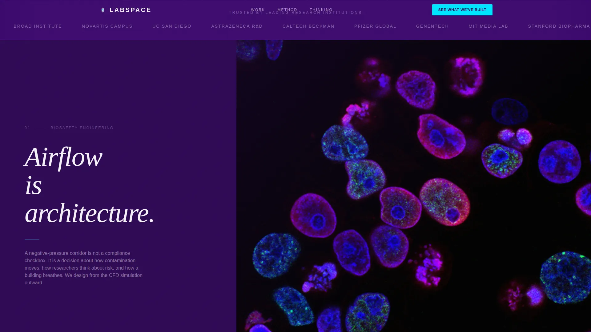
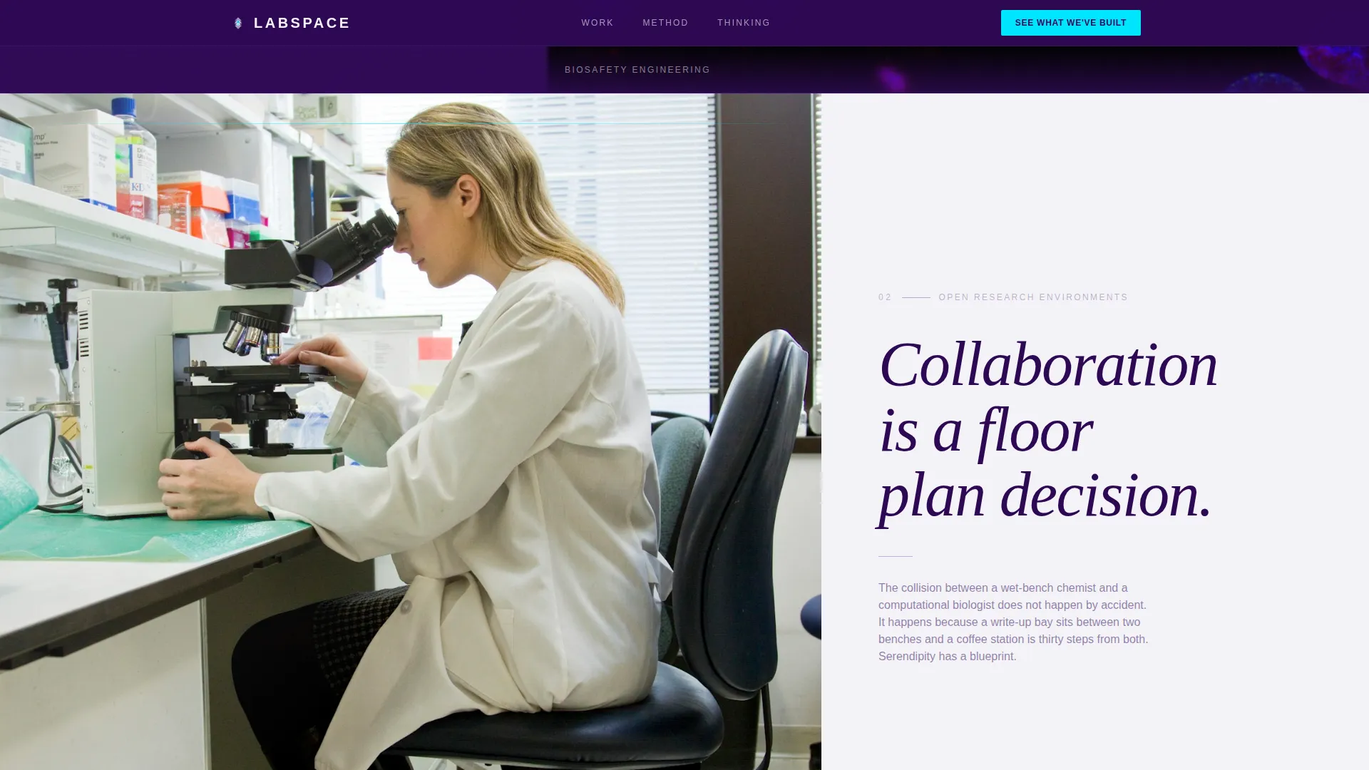
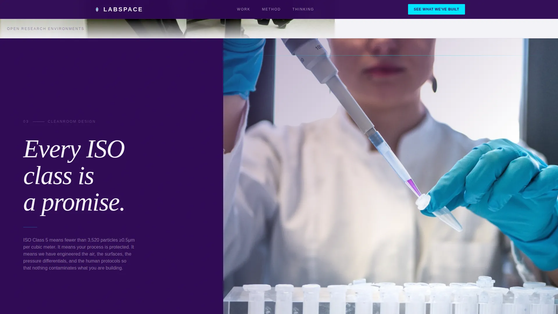
Three full-page sections each place an oversized belief statement on the left third of the viewport. The right two-thirds reveal a single photograph or architectural section drawing on scroll. This rhythm of statement and proof repeats until the visitor has internalized the firm's worldview.
Scroll-Linked Reveal Animations
Parallax photo reveals, staggered text appearances, and Intersection Observer-driven transitions are built into the scroll experience. The page pulses between deep-indigo and lab-white backgrounds across sections, creating a slow, deliberate visual heartbeat.
Asymmetric Portfolio Bento Grid
The portfolio section uses an asymmetric grid layout to display completed projects alongside key metrics such as square footage, ISO classification, and project timeline. This gives qualified visitors concrete evidence without disrupting the manifesto's visual rhythm.
Persistent Call-to-Action Bottom Bar
The primary call-to-action, "See What We've Built," appears first as plasma-blue text at the base of the final manifesto section. On scroll into the closing section, it locks into a persistent bottom bar that stays visible until the visitor clicks or leaves.
Dual-Path Navigation Structure
A secondary text link, "Read Our Thinking," routes intellectually engaged visitors to a white-paper library. This gives the page two exit paths: one for visitors ready to review the portfolio, and one for visitors who need more time but are not ready to disengage.
Page sections overview
| Section | Purpose |
|---|---|
| Hero Headline Void | Confront the visitor with a single belief statement and earn the first scroll |
| Manifesto One | Pair "Airflow is architecture" with a CFD simulation overlay on a vivarium plan |
| Manifesto Two | Pair "Collaboration is a floor plan decision" with an overhead wet-dry lab photo |
| Manifesto Three | Pair "Every ISO class is a promise" with a cleanroom section drawing |
| Portfolio Proof Grid | Display completed projects with square footage, ISO class, and timeline metrics |
| Final Call to Action | Deliver the closing statement and lock the plasma-blue call to action into a persistent bar |
| Footer | Provide minimal horizontal navigation using a clean flow layout |
Design & branding system
The visual identity is built on an Electric Indigo color system that feels like the glow of a UV sterilization lamp in a darkened cleanroom. It is precise, rare, and entirely functional. Typography follows a two-family system that separates belief from information.
- Color palette: deep spectral indigo (#2E0854) for dominant backgrounds, charged violet (#6C3FC5) for section transitions and hover states, lab-white (#F4F2F8) for all body type and breathing space, and plasma blue (#00E5FF) reserved exclusively for interactive elements and the call-to-action
- Typography: Fraunces serif for manifesto statements where weight and presence carry the philosophy, paired with DM Sans for all body copy and interface labels where clarity and legibility are the priority
Mobile & speed optimization
The template is designed desktop-first to match how Chief Science Officers and university provosts typically evaluate architecture partners. The scroll-linked animation system and full-viewport section structure are optimized for widescreen impact. The layout is still fully mobile-responsive so the manifesto reads cleanly on any device.
- Static sections use Server Components to reduce client-side load, keeping animation-heavy sections limited to minimal Client Component instances
- Scroll-triggered reveals use Intersection Observer, which avoids layout-blocking scripts and keeps transitions smooth across viewport sizes
How this template helps you convert
This template is a click-through page. There is no form, no friction, and no request for information before the visitor is ready. The manifesto structure does the qualifying work so the call-to-action only needs to confirm alignment.
- The confrontational hero and manifesto rhythm filter visitors by conviction. By the time a Chief Science Officer reaches the portfolio section, they either share the firm's beliefs about research architecture or they have already left. The click belongs to aligned minds.
- The persistent call-to-action bar removes decision delay. Once the "See What We've Built" button locks into the bottom bar, the path to the portfolio or consultation booking page is always one tap away without interrupting the reading experience.
Other information about this template
This template sits at the intersection of architecture and design, industrial and warehouse design conventions, and the specific demands of R&D facility architecture. It is built for a niche where the stakes of a wrong design decision are measured in regulatory compliance, researcher productivity, and years of delayed discovery.
- The page uses Imperial measurements throughout, making it immediately legible for a United States-based client base
- The Luxe Minimal theme is expressed through confrontational emptiness rather than decorative minimalism. Every absent element is a deliberate choice
- The manifesto creative direction is drawn from a tradition of conviction-led B2B positioning, where the page builds intellectual alignment before any commercial ask
- The template style is classified as Storybook and Full-Page, meaning each scroll section functions as a standalone visual statement while contributing to a cumulative narrative arc
- The footer follows a horizontal flow layout, keeping the closing experience as clean and uncluttered as the rest of the page

Theme
Luxe Minimal
Creative direction
Manifesto
Color system
Electric Indigo
Style
Storybook/Full-Page
Direction
Click-Through
Page Sections
Confrontational Hero with Pulse Animation
Split-viewport Manifesto Sections
Scroll-linked Reveal Animations
Asymmetric Portfolio Bento Grid
Persistent Call-to-action Bottom Bar
Dual Exit-path Structure
Related questions
Who is this landing page template designed for?
Does this template include a contact form or lead capture?
What page sections come included in this template?
Can I update the manifesto statements and project metrics with my own content?
What fonts and colors does this template use?



