Luxe Nail Franchise Landing Page Template
Lacquer is a luxe minimal landing page template built for nail salon franchise brands. It uses a masonry layout, a refined Ink and Paper color palette, and two distinct conversion paths for investors and beauty professionals. The design feels intentional and editorial, with curated image grids, breather stat sections, and dual sticky call-to-action bars that surface only after value is shown.
by Rocket studio
Quick summary
Lacquer is a single-page franchise landing page template designed for premium nail studio brands. It presents a curated masonry layout, an editorial Ink and Paper color system, and two separate conversion flows built for different visitor types. The result is a page that feels like a high-end lookbook, not a generic franchise brochure.
Who this template is for
This template was built for nail salon franchise brands that want to attract serious prospects, not casual browsers. It speaks equally well to investors and to industry professionals exploring ownership.
- Multi-unit franchise investors evaluating their next brand acquisition
- First-time entrepreneurs with a cosmetology background looking for a turnkey concept
- Existing salon owners ready to convert under a named franchise system
What problem this template solves
Most franchise landing pages present one generic pitch to every visitor. That approach loses both investors and beauty professionals before they reach the ask. Lacquer solves this by structuring the page around two clear audience paths.
- Investors and beauty professionals each see a tailored call-to-action that fits their decision stage
- The masonry layout presents studio interiors, service menus, and franchisee spotlights before any form appears
- The dual sticky bars only surface after two full collections have loaded, so the ask follows demonstrated value
What you get with this template
You get a fully structured single-page layout that carries two separate conversion goals without feeling split or unfocused. Every section is designed to feel intentional and editorial.
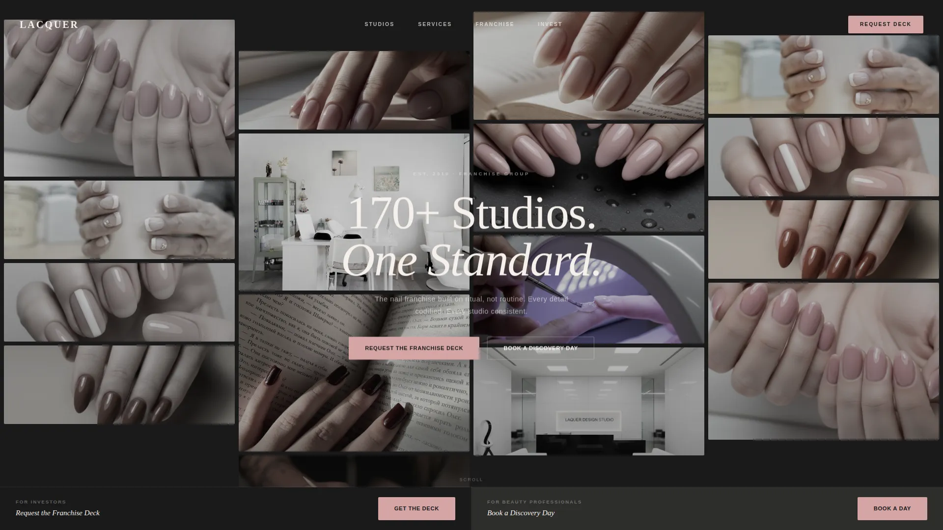
- A UGC Photo Wall header with a curated, desaturated image grid and a single line of knockout white type
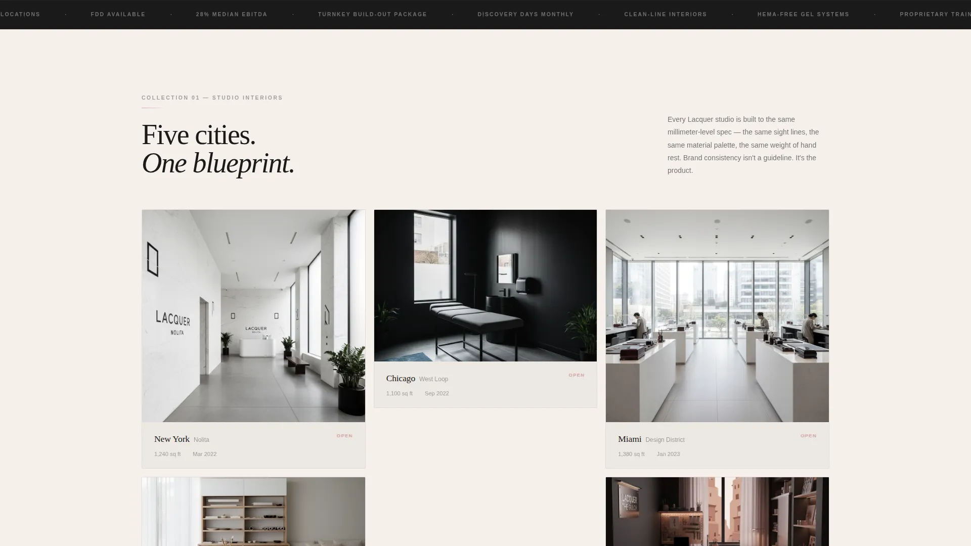
- Three masonry collection sections covering studio interiors, service menus, and franchisee spotlights with unit economics
- Two distinct sticky bottom bar calls to action, one for investor inquiries and one for discovery day bookings, each with targeted form fields
Feature list
This template is built around a set of deliberate design and layout choices that work together to create a high-trust, high-conversion franchise page.
UGC Photo Wall Header
The header is a living grid of close-up client nail shots, each desaturated and regraded into the Ink and Paper palette. Dozens of images cascade across the viewport like a studio mood board, with a single line of knockout white type centered on screen reading "170+ Studios. One Standard."
Masonry Collection Layout
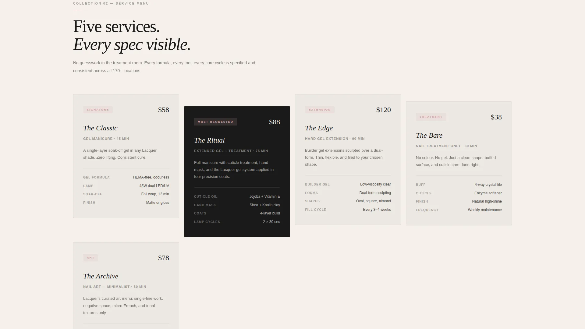
The page is organized into three self-contained masonry collections that visitors browse like a lookbook. The first shows studio interiors across five cities. The second presents signature service menus as minimalist product cards with ingredient callouts including gel composition, lamp specifications, and soak-off chemistry. The third pairs franchisee portrait photography with real unit economics data.
Dual Sticky Conversion Bars
Two separate sticky bottom bars serve the two visitor types. The investor bar prompts a franchise deck request with fields for liquid capital range, target market, and timeline to open. The beauty professional bar offers a discovery day booking with a date picker and a single industry experience question. Both bars use the wet-gel blush button on ink-black card backgrounds.
Breather Stat Sections
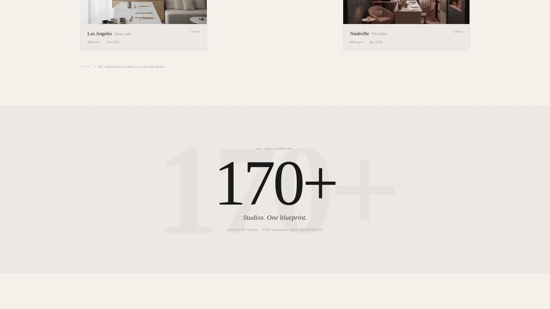
Between dense masonry collections, single-stat breather sections interrupt the visual rhythm. These clean, minimal breaks let the eye reset and highlight key brand proof points without competing with surrounding imagery.
Ink and Paper Color System
The palette anchors the entire page in four tones: sumi ink black for headlines and navigation, uncoated stock white for backgrounds, warm graphite for body copy, and a single wet-gel blush accent reserved exclusively for call-to-action buttons and hover states. The blush appears sparingly, making every instance feel like a deliberate reward.
Scroll-Triggered call to action Timing
Both sticky conversion bars are hidden on page load and surface only after the visitor scrolls past the second collection. This pacing ensures the audience has seen studio proof, service detail, and franchisee evidence before any conversion ask appears.
Page sections overview
| Section | Purpose |
|---|---|
| UGC Photo Wall | Opens with curated nail image grid and brand statement |
| Studio Interiors Collection | Shows brand consistency across five city locations |
| Service Menu Collection | Presents signature treatments as minimalist product cards |
| Franchisee Spotlight Collection | Pairs owner portraits with real unit economics |
| Breather Stat Breaks | Resets visual pace with single highlighted brand figures |
| Investor Sticky Bar | Surfaces franchise deck request form for investors |
| Discovery Day Bar | Surfaces booking form for beauty professionals |
Design & branding system
The visual identity follows a Luxe Minimal theme built entirely around the Ink and Paper color system. Every surface is matte, every element sits inside generous negative space, and the overall feel echoes a Japanese stationery shop rather than a typical beauty brand.
- Four-tone palette: sumi ink black (#1A1A1A), uncoated stock white (#F5F0EB), warm graphite (#4A4A48), and wet-gel blush (#D4A5A5) used only for calls to action and hover states
- All UGC photography is desaturated and regraded into the palette so images feel curated rather than raw
- Headlines and navigation anchor in black, body copy runs in warm graphite, and backgrounds hold the warm white tone throughout
Mobile & speed optimization
The masonry grid and sticky bars are structured to work cleanly on smaller screens. The layout adapts so the collection browsing experience remains comfortable without losing its editorial quality.
- Masonry card columns reflow for tablet and mobile viewports, preserving the lookbook rhythm
- Sticky bottom bars are positioned to avoid obscuring main content while remaining accessible as the visitor scrolls
- Image presentation relies on the desaturated, palette-regraded treatment rather than high-file-weight raw photography
How this template helps you convert
The page is built around a core insight: conversion happens after trust is established, not before. Every structural decision reinforces this idea.
- The three masonry collections build credibility in sequence, moving from visual brand proof to service detail to real franchisee results before any form appears.
- The scroll-triggered sticky bars bring the right offer to the right visitor at the right moment, reducing friction and keeping each conversion path clean and focused.
Other information about this template
This template sits at the intersection of retail franchise marketing and premium beauty brand presentation. It is well suited for nail salon franchise concepts that need to attract both capital-ready investors and experienced beauty professionals through a single, cohesive page experience.
- The Creative Direction follows a Comparison Journey structure, guiding each visitor type toward their relevant conversion path without confusion
- The template style uses an Overlap and Layered approach, which adds editorial depth to the masonry grid and image sections
- The header concept is a UGC Photo Wall, a format that signals authenticity and scale simultaneously
- The landing page direction is Click-Through, meaning the page is designed to move visitors toward a specific next action rather than contain the full conversion experience on-page
- This template is categorized under Retail and E-Commerce, specifically in the Franchise Business subcategory, making it directly relevant to nail studio franchise brands and similar premium service franchise concepts
Theme
Neo-Retro
Creative direction
Comparison Journey
Color system
Ink & Paper
Style
Overlap/Layered
Direction
Click-Through
Page Sections
UGC Photo Wall Header
Three Masonry Collection Sections
Dual Sticky Conversion Bars
Breather Stat Sections
Ink and Paper Color System
Scroll-triggered Call to Action Timing
Related questions
Can I use this template for a franchise brand outside the nail industry?
How do the two conversion paths work on one page without confusing visitors?
What does the UGC Photo Wall header look like in practice?
What form fields are included in each conversion bar?
Why does the wet-gel blush color appear so rarely across the page?



