Beauty & Cosmetics Brand Specialist Blog Website Template
Lacquer is a luxurious nail polish landing page template built for small-batch beauty brands. It features a draggable before/after hero slider, mood-curated masonry grid sections, a sixty-second shade match quiz, and a "Try Three Shades Free" trial form, all wrapped in a rich plum-to-champagne gradient visual identity designed to feel editorial and intimate.
by Rocket studio
Quick summary
Lacquer is a single-page template for premium nail polish and nail care brands. It combines an interactive before/after hero slider with scroll-driven masonry collection grids, a built-in shade match quiz, and a friction-low trial conversion form. The design uses a deep plum and warm champagne palette to deliver a velvet, editorial feel that matches the ritual mindset of its target buyer.
Who this template is for
This template is built for direct-to-consumer nail polish and nail care brands that sell to beauty-informed women in their late twenties and thirties. It suits founders who want their landing page to feel like a curated beauty edit, not a generic product catalogue.
- Small-batch nail color brands launching a trial or sampling offer
- Nail care product lines that lead with ingredients and finish quality
- Gift-focused beauty brands targeting self-care rituals and curated collections
What problem this template solves
Most beauty landing pages treat nail polish as a commodity. They show a flat product grid, list shades by number, and ask for a credit card upfront. That approach loses the ritual buyer fast.
- Visitors leave when they cannot visualize how a shade will look on their actual nails
- Generic layouts fail to communicate the craft and care behind small-batch formulas
- High-friction checkout flows block trial conversions for new-to-brand shoppers
What you get with this template
You get a fully designed, single-page layout with every section ready to populate with your brand content. The template is structured around proven conversion flow: show the transformation, build desire through curated edits, invite exploration via a quiz, and close with a no-payment trial offer.
- A draggable before/after hero slider, two mood-based masonry collection sections, a shade match quiz block, a trial form section, and a linear single-row footer
- A Plum Executive color system with scroll-linked gradient backgrounds, card tilt animations, and a sticky bottom call-to-action bar
- Fraunces display serif and DM Sans body typography pre-paired for an editorial look
Feature list
This template is built around five specific interactive and visual capabilities drawn directly from its design brief.
Draggable Before/After Hero Slider
The header features a full-bleed editorial photograph split into two states: bare, uneven nails on the left and three coats of the brand's plum shade on the right. A rose-gold circle handle lets visitors drag across the image to reveal the transformation. The "Try Three Shades Free" call-to-action sits directly inside this hero section.
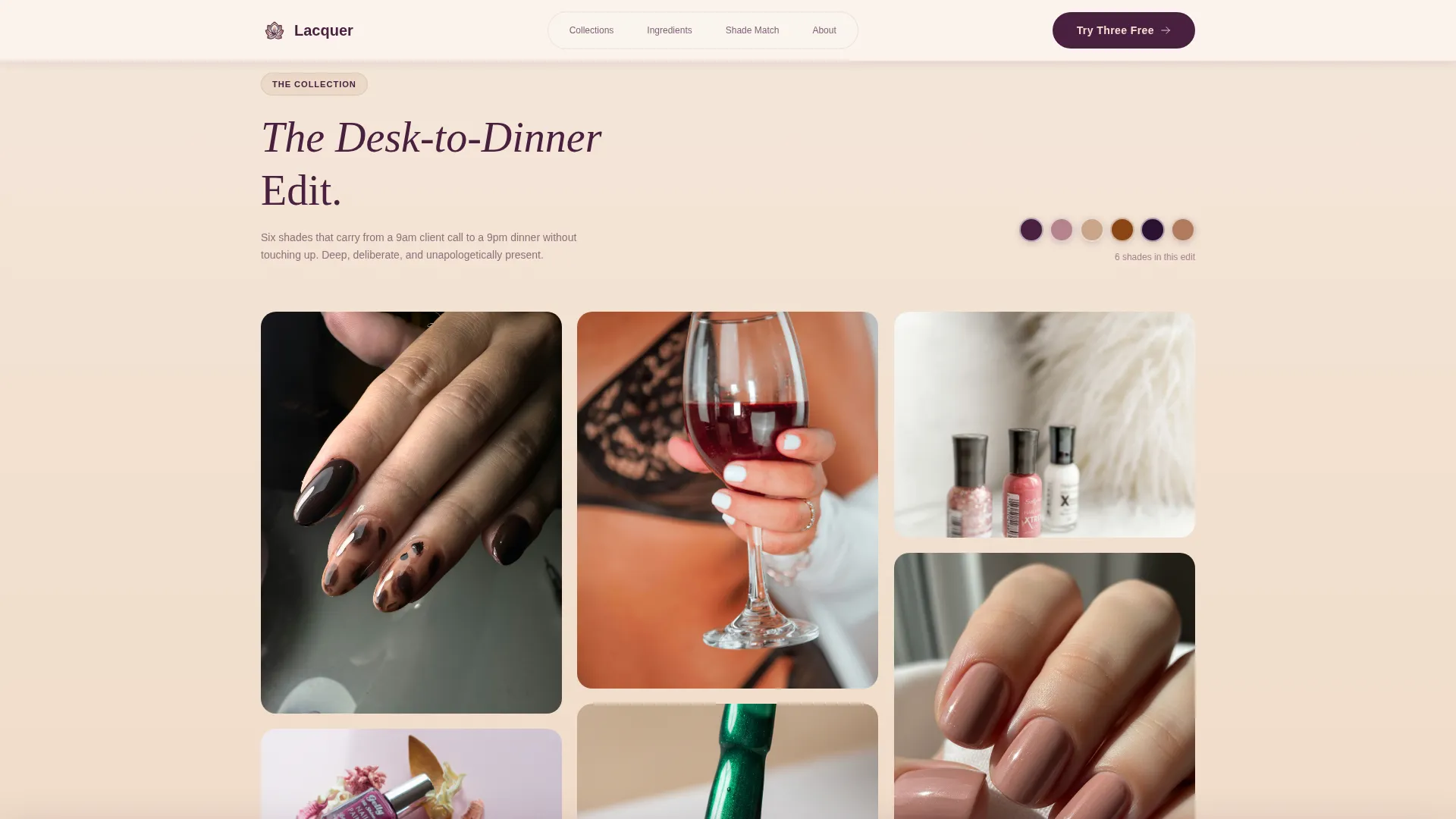
Mood-Based Masonry Collection Grids
Below the hero, two named collection sections unfold in alternating masonry layouts. "The Desk-to-Dinner Edit" and "The Bare-But-Better Edit" each combine swatched nail photography, bottle flatlays, and ingredient close-ups inside asymmetric grid cards. Cards tilt gently on hover, and each collection ends with a macro ingredient story photograph.
Sixty-Second Shade Match Quiz
A dedicated quiz block invites visitors to answer a short sequence of questions. Their answers pre-select three shades and route them directly into the trial form with those colors already populated. This path reduces decision fatigue and keeps visitors moving toward the offer.
No-Payment Trial Conversion Form
The trial form collects shade preference (warm, cool, or neutral), nail length (short, medium, or long), and a shipping address. There is no payment field. A transparent $3.95 shipping cost disclosure appears beside the submit button. The same form also appears in a sticky bottom bar after the visitor scrolls past the second collection section.
Scroll-Linked Gradient Backgrounds
The page background shifts in a soft vertical gradient from warm champagne to dusty mauve as the visitor scrolls. GSAP ScrollTrigger drives the scroll animations, CSS handles card tilts, and IntersectionObserver manages masonry card reveal sequences. The result is a page that feels alive without being distracting.
Page sections overview
| Section | Purpose |
|---|---|
| Hero Slider | Reveal nail transformation, anchor primary call-to-action |
| Desk-to-Dinner Edit | Introduce first mood-based masonry collection |
| Bare-But-Better Edit | Present second collection with full-width lifestyle shot |
| Shade Match Quiz | Guide visitors to their three trial shades via short questions |
| Trial Offer Form | Collect preferences and shipping, disclose $3.95 cost |
| Single-Row Footer | Provide brand links in a clean linear layout |
Design & branding system
The template uses the Plum Executive color system, a four-value palette built to feel rich and editorial without reading as loud or girlish. Every color has an assigned role so the hierarchy stays clear across all scroll depths.
- Deep plum (#4A2040) anchors all typography and card borders; dusty mauve (#B4838D) fills mid-section tones; warm champagne (#F2E0D0) serves as the primary background
- Rose-gold (#C9A589) is reserved exclusively for hover states and call-to-action elements, including the slider handle and the sticky bar button
- Fraunces italic display serif handles all headings and collection titles; DM Sans handles body copy, form labels, and navigation
Mobile & speed optimization
The template is designed desktop-first with a considered mobile adaptation built into the layout system. The masonry grids reflow to a single-column stack on smaller screens so ingredient stories and card imagery remain legible without horizontal scrolling.
- Masonry grids collapse to a single-column sequence on mobile, preserving the editorial card rhythm
- The sticky bottom call-to-action bar remains visible on mobile, keeping the trial offer accessible throughout the scroll
- Scroll animations and card reveals use IntersectionObserver and CSS transitions to keep motion smooth across devices
How this template helps you convert
The conversion architecture follows a deliberate sequence. Every interactive element on the page is designed to reduce the gap between "I like this" and "I want to try this."
- The before/after hero slider creates an immediate visual proof of the product's effect, which builds desire before the visitor reads a single line of copy
- The mood-based collection edits deepen brand trust by presenting shades as considered choices rather than a product list, and the ingredient close-ups ground the brand in tangible nail care
- The sixty-second quiz removes color-choice anxiety by pre-selecting three shades, so the trial form feels like a confirmation rather than a decision
Other information about this template
This template sits at the intersection of a Beauty and Personal Care category, a Beauty and Cosmetics Brand subcategory, and a Nail Polish and Nail Care Brand niche. It is built for the United States market with English copy and USD pricing already considered in the trial form disclosure.
- The template style is Masonry/Pinterest, built for brands that lead with visual editorial content rather than text-heavy product pages
- The Soft Gradient theme and Curated Collection creative direction mean the layout rewards brands that have strong product photography and a defined seasonal or mood-based collection structure
- The Freemium/Trial landing page direction means the template is optimized around a no-payment entry offer, making it well-suited for customer acquisition campaigns where reducing first-purchase friction is the primary goal
- Social proof is woven in through product badge placements (such as a "3-day gloss guarantee" callout), ingredient naming, and collection authority rather than review widgets or star ratings


Theme
Soft Gradient
Creative direction
Curated Collection
Color system
Plum Executive
Style
Masonry/Pinterest
Direction
Freemium/Trial
Page Sections
Draggable Before/after Hero Slider
Mood-based Masonry Collection Grids
Sixty-second Shade Match Quiz
No-payment Trial Conversion Form
Scroll-linked Gradient Background
Related questions
Can I change the collection names and shade options?
Does the trial form process payments?
How does the shade match quiz work?
Is the editorial hand photography included with the template?
Is this template suitable for a nail care brand that does not focus on polish?


