Elegant Chinese New Year Campaign Landing Page
Lantern is a Chinese New Year marketing campaign landing page built for retail and e-commerce teams who need culturally refined assets fast. It pairs a price-anchored header with a comparison-driven gallery, a five-step quiz that recommends a personalized bundle, and ready-to-deploy mockups spanning social, email, WeChat, and storefront formats.
by Rocket studio
Quick summary
Lantern is an elegant Chinese New Year campaign landing page for brand managers and creative leads. It showcases a curated collection of Spring Festival marketing assets through a side-by-side comparison gallery, a guided quiz, and a full asset browser. The design blends deep persimmon, imperial gold, and lacquer black into a luxe minimal visual identity that feels ceremonial without clutter.
Who this template is for
This landing page is built for professionals who launch Lunar New Year campaigns on tight timelines. It speaks directly to people who need polished assets without starting from a blank canvas.
- In-house marketing coordinators at mid-size retail chains managing seasonal promotions
- E-commerce creative leads planning Lunar New Year digital campaigns across multiple channels
- Agency art directors handling several client briefs simultaneously who need culturally fluent, ready-to-deploy templates
What problem this template solves
Every January, brand teams scramble to produce Chinese New Year assets that feel authentic rather than clip-art generic. The gap between a culturally resonant campaign and a rushed one is visible, and costly.
- Eliminates the annual panic of producing Spring Festival visuals from scratch under deadline pressure
- Replaces tone-deaf or overdesigned CNY assets with minimal, premium alternatives that respect the tradition
- Removes the need to justify a large custom design budget when a polished template collection delivers comparable results
What you get with this template
The page delivers a complete gallery-and-detail landing experience organized to guide buyers from curiosity to confident purchase. Every section builds the case that taste and quality are accessible at this price point.
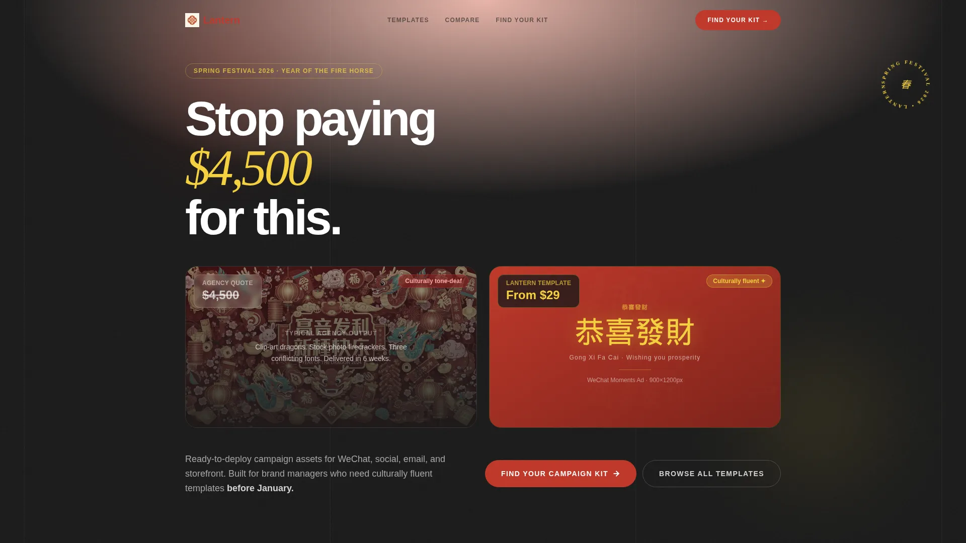
- A price-anchored hero header contrasting a generic agency quote against a single premium template mockup
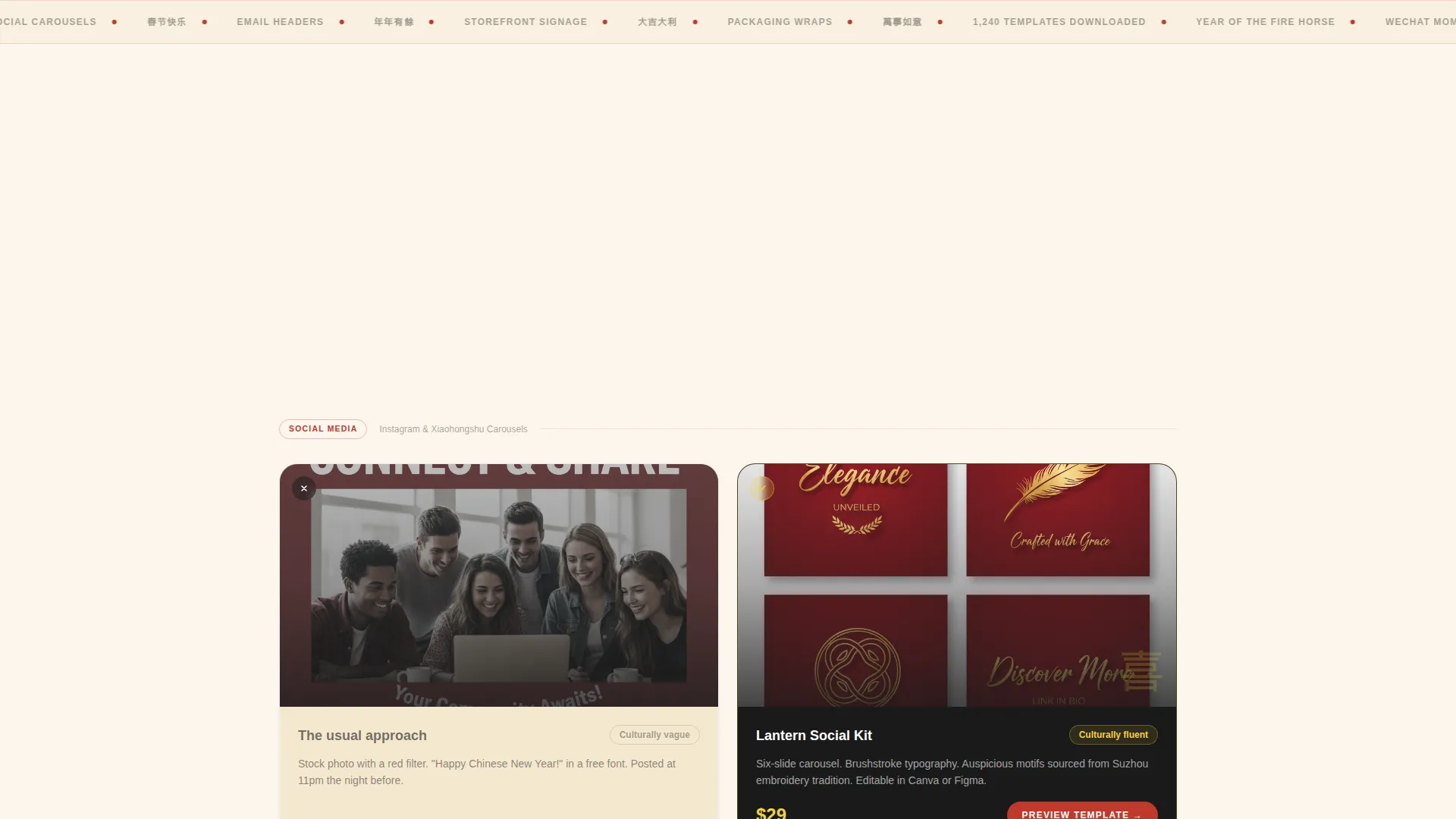
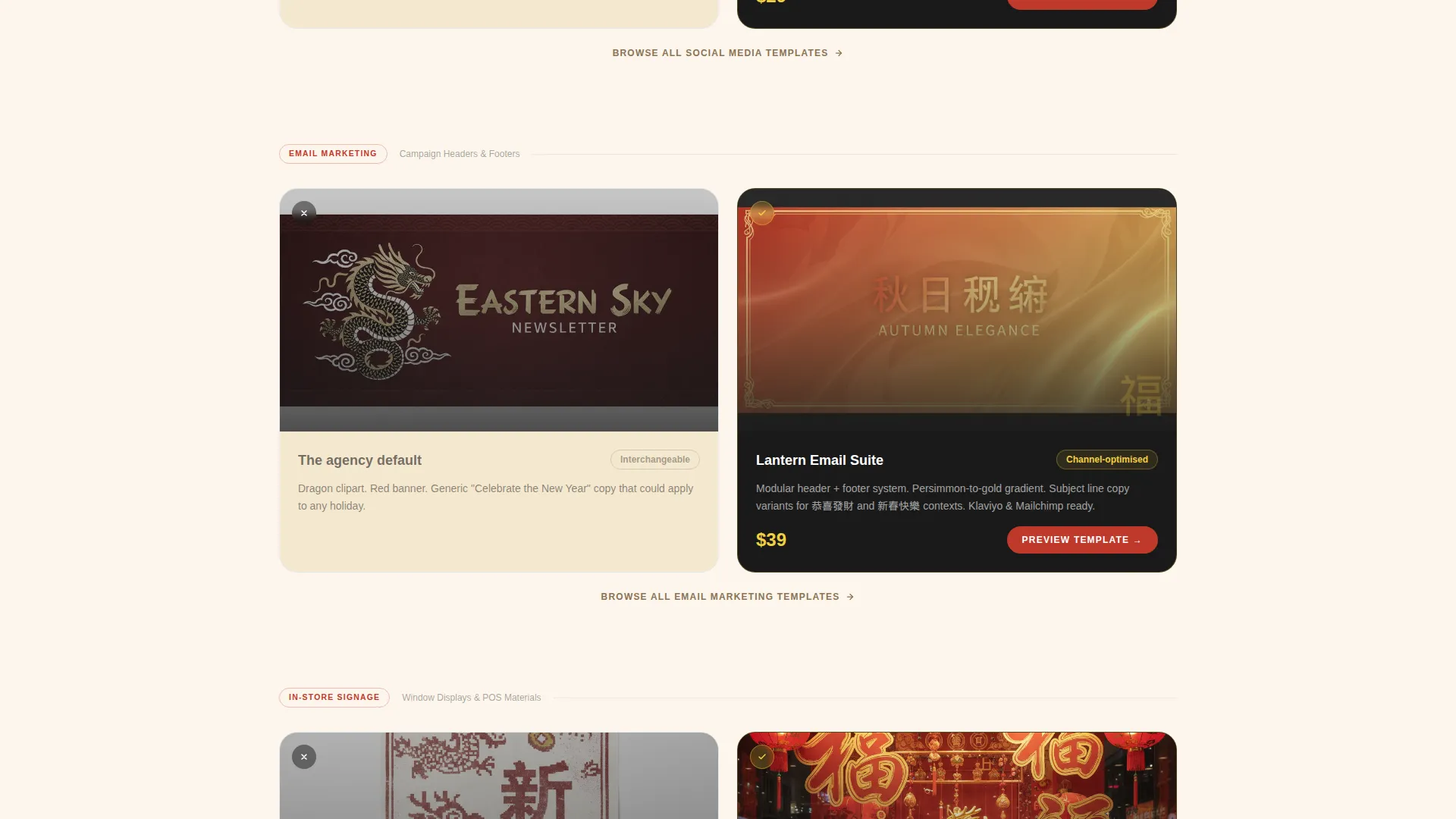
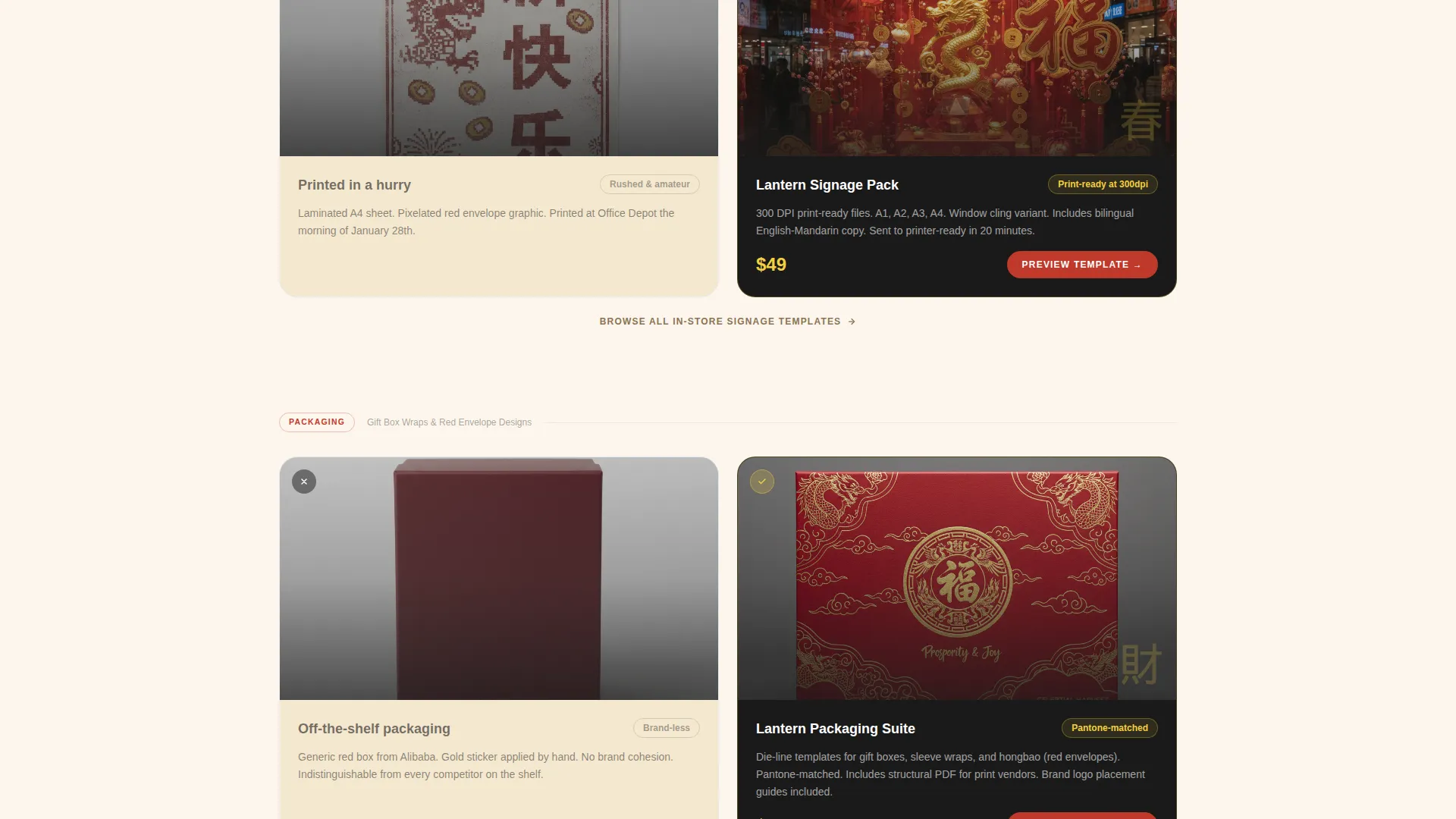
- A scrollable comparison gallery pairing typical busy CNY assets against curated template alternatives across social, email, in-store, and packaging formats
- A five-step quiz that diagnoses brand category, sales channel, budget tier, team size, and asset priorities, then returns a personalized bundle recommendation with a unique discount code
Feature list
This section covers the core functional and design capabilities built into the Lantern landing page template.
Price-Anchored Hero Header
The header opens with a split composition. The left side shows a generic, overpriced agency CNY campaign tagged at $4,500. The right side displays a single stunning WeChat Moments ad from the collection on a MacBook screen, tagged from $29. The contrast is immediate and makes the value case without a single word of persuasion copy.
Comparison-Driven Gallery Scroll
Each gallery section pairs a typical CNY marketing asset against the curated template alternative. The comparisons escalate from digital formats like social posts and email headers to physical formats like in-store signage and packaging wraps. Visitors feel the quality gap widen with each scroll, building a cumulative case for the collection.
Interactive Template Detail Panel
Clicking any template in the gallery opens a detail panel. The panel shows mockup variations, an editable layers breakdown, and format compatibility icons. Buyers can assess each asset before committing, reducing purchase hesitation.
Five-Step Campaign Quiz
The primary call to action launches a guided diagnostic covering five dimensions: brand category, primary sales channel, campaign budget tier, design team size, and required asset types. Results deliver a personalized template bundle recommendation alongside a unique discount code, making the purchase feel tailored rather than generic.
Dual Conversion Paths
A secondary call to action reading "Browse All Templates" appears anchored below each comparison pair. This catches impatient buyers who have already decided and want to skip the quiz. Both paths feed the same goal without forcing a single conversion route.
Luxe Minimal Visual System
The page uses a sunset gradient running from deep persimmon to imperial gold, anchored by lacquer black typography on rice-paper cream backgrounds. Gold appears only on hover states and active selections, making every interaction feel like a deliberate reveal. Section dividers use the gradient as a thin horizontal stroke rather than a full bleed.
Page sections overview
| Section | Purpose |
|---|---|
| Price-Anchored Header | Contrast value against agency pricing instantly |
| WeChat Mockup Spotlight | Showcase the hero asset with premium context |
| Social Posts Comparison | Compare cluttered CNY posts to clean alternatives |
| Email Campaign Comparison | Show email header quality gap side by side |
| In-Store Signage Comparison | Escalate comparison from digital to physical formats |
| Packaging Wrap Comparison | Complete the physical-format comparison arc |
| Browse All Templates | Catch decided buyers with a direct gallery anchor |
| Campaign Quiz Entry | Launch the five-step personalized bundle finder |
| Quiz Results Delivery | Present recommended bundle with discount code |
| Template Detail Panel | Display mockup variations and layer details |
Design & branding system
The visual identity is built around a Luxe Minimal theme that treats restraint as the highest form of celebration. Every color and typographic choice references the ceremony of Spring Festival without resorting to visual noise.
- Color palette: deep persimmon (#C0392B) bleeding into imperial gold (#F4D03F), anchored by lacquer black (#1A1A1A) for all body text and rice-paper cream (#FDF6EC) for open backgrounds
- Gold reserved for hover and active states only, so each interaction carries a sense of discovery and reward
- Section dividers rendered as a thin persimmon-to-gold gradient stroke, never a full-bleed band, keeping the page breathable and editorial
Mobile & speed optimization
The landing page layout is designed to translate its split compositions and gallery panels cleanly across screen sizes. The comparison gallery and quiz flow are structured to remain usable on smaller displays without losing the visual contrast that drives the page's core argument.
- Split hero compositions restack vertically on mobile so both price points remain visible and legible
- Gallery comparison pairs maintain their side-by-side intent on tablet and reflow to sequential cards on phone screens
- The five-step quiz uses a step-by-step modal format that works within a single viewport without excessive scrolling
How this template helps you convert
The page is engineered around two psychological levers: the immediate shock of the price comparison and the personalized pull of the quiz recommendation. Both work together to move visitors from browsing to buying.
- The price-anchored header creates an instant value anchor. Visitors arrive already understanding they are looking at a premium product at a fraction of the custom design cost, which removes the first objection before they have formed it.
- The comparison gallery uses escalating contrast to deepen conviction across the scroll. Each paired section adds a new format, which widens the perceived scope of the collection and increases the sense of completeness.
- The quiz converts hesitant buyers by making the decision feel personalized. A unique discount code tied to their specific bundle recommendation adds urgency without relying on a generic countdown timer.
Other information about this template
Lantern is a single-page landing experience, not a multi-page website, which keeps deployment simple and focused. The template is designed for seasonal campaign launches where speed and cultural accuracy matter most.
- The included asset formats span social carousels, email headers, WeChat banners, and storefront signage, covering the full retail marketing mix for the Lunar New Year season
- The gallery-and-detail structure means the same page functions as both a marketing tool and a product catalog, reducing the need for a separate showcase page
- The template is well-suited for Chinese New Year catering and food service businesses, retail storefronts, and e-commerce brands running holiday promotions across digital and physical channels
- The "Find Your Campaign Kit" quiz mechanic can support repeat use year over year, since brand category and team size inputs remain consistent while asset priorities may shift each season
Theme
Luxe Minimal
Creative direction
Flash Deal
Color system
Citrus Burst
Style
Gallery + Detail
Direction
Quiz/Assessment
Page Sections
Price-anchored Hero Header
Comparison-driven Gallery Scroll
Interactive Template Detail Panel
Five-step Campaign Quiz
Dual Conversion Paths
Luxe Minimal Visual Identity
Related questions
What asset formats are included in the Lantern template collection?
How does the Find Your Campaign Kit quiz work?
Can I browse the templates without completing the quiz?
Who is this landing page template best suited for?
Does the template include editable layers for each asset?



