Chinese New Year Event Planner Landing Page Template
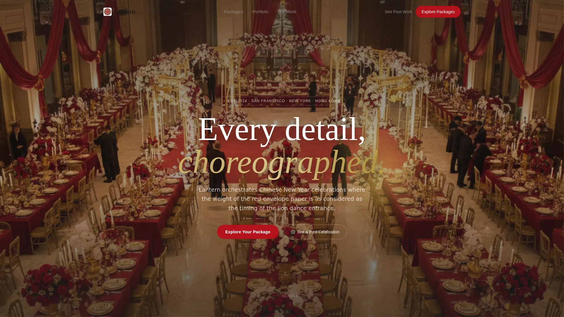
Lantern is a masonry-style landing page template for a boutique Chinese New Year event planning house. It presents three curated celebration tiers, a scrolling visual contrast journey, and two clear conversion paths. The design uses a warm, ink-and-rice-paper palette to evoke luxury editorial taste, guiding corporate clients, private families, and cultural organizations toward booking.
by Rocket studio
Quick summary
Lantern is a single-page, masonry-layout landing page built for a boutique Chinese New Year celebration planner. It opens with three premium event tier cards, flows into an editorial before-and-after visual journey, and closes with deliberate calls to action. Every design choice reflects a Luxe Minimal sensibility: warm whites, stone tones, and precise strokes of lacquer red.
Who this template is for
This template is built for high-end Chinese New Year event planners who serve discerning clients. It suits anyone who needs a landing page that communicates craft, taste, and exclusivity without relying on dense copy.
- Corporate event directors at large firms booking annual gala dinners
- Wealthy families commissioning private multi-household reunion feasts
- Cultural organizations producing public festivals with lantern-lit street programming
What problem this template solves
Generic event planning pages look the same. They list features, stack testimonials, and leave the visitor unmoved. A luxury planner needs visitors to feel the difference, not read about it.
- Visitors cannot distinguish a premium planner from a mid-tier hotel events package
- Beautiful portfolio work gets buried in clunky layouts that kill the mood
- High-value clients abandon pages that feel rushed, cluttered, or off-brand
What you get with this template
You get a fully structured, single-page layout that moves visitors from curiosity to intent through visual storytelling. The template is ready to fill with your own photography, tier details, and call-to-action links.
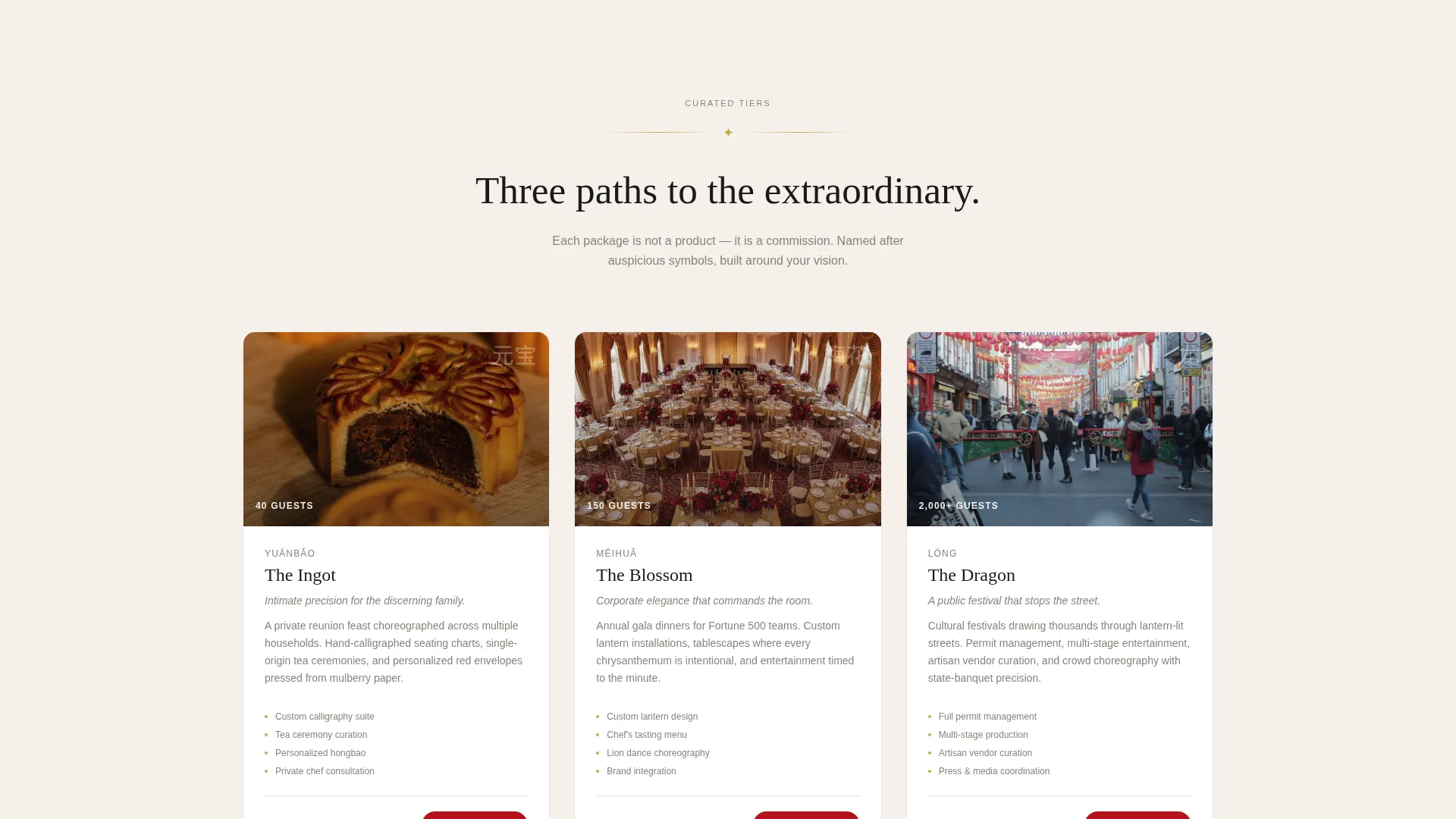
- A three-card bundle showcase header with named tiers and editorial photography slots
- A masonry grid comparison journey that escalates from ordinary to orchestrated
- Two conversion paths: a primary package exploration flow and a secondary case study lightbox
Feature list
This template delivers a focused set of layout and interaction features, each grounded in the source brief. Together they create a coherent, high-trust landing page experience.
Three-Tier Bundle Showcase Header
The page opens with three elegantly spaced package cards set against a cloud-white field. Each card holds one hero image slot, a poetic one-line description, and a starting guest count. The tiers are named The Ingot, The Blossom, and The Dragon for immediate visual and emotional clarity.
Masonry Comparison Journey Grid
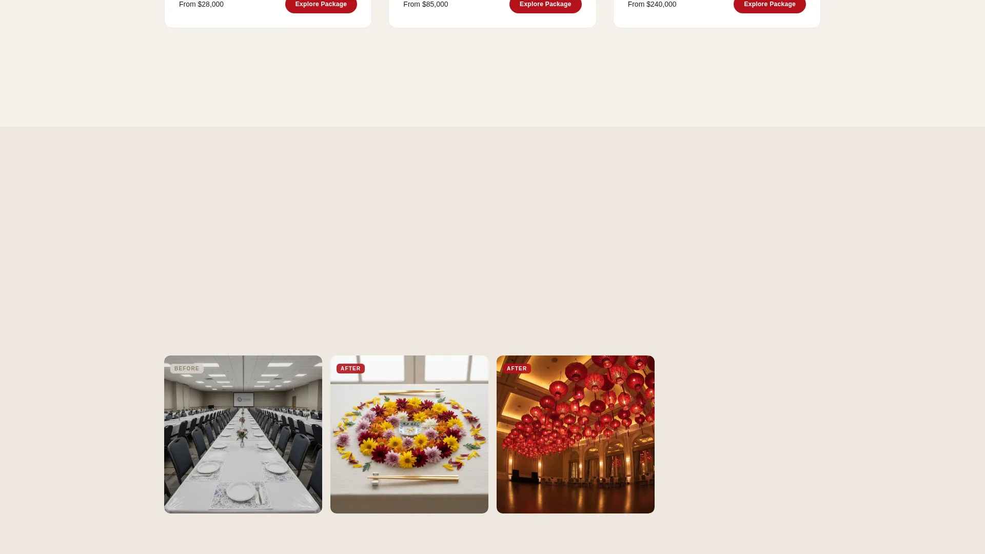
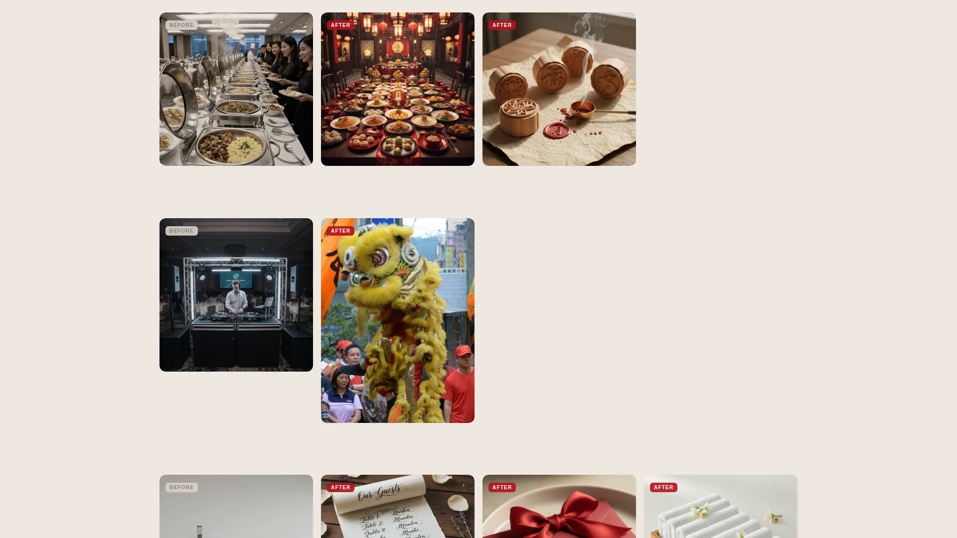
The core scroll section uses a masonry grid layout to contrast generic event setups with the planner's curated portfolio. Tiles escalate row by row across décor, cuisine presentation, entertainment, and guest experience details. The visitor feels the gap between ordinary and orchestrated without reading a features list.
Dual Conversion Path Design
A primary call-to-action button, labeled "Explore Your Package," appears beneath each bundle card and again as a floating button after the third scroll section. A secondary option, "See a Past Celebration," opens an immersive case study lightbox. Both paths are purposefully placed to capture visitors at different stages of intent.
Editorial Photography Layout
Image slots are sized and spaced to showcase tight, close-up photography: hand-pressed mooncake stamps, gold chopsticks on linen, aerial ballroom transformation shots. The layout treats each image as a full editorial moment, not a background filler.
Luxe Minimal Visual System
The Cloud Canvas color system uses rice paper white, misted pearl, and ink charcoal as the ground. Lacquer red appears only on interactive elements and accent moments. Typography stays in ink charcoal throughout, creating a calligrapher's desk atmosphere.
Floating Call-to-Action Button
After the third scroll section, a persistent floating button keeps the primary conversion path visible without interrupting the visual journey. It activates at the moment visitor intent is highest, anchored by the contrast built in the masonry grid above.
Page sections overview
| Section | Purpose |
|---|---|
| Bundle Tier Cards | Introduce the three curated event packages with editorial imagery and guest counts |
| Masonry Comparison Grid | Show the visual contrast between generic setups and the planner's portfolio work |
| Décor Contrast Row | Highlight the difference in decoration quality, from mass-printed to hand-calligraphed |
| Cuisine Presentation Row | Contrast standard banquet plating with intentional tablescapes |
| Entertainment Contrast Row | Show the gap between generic entertainment and choreographed lion dance programming |
| Guest Experience Row | Feature details like scented welcome towels and personalized red envelopes |
| Floating call to action Section | Anchor the primary conversion path after the full comparison journey |
| Case Study Lightbox | Provide an immersive secondary path through a past celebration story |
Design & branding system
The visual identity is built on a Luxe Minimal theme using the Cloud Canvas color system. The palette evokes a calligrapher's desk at dawn: soft, warm, and unhurried, until a single confident stroke of vermillion appears.
- Core palette: rice paper white (#F5F0EB), misted pearl (#D9D2C9), lacquer red (#B5121B), ink charcoal (#1A1A1A)
- Lacquer red is reserved exclusively for interactive elements and accent moments, never used as a background
- Typography runs in ink charcoal throughout, keeping the reading experience grounded and legible
Mobile & speed optimization
The masonry grid layout is designed to reflow cleanly at smaller viewport sizes, preserving the visual storytelling sequence on mobile screens. Editorial image slots scale without breaking the composition.
- Masonry columns adapt to narrower screens while maintaining the before-and-after contrast narrative
- Floating call-to-action button remains accessible on mobile throughout the scroll journey
- Card and grid spacing is calibrated to stay breathable and uncluttered on all screen sizes
How this template helps you convert
Conversion is built into the page structure, not bolted on at the end. Every layout decision moves a high-value visitor closer to action.
- The three bundle cards with named tiers and poetic descriptions create immediate emotional investment, making the visitor feel they are already choosing between options rather than deciding whether to inquire at all.
- The masonry comparison journey builds a visceral sense of contrast that no feature list can replicate, leaving the visitor with a clear understanding of what they have been missing and a floating button ready the moment that realization lands.
Other information about this template
This template is categorized under Chinese New Year Business within the Retail and E-Commerce segment. It is matched to the Chinese New Year Catering and Food Service niche intersection, making it relevant for planners who include curated dining and hospitality as part of their event offering. The Gallery and Detail template style means the layout prioritizes visual evidence over written claims, which suits high-trust luxury service sales. The Luxe Minimal theme is consistent across all sections and does not shift tone or palette partway through the page.
- Template style: Gallery and Detail, optimized for portfolio-led luxury service businesses
- Niche intersection: Chinese New Year Catering and Food Service
- The page type is a single landing page, not a multi-page website
- No integrations, backend systems, or automation workflows are included in the template itself
Theme
Luxe Minimal
Creative direction
Flash Deal
Color system
Citrus Burst
Style
Gallery + Detail
Direction
Quiz/Assessment
Page Sections
Three-tier Bundle Showcase Header
Masonry Comparison Journey Grid
Dual Conversion Path Design
Editorial Photography Layout
Cloud Canvas Color System
Floating Call-to-action Button
Related questions
Who is this landing page template designed for?
Can I customize the three bundle tier names and descriptions?
What makes the masonry grid different from a standard portfolio layout?
Does the template include the case study lightbox content?
Is this template suitable for a planner who also offers catering and dining services?



