Lactation Consultant Booking Website Template
Latch is a single-page landing page template built for lactation consultants who want their client results to speak for themselves. It uses an Editorial Magazine aesthetic, a Case Study Narrative structure, and a zigzag layout to tell real family stories, building trust through accumulated evidence before ever asking for a booking.
by Rocket studio
Quick summary
Latch is a reviews and testimonials landing page template for lactation consultants. It presents client stories as editorial case studies, moving through three escalating family scenarios to build quiet, authoritative trust. The Ink and Paper color system and serif typography give the page the weight of a serious parenting journal rather than a clinical brochure.
Who this template is for
This template is built for lactation consultants who work with high-stakes, emotionally complex cases and need a page that matches that seriousness. It suits practitioners whose best marketing asset is client outcomes, not credentials listed in a sidebar.
- Independent lactation consultants building or refreshing their online presence
- Practices serving first-time parents, NICU families, and mothers managing supply challenges
- Consultants who want testimonials to do the convincing before a booking button appears
What problem this template solves
Many lactation consultants struggle to turn genuine client gratitude into a page that actually converts anxious visitors. Generic review layouts feel thin. Long credential pages feel cold. Neither reflects the depth of the work being done.
- Visitors leave before trusting the practitioner enough to book
- Scattered testimonials fail to show the range of cases a consultant can handle
- No clear path guides a cost-anxious visitor toward next steps
What you get with this template
You get a fully structured, single-page layout built around three escalating case study sections, each telling one family's story across three narrative beats. Every design decision supports trust before conversion.
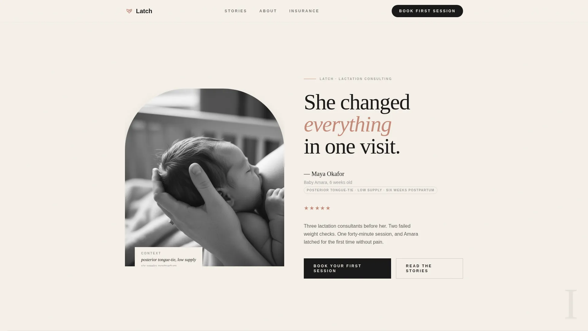
- A half-page editorial header pairing a black-and-white photograph with a large serif headline and client context tag
- Three zigzag case study sections with pull-quotes, thin horizontal rules, and editorial spacing
- Two strategically placed call-to-action moments and a secondary zip code lookup path for cost-sensitive visitors
Feature list
This section details the core built-in capabilities of the Latch template as described in the source brief.
Editorial Half-Page Header
The header splits into two halves. One side holds a black-and-white close-up photograph of a mother and infant, shot with shallow depth of field. The other side carries a large serif headline, the client's name, the baby's age at the time, and a single-line context tag such as "posterior tongue-tie, low supply, six weeks postpartum." The composition sets an authoritative, human tone from the first scroll.
Zigzag Case Study Layout
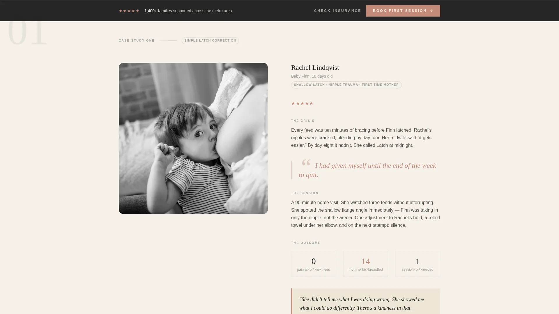
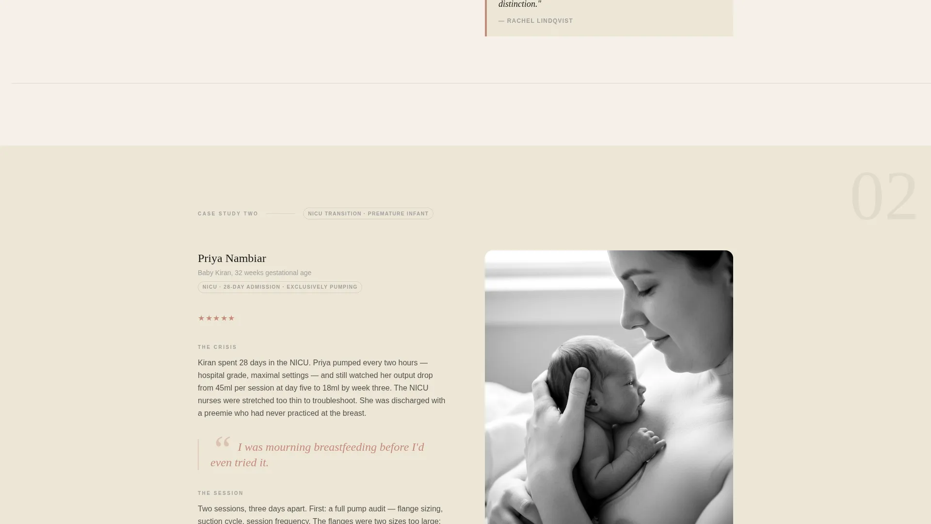
Each section alternates image and text side-by-side in a classic zigzag pattern. The layout guides the reader through three narrative beats per family: the crisis, the session, and the measurable outcome. This structure lets the consultant's expertise emerge through evidence rather than self-promotion.
Escalating Credibility Arc
The three case studies are sequenced intentionally. The page opens with a straightforward latch correction, advances to a premature infant, and closes with twins. The escalating complexity builds the consultant's range and confidence in the reader's mind before any booking prompt appears.
Oversized Rose Pull-Quotes
Client pull-quotes are set at editorial scale using the muted rose accent color (#C48B7A). They function like magazine callouts, pulling the emotional core of each story into immediate visual focus. This treatment reinforces trust without requiring the visitor to read every word.
Dual Call-to-Action Conversion Path
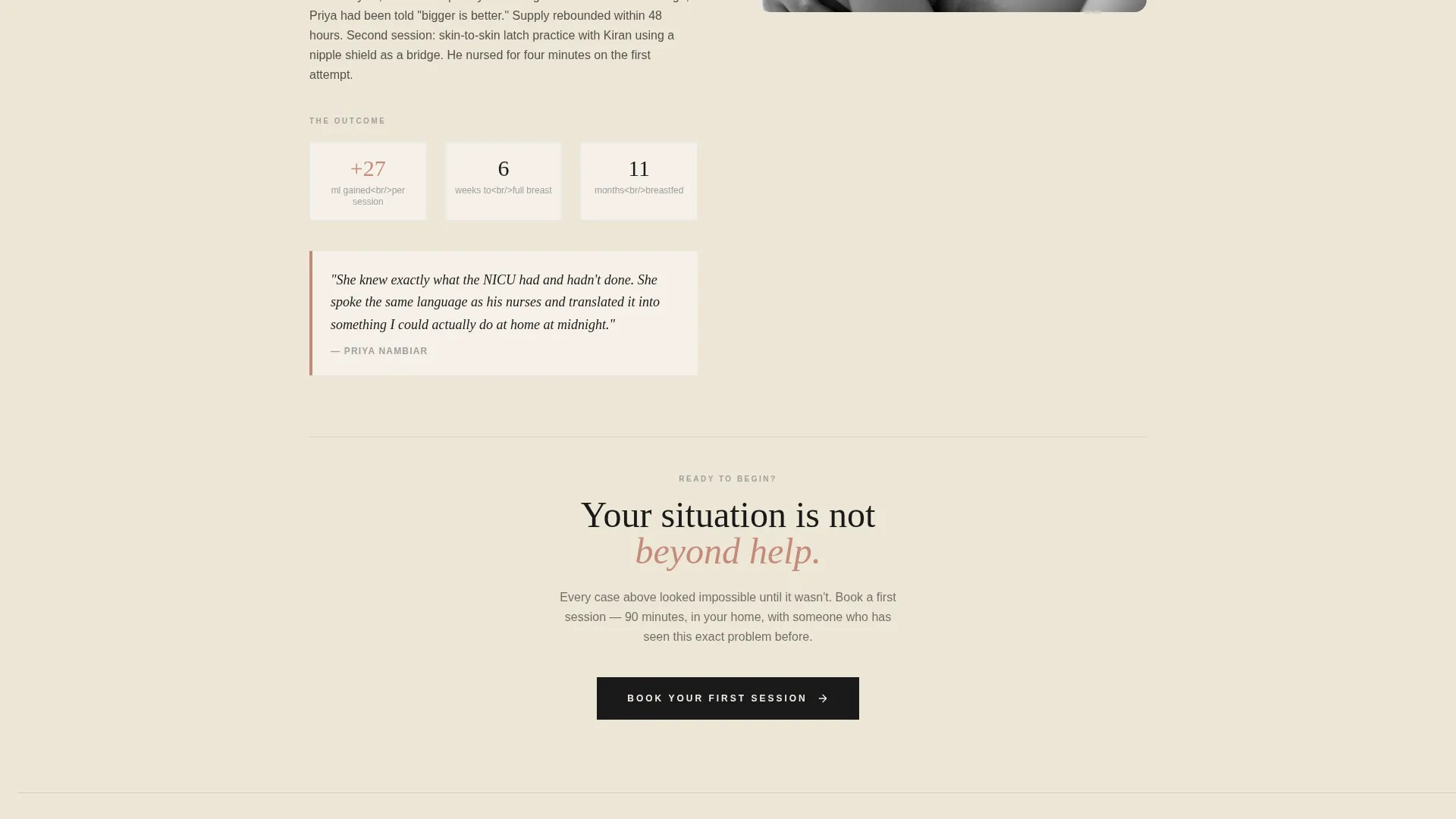
The primary call to action, "Book Your First Session," appears after the second case study once sufficient trust has been built. It then repeats as a persistent bottom bar after the third. A secondary call to action, "See If Insurance Covers You," uses a single-field zip code lookup to capture cost-anxious visitors with minimal friction.
Horizontal Rule and Breathing Space System
Thin horizontal rules and generous editorial spacing separate each case study section. This pacing mirrors the rhythm of printed columns in a quality journal, letting the page feel considered rather than crowded.
Page sections overview
| Section | Purpose |
|---|---|
| Editorial Header | Opens with a client story headline and photograph |
| Case Study One | Presents a straightforward latch correction journey |
| First Booking call to action | Introduces the primary call to action after trust is set |
| Case Study Two | Advances to a premature infant feeding story |
| Case Study Three | Closes with a twin-feeding complexity case |
| Persistent Bottom Bar | Repeats the booking prompt as a fixed conversion anchor |
| Insurance Lookup | Captures cost-sensitive visitors via zip code field |
Design & branding system
The template uses an Ink and Paper color system that deliberately avoids the pastel softness common in parenting-adjacent design. Every color choice reinforces editorial authority and warmth without tipping into clinical distance.
- Deep editorial black (#1A1A1A) for body text and structural elements, warm parchment (#F5F0E8) for backgrounds, and soft pencil gray (#9E9E9E) for secondary labels
- A single muted rose accent (#C48B7A) reserved for pull-quotes, star ratings, and hover states to draw attention without visual noise
- Serif typography set large and unhurried throughout, evoking the feeling of ink pressed into heavy stock paper
Mobile & speed optimization
The zigzag layout and editorial photography are structured to restack cleanly on smaller screens without losing the narrative flow of each case study.
- Alternating image-text columns collapse to a single-column reading experience on mobile
- The persistent bottom bar and zip code lookup field remain accessible without horizontal scrolling
- Thin horizontal rules and generous whitespace maintain visual pacing across all screen sizes
How this template helps you convert
The page is designed around a specific conversion insight: a visitor who has read three stories that mirror her own situation is far more ready to book than a visitor who has only read credentials.
- Trust is built first through narrative. The booking prompt does not appear until the visitor has moved through at least two complete case studies, reducing resistance at the moment of decision.
- Two distinct conversion paths serve different visitor states. The primary "Book Your First Session" call to action captures ready visitors, while the "See If Insurance Covers You" zip code lookup removes the cost barrier for visitors who need one more reason to act.
Other information about this template
This template is part of a broader library of professional services landing page designs built for practitioners whose conversion depends on human trust rather than feature lists.
- The Editorial Magazine theme and Case Study Narrative creative direction make Latch well suited for practitioners who want their page to feel like a respected parenting publication rather than a generic health services site
- The Zigzag/Alternating template style and Half-Page Photo and Text header concept are drawn from the matched intersection context, ensuring the design system is internally consistent
- The Click-Through landing page direction means every design and copy decision is oriented toward one clear next step, either booking a session or checking insurance coverage
Theme
Editorial Magazine
Creative direction
Case Study Narrative
Color system
Ink & Paper
Style
Zigzag/Alternating
Direction
Click-Through
Page Sections
Editorial Half-page Header
Zigzag Case Study Layout
Escalating Credibility Arc
Oversized Rose Pull-quotes
Dual Call-to-action Path
Editorial Spacing and Rule System
Related questions
Can I adapt the three case study sections to use my own client stories?
Does the template include booking form or insurance lookup functionality?
Is this template suitable if I only have one or two client stories?
Who is the ideal visitor this landing page is designed for?
Can I use color photography instead of black-and-white images?



