Precision Portfolio Landing Page Template
The Lease Precision Portfolio landing page is a modular card grid template built for commercial real estate and corporate facilities teams. It combines an interactive map header, stats-first card rows, and a dark emerald atelier visual identity to present lease portfolio data with clarity and authority. Every section is designed to earn trust through evidence before asking for a click.
by Rocket studio
Quick summary
This single-page template transforms a lease management platform into a high-conviction, data-dense landing page. It opens with an animated property map, moves through three rows of metric-led cards, and closes with a clear call to action. The Atelier Studio aesthetic signals precision and craft, making the platform feel as organized as the work it promises to deliver.
Who this template is for
This template is built for PropTech and commercial real estate software teams who need to speak directly to sophisticated, data-literate buyers. It is equally useful for in-house product marketers launching a lease management platform to enterprise audiences.
- Commercial real estate portfolio managers overseeing dozens of properties across multiple states
- Corporate facilities directors inheriting complex, legacy lease portfolios they need to rationalize quickly
- CFOs and finance teams preparing for Accounting Standards Codification 842 (ASC 842) compliance audits who need every lease obligation visible and accounted for
What problem this template solves
Lease data is rarely in one place. It lives in spreadsheets, filing cabinets, email threads, and outdated property management systems. This template gives a lease management platform a landing page that mirrors the solution: structured, surfaced, and immediately legible.
- Critical renewal windows and escalation clauses get buried, leading to missed deadlines and missed savings
- Audit preparation takes weeks when obligations are scattered across disconnected records
- Prospects land on generic software pages and cannot quickly see that the platform understands their complexity
What you get with this template
This template delivers a fully structured, modular card grid landing page ready to represent a lease management platform at an enterprise audience. Every section is purposefully sequenced to move a skeptical buyer from curiosity to conviction.
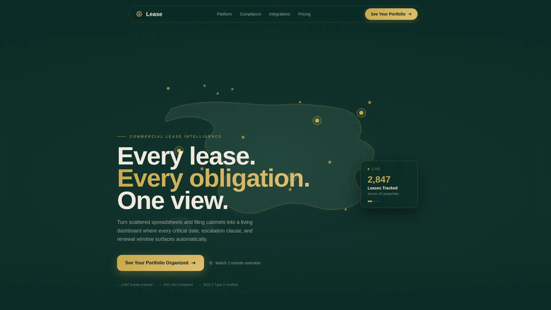
- An animated, interactive map header showing leased properties as glowing pins across the continental United States
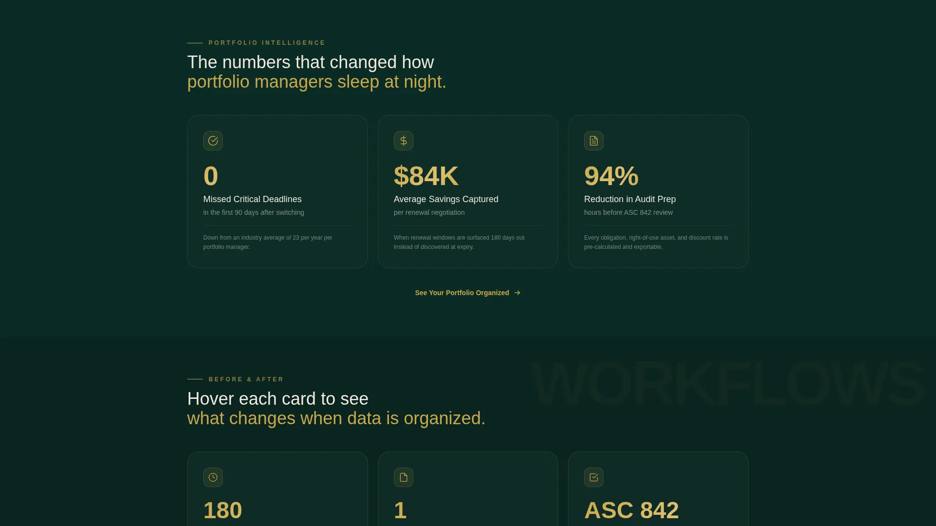
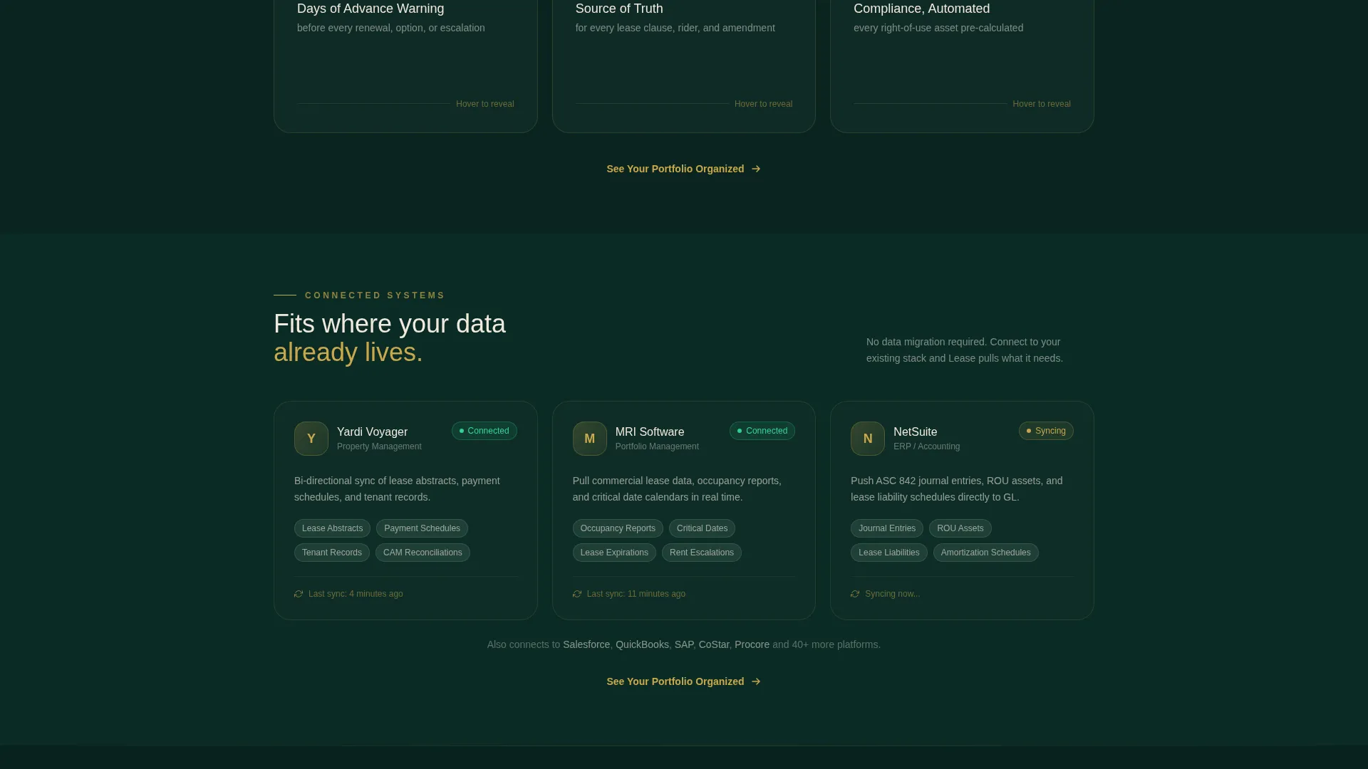
- Three distinct card rows: portfolio metrics, feature flip cards, and integration status cards
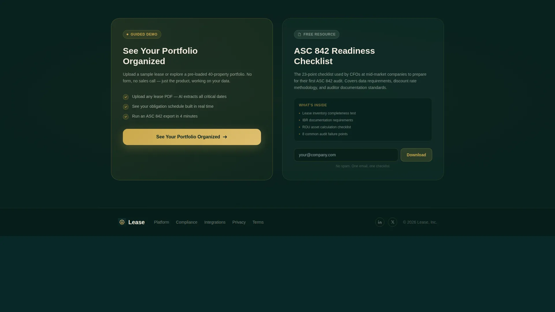
- Two conversion paths: a primary demo call to action and a secondary checklist download with a single email field
Feature list
This template is built around a stats-first content architecture. Each feature below reflects a deliberately designed component present in the template brief.
Animated Map Header
The header centers on an elegantly rendered dark-emerald map of the continental United States. Brass-colored property pins animate in on load, clustering by geography. A floating card beside the map auto-cycles through live portfolio statistics, such as total leases tracked, annual obligations, and upcoming renewals, giving visitors an immediate sense of scale and system intelligence.
Stats-First Card Grid
Every card in the modular grid leads with a single arresting number before revealing supporting context. The rhythm trains the visitor to trust the platform through evidence. The first row of cards highlights portfolio-level outcomes: missed deadlines eliminated, average savings captured at renewal, and audit preparation hours reduced.
Feature Flip Cards
The second card row introduces platform capabilities through an interactive hover mechanic. Each card flips to reveal a before-and-after workflow comparison, showing visitors precisely how the platform replaces a broken manual process with a structured one.
Integration Status Cards
The third card row presents integration connections, each displayed with a live-status indicator dot. This row communicates platform compatibility in a format that feels operational rather than promotional.
Dual Conversion Path Design
The primary call to action, labeled "See Your Portfolio Organized," is placed as a floating brass-accented button in the map header and repeated at the base of each card row. A secondary path captures compliance-motivated visitors with a downloadable ASC 842 Readiness Checklist and a single email field, keeping friction low for both buyer types.
No-Form Primary call to action Flow
The primary click routes visitors to a guided product demo environment where they can upload a sample lease or explore a pre-loaded portfolio. There is no form on the main page, removing friction for buyers who are still evaluating and not yet ready to commit to a sign-up process.
Page sections overview
| Section | Purpose |
|---|---|
| Animated Map Header | Show portfolio scale visually with live cycling stats |
| Portfolio Metrics Row | Lead with outcome numbers to establish platform credibility |
| Feature Flip Cards | Reveal before-and-after workflows on hover interaction |
| Integration Status Row | Display platform connections with live-status indicators |
| Primary call to action Repeat | Drive demo clicks at each natural scroll pause point |
| Checklist Download Strip | Capture compliance-driven visitors with a single email field |
Design & branding system
The visual identity follows an Atelier Studio theme built on a Dark Emerald color system. The palette is inspired by a master bookbinder's workshop at dusk: dark green leather, brass clasps, and cream-colored pages. Every color carries a functional role, not just an aesthetic one.
- Deep emerald black (#0B2B26) serves as the primary background, grounding the page in authority and depth
- Muted sage (#4A6B5D) covers card surfaces and secondary containers, adding dimensional layering without distraction
- Warm parchment (#F0E9DD) is used for typography and data labels, ensuring high contrast and legibility against dark backgrounds
- Polished brass (#C9A84C) drives interactive accents, hover states, and key metric highlights, directing attention to the most important numbers and actions
Mobile & speed optimization
The card grid layout is modular by design, which means it adapts naturally to smaller viewports without restructuring the content hierarchy. Each card row stacks cleanly, preserving the stats-first reading experience on any screen size.
- Card components are built as independent modules, making them easy to reorder or resize for mobile breakpoints
- The map header is designed to feel like a fine instrument rather than a heavy graphic asset, keeping the opening section functional on constrained screens
- Conversion elements, including the floating call to action button and the checklist email field, remain accessible and visible at every scroll depth
How this template helps you convert
This template earns the click before asking for it. The page architecture is sequenced to build trust through data density, then present a low-friction action at exactly the right moment.
- The animated map header and cycling stats establish portfolio scale in the first three seconds of the visit, communicating competence before a single word of copy is read.
- The three card rows progressively build a case through numbers, workflows, and integration proof, so by the time the call to action appears, the visitor has already been shown evidence rather than told claims.
- The dual conversion path design means compliance-driven visitors who are not yet ready for a demo still have a meaningful next step, keeping them in the funnel through the ASC 842 Readiness Checklist download.
Other information about this template
This template was designed specifically for lease management platform use cases within the PropTech and real estate software category. The intersection between commercial real estate portfolio management and compliance-driven finance teams makes it well suited for platforms that serve both operational and regulatory audiences simultaneously.
- The template style is a Card Grid (Modular) layout, making individual sections easy to customize, reorder, or extend without rebuilding the page structure
- The Atelier Studio theme and Dark Emerald color system are applied consistently across all card rows, the map header, and conversion elements, creating a unified visual language throughout
- The creative direction follows a Stats-First Impact approach, meaning the content hierarchy always prioritizes a key metric before revealing the explanation, a pattern proven to hold attention in data-literate B2B audiences
- The page is designed for a Click-Through conversion model, routing the primary call to action to a demo environment rather than a sign-up wall, which reduces drop-off among buyers still in evaluation mode
- Platforms built on property management systems or enterprise resource planning tools will find the integration status card row particularly useful for signaling compatibility to technical evaluators
Theme
Atelier Studio
Creative direction
Stats-First Impact
Color system
Dark Emerald
Style
Card Grid (Modular)
Direction
Click-Through
Page Sections
Animated Property Map Header
Stats-first Modular Card Grid
Interactive Feature Flip Cards
Integration Status Card Row
Dual Conversion Path Design
Floating Brass Call to Action Button
Related questions
Who is this landing page template designed for?
Does this template include a sign-up form on the main page?
Can I customize the card grid rows for my platform features?
What does the animated map header include?
Is this template suitable for platforms targeting ASC 842 compliance buyers?



