Personal Finance & Budgeting App Privacy Policy Website Template
The Ledger landing page template is built for financial literacy platforms targeting first-gen graduates, freelancers, and young couples. It opens with a three-step diagnostic form, then walks visitors through sharp comparison tables that expose the gap between what people think financial terms mean and what they actually mean. The design is industrial, mobile-first, and converts on a free trial signup.
by Rocket studio
Quick summary
This is a single-page financial literacy landing page template designed around a Problem-to-Solution Arc. It opens with a three-step conversational form, then delivers two comparison tables that make the cost of not knowing feel immediate. The page converts on a freemium model, asking only for email and first name before unlocking the curriculum.
Who this template is for
This template is built for anyone launching a financial literacy platform, course, or coaching service that speaks plainly to people who were never taught the basics. It works especially well when your audience carries real financial confusion, not just casual curiosity.
- First-generation college graduates managing student debt and unfamiliar financial documents
- Freelancers who need clear guidance on taxes, quarterly bills, and spending records
- Educators and course creators who want to set up a high-converting page without writing from scratch
What problem this template solves
Most financial literacy pages either lecture or intimidate. They use dense text, generic stock imagery, or a picture of someone smiling at a spreadsheet. Visitors arrive already anxious and leave without taking action. This template solves that by mirroring the visitor's confusion before promising a solution.
- No hero image means no false aspirational picture that breaks trust before the page earns it
- The three-step form creates immediate personal relevance, so students and adult learners feel seen
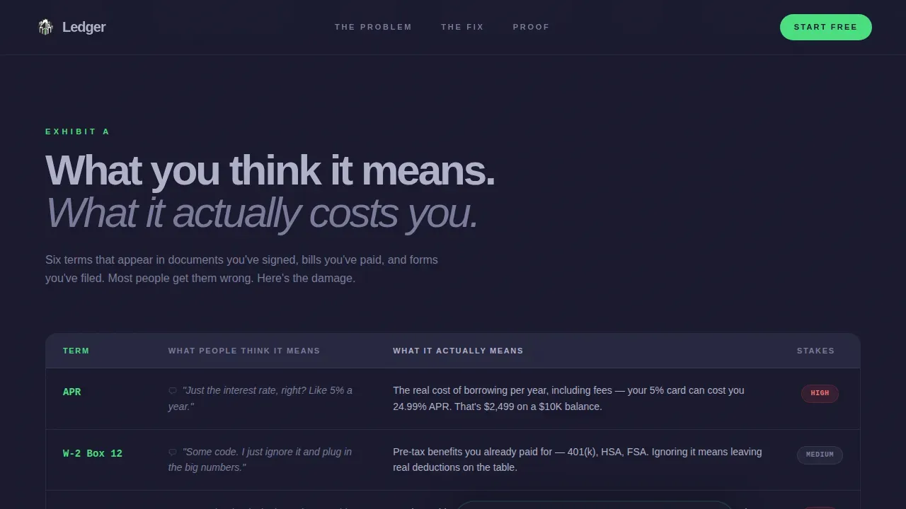
- Comparison tables replace abstract explanations with side-by-side clarity that anyone can read
What you get with this template
You get a fully structured landing page with every section needed for a financial literacy platform launch. Each section is designed to move the visitor forward, from self-diagnosis through belief in the solution and finally to a low-friction free signup. The design system, copy structure, and interaction patterns are all set and ready to customize.
- A three-step multi-step form with card-flip interactions and step-transition animations
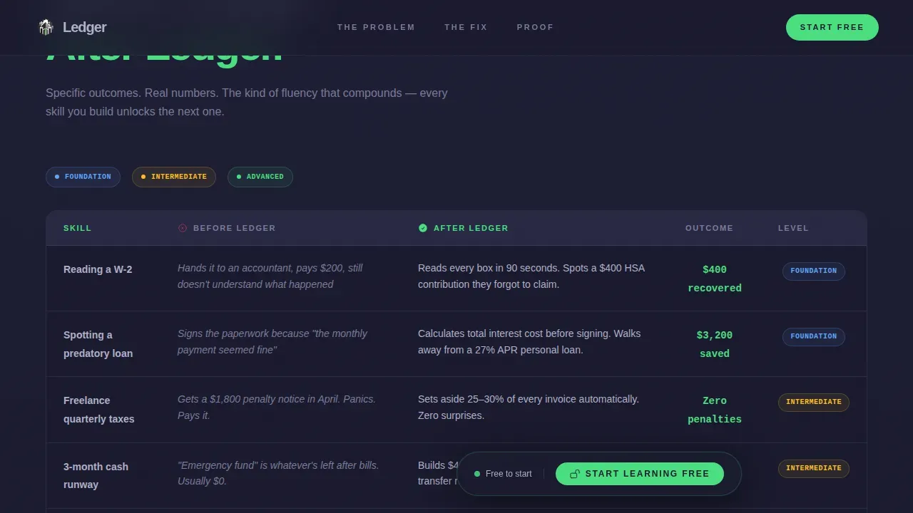
- Two distinct comparison tables: one for financial jargon versus real meaning, one for before-and-after outcomes
- A freemium call-to-action section with a floating bar that pins after 40 percent scroll depth, plus a social proof section with testimonial cards
Feature list
This template's features come directly from the brief's design and interaction requirements.
Three-Step Diagnostic Form
The page opens with a conversational three-step form rather than a static hero. Step one asks visitors to identify their biggest financial blind spot from four card options. Step two asks income range. Step three asks about bill surprises. Each step animates forward like a lock tumbler, making the form itself the first moment of engagement.
Side-by-Side Comparison Tables
Two structured comparison tables drive the core narrative. The first table shows what financial terms actually mean versus common misconceptions, with columns that slide into view. The second table contrasts before-and-after outcomes, using specific examples like reading a W-2 in 90 seconds or identifying predatory loan terms. Visual learning transforms abstract financial concepts into memorable, actionable knowledge.
Floating Freemium Call-to-Action Bar
After visitors scroll past 40 percent of the page, a verdict-green call-to-action bar pins to the screen. The primary action is a single clear prompt to start learning free. The secondary path pre-fills the blind-spot selection from the header form into a personalized trial preview. Students retain 65 percent more information when concepts are presented visually, and this page design keeps visuals and action tightly paired.
Scroll-Triggered Section Reveals
Each page section below the fold animates into view on scroll. Problem sections slide in like evidence exhibits. Solution rows expand progressively. This keeps the reader's attention moving and creates a natural reward for continued scrolling, reinforcing confidence at each new section.
Testimonial Cards with Specific Outcomes
The social proof section uses testimonial cards that store real financial situations and measurable results rather than generic praise. Each card is designed to picture a relatable scenario, such as a freelancer who filed taxes incorrectly for three years or a couple facing a mortgage application for the first time.
Page sections overview
| Section | Purpose |
|---|---|
| Multi-Step Form Header | Opens mid-conversation, diagnoses the visitor's financial blind spot across three steps |
| Problem Comparison Table | Shows financial jargon versus real meaning to make confusion visible and specific |
| Solution Comparison Table | Contrasts before-and-after platform outcomes with measurable confidence markers |
| Social Proof Cards | Displays testimonials with concrete financial situations and specific outcomes |
| Freemium call to action Section | Collects email and first name for a free trial, with a floating bar at 40 percent scroll |
| Single-Row Footer | Linear, minimal footer keeping the page clean and focused |
Design & branding system
The design follows an industrial vault aesthetic. The color palette is Monochrome Steel, built around four values that each carry deliberate meaning. Typography uses Plus Jakarta Sans at weights 300 and 800 for contrast, with JetBrains Mono reserved for all data, numbers, and financial figures.
- Forge-black (#1A1A2E) and brushed gunmetal (#3D3D5C) set a deep gradient background that communicates seriousness without being cold
- Cold-rolled silver (#B0B0C8) carries all body text, keeping information readable against dark backgrounds
- Verdict green (#4ADE80) appears exclusively on completed states, positive outcomes, and call-to-action elements, acting as a visual reward for progress
Mobile & speed optimization
The template is built mobile-first to match the phone-heavy habits of its target audience. Every section is designed for fast, easy navigation on small screens. Interactive components use client-side rendering while static sections use server components to keep load behavior smooth.
- Card-flip interactions, step transitions, and the floating call-to-action bar are all designed to work cleanly on mobile viewports
- Large headline fonts and high-contrast buttons make critical information immediately visible without pinching or zooming
- Ample spacing between sections prevents the page from feeling cluttered on narrow screens, protecting the reading experience at any size
How this template helps you convert
The page earns the click by making the cost of financial ignorance feel personal before ever mentioning the platform. Every design and copy decision works toward a single primary action: starting for free.
- The three-step form creates personal stakes immediately, so visitors arrive at the first comparison table already invested in the answer
- The floating call-to-action bar catches visitors who are convinced mid-scroll, removing the need to find their way back to the top
- The freemium model asks only for email and first name, with no credit card and no commitment language, lowering the barrier to getting started
Other information about this template
This template also has strong utility beyond direct-to-consumer financial literacy platforms. Educators and classroom facilitators can find this page structure useful when promoting financial education programs or workshops. The design strategies built into this template reflect best practices for landing pages that need to build trust quickly and motivate action from audiences who may be skeptical or overwhelmed.
- The comparison table format works well for classroom economy programs where teachers want to picture clear before-and-after states for students learning about saving, spending, and bills
- Editable classroom money templates and other print-ready financial education materials pair naturally with a page like this, since educators can use it to store, share, and promote downloadable resources
- Teachers can print supporting materials on colored cardstock and promote them through this page, giving students at every grade level a concrete way to access financial literacy content
- The page design supports sharing across social channels and education communities, and its pro-level interactivity is achievable without traditional programming skills using no-code tools
- The Ledger street level financial literacy landing page template is the reference design in this category, combining a Legal Shield theme with a Monochrome Steel color system to create a page that feels built for high-stakes financial education


Theme
Legal Shield
Creative direction
Problem→Solution Arc
Color system
Monochrome Steel
Style
Comparison Table
Direction
Freemium/Trial
Page Sections
Three-step Diagnostic Form Header
Dual Comparison Table Structure
Floating Freemium Call to Action Bar
Scroll-triggered Reveal Animations
Testimonial Cards with Outcome Data
Related questions
Who is this landing page template designed for?
Can I customize the comparison tables and form steps?
Does the page work without a designer or developer?
How does the freemium conversion model work in this template?
Is this template suitable for classroom or educational settings?



