Automated Invoicing Landing Page Template
Ledger is a dashboard-style landing page template built for invoicing and billing fintech products. It uses a bold comparison layout to show the real cost of unpaid invoices, an interactive lost-revenue calculator, and a sticky call-to-action bar. The design pairs deep charcoal with catalyst teal and signal amber to make every number feel urgent and every next step obvious.
by Rocket studio
Quick summary
Ledger is a single-page fintech landing page template designed around a Before-and-After comparison journey. It opens with a viewport-filling headline, moves through an animated data grid that contrasts old invoice chaos with automated collection, and closes with a sticky call-to-action bar. The template targets accounts receivable automation products and similar invoicing platforms.
Who this template is for
This template is built for B2B fintech founders, product marketers, and growth teams who need to turn skeptical finance professionals into demo signups. It works best when the product's core value is measurable and the audience responds to data over storytelling.
- Chief Financial Officers at mid-market SaaS companies managing high invoice volumes on net-60 payment terms
- Freelance consultants and agency founders who lose revenue to invoices that go untracked or unanswered
- Fintech product teams launching or repositioning an accounts receivable automation platform
What problem this template solves
Finance decision-makers don't respond to vague benefit claims. They respond to numbers that match their own pain. This template solves the problem of landing pages that fail to make the cost of inaction concrete enough to motivate action.
- Visitors leave without feeling the weight of their unpaid invoice backlog, so they never click
- Static feature lists don't communicate the difference between manual follow-up workflows and automated collection
- There is no mechanism on most landing pages to personalize the revenue impact for each visitor's situation
What you get with this template
You get a fully structured, single-page layout with six distinct sections, each designed to move a finance professional from recognition to action. The design system, typography choices, and interactive components are all defined and ready to build from.
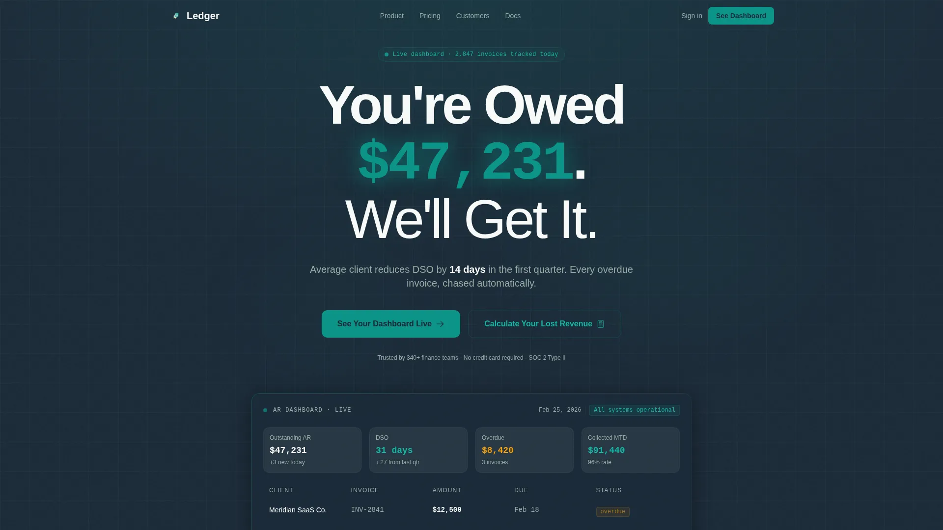
- A hero section with a live-counter dollar figure, a trust subline, and a primary call-to-action button
- A scroll-driven Before-and-After comparison data grid with animated metrics and per-row scroll reveals
- An interactive lost-revenue calculator and a sticky bottom call-to-action bar that follows the visitor down the page
Feature list
This template ships with a clear set of defined components. Each one is grounded in the brief and built to serve the accounts receivable automation use case.
Viewport-Dominating Hero Headline
The hero centers a single massive headline on a deep charcoal background. The dollar figure inside it renders in catalyst teal and is styled as a live counter, making the opening statement feel real and personal rather than generic.
Scroll-Driven Comparison Data Grid
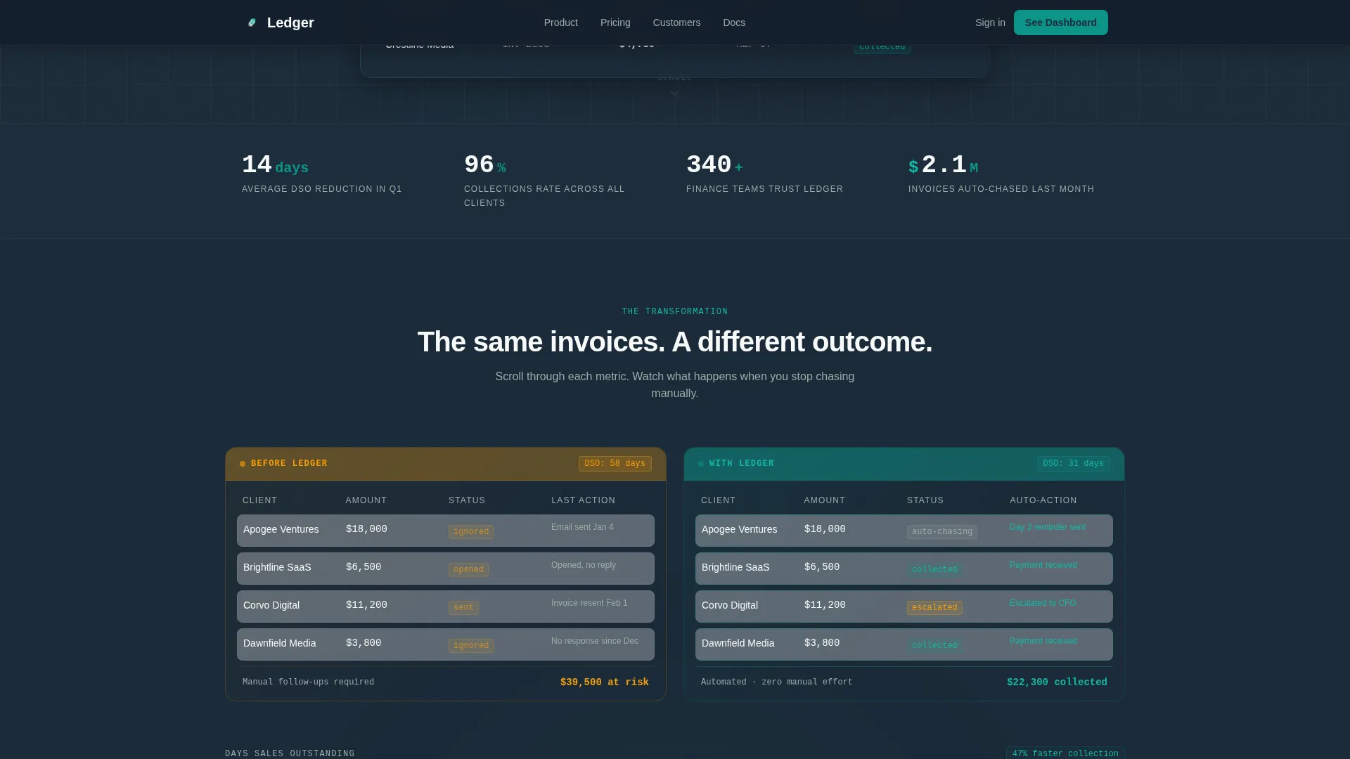
The core of the page is a two-column split layout. The left column shows a chaotic pre-product state with amber overdue flags, manual timestamps, and a Days Sales Outstanding (DSO) counter stuck at 58 days. The right column shows the same data set transformed, with automated chase sequences, delivery confirmations, and a DSO counter animating down to 31 days.
Interactive Lost-Revenue Calculator
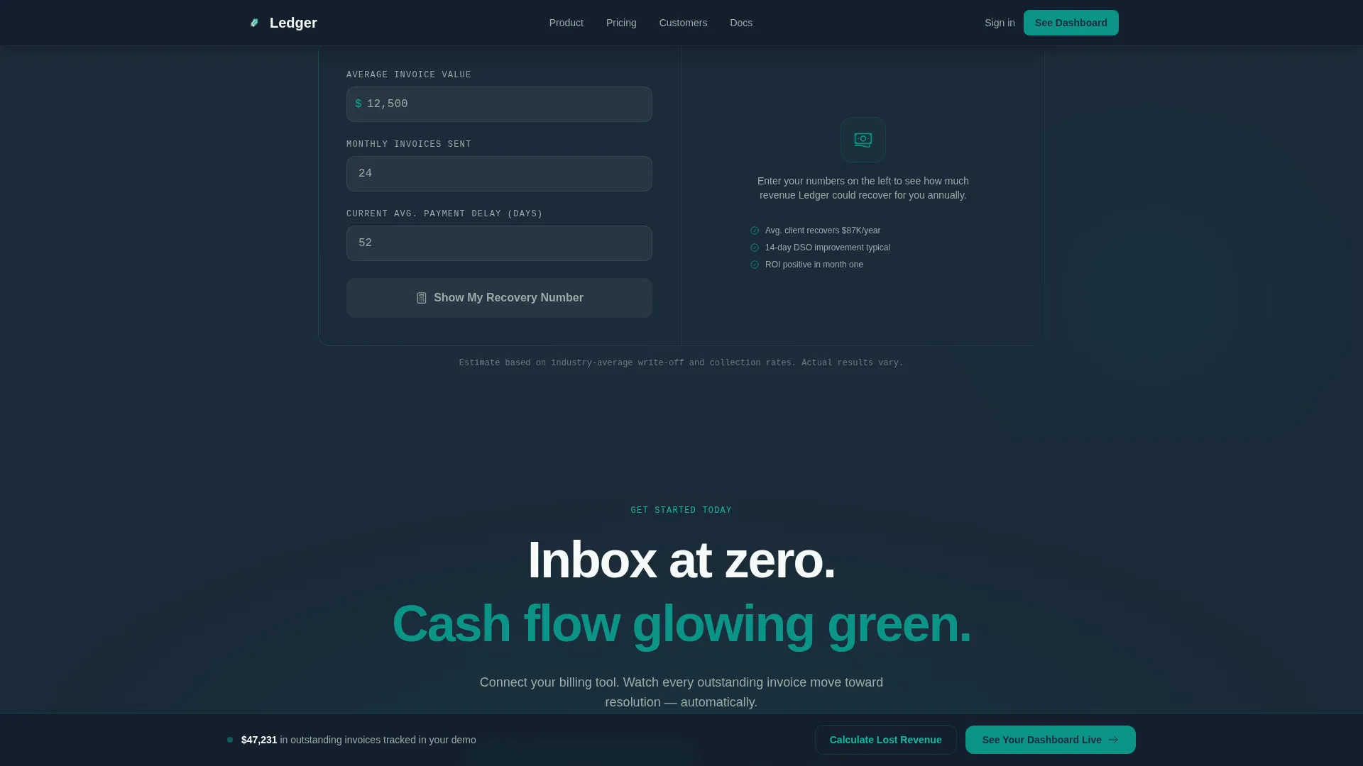
A secondary call-to-action links to a calculator that accepts average invoice value, monthly invoice count, and current average payment delay. It outputs a projected annual recovery figure styled in teal, giving each visitor a personalized number before they decide whether to book a demo.
Animated Metric Pairs on Scroll
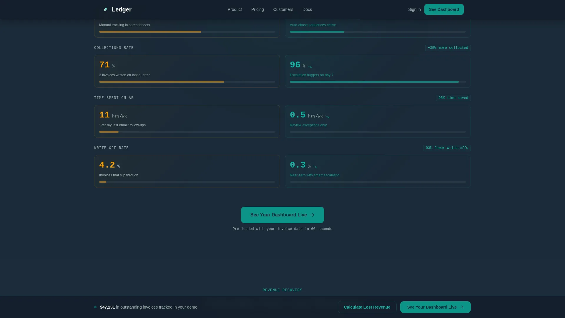
Each scroll increment in the comparison section introduces a new metric pair: collections rate, time-to-payment, and write-off percentage. The visual gap between the two columns widens as the visitor scrolls, reinforcing the return on investment argument without a single word of copy doing the heavy lifting.
Sticky Bottom Call-to-Action Bar
After the third comparison row, a sticky bar appears at the bottom of the viewport and stays visible for the rest of the page. It repeats the primary call-to-action label so the visitor always has a clear next step regardless of where they stop scrolling.
Trust Metrics Stats Bar
A compact stats bar below the hero displays aggregate social proof figures: DSO reduction, collections rate improvement, and customer count. These are rendered in JetBrains Mono to visually separate data from prose and reinforce the dashboard aesthetic.
Page sections overview
| Section | Purpose |
|---|---|
| Hero Headline Block | Anchor visitor attention with a live teal dollar counter and a single trust subline |
| Trust Metrics Bar | Display aggregate proof figures in monospaced type beneath the hero |
| Comparison Journey Grid | Show Before-and-After invoice data side by side with scroll-triggered metric reveals |
| Lost Revenue Calculator | Let visitors calculate their personal annual recovery figure interactively |
| Final Call-to-Action Block | Close with a centered call-to-action and reinforce the primary button message |
| Linear Footer Row | Single-row footer with minimal links and brand mark |
Design & branding system
The visual identity follows an Executive Suite theme. It pairs Bloomberg terminal data density with Scandinavian negative space so the page feels authoritative without being aggressive. Every color choice carries a specific job.
- Deep boardroom charcoal (#1B2A38) grounds all background surfaces and body typography, keeping the page serious and readable
- Catalyst teal (#0D9488) carries every interactive moment: hover states, progress bars, toggle switches, animated counters, and the primary dollar figure in the hero
- Signal amber (#F59E0B) appears only on overdue invoice flags and urgency indicators, so when it shows up the eye snaps to it immediately
- Pressed-linen white (#F8FAF9) surfaces card backgrounds and creates the negative space that lets numbers breathe
- DM Sans is used for all headlines; JetBrains Mono handles all data values and numeric displays to reinforce the dashboard context
Mobile & speed optimization
The template is desktop-first by design because the primary audience, CFOs and finance operators, review dashboards and evaluate tools on large screens. That said, the layout is structured to remain functional and readable on smaller viewports.
- Server Components handle static sections such as the hero and stats bar, keeping initial load lightweight
- Client Components are scoped to animated elements including the live counter, DSO animation, scroll reveals, and the interactive calculator
- The sticky call-to-action bar is implemented at the layout level so it does not interfere with content scroll performance
How this template helps you convert
The entire page is structured around one conversion goal: get the visitor to click through to a product demo environment pre-loaded with sample data. Every design and copy decision supports that single action.
- The hero makes the visitor feel the weight of money already owed before any feature is mentioned, reducing the psychological distance between "browsing" and "I need this now"
- The comparison journey replaces abstract benefit claims with animated metric pairs that widen visually as the visitor scrolls, making the return on investment argument self-evident and visceral
- The sticky call-to-action bar and the personalized calculator output ensure the visitor always has a reason and a route to click, no matter where they stop on the page
Other information about this template
This template is designed for a single-page, click-through flow. There is no form on the page. The primary call-to-action routes to a demo environment; the secondary routes to the calculator. Both paths avoid friction at the point of first contact.
- The template is categorized under Finance and Insurance, Payment and Fintech, with a specific focus on the invoicing and billing fintech niche
- Localization defaults are set to English, United States Dollar (USD), and MM/DD/YYYY date format
- Animation intensity is high by design: the brief specifies live counters, animated DSO transitions, scroll reveals, and a comparison column that widens progressively
- The footer follows a linear single-row pattern with minimal navigation to avoid distraction from the primary conversion path
- The template style is classified as Dashboard and Data Grid, which informs the monospaced typography, the data-table aesthetic, and the metric-pair layout throughout the comparison section
Theme
Executive Suite
Creative direction
Comparison Journey
Color system
Teal Catalyst
Style
Dashboard/Data Grid
Direction
Click-Through
Page Sections
Live-counter Hero Headline
Before-and-after Comparison Grid
Interactive Revenue Calculator
Sticky Bottom Call-to-action Bar
Animated Scroll-reveal Metrics
Monospaced Trust Stats Bar
Related questions
Who is this landing page template designed for?
Does this template include a contact form?
Can I change the colors and typography to match my brand?
How does the lost-revenue calculator work in this template?
Is this template suitable for a desktop audience?



