Dynamic Financial Advisor Interactive Portfolio Website Template
Ledger is a split-screen financial advisor landing page template built around dynamic motion, interactive comparison, and a bold Electric Indigo color system. It pairs a live-looking portfolio dashboard mockup with persona-driven content blocks, letting visitors experience the template's intelligence before committing. Designed for advisors who serve complex, anxious clients, Ledger turns a homepage into a quiet, confident conversation.
by Rocket studio
Quick summary
Ledger is a single-page financial advisor landing page template that leads with a product screenshot header and earns conversions through interactive proof. Visitors compare static versus dynamic advisor layouts, toggle feature states, and drag a persona slider before ever seeing a form. The result feels less like a sales page and more like a working demo.
Who this template is for
This template is built for independent financial advisors who work with emotionally layered, financially complex clients. If your practice depends on trust over transactions, Ledger was designed with you in mind.
- Financial advisors serving dual-income couples juggling college tuition and retirement simultaneously
- Professionals advising recently-divorced clients rebuilding wealth or small business owners with tangled personal and corporate finances
- Advisors who want a homepage that communicates depth and calm before a prospect ever books a call
What problem this template solves
Most financial advisor homepages look like brochures. They list credentials, stack headshots, and ask for a call before earning the right to one. Ledger addresses this directly.
- Visitors arrive anxious about money and leave a generic advisor site no more convinced than when they arrived
- Static layouts cannot show portfolio thinking or client empathy, so the homepage fails to differentiate the advisor
- Generic templates force advisors to compete on price and proximity rather than clarity and trust
What you get with this template
Ledger delivers a fully structured, interactive landing page with every section and motion detail described in the brief. Nothing needs to be built from scratch.
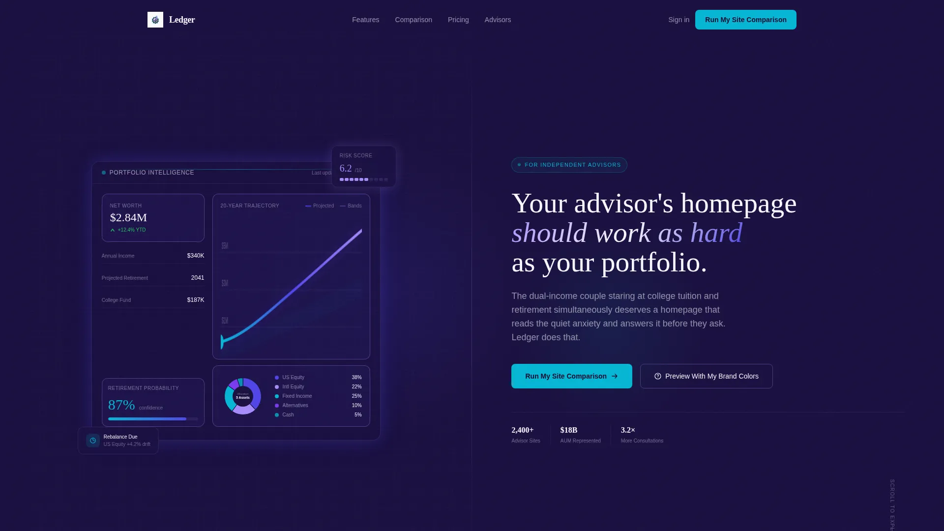
- A 50/50 split-screen hero with a parallax portfolio dashboard mockup on the left and a bold headline on the right
- An interactive comparison module, animated feature toggles, a draggable persona slider, and a fixed-bottom comparison bar
- Two conversion paths: a primary "Run My Site Comparison" form and a secondary live brand-color preview tool
Feature list
This section covers the core functional and visual capabilities built into the Ledger template.
Split-Screen Parallax Hero
The hero divides the viewport evenly. The left half displays an oversized dashboard mockup showing a portfolio allocation wheel, a net-worth trajectory line, and a Monte Carlo probability band. The right half carries a single bold headline. As the cursor moves, parallax shifts each dashboard layer at a different speed, making the screenshot feel three-dimensional and alive.
Side-by-Side Comparison Module
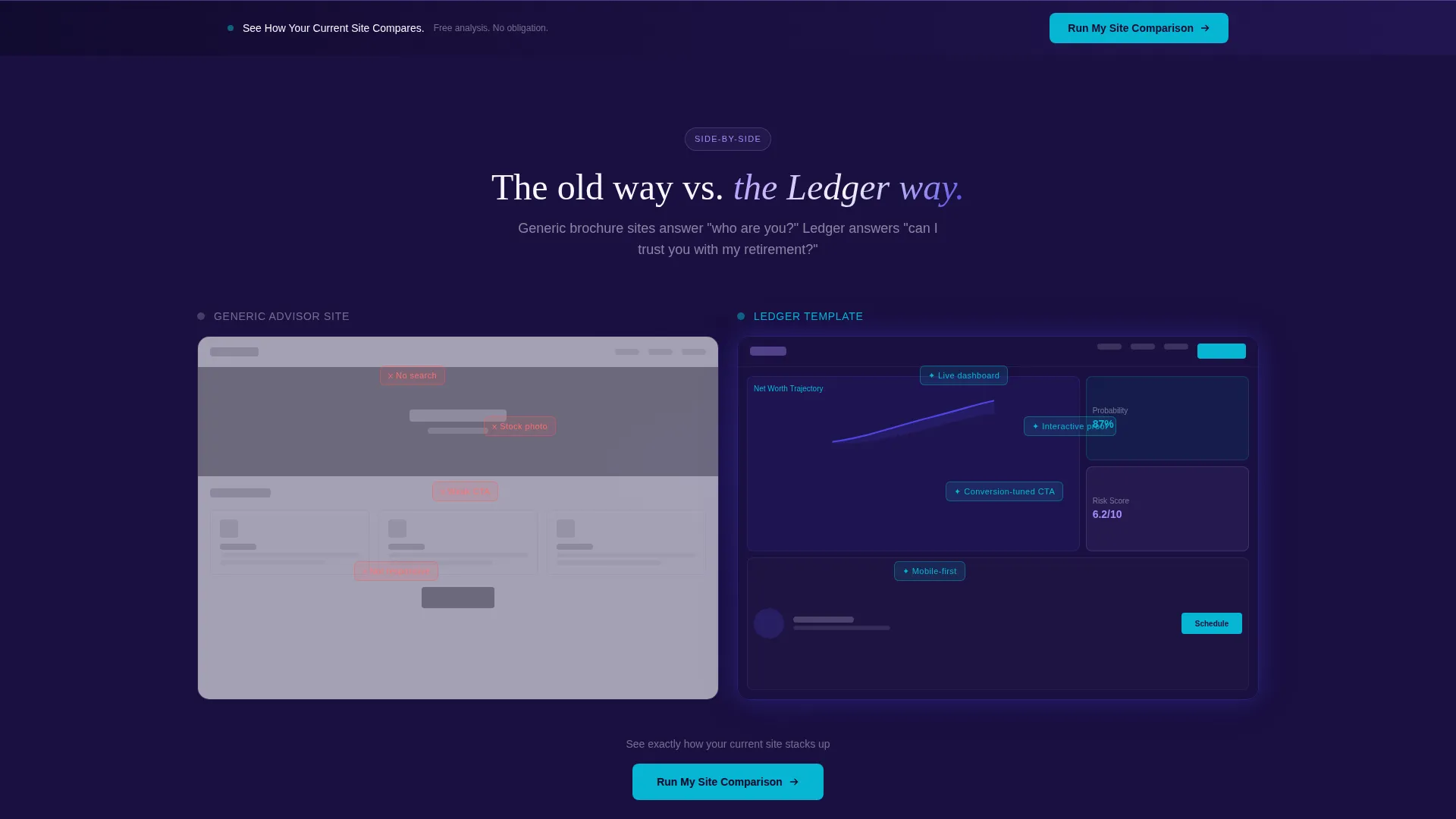
The first section below the fold presents two advisor homepage approaches next to each other: a static brochure layout on the left and this dynamic template on the right. Animated callouts highlight differences as each element enters the viewport, building a case through visual contrast rather than marketing copy.
Interactive Feature Toggles
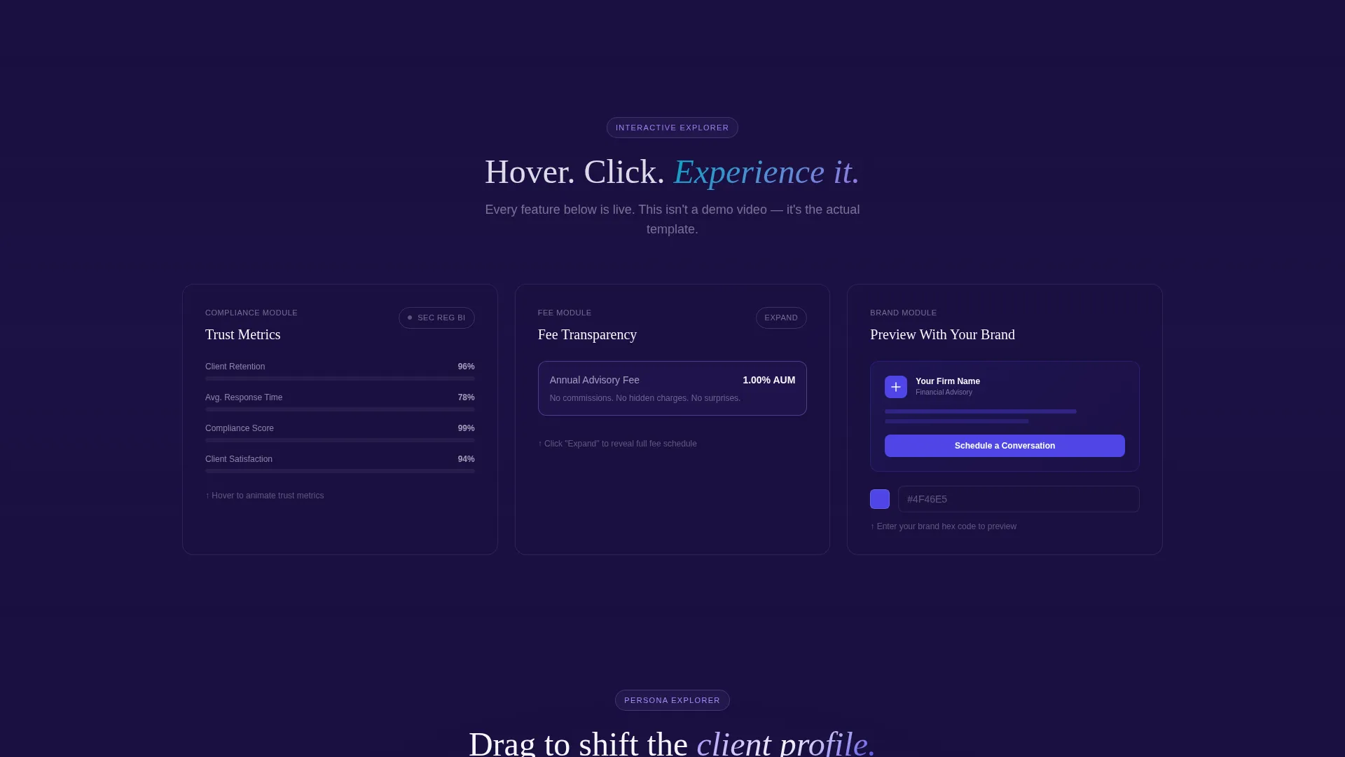
Visitors can hover a compliance badge to watch trust metrics animate, click a fee-transparency module to expand it with sample disclosures, and explore each feature state without leaving the page. Every interaction is designed to reveal depth rather than simply describe it.
Persona Drag Slider
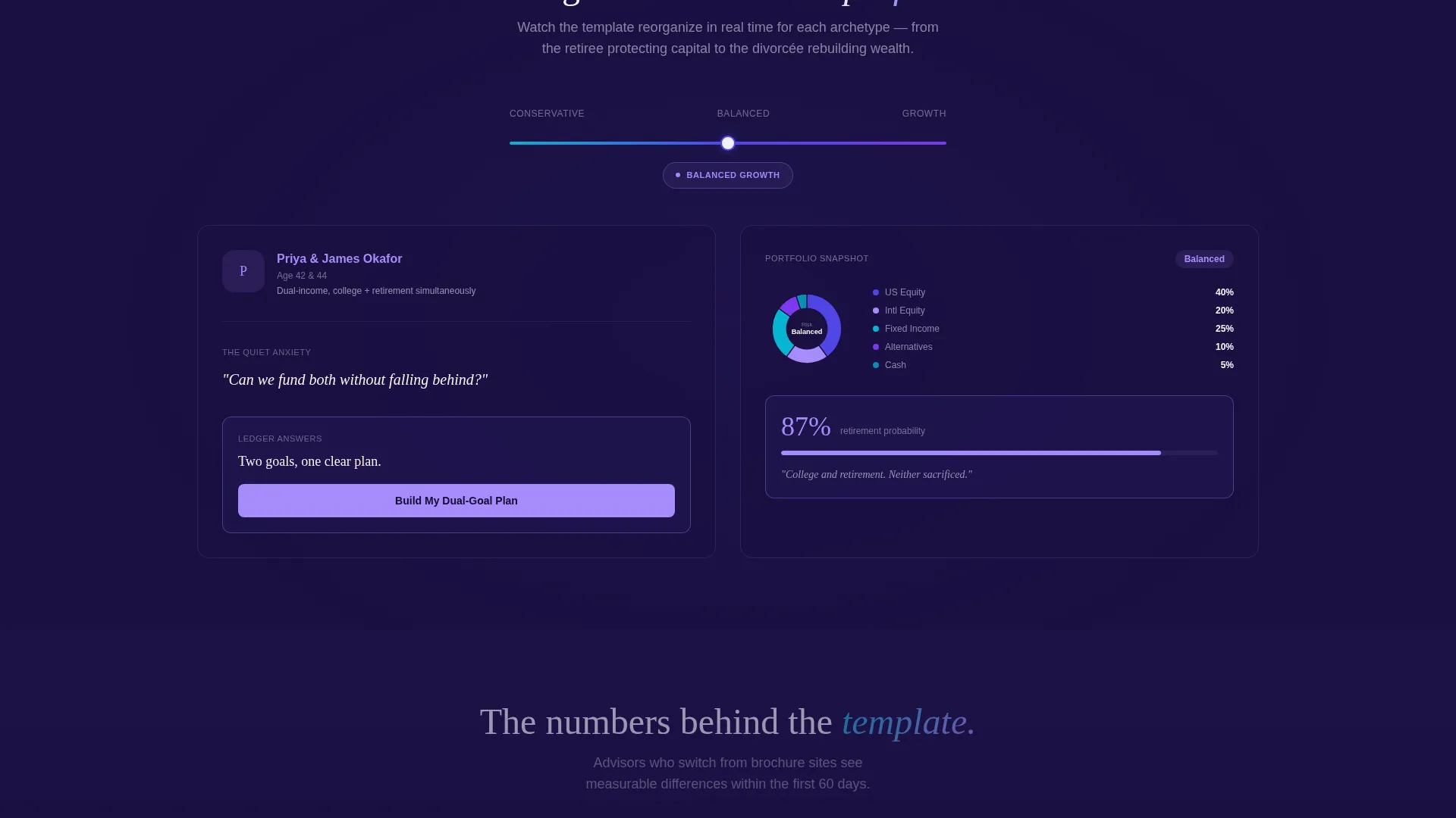
A draggable slider lets visitors shift a sample client profile from conservative to aggressive. As the slider moves, the template's content blocks reorganize in real time, showing how the layout adapts to different client types. This single interaction communicates flexibility more convincingly than any bullet list could.
Dual Conversion Paths
The primary call to action, "Run My Site Comparison," opens a minimal form asking only for the advisor's current website URL, followed by a name and email. A secondary path, "Preview With My Brand Colors," lets visitors enter a hex code and watch the template re-skin live. Both paths lower friction and let visitors self-qualify before committing.
Fixed-Bottom Comparison Bar
A persistent bar anchored to the bottom of the viewport reads "See How Your Current Site Compares." It stays visible throughout the scroll journey, keeping the primary conversion action accessible without interrupting any section's interactive experience.
Page sections overview
| Section | Purpose |
|---|---|
| Split-Screen Hero | Introduce template with parallax dashboard and headline |
| Comparison Module | Show static versus. dynamic layout side by side |
| Feature Toggle Section | Let visitors interact with trust and fee components |
| Persona Slider Section | Demonstrate real-time content adaptation by client type |
| Fixed-Bottom Bar | Keep primary comparison call to action persistently visible |
| Primary Conversion Form | Capture URL, name, and email with minimal friction |
| Brand Color Preview | Let visitors re-skin the template with their own hex code |
Design & branding system
The Electric Indigo color system was chosen to feel precise and luminous, like a Bloomberg terminal that has been through a serious design education. Every color has a role, and none of them overlap.
- Deep vault navy (#1A1040) forms the dark foundation; charged indigo (#4F46E5) and phosphor lilac (#A78BFA) carry the brand energy; clean ledger white (#F8F7FF) provides breathing room throughout
- Electric cyan (#06B6D4) appears exclusively on interactive elements and calls to action, so every glowing point of interaction is immediately identifiable
- The Dynamic Motion theme means scroll and hover states are purposeful, not decorative, each animation earning its place by clarifying something for the visitor
Mobile & speed optimization
The Ledger template is structured so that its interactive complexity does not come at the cost of usability on smaller screens. The motion and layout choices scale intentionally.
- The 50/50 split-screen hero stacks vertically on mobile, keeping the dashboard mockup and headline readable without horizontal scrolling
- Interactive toggles and the persona slider are touch-friendly, so mobile visitors can engage with the same feature states as desktop users
- The fixed-bottom comparison bar remains accessible on all screen sizes, keeping the conversion path visible throughout the mobile scroll experience
How this template helps you convert
Ledger is built around a specific conversion philosophy: let visitors use the product before asking for anything. By the time a visitor reaches the form, they have already experienced the template's intelligence firsthand.
- The interactive comparison module and feature toggles create a series of small "aha" moments as visitors scroll, each one making the generic alternative feel less acceptable and building confidence in this template's approach.
- The dual conversion paths reduce decision friction by offering a lower-commitment secondary action ("Preview With My Brand Colors") alongside the primary form, so visitors who are not yet ready to submit their URL can still self-qualify through hands-on exploration.
Other information about this template
Ledger sits within the Financial Advisor Website Templates subcategory and is a strong fit for advisors building or refreshing a financial advisor homepage template. A few additional details worth knowing before you start.
- The template is categorized under Technology and is designed specifically for the financial advisor homepage template niche, where differentiation from generic layouts is a primary challenge
- The lp_direction is Comparison/Versus, meaning every section is architecturally framed to contrast this template against the static alternative, which makes the value case accumulate naturally as visitors scroll
- The template style is Split Screen (50/50), the header concept is Product Screenshot, and the creative direction is Interactive Explorer, all three of which work together to create a cohesive, demo-forward experience
- Color customization is built into the secondary conversion path, so advisors can preview the template in their own brand palette before making any commitment
Theme
Dynamic Motion
Creative direction
Interactive Explorer
Color system
Electric Indigo
Style
Split Screen (50/50)
Direction
Comparison/Versus
Page Sections
Split-screen Parallax Hero
Side-by-side Comparison Module
Interactive Feature Toggles
Persona Drag Slider
Dual Conversion Paths
Fixed-bottom Comparison Bar
Related questions
Who is the Ledger template designed for?
What makes the hero section different from a standard header?
Can I preview the template in my own brand colors before committing?
How does the persona slider work?
What does the primary conversion form ask for?



