Accounting & Tax Firm Directory Website Template
Ledger is a forensic audit landing page built for accounting and audit firms serving CFOs, nonprofit directors, and private-equity-backed companies. The split-screen layout pairs credential badges with bold proof-of-performance headlines. A monochrome steel palette and industry-report scroll structure guide every visitor toward one clear action: requesting an audit readiness assessment.
by Rocket studio
Quick summary
Ledger is a single-page, click-through landing page template designed for forensic audit firms. It uses a 50/50 split-screen layout, a monochrome steel color system, and an industry-report scroll structure. The page front-loads authority through credential badges, escalates trust with data visualizations, and closes with a single signal-green call-to-action button.
Who this template is for
This template is built for audit and accounting firms that need to communicate analytical depth and professional credibility before a visitor ever fills out a form. It works especially well for firms targeting clients who face high-stakes financial scrutiny.
- Forensic audit firms serving mid-market manufacturers, nonprofits, and private-equity-backed companies
- Accounting practices preparing clients for Securities and Exchange Commission filings or grant compliance reviews
- Audit professionals who want a credential-first page that earns trust before asking for contact information
What problem this template solves
Most audit firm pages look like every other professional services site. They lead with a generic tagline and bury their proof. Ledger flips that structure entirely, making authority visible from the first scroll position.
- Visitors leave before trusting a firm because credentials are hidden deep in the page
- Data-heavy audit services are hard to communicate without a clear visual structure
- Generic layouts fail to signal the analytical rigor that high-stakes audit clients actually need
What you get with this template
You get a fully structured, single-page click-through layout that guides a visitor from credential recognition to conversion without requiring a form on the page. Every section is purpose-built for an audit firm's specific proof points.
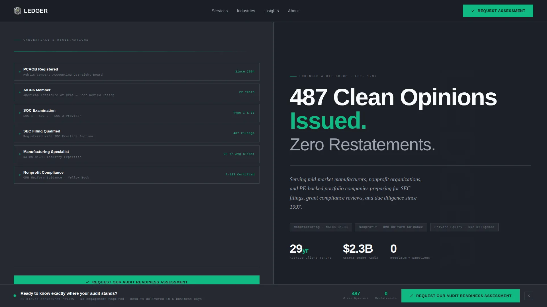
- A horizontal award badge header displaying registrations and industry recognitions on a graphite field
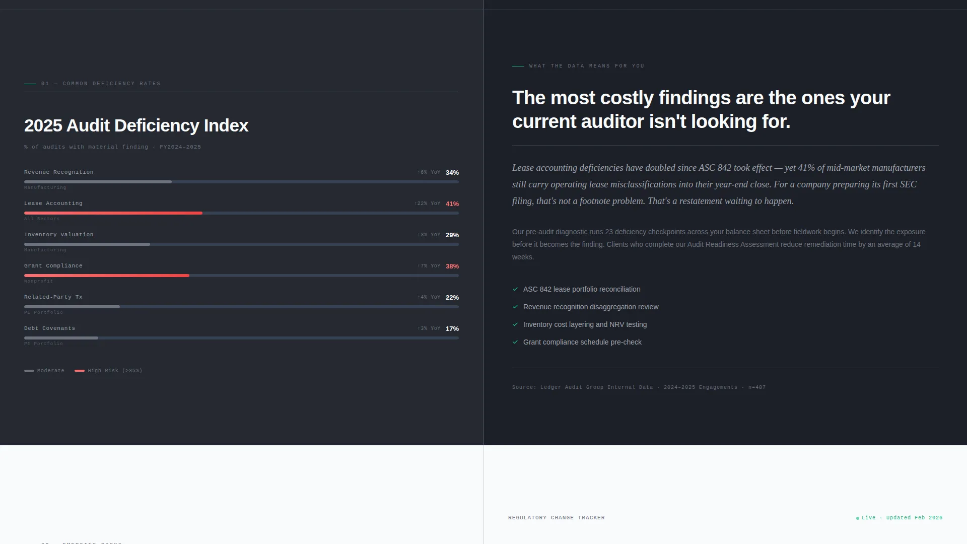
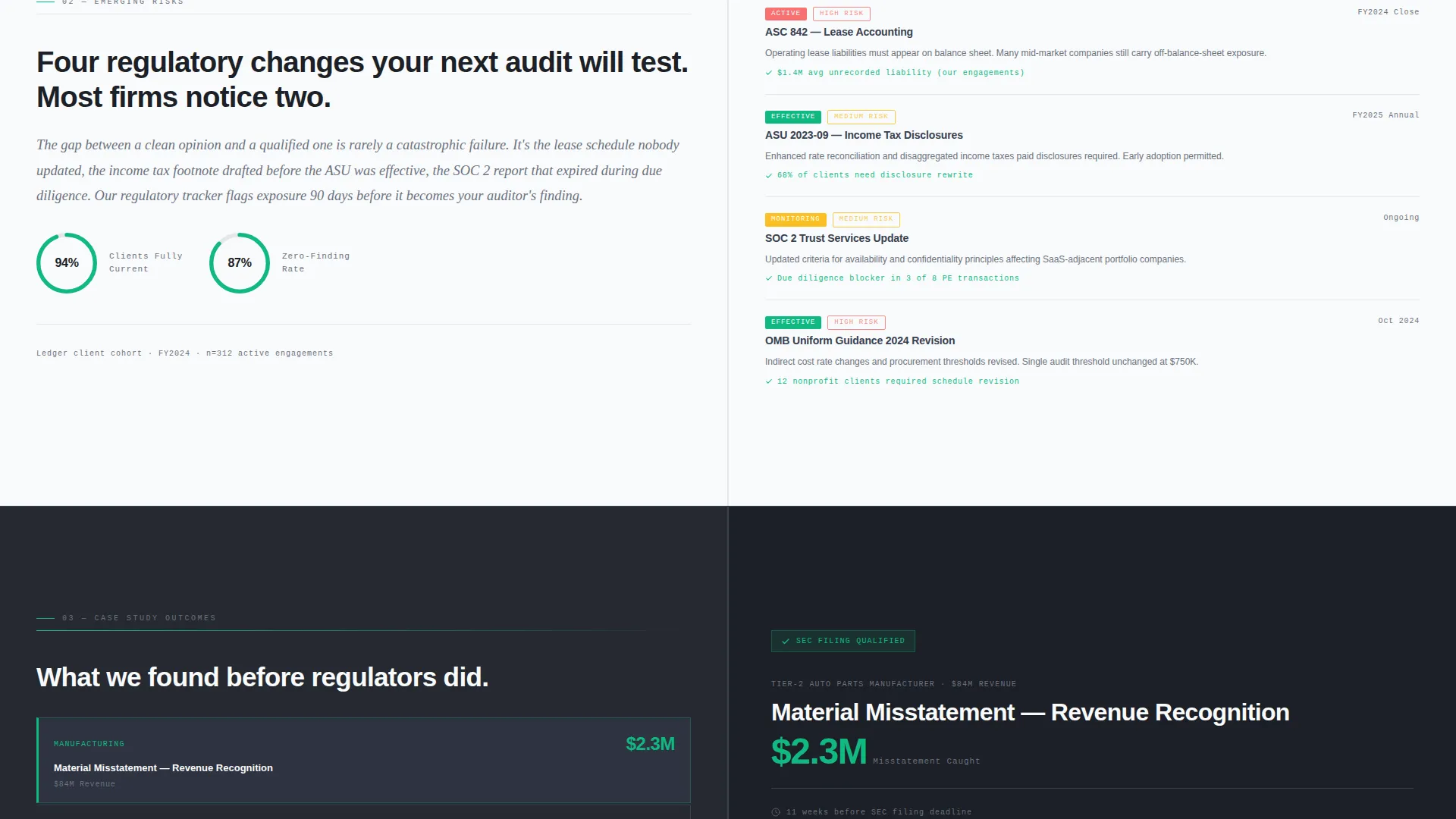
- Three escalating split-screen content sections pairing data visualizations with narrative explanations
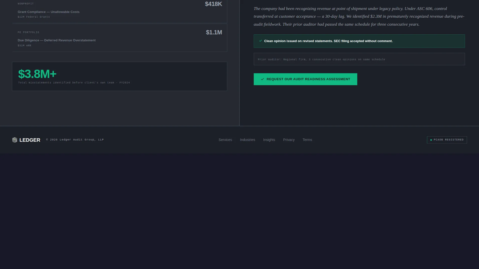
- A persistent bottom-bar call-to-action that reappears after the second scroll section
Feature list
This template delivers a focused set of design and layout features grounded entirely in the source brief.
Split-Screen Section Layout
Each content section divides the viewport into two equal panels. The left panel holds a minimal dashboard chart or data visualization. The right panel carries a narrative paragraph explaining what that data means for the visitor's specific industry context.
Award Badge Header Band
The top of the page is a full-width horizontal band reserved for professional credential badges. Badges render as monochrome steel icons on a graphite background, each outlined with a hairline signal-green border to visually confirm verified status.
Escalating Stakes Structure
The three scroll sections are deliberately sequenced. The first covers routine compliance, the second introduces emerging risks such as new lease accounting standards, and the third presents case-study outcomes. The sequence builds urgency without manufactured pressure.
Click-Through Call-to-Action System
The primary call-to-action button reads "Request Our Audit Readiness Assessment" and appears twice: once beneath the header badge band and again as a persistent bottom bar after the second scroll section. There is no form on this page.
Proof-Led Headline Block
The right panel of the opening section carries a single heavy, condensed sans-serif headline stating a specific performance record, supported by a subline naming the three industries served and the firm's founding year. The composition replaces stock photography entirely.
Monochrome Steel Color System
The palette uses four values only: deep graphite for backgrounds, brushed steel for body text and divider lines, ledger-paper white for breathing room in data sections, and a single signal-green accent reserved for checkmarks, verified badges, and the primary call-to-action button.
Page sections overview
| Section | Purpose |
|---|---|
| Badge Header Band | Establish credential authority at first glance |
| Headline Proof Block | Anchor performance record and firm identity |
| Compliance Data Section | Introduce routine compliance context with data |
| Emerging Risk Section | Surface new regulatory risks with visual support |
| Case Study Section | Convert skepticism into urgency via outcomes |
| Persistent call to action Bar | Recapture scroll-past visitors with a fixed prompt |
Design & branding system
The visual identity follows a Dashboard Pro theme expressed through a Monochrome Steel palette. Every color decision has a defined role, and no decorative elements appear outside those roles.
- Graphite (#1C1F26) anchors all section backgrounds; steel (#6B7280) carries body text and divider lines; ledger-paper white (#F9FAFB) opens breathing room in data-heavy panels
- Signal-green (#10B981) appears only on checkmarks, verified badge borders, and the call-to-action button, so every instance reads as a confirmed or actionable element
- Typography uses a heavy condensed sans-serif for headlines and a clean body face for narrative paragraphs, reinforcing the audit-report aesthetic throughout
Mobile & speed optimization
The layout is structured for clarity on any screen size. The split-screen panels and data visualization sections are designed to reflow cleanly without losing their visual logic.
- Split-screen panels stack vertically on smaller viewports so data and narrative remain paired and readable
- The persistent bottom-bar call-to-action is positioned to stay accessible on mobile without blocking content
- Minimal decorative elements and a tight color palette keep the visual load light across all devices
How this template helps you convert
The page earns its click by sequencing proof before the ask. Every layout decision moves a skeptical, high-value visitor closer to the one action the page requests.
- The badge header establishes regulatory and professional credibility before the visitor reads a single line of copy, reducing the friction that specialist audiences bring to an unfamiliar firm.
- The escalating data sections deepen analytical trust across three scroll positions, so by the time the persistent call-to-action bar appears, the visitor has already absorbed specific evidence of the firm's capabilities.
Other information about this template
This template is filed under the Finance and Insurance category, with a subcategory of Accounting and Tax Firm and a niche focus on audit practices. It is one of the more specialized templates in the marketplace for this vertical.
- The template style is a 50/50 split screen, the theme is Dashboard Pro, and the creative direction is Industry Report
- The landing page direction is Click-Through, meaning the page goal is a single button click to a qualification page, not an on-page form submission
- The header concept is Award Badges, which is a deliberate structural choice to front-load proof for audiences who evaluate credibility before reading body copy
Theme
Dashboard Pro
Creative direction
Industry Report
Color system
Monochrome Steel
Style
Split Screen (50/50)
Direction
Click-Through
Page Sections
Split-screen Section Layout
Award Badge Header Band
Escalating Stakes Structure
Click-through Call-to-action System
Proof-led Headline Block
Monochrome Steel Color System
Related questions
Does this template include a contact form?
Can I update the badge icons to match my firm's real credentials?
Is this template suitable for a firm focused on one industry only?
What is the purpose of the persistent bottom-bar call-to-action?
How many layout sections does this landing page contain?



