Fee-Only Financial Advisor Website Template with Retirement Tools
Ledger is a split-screen financial advisor landing page template built around interactive tools and calm, dashboard-style design. It pairs a live stats header and a retirement gap calculator with a lead capture form, guiding anxious prospective clients from raw numbers to a confident next step. The monochrome steel palette and signal-green accents communicate precision and trust from the first scroll.
by Rocket studio
Quick summary
Ledger is a single-page financial advisor contact landing page that leads with data before it leads with persuasion. A live metrics header, interactive calculators, and a persistent booking button work together to show visitors exactly what they stand to gain from a conversation. The design feels like a professional financial dashboard: honest, calm, and purposeful.
Who this template is for
This template is built for financial advisors who want their landing page to do real work. It is suited to practitioners who serve clients with layered financial situations and who want to earn trust through transparency rather than sales copy.
- Independent financial advisors ready to replace a generic contact page with a tool-led experience
- Advisory practices targeting dual-income households, small business owners, and recent inheritors
- Advisors focused on retirement planning, tax efficiency, and estate exposure who need a lead generation landing page
What problem this template solves
Most financial advisor contact pages ask for a meeting before they have earned one. Ledger flips that sequence. It gives visitors something useful first, then lets the results create the motivation to reach out.
- Visitors arrive with financial anxiety and leave without a reason to act, because generic pages offer no diagnostic value
- Advisors lose qualified leads to friction, since a blank contact form feels like a cold ask rather than a logical next step
- The template removes both problems by building a case section by section, so the call-to-action feels inevitable rather than intrusive
What you get with this template
You get a fully structured, single-page lead generation landing page designed specifically for financial advisory practices. Every section is intentional, and the layout follows a clear diagnostic arc from awareness to action.
- A 50/50 split-screen layout with a live stats header, interactive calculators, and a two-stage call-to-action system
- A retirement gap calculator with real-time projection output, plus subsequent mini-tool sections covering tax efficiency, estate exposure, and insurance gap
- A soft-lock lead capture form collecting name, email, and preferred call window, alongside a persistent floating booking button
Feature list
This template includes a focused set of built-in components. Each one is designed to move a financially anxious visitor closer to a confident decision.
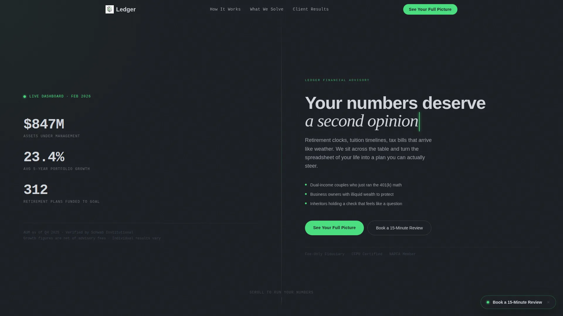
Animated Stats Header
The header displays three animated counters: total assets under management, average client portfolio growth over a trailing five-year period, and number of retirement plans funded to goal. Numbers tick upward in a monospaced typeface against a deep charcoal background, building immediate credibility before the visitor reads a single line of copy.
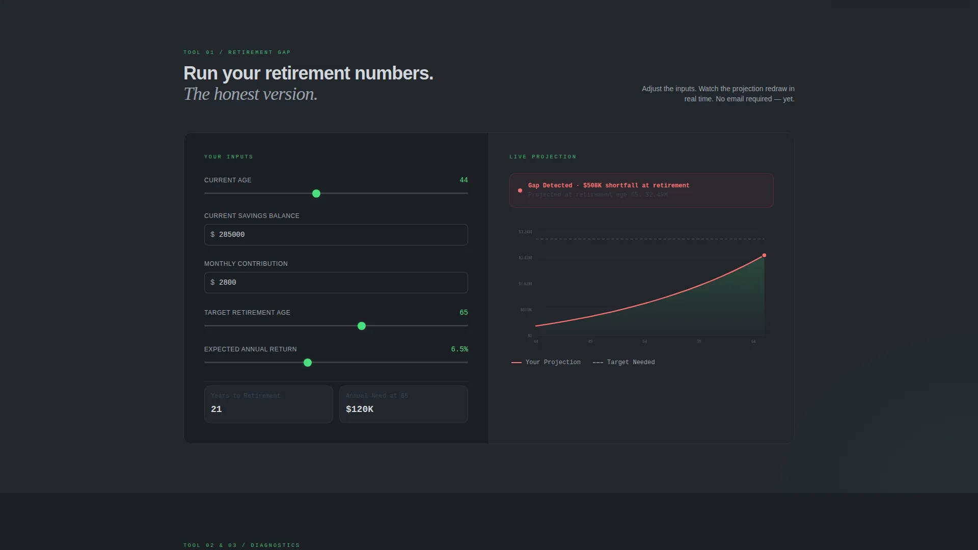
Interactive Retirement Gap Calculator
The primary interactive section splits across both panels. Visitors enter their current age, savings balance, monthly contribution, and target retirement age on the left. A real-time projection graph redraws on the right with every keystroke, making the visitor's financial gap visible before any advisor says a word.
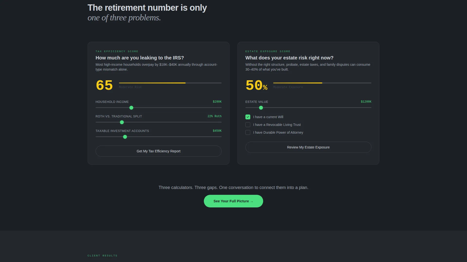
Progressive Diagnostic Sections
Each scroll depth reveals a new financial dimension with its own mini-tool. Tax efficiency score, estate exposure, and insurance gap each get their own section and interactive element. The cumulative effect is a visitor who understands their situation better than when they arrived.
Soft-Lock Lead Capture Form
After the retirement calculator delivers its projection, a form appears inviting the visitor to enter their name, email, and preferred call window (morning, midday, or evening). The placement is earned: visitors have already seen a gap they care about, so the form feels like a logical continuation rather than an interruption.
Persistent Floating Booking Button
A secondary call-to-action pill labeled "Book a 15-Minute Review" floats in the bottom-right corner after the visitor has scrolled past two tool sections. It appears only once the visitor has engaged with the content, avoiding the feel of an ambush and respecting the earned-placement principle built into the template.
Split-Screen 50/50 Layout
Every section uses a deliberate 50/50 panel structure. Inputs and data live on the left; outputs, graphs, and context live on the right. This division mirrors the way a real advisor meeting works: the client brings the numbers, the advisor shows what they mean.
Page sections overview
| Section | Purpose |
|---|---|
| Stats metrics header | Display animated counters to build instant credibility |
| Retirement gap calculator | Let visitors diagnose their own retirement shortfall |
| Tax efficiency section | Reveal tax planning gaps with an interactive mini-tool |
| Estate exposure section | Show potential estate vulnerabilities through a self-scored tool |
| Insurance gap section | Surface underinsurance risk as a concrete, visible number |
| Soft-lock lead form | Capture name, email, and call preference after value is delivered |
| Floating booking button | Provide persistent, low-friction access to a 15-minute review |
Design & branding system
The visual identity follows a Dashboard Pro theme built on a Monochrome Steel color system. Every color choice is functional. Nothing is decorative. The palette is designed to communicate precision and calm at a glance.
- Core tones include gunmetal (#3B3F45), polished chrome (#D1D5DB), and deep charcoal (#1C1F24), creating a brushed-steel feeling across all panels
- A single signal-green accent (#4ADE80) is reserved exclusively for positive projections, active buttons, and confirmation states, so green always means go
- Typography uses a monospaced typeface for all numerical displays, reinforcing the dashboard metaphor and making data feel live and authoritative
Mobile & speed optimization
The split-screen layout is structured to adapt cleanly across screen sizes. The 50/50 panel logic translates to a stacked single-column flow on smaller devices so that every interactive section remains usable without horizontal scrolling.
- Calculator inputs and output graphs reflow into a vertical sequence on mobile, preserving the diagnostic arc of the page
- The persistent floating booking button remains anchored in the bottom-right corner on all screen sizes, maintaining access to the secondary call-to-action throughout the scroll
How this template helps you convert
Ledger is built around a single conversion principle: give value before you ask for anything. The page architecture follows a deliberate sequence that moves visitors from curiosity to commitment.
- The animated stats header and retirement calculator deliver immediate, personalized insight, giving visitors a reason to stay and engage rather than bounce
- Progressive diagnostic sections deepen the case with each scroll, so by the time visitors reach the lead capture form, they have already identified multiple gaps they want help solving
- The two-stage call-to-action system (soft-lock form plus floating booking button) gives visitors two natural entry points at different levels of intent, increasing the likelihood that any motivated visitor finds a friction-appropriate way to reach out
Other information about this template
Ledger fits within the broader category of financial advisor website templates focused on lead generation. It is a strong fit for advisors building or refreshing their digital presence with a tool-first approach.
- The template is categorized under financial advisor website templates and is specifically designed as a financial advisor contact page
- The Dashboard Pro theme and Monochrome Steel color system make it visually distinct from typical financial services pages that rely on stock photography and blue gradients
- The creative direction is Calculator/Tool First, meaning the page architecture prioritizes interactive utility over static marketing copy throughout the entire scroll experience
Theme
Dashboard Pro
Creative direction
Calculator/Tool First
Color system
Monochrome Steel
Style
Split Screen (50/50)
Direction
Lead Generation
Page Sections
Animated Stats Metrics Header
Interactive Retirement Gap Calculator
Progressive Diagnostic Mini-tools
Soft-lock Lead Capture Form
Persistent Floating Booking Button
50/50 Split-screen Layout
Related questions
Who is the ideal client profile for this template?
Can I customize the calculator inputs and projection outputs?
How does the two-step call-to-action system work?
Is this template suitable for a solo advisor or only for larger firms?
What makes this landing page different from a standard financial advisor contact page?



