Small Business Checking Landing Page Template
Ledger is a single-column landing page template built for small business checking account offers. It pairs a commanding dark-navy hero with an inline four-question quiz that recommends the right checking tier for each visitor. The design reads like a banking dashboard: data cards, fee comparisons, and social proof sections guide owners from problem awareness to account signup.
by Rocket studio
Quick summary
Ledger is a conversion-focused landing page template designed for small business checking account products. It opens with a typographic hero on deep navy, moves through industry-report-style data sections that build urgency, and closes with an inline progressive quiz that matches each visitor to the right checking tier before directing them to open an account.
Who this template is for
This template is built for fintech brands, credit unions, and digital banks that want to qualify leads and convert them into business checking account holders. It speaks directly to the people actually opening these accounts.
- Freelance contractors managing multiple 1099 income streams who need a dedicated business account
- First-time limited liability company founders who just received their Employer Identification Number and need a real place to deposit revenue
- Main Street shop owners juggling vendor payments, point-of-sale deposits, and monthly payroll
What problem this template solves
Most small business owners open the wrong checking account, or none at all, because no one shows them the actual cost of that mistake. This template frames the decision as a data problem and gives visitors a structured path to the right answer.
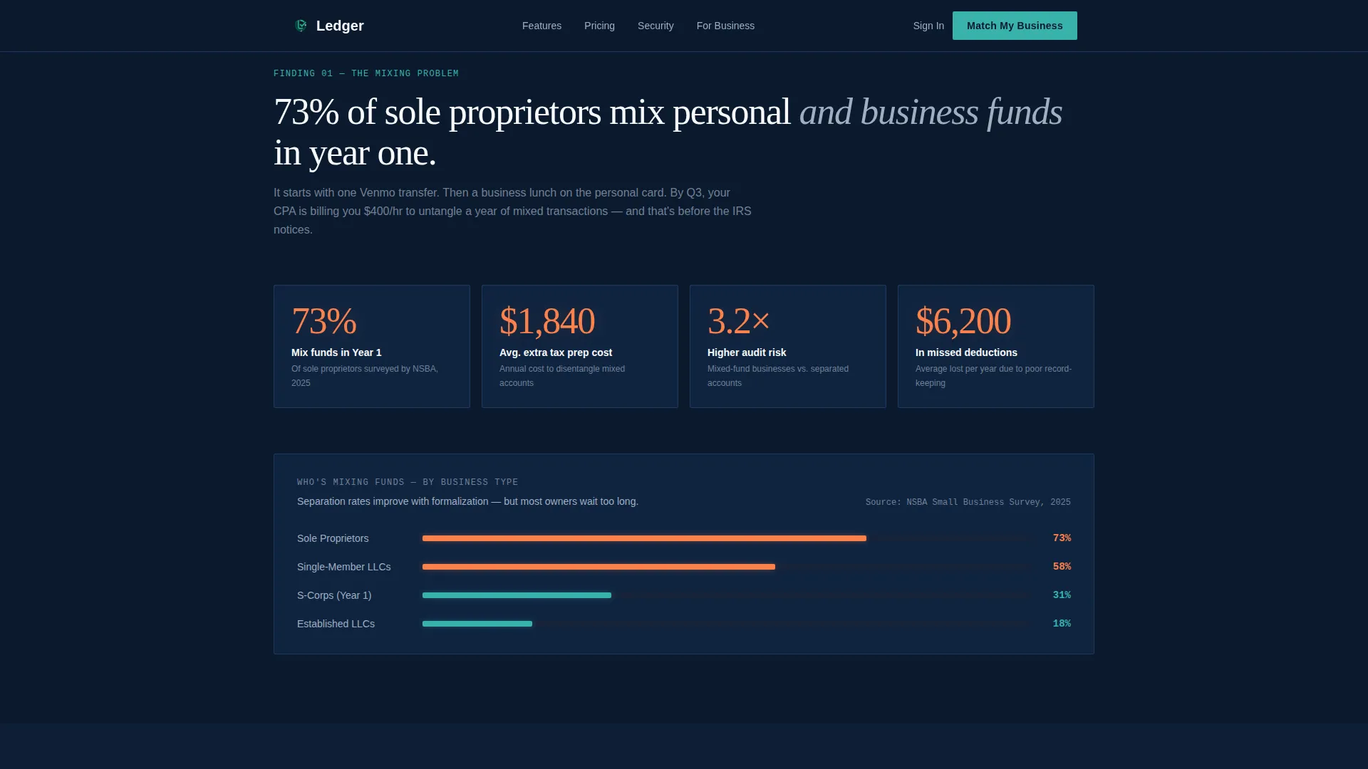
- Sole proprietors mixing personal and business funds face hidden costs in tax preparation, audit exposure, and missed deductions
- Generic landing pages offer no qualification logic, so visitors leave without knowing which account fits their structure
- High-friction signup forms ask the same questions twice, creating drop-off before the account is ever opened
What you get with this template
You get a fully structured single-column landing page with six clearly defined sections, a working inline quiz flow, and a dark-navy Dashboard Pro visual system ready to represent a serious financial product. Every section earns its place in the conversion sequence.
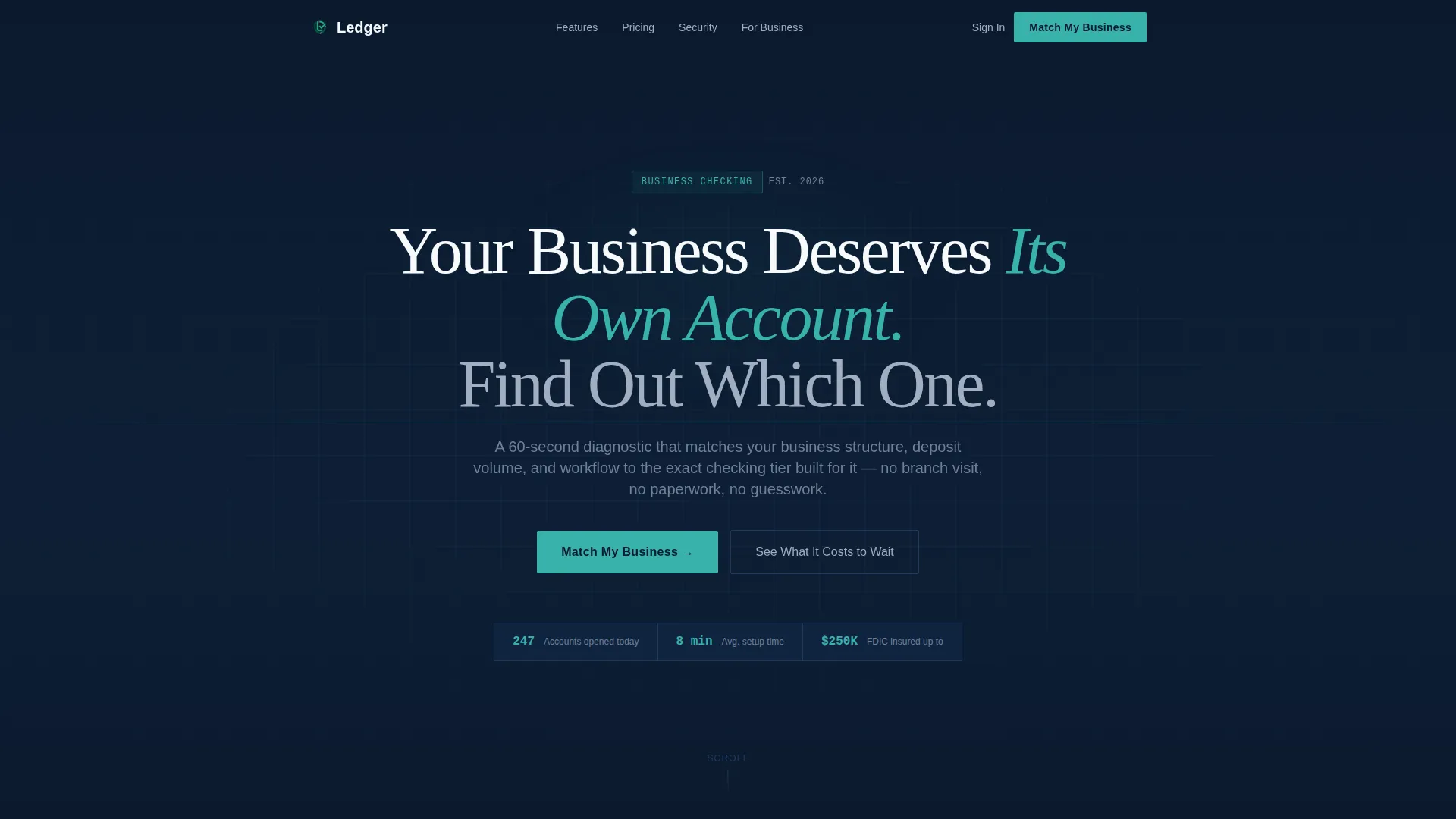
- A hero section with a 72-pixel-plus centered headline and a single subline that reframes the quiz as a 60-second diagnostic
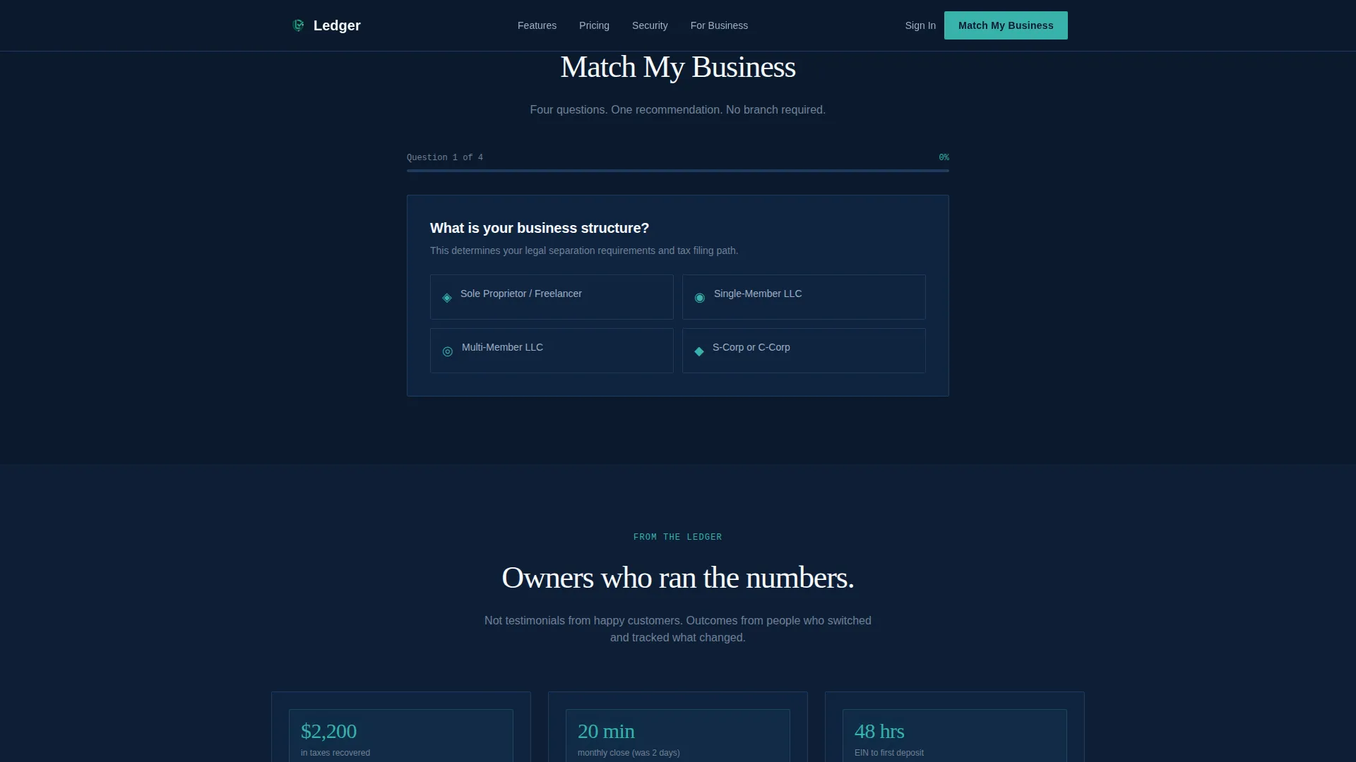
- An inline four-question progressive quiz with personalized tier results, a side-by-side comparison, and a pre-filled final call-to-action button
- Data cards, fee comparison visuals, and social proof blocks including account holder quotes and an FDIC insured badge
Feature list
This template delivers a focused set of components built around one goal: turning a curious visitor into a qualified account opener.
Giant Centered Hero Headline
The hero renders stark white type at 72 pixels or larger against the deep terminal navy background. No imagery or illustration competes with the message. Negative space and typographic scale communicate institutional confidence from the first scroll position.
Industry Report Data Sections
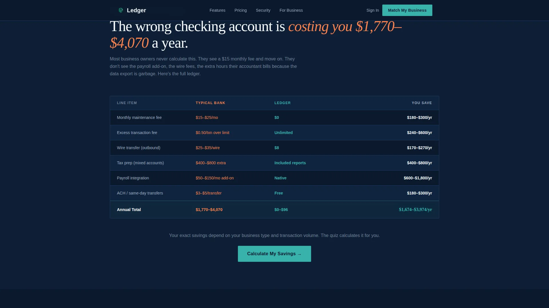
Scrolling past the hero, the page presents findings in an industry-report format. A prominent data point opens each section, followed by visual cost-breakdown cards that quantify the real expense of choosing the wrong account or mixing funds.
Inline Progressive Quiz
The quiz is embedded directly in the page flow, not behind a modal or a redirect. Four sequential questions cover business structure, average monthly deposits, monthly transaction volume, and invoicing or payroll needs. Results appear inline with a personalized tier recommendation.
Side-by-Side Results Comparison
After the quiz completes, the results view presents a clear comparison of checking tiers relevant to the visitor's answers. The layout mirrors a clean data card format consistent with the rest of the page design.
Pre-Filled Account Opening call to action
The final call-to-action button reads "Open This Account" and carries the visitor's quiz answers forward. This removes redundant form fields and reduces friction at the most critical conversion step.
Trust and Social Proof Section
This section includes specific account holder quotes identified by business type, an FDIC insured badge, and security signal indicators. It appears after the quiz to reinforce confidence at the moment of decision.
Page sections overview
| Section | Purpose |
|---|---|
| Hero Headline | Establish authority and introduce the 60-second quiz |
| Data Stakes | Present industry-report findings on fund-mixing costs |
| Fee Comparison | Show silent expense data cards for wrong account choices |
| Inline Quiz | Qualify visitors across four progressive questions |
| Results Comparison | Deliver personalized tier recommendation with account comparison |
| Trust and Proof | Reinforce credibility with quotes, FDIC badge, and security signals |
Design & branding system
The visual language follows a Dashboard Pro theme built around the Midnight Blue color system. The overall feel is a banking terminal at 2 AM: dark, focused, and precise. Every color in the palette has a specific functional role.
- Deep terminal navy (#0B1A2E) as the primary background, muted ledger gray (#A0AEC0) for secondary text and data labels, and crisp deposit white (#F7FAFC) for primary body copy
- Confirmation green (#38B2AC) reserved exclusively for call-to-action buttons and positive-state indicators such as quiz result highlights
- DM Sans handles data labels and body text for clarity at small sizes; Fraunces appears at editorial moments to add serif warmth to key headlines
Mobile & speed optimization
This template was designed mobile-first, reflecting the reality that its target users run payroll from a phone at 6 AM and review receipts late at night. The single-column flow scales naturally across screen sizes without structural changes.
- Scroll-triggered number reveals and staggered data card animations are handled by client-side components only, keeping the static page shell lightweight
- The inline quiz uses step-transition animations optimized for touch navigation, with each question advancing on a single tap
How this template helps you convert
The page is structured as a deliberate escalation sequence. Each section increases the visitor's awareness of the problem before presenting the solution and the path forward.
- The hero anchors attention with a direct headline and reframes the quiz as a fast, useful diagnostic rather than a lead capture form, lowering the perceived commitment barrier
- The data and fee comparison sections build urgency by converting abstract risk into specific dollar costs, making inaction feel more expensive than signing up
- The quiz collects qualification data naturally through the user experience, so the final call-to-action arrives pre-personalized and the visitor has already mentally committed to a specific account tier
Other information about this template
This template is built for the Finance and Insurance category, specifically the small business owner finance and small business checking niche. It is designed for United States markets with USD currency formatting and MM/DD/YYYY date conventions throughout.
- The template style is Single Column Flow using the Dashboard Pro theme
- Creative direction follows an Industry Report structure, and the primary conversion mechanism is a Quiz and Assessment flow
- The header concept uses a Giant Headline Centered layout with no decorative imagery, relying on typographic scale and negative space alone
- Animation is set at a medium intensity level with scroll-triggered reveals; interactivity is high due to the inline quiz with state management and results comparison logic
Theme
Dashboard Pro
Creative direction
Industry Report
Color system
Midnight Blue
Style
Single Column Flow
Direction
Quiz/Assessment
Page Sections
Giant Centered Hero Headline
Industry Report Data Sections
Inline Progressive Quiz
Personalized Tier Results View
Pre-filled Account Opening Call to Action
Trust and Social Proof Block
Related questions
Who is this landing page template designed for?
What does the inline quiz actually do?
Can I use this template without the quiz section?
What design system does this template use?
Is this template suited for mobile users?



