Financial Advisor 404 Error Recovery Website Template
Ledger is a financial advisor 404 error landing page that turns a broken link into a working financial tool. Built on a Tech Glass visual identity with a Slate and Sky color system, it opens with a live net-worth estimator and flows through three interactive comparison tools. Visitors leave with real numbers, not an apology.
by Rocket studio
Quick summary
Ledger replaces a dead-end 404 page with an interactive financial checkpoint. Visitors land on a working net-worth estimator and scroll through three tool-driven sections covering DIY versus advised portfolios, fee comparisons, and risk. Every section builds trust through the visitor's own numbers before a call-to-action ever appears.
Who this template is for
This template is built for independent financial advisors and advisory firms who want every entry point on their site to generate real leads. It works best when your audience is financially aware and comparison-driven.
- Financial advisors who want a 404 page that actively earns new client conversations
- Advisory practices that compete on fee transparency and long-term performance data
- Professionals whose site visitors are mid-research and respond better to tools than to text
What problem this template solves
Most 404 pages lose visitors instantly. They offer an apology, maybe a search bar, and nothing else. For a financial advisor, that is a wasted moment with a high-intent professional who was already on your site.
- Broken links and stale bookmarks quietly drain potential client traffic with nothing to show for it
- Generic error pages offer no reason to stay, explore, or trust the advisor behind the site
- Visitors who land on a dead URL have no path to the advisor's value unless the page creates one
What you get with this template
You get a single-page hub and spoke layout with anchor navigation linking three interactive tool sections. The page is structured to hold attention from the first second and convert through demonstrated value rather than persuasion copy.
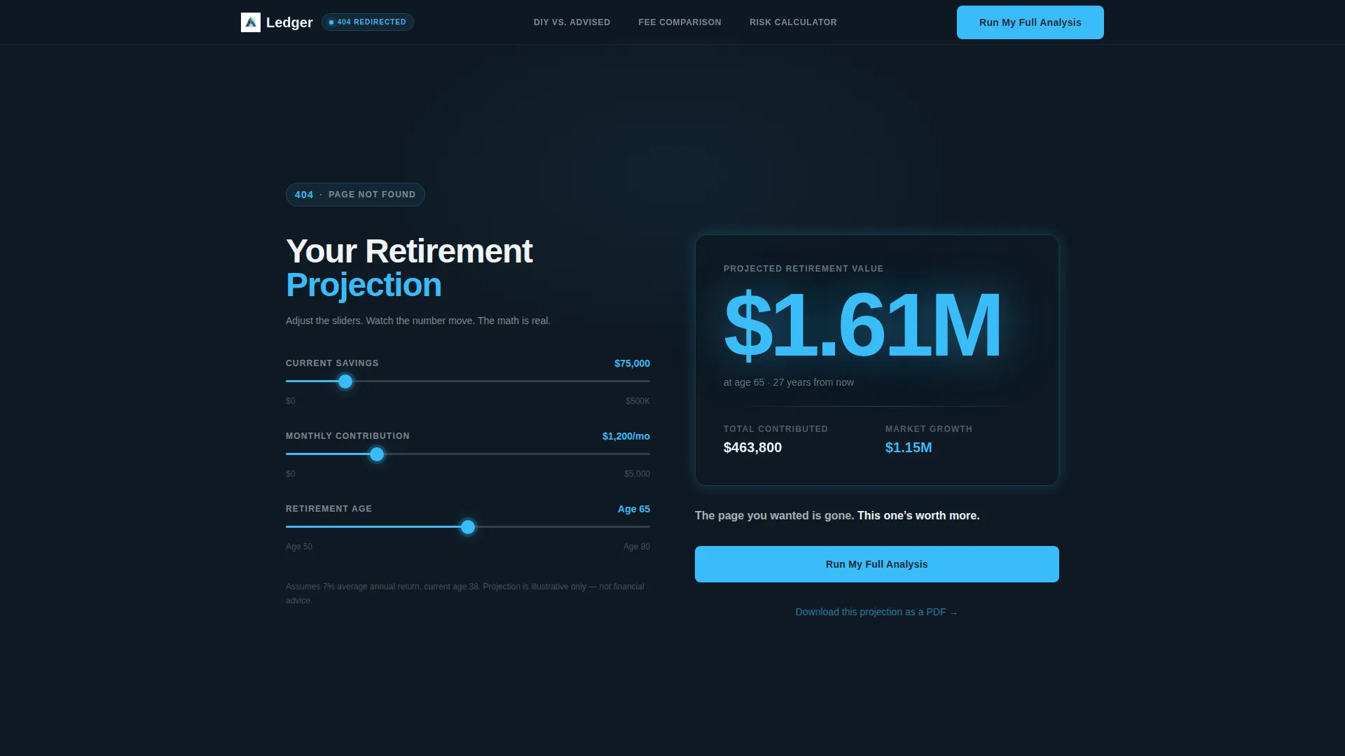
- A header-level net-worth estimator with three real-time sliders and animated output
- Three spoke sections, each built around a financial comparison tool rather than static content
- A primary call-to-action button and a secondary PDF download link repeated at each tool section
Feature list
A paragraph introducing the features: Each built-in tool is designed to let visitors reach their own conclusions. The template's interactive components do the persuasion work quietly, so the call-to-action at the bottom feels like a logical next step rather than a sales push.
Live Net-Worth Estimator Header
The header opens directly on a functioning estimator with three sliders: current savings, monthly contribution, and retirement age. The projected retirement value updates in real time and displays in large sky-blue type against the deep slate background. There is no error illustration, no apology text, and no lost-page messaging beyond one precise line in frost white.
DIY versus. Advised Portfolio Simulator
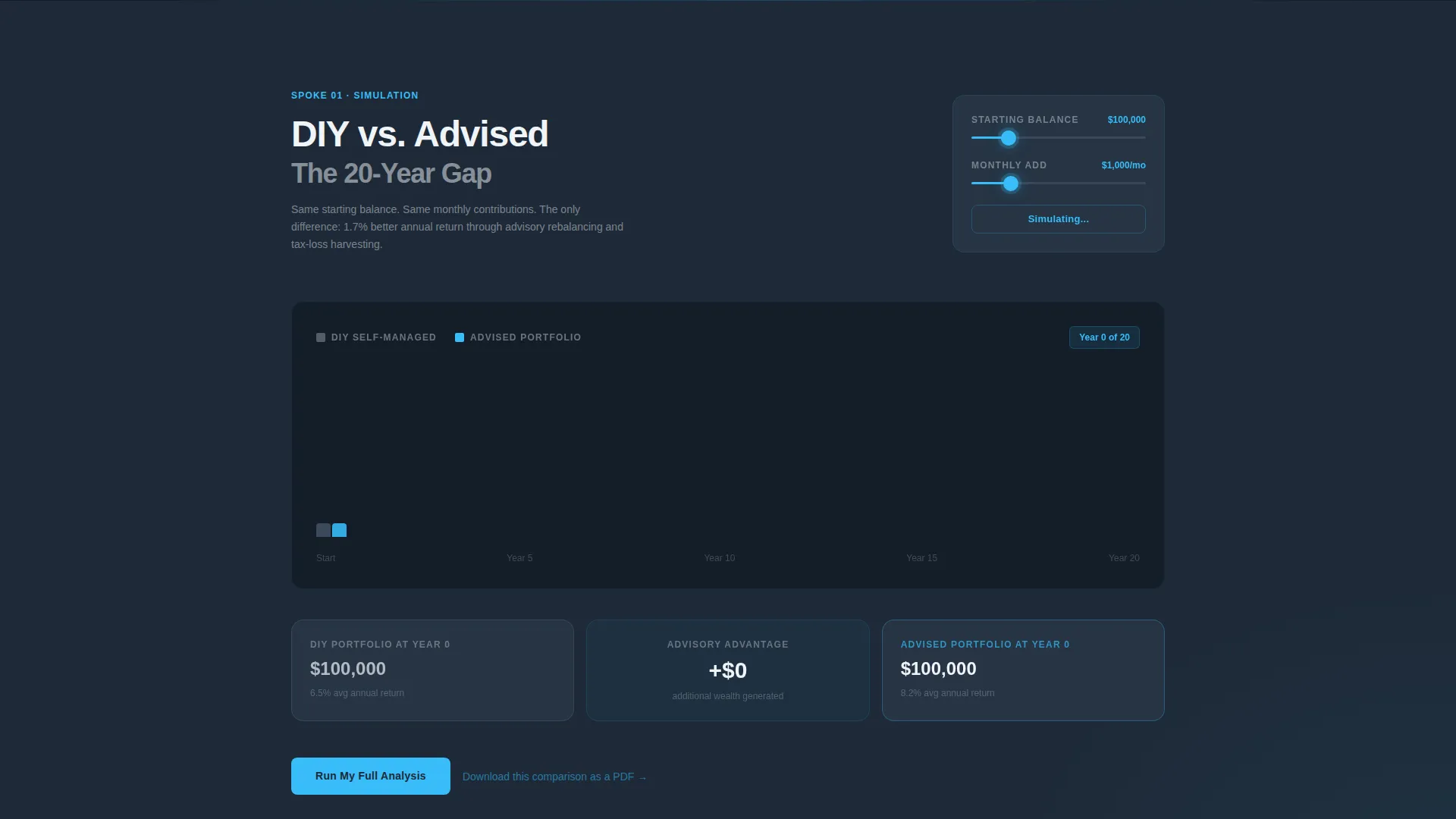
This spoke section shows two identical portfolios diverging over a 20-year timeline. Advisory rebalancing is applied to one side and withheld from the other, with the performance gap animating as the years advance. Visitors watch the difference grow using a simulation tied to the inputs they control.
Interactive Fee Comparison Tool
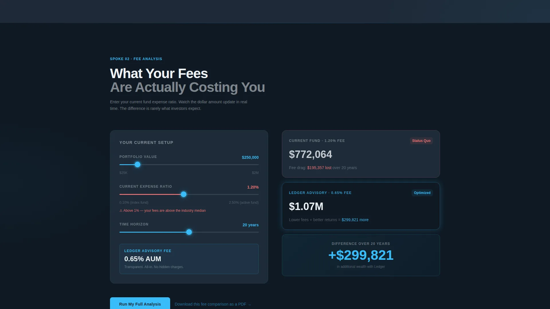
Visitors enter their current expense ratio and see a live side-by-side cost projection against the advisor's stated fee structure. Dollar figures update keystroke by keystroke. The tool reframes fee conversations from abstract percentages to concrete long-term dollar amounts.
Anchor Navigation Bar
A fixed anchor navigation bar sits at the top of the page with three labeled spokes: DIY versus. Advised, Fee Comparison, and Risk Calculator. Each label scrolls directly to its corresponding tool section. Navigation stays visible throughout the entire scroll.
Dual Conversion Path
Each tool section ends with a primary button labeled "Run My Full Analysis" and a secondary text link offering a PDF download of the comparison. The primary button opens a three-field form with a name field, email field, and a single dropdown asking the visitor's biggest financial question.
Contextual 404 Acknowledgment
The 404 status is addressed in exactly eight words below the calculator header. The line reads: "The page you wanted is gone. This one's worth more." This keeps the error context clear without dwelling on it or undermining the page's credibility.
Page sections overview
| Section | Purpose |
|---|---|
| Net-Worth Estimator Header | Opens on a live calculator with three sliders and animated retirement output |
| Anchor Navigation Bar | Fixed top nav with three spoke labels linking to each tool section |
| DIY versus. Advised Tool | Simulates a 20-year portfolio divergence with and without advisory rebalancing |
| Fee Comparison Tool | Projects cost differences between current expense ratios and advisor fee structure |
| Risk Calculator Spoke | Provides a third interactive tool reinforcing the comparison-first page strategy |
| Primary Call-to-Action | "Run My Full Analysis" button opening a three-field lead capture form |
| Secondary PDF Download | Email-gated text link offering a downloadable version of each comparison |
Design & branding system
The visual identity follows a Tech Glass theme that feels precise and modern without being cold. Every color and typographic choice reinforces the sense that you are looking at real financial data, not a marketing page.
- Deep charcoal slate (#1E2A38) covers the primary background, atmospheric steel (#475569) surfaces cards and secondary panels, and open-sky blue (#38BDF8) activates every interactive element and hover state
- Frost white (#F0F4F8) handles all body typography and negative space, keeping text sharp against dark backgrounds
- The overall palette reads like financial-grade data display: high contrast, minimal distraction, and visually authoritative
Mobile & speed optimization
The hub and spoke structure is laid out to adapt cleanly across screen sizes. The fixed anchor navigation and slider-based tools are designed to remain usable whether a visitor arrives on a desktop, tablet, or phone.
- Sliders and real-time outputs in the estimator and comparison tools are built for touch interaction on smaller screens
- The fixed anchor nav collapses to remain accessible without consuming excessive vertical space on mobile viewports
- Tool sections stack vertically on smaller screens so each comparison remains readable without horizontal scrolling
How this template helps you convert
The page is built around a Comparison and Versus approach to conversion. Every tool quietly demonstrates value before asking the visitor to act, so the call-to-action is the natural conclusion rather than an interruption.
- The net-worth estimator creates immediate personal relevance the moment a visitor lands, giving them a number tied to their own situation before any advisor messaging appears
- The three comparison tools build a cumulative case through the visitor's own inputs, so by the time the "Run My Full Analysis" button appears, the visitor has already seen the advisor's value in dollar terms
Other information about this template
This template is categorized under financial advisor website templates within the Technology category. It is a strong fit for advisors looking to improve lead capture from otherwise dead traffic sources.
- Template style: Hub and Spoke with anchor navigation, structured as a single-page scroll with fixed top-level navigation
- Niche fit: purpose-built for the financial advisor 404 error page use case, where standard error pages discard high-intent visitors
- The creative direction prioritizes Calculator and Tool First interaction, placing the most engaging element at the very top of the page
- The lp direction is Comparison and Versus, meaning every interactive section frames the advisor's value against a clear alternative
- The theme is Tech Glass, combining a data-display visual language with warm conversion mechanics

Theme
Tech Glass
Creative direction
Calculator/Tool First
Color system
Slate & Sky
Style
Hub & Spoke (Anchor Nav)
Direction
Comparison/Versus
Page Sections
Live Net-worth Estimator Header
DIY Versus. Advised Portfolio Simulator
Interactive Fee Comparison Tool
Fixed Anchor Navigation Bar
Dual Conversion Path Per Section
Contextual 404 Acknowledgment Line
Related questions
Can I customize the slider ranges in the net-worth estimator?
Does this template work as a standalone 404 replacement without redesigning my full site?
What information does the lead capture form collect?
Is the PDF download conversion path included in the template?
How does this template handle the 404 error without hurting credibility?



