Wealth Advisory Service Tier Comparison Website Template
Ledger is a precision-built landing page template for wealth advisory practices. It pairs a live-feel financial dashboard header with an interactive service-tier comparison table and a three-question diagnostic tool. The design uses a cold Monochrome Steel palette to signal competence, and every conversion element drives visitors toward a "Request Your Wealth Audit" intake form.
by Rocket studio
Quick summary
Ledger is a single-page lead generation template designed for financial advisory practices. It opens with a stylized client dashboard, moves visitors through a toggleable service comparison table, and closes with a self-qualifying intake form. The design is engineered to make disorganization feel costly and professional clarity feel immediately within reach.
Who this template is for
This template is built for advisory practices that work with clients at genuine financial turning points. It suits firms that need to communicate rigor, not warmth, and close high-intent prospects before a first meeting.
- Fee-based financial advisors and registered investment advisers managing complex, multi-account client wealth
- Boutique wealth consultancies serving newly liquid founders, inheritance recipients, or pre-retirement households
- Solo practitioners or small advisory teams ready to move from referral-only growth to structured inbound lead capture
What problem this template solves
Most financial advisor pages feel like brochures. They describe services in generic terms, offer no way for a visitor to self-identify their situation, and ask for a phone call before establishing any trust. Ledger fixes this by making the page itself do the qualification work.
- Visitors arrive with scattered accounts, vague anxiety, and no framework for comparing advisory tiers
- A static contact form cannot capture urgency or signal which service level a prospect actually needs
- Advisors waste consultation time on prospects who were never the right fit to begin with
What you get with this template
You get a fully structured, section-led landing page that guides a financially anxious visitor from curiosity to commitment. Every section is purposeful and sequenced to deepen trust before asking for anything.
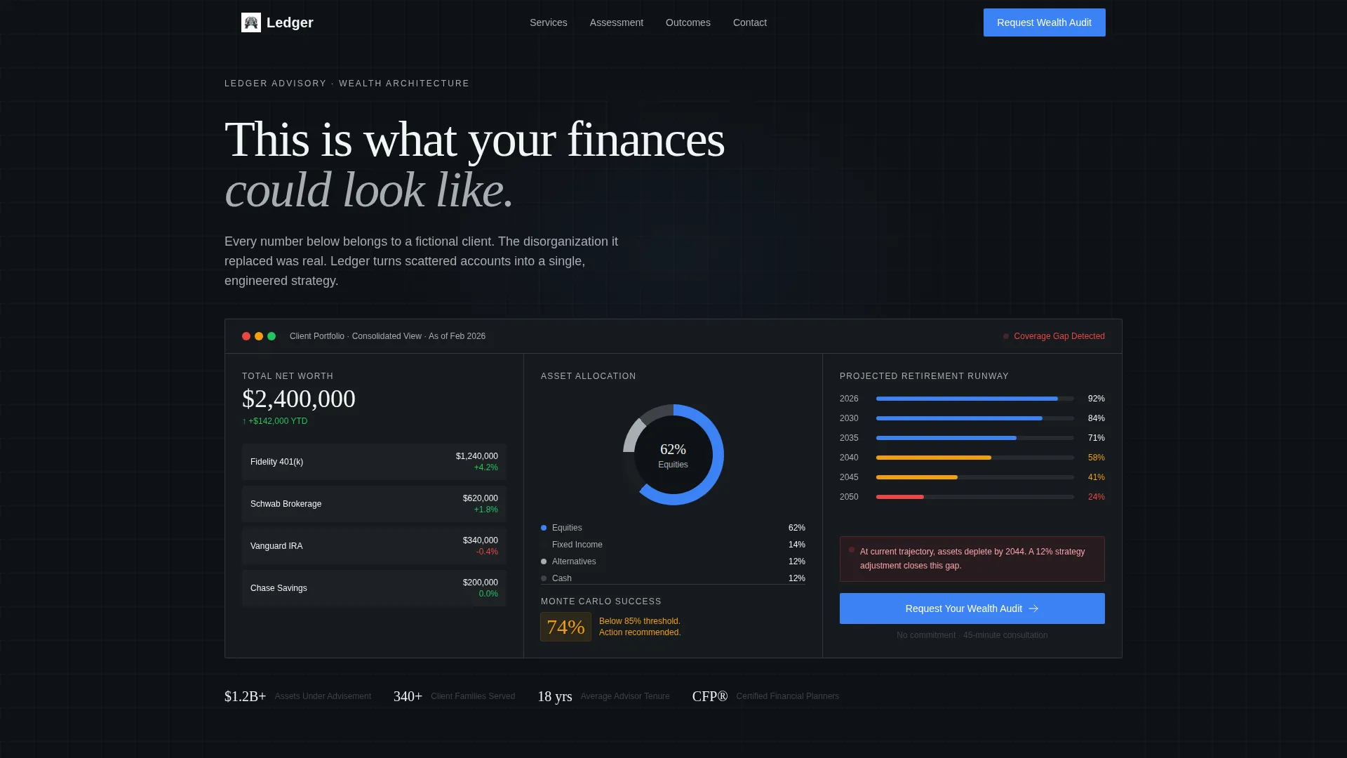
- A stylized dashboard header showing fictional consolidated net worth, asset allocation rings, a retirement runway graph, and a gap indicator
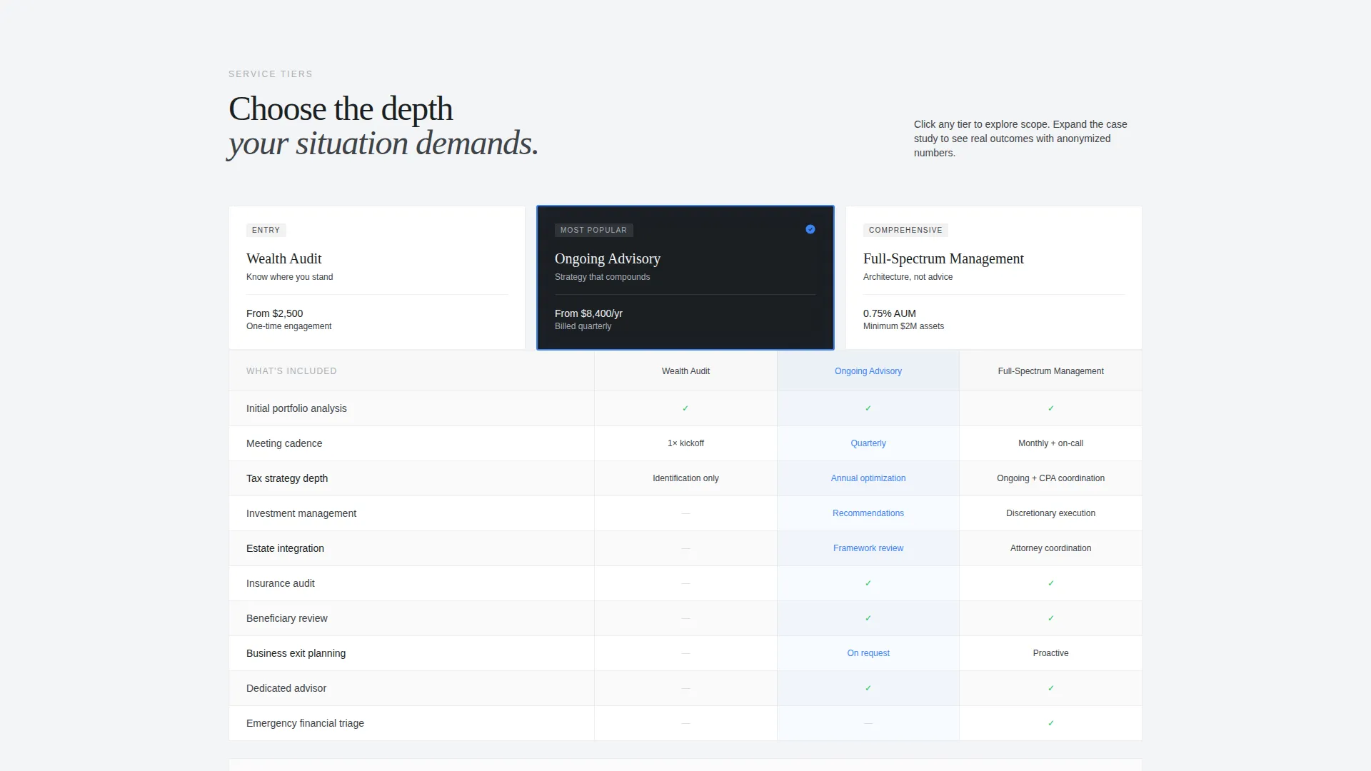
- A three-tier comparison table with toggleable rows covering scope, meeting cadence, tax strategy depth, and estate integration, each expandable to a mini case study
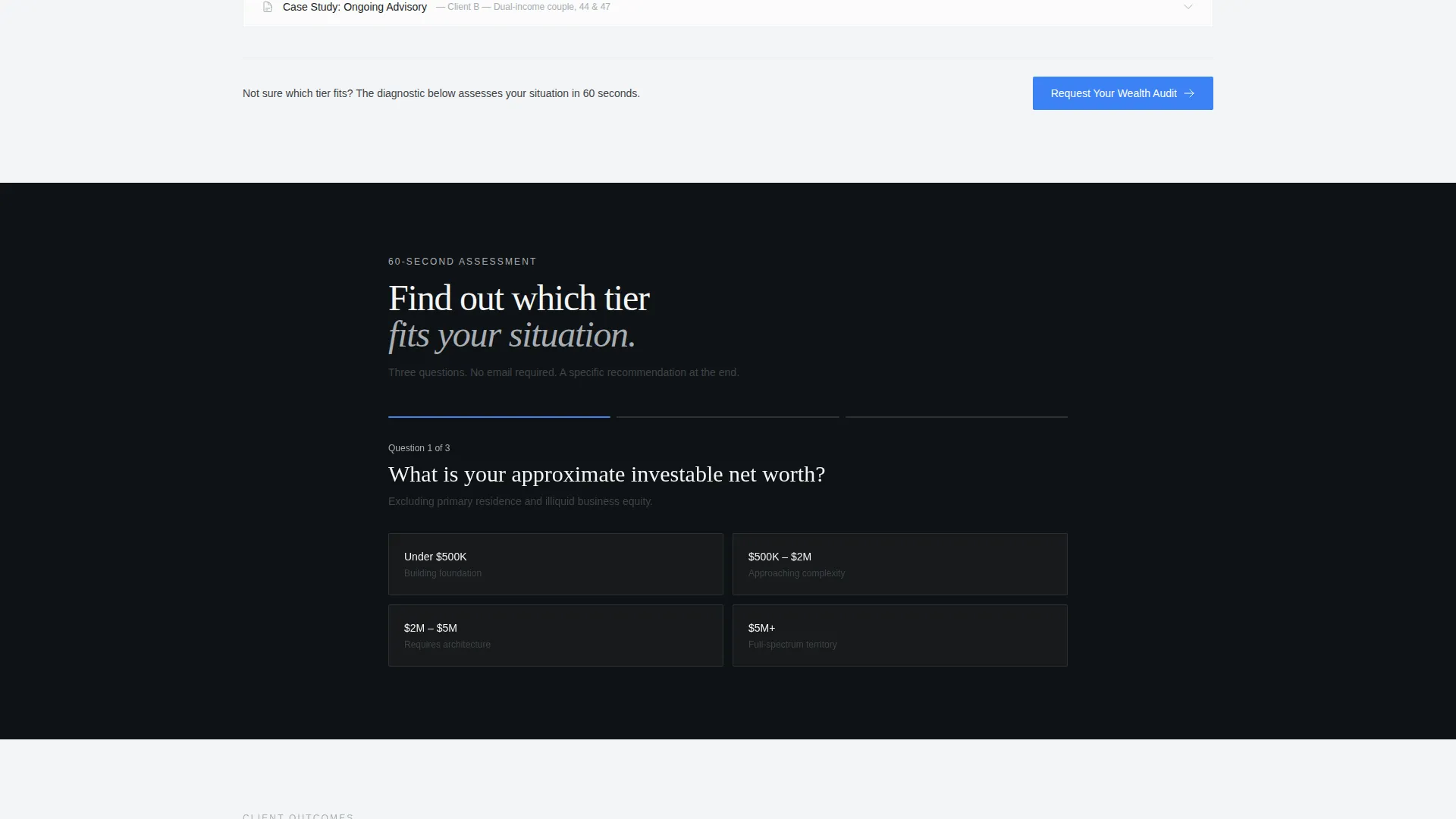
- A three-question interactive diagnostic that surfaces the recommended service tier based on net worth range, number of accounts, and stated financial anxiety
- A primary lead capture form asking for first name, estimated investable assets, and one open-ended qualifying question
- A secondary conversion path: a gated downloadable PDF titled "The 12 Questions Your Current Advisor Should Have Already Asked," captured behind email only
Feature list
This landing page template packs several purpose-built components that work together to qualify, engage, and convert high-value financial advisory prospects.
Stylized Financial Dashboard Header
The header presents a fictional but specific client overview: $2.4 million in total assets, 62 percent equities, and a Monte Carlo retirement success probability of 74 percent shown in amber. A small red gap indicator blinks where coverage falls short. This is not decorative; it demonstrates the clarity your practice delivers before a visitor reads a single word of body copy.
Interactive Service Tier Comparison Table
Visitors toggle between three tiers: Wealth Audit, Ongoing Advisory, and Full-Spectrum Management. Each row reveals scope, meeting frequency, tax strategy depth, and estate integration level. Clicking a tier expands an anonymized mini case study with real-looking numbers, letting prospects see themselves in the outcome before they commit.
Three-Question Prospect Diagnostic
This embedded diagnostic asks for net worth range, number of accounts, and biggest financial anxiety. It dynamically recommends the most relevant service tier, making each visitor feel personally assessed. The diagnostic reduces friction and pre-qualifies leads before any human contact occurs.
Primary Lead Capture Form
The main intake form collects first name, an estimated investable assets dropdown (under $500K, $500K to $2M, $2M to $5M, and $5M or above), and a single open field asking "What's keeping you up at night financially?" This question self-qualifies urgency and gives advisors a warm conversation starter before the first call.
Gated PDF Secondary Conversion
A secondary path captures visitors who are not ready to book a call. The downloadable PDF "The 12 Questions Your Current Advisor Should Have Already Asked" is gated behind email only, converting hesitant prospects into a nurture-ready list without requiring a commitment.
Anchored Repeat Call-to-Action
The primary call to action, "Request Your Wealth Audit," is anchored in the header dashboard and repeated after the comparison table. This ensures the conversion prompt is visible at the two highest-intent moments in the scroll journey without feeling aggressive.
Page sections overview
| Section | Purpose |
|---|---|
| Dashboard Header | Show a specific, data-rich fictional client overview to demonstrate the value of organized wealth management |
| Service Tier Table | Let visitors compare Wealth Audit, Ongoing Advisory, and Full-Spectrum Management side by side |
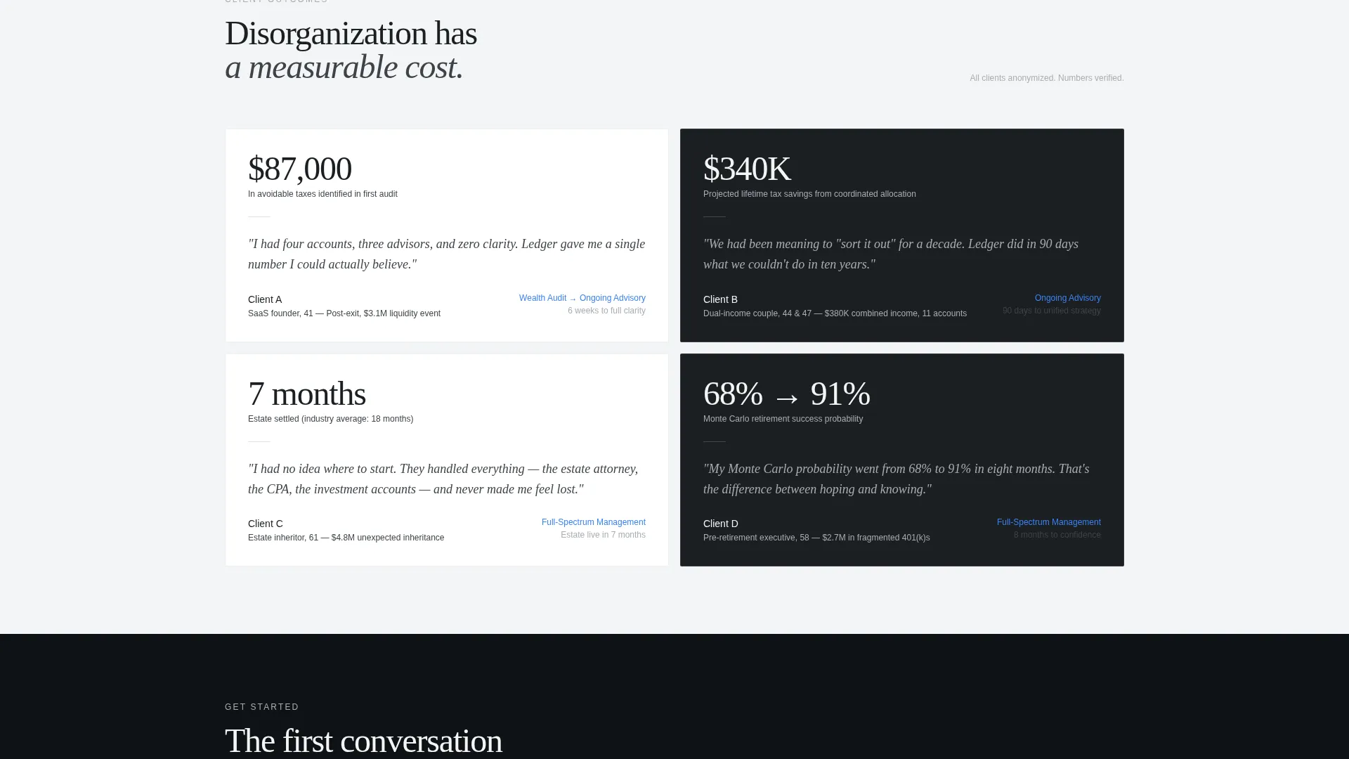
| Mini Case Studies | Expand each tier into anonymized client scenarios with real-looking financial numbers |
| Prospect Diagnostic | Ask three targeted questions and surface the most relevant service tier dynamically |
| Primary Lead Form | Capture first name, asset range, and a qualifying open-field question to initiate the advisory relationship |
| PDF Gated Offer | Provide a secondary conversion for visitors not yet ready to book, collected via email only |
| Repeat call to action Block | Reinforce the "Request Your Wealth Audit" prompt after the comparison table at peak scroll intent |
Design & branding system
The Monochrome Steel palette is the central design decision. Every color choice communicates function and control. There is no warmth here by design: the absence of it signals precision.
- The four-color system uses forge-black (#1B1F23), brushed gunmetal (#3E4348), polished chromium (#A8ADB3), and clean-sheet white (#F4F5F6) as the full palette
- Signal blue (#3B82F6) appears exclusively on interactive elements, active states, and call-to-action buttons, making every clickable surface instantly identifiable
- The overall visual tone references a precision instrument panel: engineered, legible, and free of decorative elements that would dilute trust
Mobile & speed optimization
The page layout is designed to scale cleanly from desktop to mobile without losing the logic of the conversion sequence. Interactive components are built to remain usable on smaller screens.
- The dashboard header collapses to a focused data summary on mobile, keeping the key figures visible without requiring horizontal scroll
- The comparison table toggles and diagnostic flow are touch-friendly and vertically stacked on smaller viewports so the decision journey stays intact
How this template helps you convert
This template converts by making the visitor feel assessed, not sold to. Every interactive element builds the case that their current situation has measurable gaps, and that your practice already has the answer.
- The dashboard header creates immediate contrast between the organized clarity shown on screen and the visitor's current reality, establishing desire before any copy has been read
- The comparison table and diagnostic work together as a self-selection funnel, routing prospects to the right tier and reducing the advisor's time spent on mismatched consultations
- The dual conversion paths, a direct intake form and a gated PDF download, capture both ready buyers and early-stage researchers, widening the total addressable pool of leads
Other information about this template
Ledger is categorized under Financial Advisor Website Templates and sits within the Financial Advisor Services Page niche. It is part of the Directory and Discovery theme family and uses the Interactive Explorer creative direction.
- The template style is a Comparison Table layout, purpose-built for practices that offer multiple service tiers and need visitors to self-select before reaching out
- The header concept is a Dashboard Preview, a proven format for financial services pages because it replaces stock photography with functional, data-forward visual communication
- The page direction is Lead Generation, meaning every section is sequenced to move visitors toward either the primary intake form or the secondary PDF download
- This template works well for practices on platforms such as Framer, where interactive components like toggleable tables, dynamic diagnostics, and anchored call-to-action blocks can be implemented without custom code
Theme
Directory & Discovery
Creative direction
Interactive Explorer
Color system
Monochrome Steel
Style
Comparison Table
Direction
Lead Generation
Page Sections
Stylized Financial Dashboard Header
Interactive Service Tier Comparison Table
Three-question Prospect Diagnostic
Qualifying Lead Capture Form
Gated PDF Secondary Conversion
Anchored Repeat Call-to-action
Related questions
Can I customize the fictional dashboard numbers in the header?
What service tiers does the comparison table cover?
How does the three-question diagnostic work?
Is this template suitable for a solo advisor or only for larger firms?
What does the secondary conversion path offer visitors who are not ready to book a call?



