Bank & Financial Institution Pricing Website Template
Ledger is a split-screen credit union landing page template built on a Data Command theme. It uses a Charcoal and Amber color system to present fee comparisons, member FAQs, and a free account sign-up flow with quiet authority. The design speaks directly to first-time homebuyers, small-business owners, and young professionals ready to stop paying unnecessary bank fees.
by Rocket studio
Quick summary
Ledger is a single-page credit union landing page template with a 50/50 split-screen layout. It pairs a fee-comparison header with a scroll-driven FAQ section that builds member trust through data, not sales copy. Every interactive element glows in signal amber against a deep graphite background, giving the page the calm clarity of a financial dashboard.
Who this template is for
This template is built for credit unions that want to attract members who are actively questioning what their current bank is costing them. It works best for institutions that compete on transparency, lower fees, and member ownership.
- First-time homebuyers comparing mortgage rates and lender fees before committing
- Small-business owners looking for an alternative to high-fee commercial banking
- Young professionals who have noticed monthly maintenance charges eating into their balance
What problem this template solves
Most credit union pages look like generic bank websites. They bury the membership benefit and lead with jargon. Ledger is built to solve that specific credibility gap by leading with real numbers and answering the questions prospective members actually ask before they join.
- Visitors arrive skeptical and leave without a clear reason to switch banks
- Fee structures are rarely explained side by side, so the value is invisible
- Trust in financial institutions is low, and most landing pages do nothing to address that directly
What you get with this template
Ledger delivers a complete, conversion-ready credit union landing page. Every section is purpose-built around a single goal: turning a curious visitor into a confident new member.
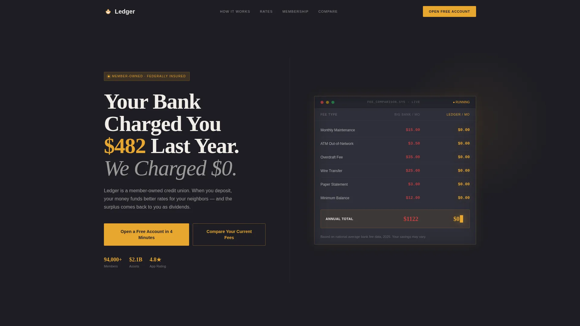
- A stats-driven header with a live-styled fee comparison between a traditional bank and a credit union
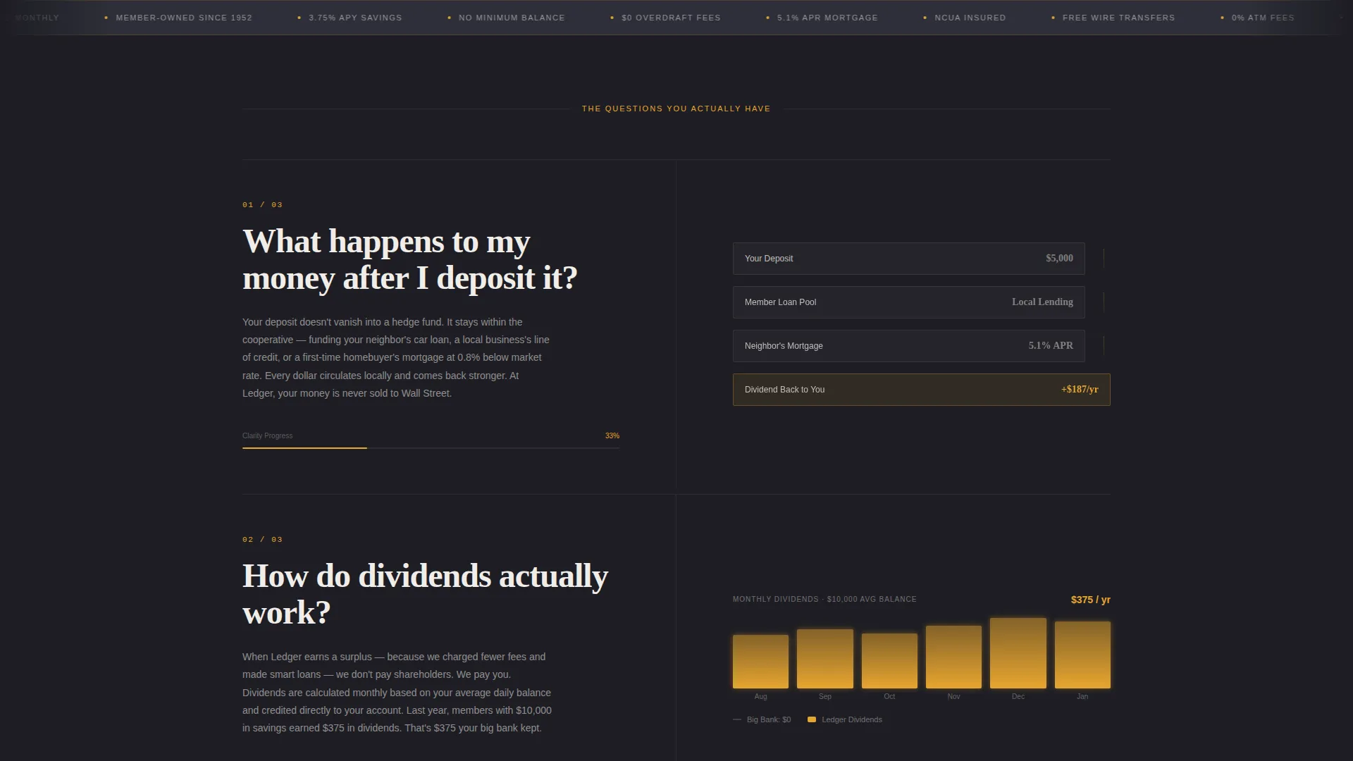
- A scroll-based FAQ section where each member question is answered with data visualizations and short narrative paragraphs
- A primary call-to-action button for opening a free account and a secondary fee calculator path that leads to the same membership form
Feature list
This section covers the core functional and design components built into the Ledger template.
Split-Screen Stats Header
The header divides into two equal panels. The left side carries a bold headline calling out the average annual bank fee directly. The right side shows a side-by-side comparison dashboard with a traditional bank's fee stack in muted gray versus the credit union's amber-lit column of zeros. The numbers animate subtly on load, mimicking a live terminal refresh.
FAQ-Driven Scroll Sections
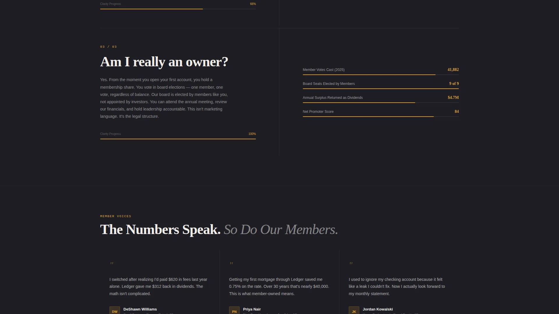
Each scroll section pairs a single member question on the left with an answer panel on the right. Answers include animated data visualizations, comparison charts, and short paragraphs. The questions move from practical and financial toward trust and governance, so conviction builds naturally as the visitor scrolls.
Amber Progress Bar Navigation
Each FAQ answer panel includes a subtle amber progress bar. It gives visitors a clear visual sense of how far through the content they are, reinforcing the feeling of moving toward a decision rather than drifting through a marketing page.
Inline Free Account Form
The primary call-to-action is an amber button labeled "Open a Free Account in 4 Minutes." It first appears after the second FAQ section and then persists as a sticky bar. Clicking it expands an inline form asking only for first name, email, and zip code to check eligibility and start a membership.
Fee Savings Calculator
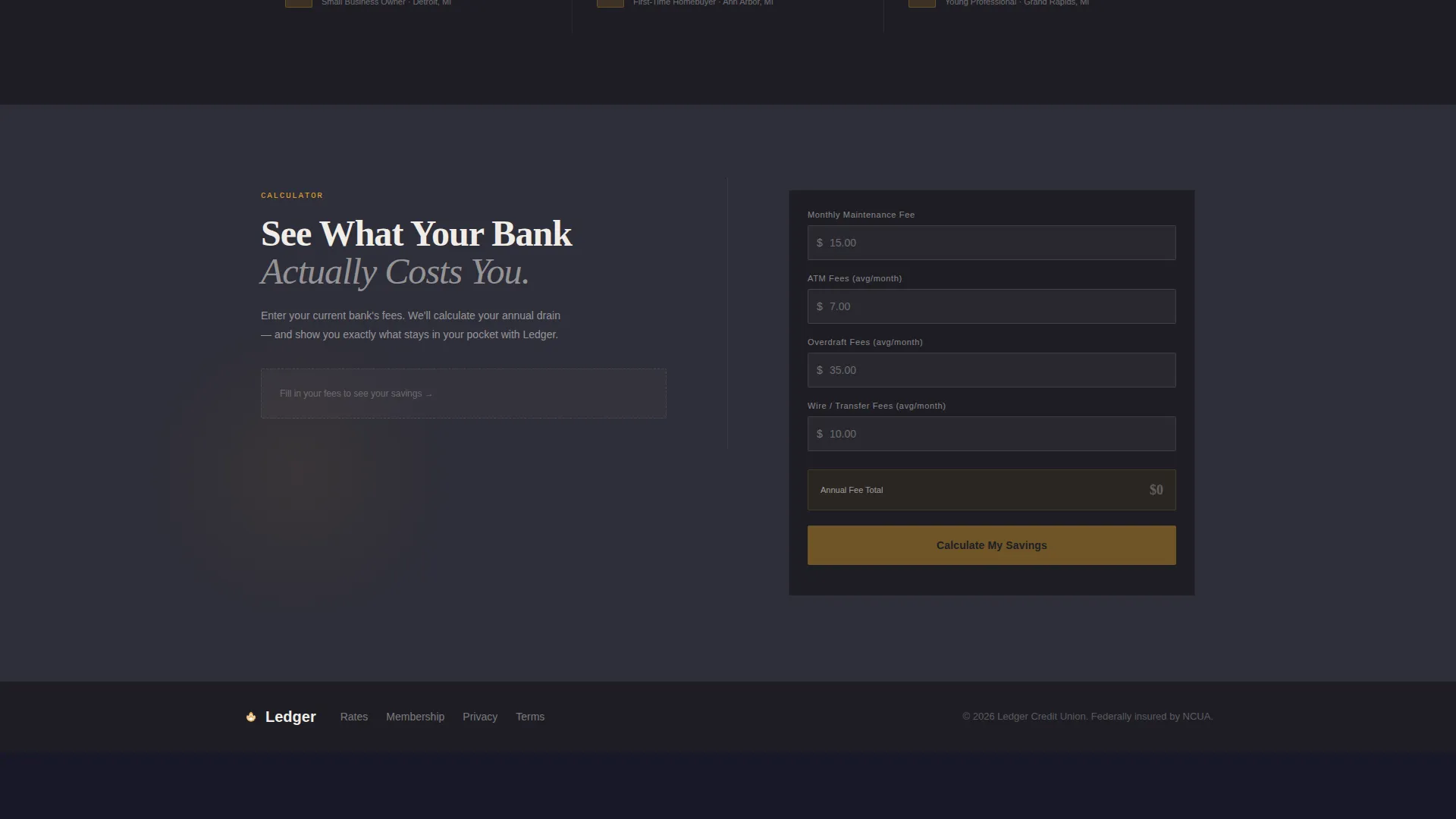
A secondary conversion path labeled "Compare Your Current Fees" opens a lightweight inline calculator. Visitors enter their current bank's monthly charges and see projected annual savings displayed in amber numerals. The calculator closes with the same membership form, pre-filled with the visitor's calculated savings figure.
Page sections overview
| Section | Purpose |
|---|---|
| Stats Header Panel | Introduce fee comparison with a bold headline and animated live-data dashboard |
| FAQ Section One | Answer practical financial questions with charts and short narrative paragraphs |
| Sticky call to action Bar | Keep the free account button visible as visitors scroll through FAQ sections |
| FAQ Section Two | Deepen trust with questions about dividends, ownership, and member governance |
| Fee Calculator Panel | Let visitors calculate their own savings and route them to the membership form |
| Membership Signup Form | Collect first name, email, and zip code to check eligibility and open an account |
Design & branding system
Ledger follows a Data Command visual theme that makes financial information feel precise and trustworthy without turning cold. The palette draws from the instrument panel of a well-built cockpit at dusk.
- Deep graphite (#1E1E24) as the primary background, warm charcoal (#2E2E38) for card surfaces and section dividers, signal amber (#E8A630) on every interactive element and data point, and clean chalk (#F0EDE8) for all body text and labels
- Typography is set for high contrast and legibility, with bold headlines in chalk white and data figures rendered in amber to draw the eye to the numbers that matter most
- Subtle load animations on the fee comparison and progress bars give the page a live-data energy without relying on heavy motion
Mobile & speed optimization
The split-screen layout adapts for smaller screens so the comparison dashboard and FAQ sections remain readable on any device. The template is designed with a lean visual structure that avoids heavy assets.
- The 50/50 split collapses into a single-column stacked layout on mobile, keeping the fee comparison and FAQ format intact
- Inline forms and the fee calculator are touch-friendly and sized for mobile input without zooming or horizontal scrolling
How this template helps you convert
Ledger is structured around progressive trust-building rather than immediate persuasion. The page earns the conversion by removing doubt before asking for anything.
- The fee comparison header creates an immediate emotional hook by naming a real cost the visitor has likely already paid, making the value of switching concrete before the visitor reads a single paragraph of marketing copy.
- The FAQ scroll format answers the exact questions a cautious prospective member would ask, using data visuals and progress bars to build conviction through transparency rather than pressure.
- The dual conversion paths, the free account form and the fee savings calculator, meet visitors at different levels of readiness and funnel both toward the same simple sign-up action.
Other information about this template
Ledger is part of a broader library of finance and insurance landing page templates designed for specific niches. A few practical notes for teams evaluating this template for a credit union build.
- The template is categorized under Finance and Insurance, Bank and Financial Institution, and Credit Union, making it a targeted fit for member-owned financial cooperatives
- The Freemium and Trial conversion direction means the page is optimized for low-friction sign-ups rather than hard-sell product pages
- The Data Command theme and Charcoal and Amber color system are consistent across all intersection-matched template variants in this category
- The template style is Split Screen (50/50) and the header concept is Stats and Metrics, both defined at the intersection level and reflected throughout the layout
Theme
Data Command
Creative direction
FAQ-Driven
Color system
Charcoal & Amber
Style
Split Screen (50/50)
Direction
Freemium/Trial
Page Sections
Split-screen Fee Comparison Header
Faq-driven Scroll Layout
Amber Progress Bar Per Section
Inline Free Account Form
Fee Savings Calculator
Related questions
Can I edit the fee comparison numbers and headline in the header?
Does the fee savings calculator connect to any external system?
Can I change the amber color to match my credit union's brand colors?
Who is this landing page template best suited for?
Is the sticky call-to-action bar always visible while scrolling?



