Financial Planner FAQ Website Template
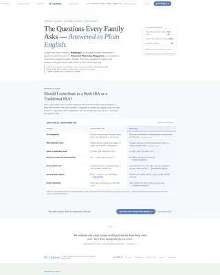
Ledger is a single-page financial planner landing page template built around comparison tables, FAQ clusters, and a press-mentions header. It guides dual-income couples, single parents, and small-business owners through complex financial decisions using plain-language questions, side-by-side tables, and a calm Cloud Canvas color system that makes every answer easy to follow.
by Rocket studio
Quick summary
Ledger is a comparison-table landing page template designed for financial planners. It opens with a press mentions bar, unfolds into a series of side-by-side comparison tables framed by plain-language FAQ entries, and closes each section with a clear call to action. The layout feels like a trusted advisor sliding a clean sheet of paper across the table and walking you through it step by step.
Who this template is for
This template is built for independent financial planners and small planning practices that serve everyday families rather than institutional clients. If your work involves turning complicated money questions into clear, actionable answers, this layout fits naturally.
- Financial planners working with dual-income couples navigating mortgages, retirement accounts, and life insurance decisions
- Advisors who help single parents untangle rollovers from former employers and build a manageable savings plan
- Planning practices serving self-employed individuals and small-business owners who need structured guidance before their first formal meeting
What problem this template solves
Many financial planner pages lead with credentials and headshots but never actually answer the questions visitors are already carrying. A prospective client searching "should I pay off my house or max out my retirement account" does not want a biography. They want a straight answer that earns trust before any form ever appears.
- Visitors leave without engaging because the page offers promises instead of substance
- Busy families feel overwhelmed by jargon and skip to a competitor whose page feels less intimidating
- Planners lose warm leads because there is no low-friction conversion path for visitors who are curious but not yet ready to book
What you get with this template
You get a structured, single-page layout that doubles as a financial FAQ and resource hub. Every section is purpose-built to reduce hesitation and move a visitor naturally toward either booking a call or downloading the full FAQ document.
- A press mentions header bar with grayscale publication logos and an editorial headline that opens the page with immediate authority
- A repeating pattern of FAQ entry plus comparison table plus pull-quote card, alternating between soft sage and white backgrounds to keep each section visually distinct
- Two conversion paths: a primary call-to-action button labeled "See Your Free Comparison Report" and a secondary text link for a PDF download that captures an email address in a single field
Feature list
The Ledger template includes purpose-designed components that work together to build trust and drive action on a single page.
Press Mentions Authority Header
The page opens with a horizontally scrolling bar of grayscale publication logos sitting above an editorial serif headline. A short social proof paragraph below the logos cites a specific feature or quote, grounding the page's authority in evidence from the first scroll.
Side-by-Side Comparison Tables
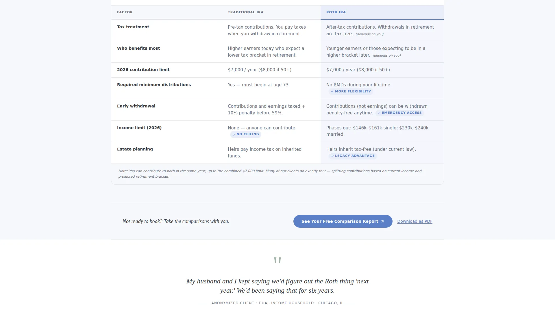
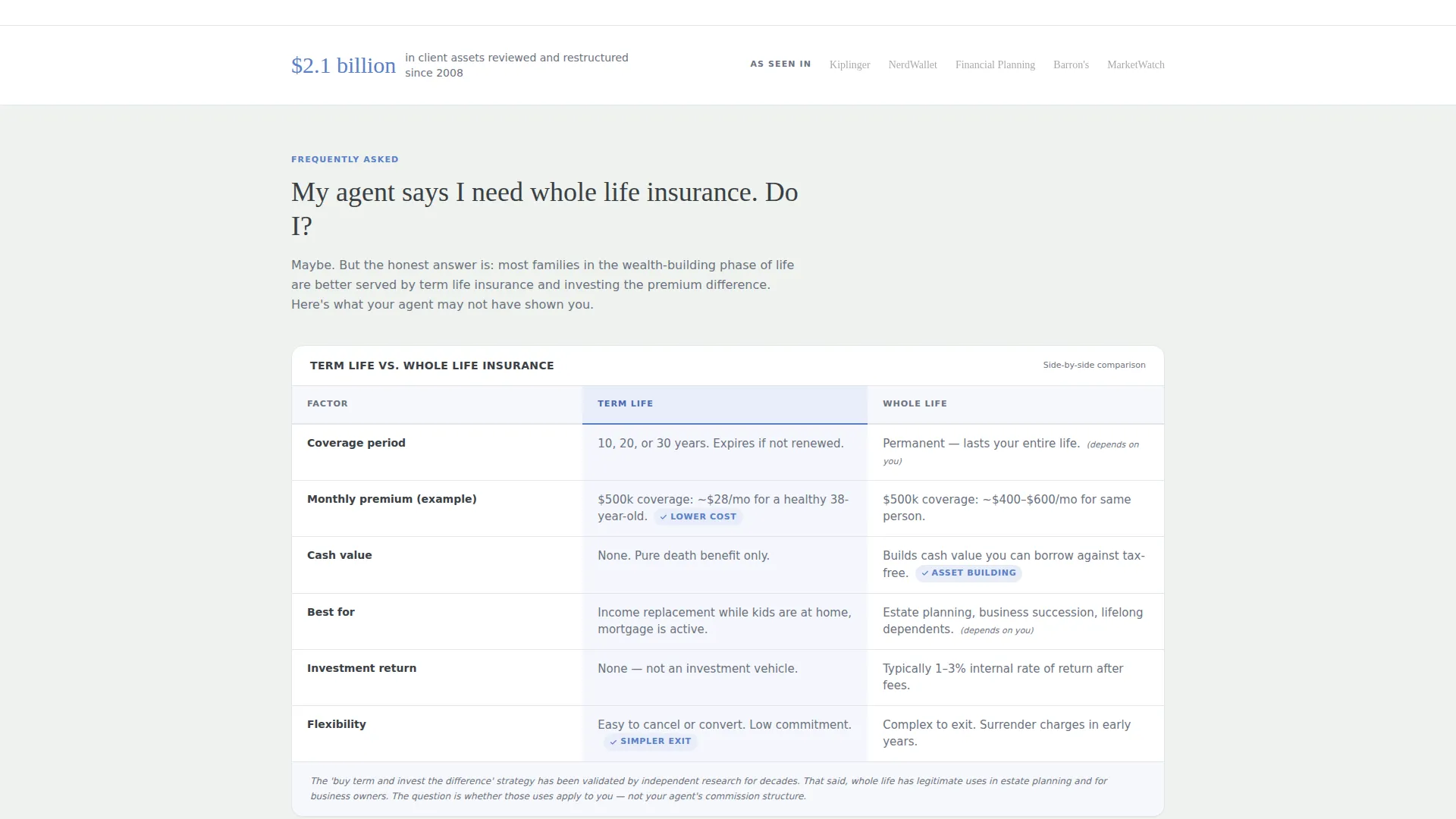
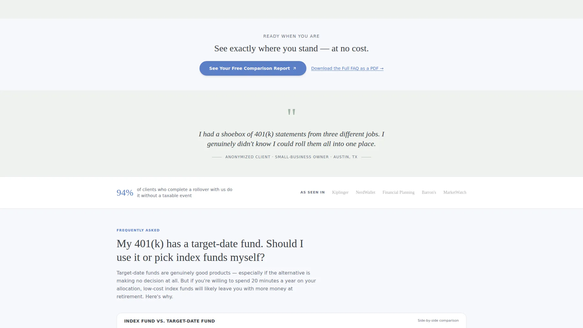
Each major financial decision gets its own comparison table: Roth versus Traditional individual retirement account, term versus whole life insurance, index fund versus target-date fund. Every table is preceded by a plain-language FAQ question that frames the comparison in human terms before the data appears.
Pull-Quote Client Cards
Between comparison tables, styled pull-quote cards display real anonymized client questions in handwritten-style italic. These cards remind visitors that their confusion is shared and that someone has already asked the same question on their behalf.
Dual Conversion Path Design
The primary call-to-action button, "See Your Free Comparison Report," appears first beneath the opening table and repeats after every second section. A secondary text link, "Download the Full FAQ as a PDF," offers a single-field email capture for visitors who are not yet ready to book a meeting.
Alternating Section Backgrounds
FAQ clusters alternate between cumulus white and a faint sage tint, giving each topic its own visual room without adding clutter. Recurring slim logo bars and cited statistics appear roughly every third section to quietly reinforce credibility as the visitor scrolls.
Cornflower Accent Call-to-Action Styling
Every clickable element, including buttons, links, and table highlights, uses the cornflower accent color. The primary button sits on white with a subtle hover lift, making the next step unmistakably clear without feeling aggressive.
Page sections overview
| Section | Purpose |
|---|---|
| Press Mentions Bar | Opens with publication logos and editorial headline to establish authority |
| Social Proof Paragraph | Grounds credibility with a specific cited feature or quote below the logos |
| Opening FAQ Entry | Frames the first comparison with a plain-language human question |
| First Comparison Table | Presents the initial side-by-side breakdown, for example Roth versus. Traditional |
| Primary call to action Button | Invites visitors to see their free comparison report after the first table |
| Pull-Quote Card | Surfaces an anonymized client question in handwritten-style italic |
| Second Comparison Table | Covers the next topic, for example term versus. whole life insurance |
| Recurring call to action Repeat | Repeats the primary button after every second section |
| Logo Bar Refresh | Returns a slim publication bar or statistic every third section |
| Index Fund Table | Compares index fund versus. target-date fund for retirement savers |
| PDF Download Link | Secondary text link with single-field email capture for lower-intent visitors |
Design & branding system
The Cloud Canvas color system gives the page the feeling of a well-organized notebook left open on a sunlit desk. Every color choice supports readability and calm rather than urgency or flash.
- Soft cumulus white (#F7F8FC) and a faint sage tint (#A3B5A6) alternate as section backgrounds, while warm graphite (#3B3F45) anchors all body text for consistent legibility
- A steady cornflower accent (#5B7FC7) appears on every button, link, and table highlight, drawing the eye along every clickable path without competing with the informational content
- Typography follows an Educational Guide theme: a generous serif for the editorial headline and clear body type throughout, keeping the page approachable and impossible to misread
Mobile & speed optimization
The layout is built for straightforward rendering across screen sizes. Comparison tables, pull-quote cards, and alternating section backgrounds are all structured to remain readable and functional on smaller displays.
- Comparison tables are designed to remain scannable on mobile without requiring horizontal scrolling that breaks the reading flow
- The single-page structure keeps the visitor's scroll path linear and uninterrupted, with no nested navigation or complex menu behavior to manage on touch screens
How this template helps you convert
Ledger is designed with two conversion temperatures in mind. It meets visitors at whatever stage of readiness they arrive, from early-stage research to ready-to-book.
- The primary call-to-action button, "See Your Free Comparison Report," appears after the first table and repeats after every second section, giving high-intent visitors multiple natural moments to act without any form living on the page itself.
- The secondary text link, "Download the Full FAQ as a PDF," captures an email address in a single field, creating a warm lead from visitors who find the content valuable but are not yet ready to schedule a meeting.
Other information about this template
The Ledger template sits at the intersection of professional services and financial planning. It is specifically matched to the Financial Planner FAQ and Resource Page niche within the Financial Planner Online Presence subcategory.
- The template style is Comparison Table, meaning every major content block is organized around a direct side-by-side layout rather than long-form prose
- The creative direction follows a Logo Wall Authority approach, where credibility accumulates quietly through repeated logo bars and cited statistics rather than a single bold claims section
- The header concept is Press Mentions, built around a horizontal logo scroll above an editorial headline that sets a journalistic, trustworthy tone from the first pixel
- The landing-page direction is Click-Through, meaning no form appears on this page; the call-to-action button carries the visitor to a short intake page where they choose household type, primary financial concern, and preferred meeting format
- This template is well suited for planners who have received media coverage or third-party recognition and want a structured way to surface that authority alongside educational content
Theme
Educational Guide
Creative direction
Logo Wall Authority
Color system
Cloud Canvas
Style
Comparison Table
Direction
Click-Through
Page Sections
Press Mentions Authority Header
Plain-language Comparison Tables
Anonymized Pull-quote Cards
Dual Conversion Temperature Design
Recurring Credibility Reinforcement
Cloud Canvas Color System
Related questions
Does this template include a contact form on the page?
What comparison topics are built into the template?
Who is this landing page template designed for?
How does the two-path conversion setup work?
Can I customize the press mentions bar with my own media coverage?



