Compassionate Senior Care Branding Landing Page Template
The Imprint award winning senior care branding agency landing page template is built for agencies that help seniors find safe, trusted homes. It combines a full-screen video header, a GSAP-powered horizontal scroll case study timeline, gated playbook download, and a letterpress-inspired Ink and Paper design system. The result is an elderly care landing page that earns credibility before a single word is read.
by Rocket studio
Quick summary
This landing page is designed for senior care branding agencies that need to show authority fast. The template leads with intimate video footage, moves visitors through an award case study timeline, and converts them with a gated playbook download. Every design decision reflects quiet confidence, making it one of the most focused elder care landing page designs available today.
Who this template is for
This template is built for branding professionals and agency owners who serve the senior living and elder care market. It speaks directly to decision-makers who need to prove their value before the first call.
- Senior care branding agencies pitching assisted living operators and developers
- Memory care network marketing leads looking for a credible agency partner
- Studio founders who want an elderly care landing page that shows, not just tells
What problem this template solves
Most agency landing pages look generic. In the elder care space, that is a critical failure. Families making care decisions need to trust the company behind the brand before they trust the brand itself. A weak landing page design loses leads before visitors even reach a call to action.
- Generic design fails to signal the specialization that senior care clients demand
- No structured case study flow means visitors cannot determine the agency's track record
- Missing gated content removes the chance to capture qualified leads from serious buyers
What you get with this template
This template gives you a complete, ready-to-customize landing page built around an award-and-recognition narrative. Every section is designed to promote trust, display expertise, and drive conversions for elderly care clients.
- A full-screen video header with a headline fade-in and GSAP scroll-pin expansion
- A five-panel horizontal scroll case study timeline with award badge placements
- A two-field gated form to capture leads, plus an ungated secondary path for browsers
Feature list
This elderly care landing page template includes a focused set of built-in sections and interaction patterns. Each feature is designed to promote the agency's work and help visitors self-qualify with confidence.
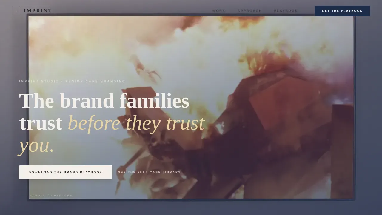
Full-Screen Video Hero with Headline Reveal
The header plays slow, close footage of hands at work: gold foil pressing, ink rollers turning, brand guidelines opening on a boardroom table. A single line of type fades in over the footage. This design creates immediate emotional weight and sets the tone for everything that follows on the page.
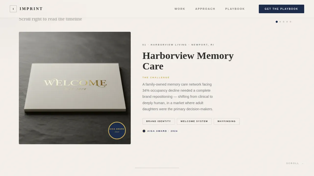
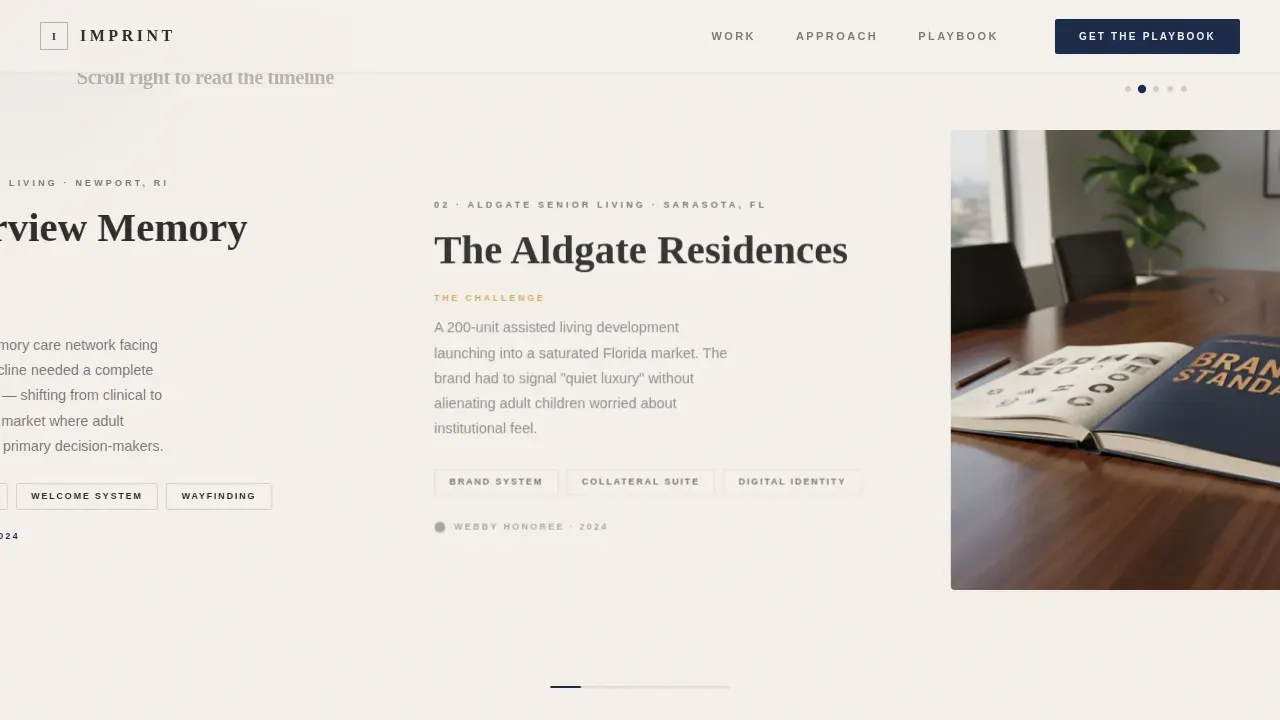
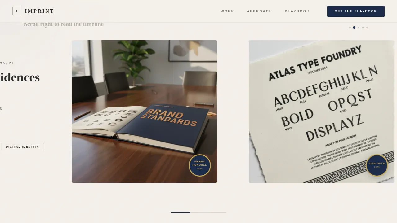
GSAP Horizontal Scroll Case Study Timeline
Five lateral panels scroll left to right, each framed as an award entry. Every panel includes a project title, a challenge statement, and finished brand collateral photographed on slate surfaces. Award badges are displayed in the lower corners of winning projects, building cumulative authority as visitors move through the timeline.
Gated Playbook Download with Data Teasers
Three proprietary benchmark figures are surfaced but kept incomplete. Visitors see occupancy lift percentages, family trust survey results, and brand recall figures. To get the full methodology, they complete a two-field form with work email and community name. This structure makes the e-book download feel earned, not forced.
Ungated Case Library Secondary Path
A second call to action lets browsers explore the full case library without giving contact information. This path helps visitors self-qualify and gives the agency a consistent way to promote its portfolio to leads who are not yet ready to share details.
Studio Philosophy Panel with Asymmetric Layout
A manifesto section uses asymmetric type layout to describe the agency's approach to senior care identity work. The copy is direct and word-for-word deliberate. This section adds the human voice that makes a landing page feel like a real company speaking, not a template filling space.
Arc Browser Split Footer
The footer follows a split pattern with the logo and tagline on the left and navigation links on the right. This consistent layout keeps the page end clean and reinforces the brand identity without adding visual noise.
Page sections overview
| Section | Purpose |
|---|---|
| Full-Screen Video Hero | Opens with intimate footage and a brand headline |
| Horizontal Scroll Timeline | Displays five award case study panels |
| Data Teaser Block | Shows partial benchmark figures to prompt download |
| Playbook Download Form | Gated two-field form to capture qualified leads |
| Case Library Path | Ungated secondary call to action for self-qualifying visitors |
| Studio Philosophy Panel | Manifesto copy with asymmetric editorial layout |
| Arc Split Footer | Logo left, navigation links right |
Design & branding system
The design follows an Ink and Paper theme using a Monochrome Steel color system. Every color and type choice is made to feel like a letterpress studio at dusk, where the importance of restraint is visible in every detail.
- Color palette: aged linen (#F5F0EB) background, pressed charcoal (#2C2C2C) type, archival ink blue (#1B2A4A) for awards and interactive states, and award gold (#C9A84C) for badge accents
- Typography: Fraunces serif display for headlines, DM Sans for body and user interface text
- Interaction details: magnetic buttons, cursor glow effect, and grayscale-to-color image hovers on case study images
Mobile & speed optimization
The template is designed desktop-first because the horizontal scroll experience requires a wide viewport. On smaller screens, the layout falls back to a vertical scroll version so the page remains usable and effective.
- Video assets use lazy loading and autoplay muted to keep the page start fast
- Static sections use Server Components while GSAP animations run on Client Components only
- The mobile fallback ensures elderly care landing visitors on any device can still find the information they need
How this template helps you convert
A care landing page only works when it moves visitors toward a clear action. This template uses three conversion levers working together to drive results.
- The data teaser block creates genuine curiosity. Visitors see enough of the benchmarks to understand the value, then complete the form to get the full e-book. This is one of the most effective ways to generate leads from senior care operators who are actively thinking about brand investment.
- The ungated case library gives hesitant visitors an easy entry point. It removes the barrier for early-stage buyers, giving the agency a chance to build familiarity before asking for contact information.
- Award badges displayed throughout the timeline give the page instant third-party credibility. Showing recognized certifications and accolades is an important trust signal for any elderly care landing page targeting adult children and senior living decision-makers.
Other information about this template
This template is built specifically for the senior care branding niche. It brings together lots of proven landing page design ideas from the elder care space into one ready-to-use structure. Effective elderly care landing pages, like those from Sunrise Senior Living and Concordia Village, show that relevant, useful information consistently outperforms pure aesthetics. The Imprint award winning senior care branding agency landing page template follows that principle throughout.
- Customized branding: the logo, color palette, images, and copy are all easy to update to match your agency identity
- Local SEO ready: each care landing page can be further customized with location-specific keywords to improve visibility in search engines, since Google ranks individual pages rather than full websites
- Google Ads compatible: the gated form structure works well with paid traffic campaigns, and using location extensions in Google Ads alongside this page can help senior care facilities rank higher in local search results
- Inbound marketing fit: the playbook download and case library together support a complete inbound marketing funnel, helping you determine where each visitor is in the buying journey based on what they choose to download or explore
- Dribbble and other design platforms store lots of senior care templates, but few are built around an award-recognition narrative at this level of editorial design
Theme
Ink & Paper
Creative direction
Award & Recognition
Color system
Monochrome Steel
Style
Horizontal Scroll
Direction
Content/Resource
Page Sections
Full-screen Video Hero with Headline Reveal
GSAP Horizontal Scroll Case Study Timeline
Gated Playbook Download with Data Teasers
Ungated Case Library Secondary Path
Studio Philosophy with Asymmetric Layout
Arc Browser Split Footer
Related questions
Can this landing page be customized for different senior care niches?
How does the gated playbook form capture leads?
Does the horizontal scroll experience work on mobile devices?
Is this template a good fit for Google Ads campaigns targeting senior care operators?
What makes this different from a generic agency landing page template?


