P2P Lending Platform Landing Page Template
Lend is a peer-to-peer lending landing page template built for UK-based fintech platforms. It uses a dark cockpit aesthetic, live-ticking data counters, sortable comparison tables, and a three-step sign-up flow to convert financially literate investors and borrowers. The template answers real due-diligence questions with hard data before asking for a single penny.
by Rocket studio
Quick summary
Lend is a single-page fintech template designed for peer-to-peer lending platforms operating in the UK market. It leads with a live £14.2M lending counter, walks visitors through investor and borrower comparison tables, addresses default and withdrawal questions with data, and closes with a progressive three-step sign-up flow. Every section earns the next scroll.
Who this template is for
This template is built for founders and product teams launching or repositioning a peer-to-peer lending platform. It speaks directly to a financially literate audience that demands proof before they act.
- Salaried UK professionals seeking 8 to 12 percent annual yields on idle savings
- Small business owners who need fast working capital without lengthy bank paperwork
- Portfolio diversifiers who have already maxed out their Individual Savings Accounts and want an uncorrelated asset class
What problem this template solves
Most fintech landing pages open with vague promises and close with a generic sign-up form. That approach fails with financially literate visitors who run their own due diligence before committing capital. This template is built around the actual questions those visitors ask.
- Investors want to know real returns, default rates, and withdrawal speed before depositing anything
- Borrowers compare fees and approval timelines against high-street banks before applying
- Both audiences need conviction, not marketing copy, before they click a call-to-action button
What you get with this template
You get a complete, conversion-focused landing page that mirrors the due-diligence journey of a serious financial audience. The layout is structured as a series of real investor and borrower questions, each answered with data, tables, and interactive tools.
- A dark full-bleed hero with a teal radial glow beacon and a live-ticking lending counter
- Sortable comparison tables for investor returns and borrower loan costs side by side
- A three-step progressive sign-up flow with a risk appetite slider and projected return preview
Feature list
This template includes the following built-in components and design features.
Live Lending Counter Hero
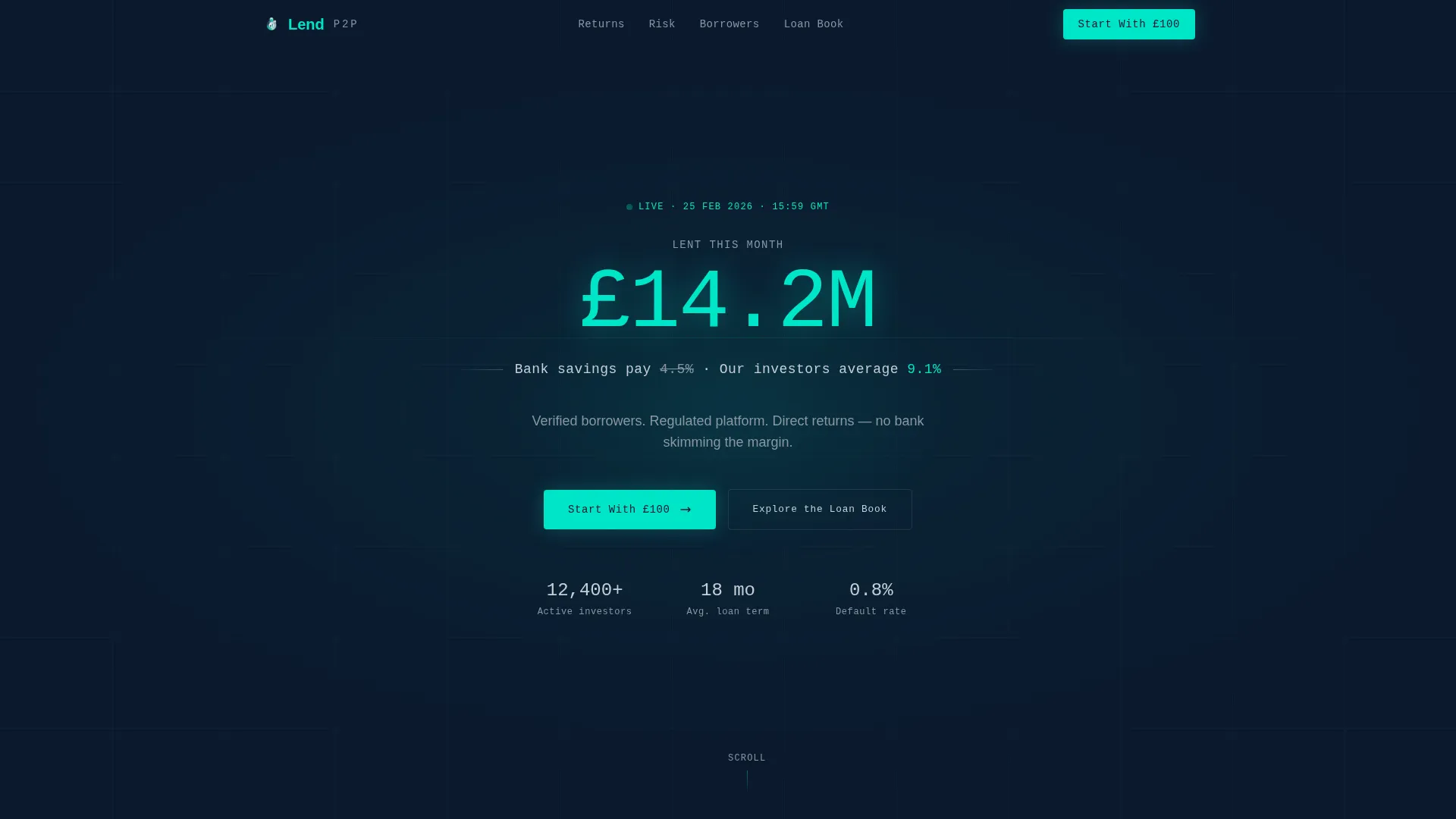
The hero section displays a single oversized monospaced figure, £14.2M lent this month, rendered in real-time ticking animation. A teal radial pulse glow surrounds the number like a signal beacon. Below it, a single contrast line compares bank savings rates against the platform average yield, delivering the hook in two seconds.
Sortable Investor Comparison Table
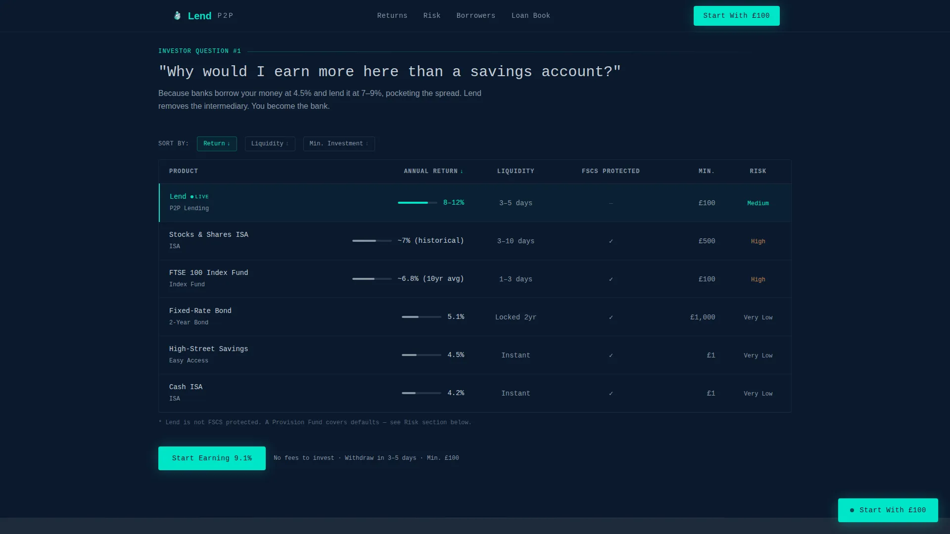
A fully interactive table lets visitors sort returns across the platform, standard savings accounts, Individual Savings Accounts, and index funds side by side. Live rate columns update dynamically, giving investors a transparent, data-led reason to consider moving idle capital.
Borrower Loan Cost Comparison
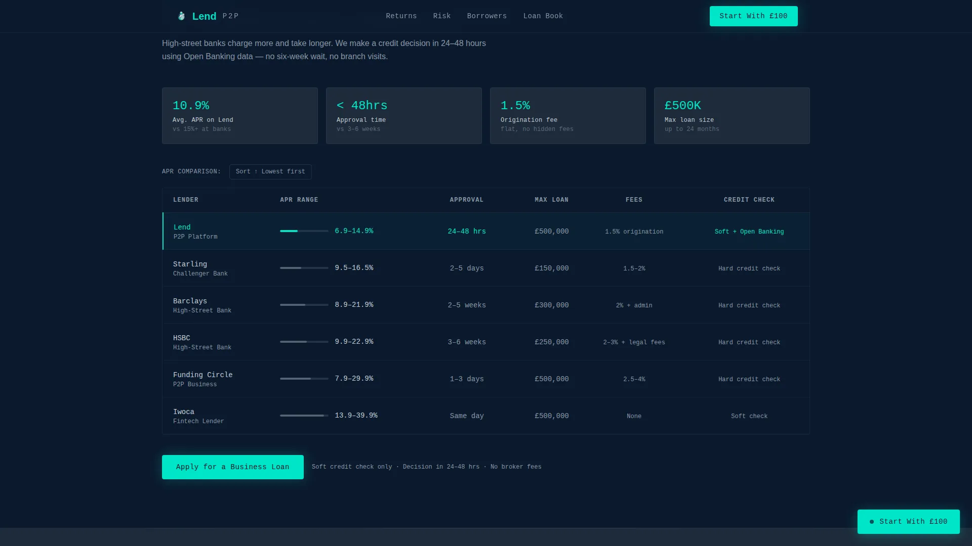
A dedicated borrower section compares the platform against high-street banks and challenger lenders on three key metrics: annual percentage rate, approval time, and total fees. The layout makes the cost advantage immediately visible without requiring visitors to do their own arithmetic.
Risk and Protection Section
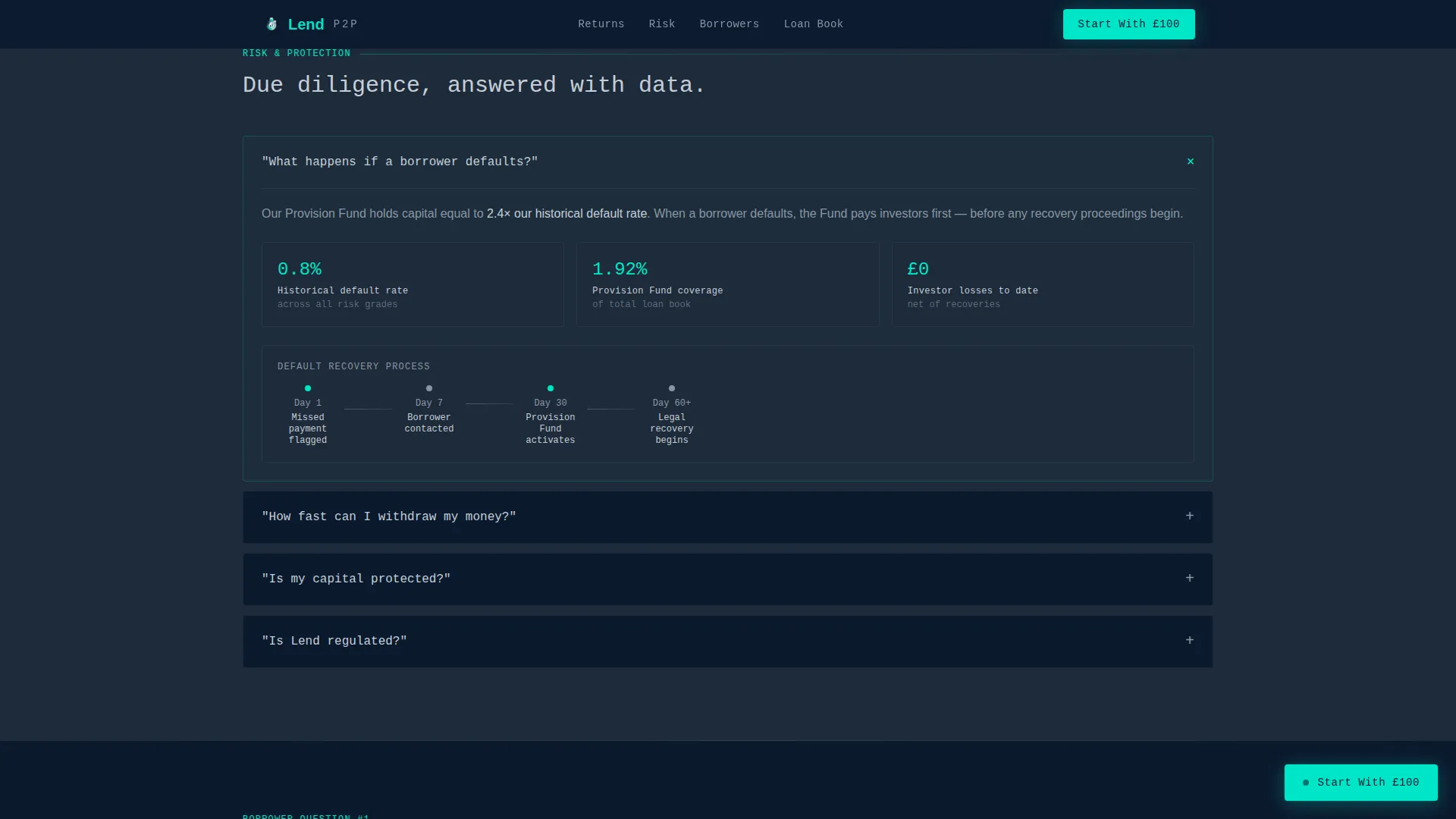
This section answers the three questions every cautious investor asks, default scenarios, capital protection, and withdrawal speed, using hard data rather than reassurances. Each answer opens into its own sub-section with supporting figures and context.
Three-Step Progressive Sign-Up Flow
The sign-up flow is split into three focused steps. Step one asks whether the visitor is an investor or a borrower. Step two captures email and mobile for verification. Step three lets investors set a risk appetite using a slider and see a projected annual return before they deposit a single pound.
Loan Book Explorer
A secondary conversion path lets skeptical visitors browse anonymized live loans, each showing risk grade, loan term, and funded percentage. This component builds conviction for visitors who are not yet ready to sign up but are close to the decision point.
Page sections overview
| Section | Purpose |
|---|---|
| Hero Glow Counter | Open with live lending volume and the bank-versus-platform yield contrast |
| Investor Comparison Table | Let investors sort returns across savings accounts, ISAs, and index funds |
| Risk and Protection | Answer default, withdrawal, and capital protection questions with data |
| Borrower Comparison Section | Compare platform APR, approval time, and fees against banks and challengers |
| Three-Step Sign-Up | Guide visitors from role selection through verification to projected return |
| Loan Book Explorer | Let undecided visitors browse live anonymized loans before committing |
Design & branding system
The visual identity follows a Corporate Precision theme. The palette feels like the instrument panel of a long-haul aircraft at cruising altitude: dark, purposeful, and every glow earned.
- Deep command navy (#0B1A2E) covers all primary backgrounds; gunmetal slate (#1E2A3A) surfaces card panels, table rows, and form containers
- Cold silver (#C5CED6) handles all body text and divider lines, keeping contrast readable without competing with the accent
- Electric teal (#00E5C7) is reserved exclusively for live data figures, active table states, and call-to-action buttons, ensuring every teal element carries meaning
Mobile & speed optimization
The template is designed desktop-first to preserve the private trading floor aesthetic, with a responsive layout that adapts cleanly for mobile visitors.
- Interactive components such as the sortable table, risk slider, and loan book explorer are built as client-side elements, while static sections use server-rendered components for faster initial load
- The floating call-to-action button remains pinned on scroll across all screen sizes, keeping the primary conversion path visible throughout the entire page
How this template helps you convert
The page earns each click by proving its math before asking for money. Every structural decision is designed to reduce friction for a skeptical, financially literate audience.
- The hero comparison line, bank savings at 4.5 percent versus the platform average at 9.1 percent, creates immediate interest before the visitor has read a single paragraph, giving them a quantified reason to keep scrolling
- The FAQ-driven scroll structure mirrors the actual decision journey, moving visitors from curiosity through comparison, risk assessment, and projected returns before presenting the "Start With £100" call-to-action at precisely the right moment
Other information about this template
This template was built specifically for the UK market. Currency formatting uses GBP (£), dates follow the DD/MM/YYYY convention, and timezone context is set to London. The template style is classified as a Comparison Table layout within the Finance and Insurance category, under the Mortgage and Lending subcategory, targeting the peer-to-peer lending platform niche.
- Typography uses DM Mono for all numerical and data display elements, paired with DM Sans for body copy, creating a clear visual separation between instrument-panel data and readable prose
- Animation intensity is set to high, covering the live counter tick, teal radial pulse glow, scroll-reveal transitions, and table sort interactions
- The footer follows a minimal developer-style pattern, keeping visual weight low at the bottom of the page so attention stays on the sign-up flow above it
Theme
Corporate Precision
Creative direction
FAQ-Driven
Color system
Navy Authority
Style
Comparison Table
Direction
Freemium/Trial
Page Sections
Live Lending Counter Hero
Sortable Investor Comparison Table
Borrower Loan Cost Comparison
Risk and Protection Section
Three-step Progressive Sign-up Flow
Loan Book Explorer
Related questions
What type of platform is this template designed for?
Can this template serve both investors and borrowers?
What makes the sign-up flow different from a standard form?
Is there a way for undecided visitors to explore without signing up?
What visual style and typography does this template use?



