Photographer Portfolio Booking Website Template
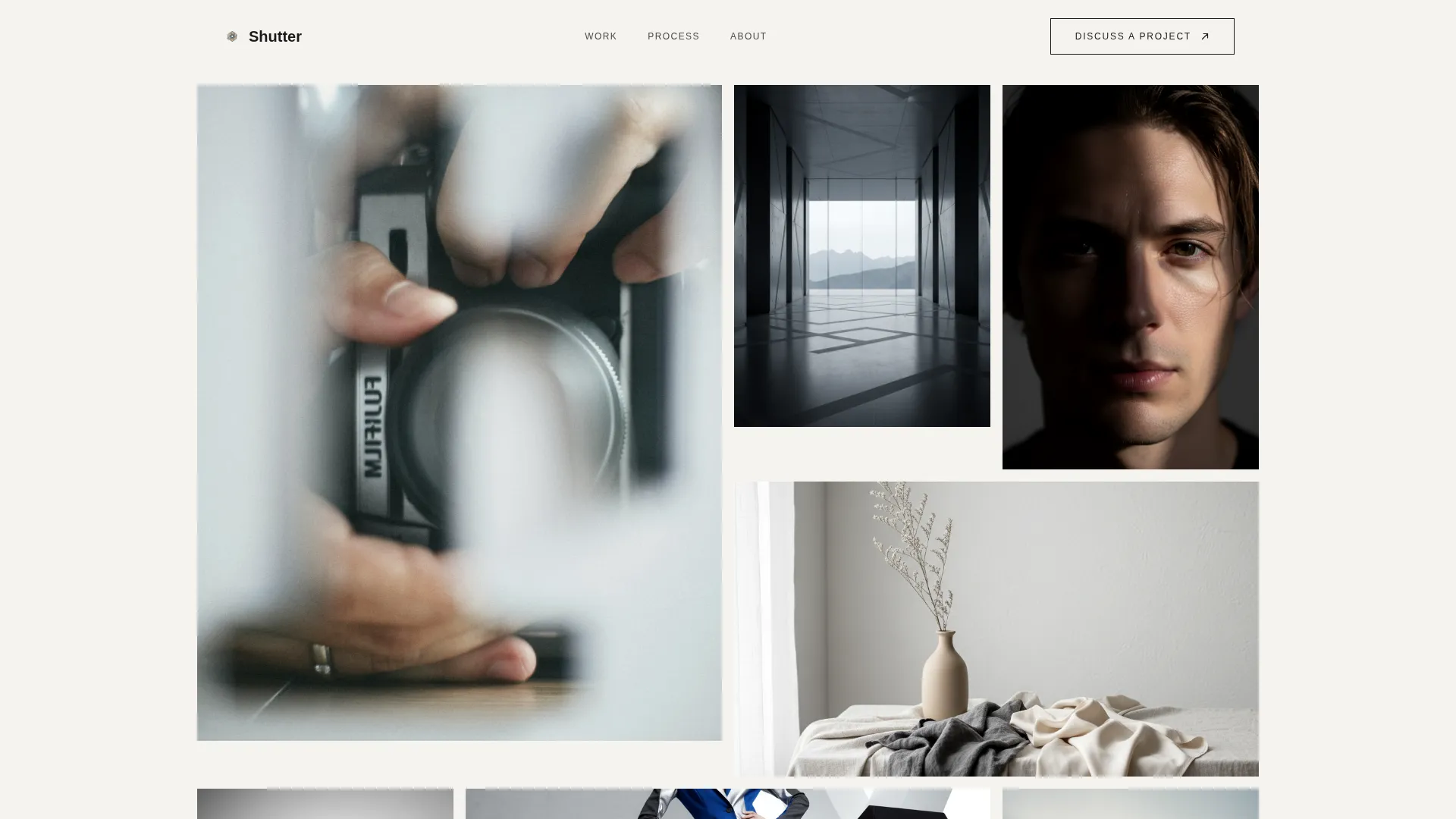
Shutter is a minimalist photographer portfolio landing page built on an asymmetric 60/40 grid. It follows a Case Study Narrative structure, moving visitors from a staggered Photo Grid Mosaic header through three in-depth project stories, then guiding them toward a booking inquiry. The Monochrome Steel palette and Atelier Studio theme give every section a quiet, deliberate authority.
by Rocket studio
Quick summary
Shutter is a single-page photographer portfolio template designed to feel like a curated private viewing. It uses an asymmetric 60/40 grid, a Monochrome Steel color system, and a Case Study Narrative flow. Three layered project stories move visitors from curiosity to conviction before placing a clear booking call-to-action in front of them.
Who this template is for
This template is built for photographers who need to impress discerning clients before a first conversation ever happens. It is not a general gallery dump. It is a deliberate editorial statement aimed at buyers who judge vision, not volume.
- Freelance photographers targeting creative directors and brand managers commissioning editorial or campaign work
- Fine-art and documentary photographers seeking gallery curators or institutional clients who require proof of process
- Established photographers ready to move beyond a basic grid and present work as a thought-through narrative
What problem this template solves
Most portfolio pages show images without context. A creative director or brand manager needs to see how a photographer thinks, not just what they shoot. Shutter closes that gap by pairing finished images with the brief, the constraints, and the behind-the-scenes process that led to each final frame.
- Visitors arrive, scroll through beautiful images, and leave with no reason to reach out
- Photographers lose high-value commissions because their site looks like every other portfolio grid
- Art directors need shareable proof of concept before they can internally justify a booking
What you get with this template
You get a fully structured single-page layout that guides visitors through a compelling visual story and ends with a clear path to booking. Every section is intentional, and the design system is consistent from the header mosaic to the final call-to-action band.
- A staggered Photo Grid Mosaic header with six to eight overlapping image tiles at varying scales and crop ratios
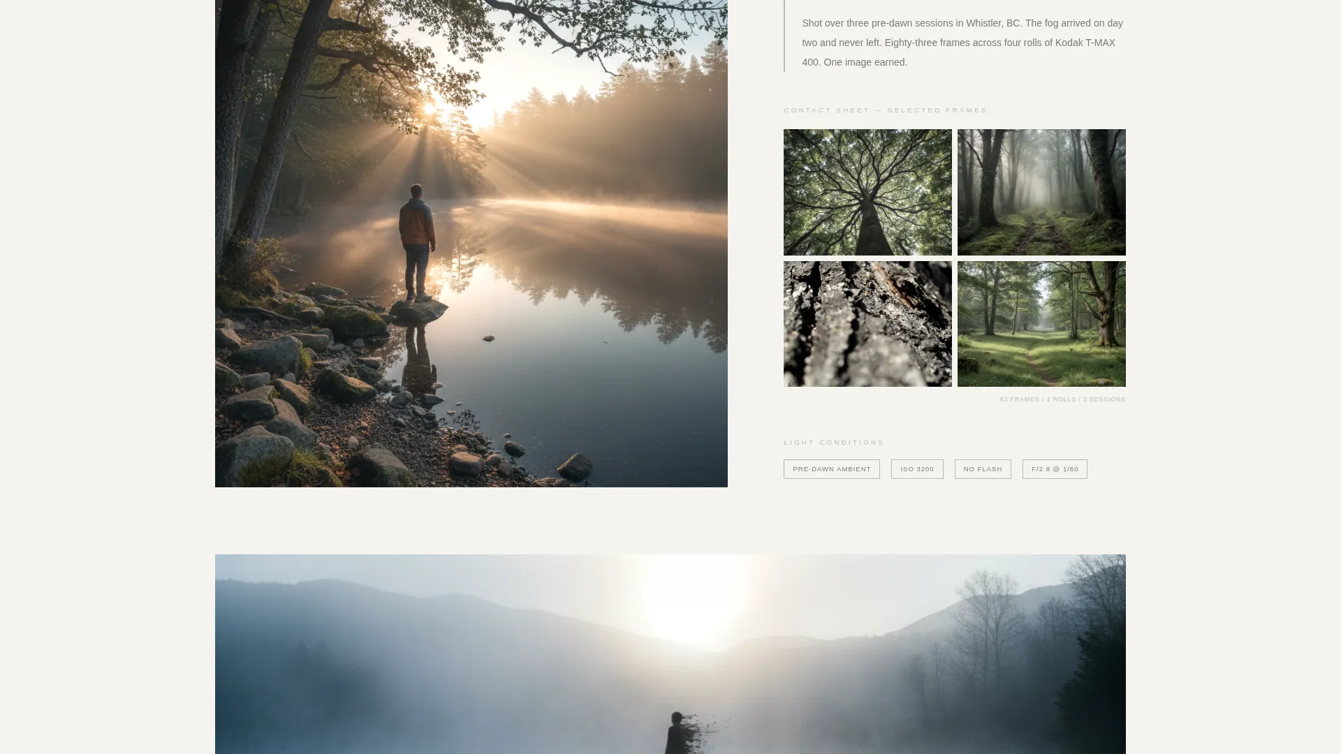
- Three complete Case Study Narrative blocks, each moving from brief introduction through contact sheets and process layers to a full-width final image reveal
- A fixed "Discuss a Project" call-to-action in the top-right corner, a full-width forge-black call to action band after the last project, and a secondary "Download Portfolio PDF" path for art directors
Feature list
This template is built around a focused set of capabilities drawn directly from its design brief. Each feature serves the goal of moving a professional visitor toward a booking inquiry.
Asymmetric 60/40 Grid Layout
The page uses a deliberate 60/40 column split throughout. The wider column carries hero imagery and full-bleed project photos while the narrower column holds project briefs, process notes, and supporting selects. The division creates natural visual tension that keeps scrolling purposeful.
Photo Grid Mosaic Header
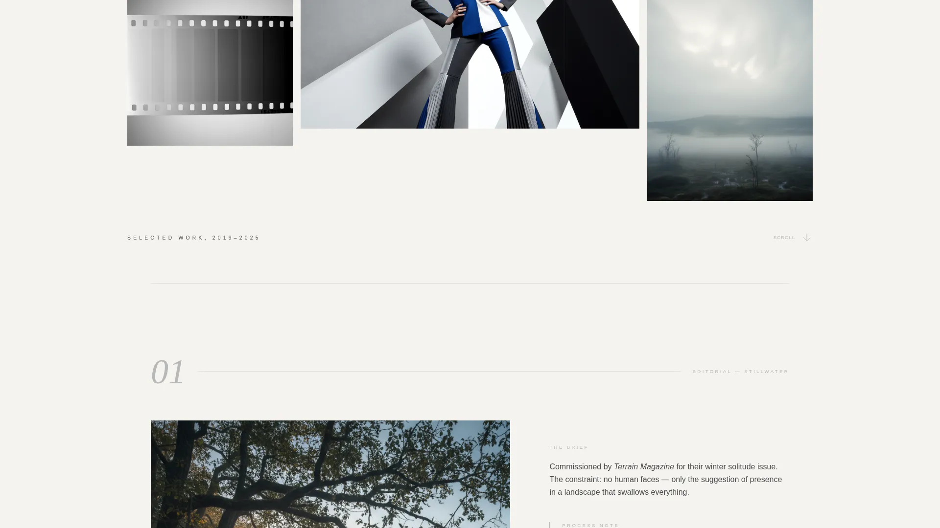
Six to eight images open the page in staggered, overlapping tiles at varying scales. No two images share the same crop ratio. The largest tile bleeds past the 60-column edge while smaller frames settle into the 40-column gutter. Generous whitespace between tiles lets each image hold its own silence.
Case Study Narrative Structure
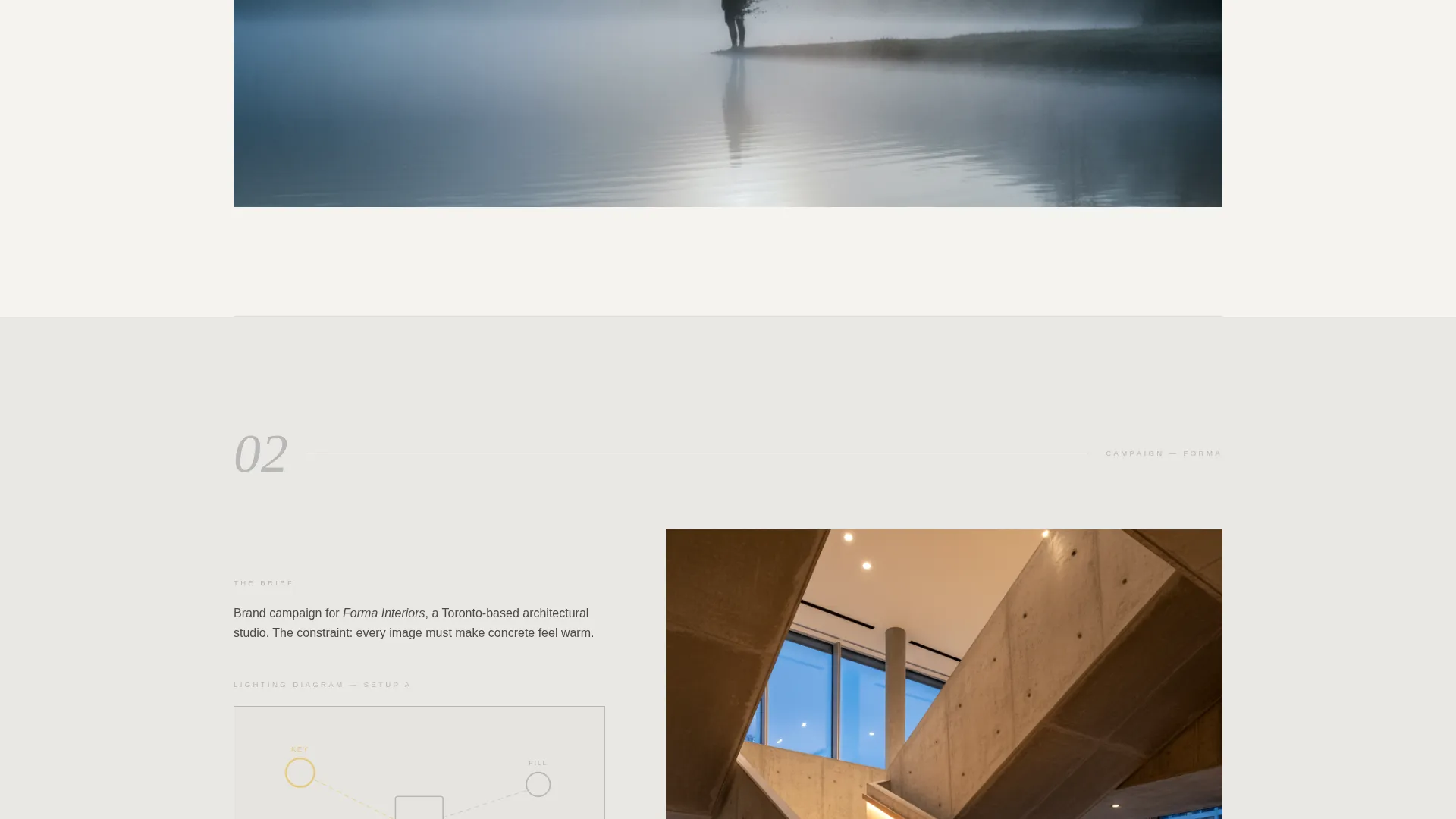
Each of the three project blocks follows a tension-process-release rhythm. The 60-column side opens with a full-bleed hero image. The 40-column side introduces the commission brief in two tight sentences. Behind-the-scenes contact sheets, lighting diagrams, and alternate selects layer in as the visitor scrolls deeper, building the story of how one final image was earned.
Dual Call-to-Action Placement
"Discuss a Project" appears first as a subtle fixed element in the top-right corner, then returns full-width on a forge-black band with a tungsten-filament underline after the last case study. Both placements link to a dedicated contact page rather than an inline form, keeping the portfolio layout clean.
Secondary Portfolio PDF Path
A "Download Portfolio PDF" link sits beneath the final project block. This gives art directors a way to circulate work internally before committing to a conversation, supporting the real-world workflow of agency and brand commissioning teams.
Monochrome Steel Palette with Accent Control
The color system uses four tones: forge black, brushed graphite, developing-tray silver, and raw linen white. A single warm accent, tungsten filament, appears only on hover states and active links. This restraint keeps the focus on imagery and prevents the interface from competing with the photographs.
Page sections overview
| Section | Purpose |
|---|---|
| Photo Grid Mosaic | Opens the page with six to eight staggered image tiles at varying scales and crop ratios |
| Delayed Title Reveal | Surfaces a wide-letterspaced "Selected Work, 2019, 2025" headline on first scroll |
| Project One Block | Introduces the first case study with a full-bleed hero, a two-sentence brief, and layered process materials |
| Project Two Block | Continues the narrative with a second commission story, contact sheets, and behind-the-scenes selects |
| Project Three Block | Completes the three-project arc with the same tension-process-release rhythm |
| Full-Width Final Image | Presents each project's chosen final image alone on screen with no caption before the next case study begins |
| Primary call to action Band | Forge-black full-width band carrying "Discuss a Project" with tungsten-filament underline |
| PDF Download Path | Secondary link beneath the last project for art directors who need to share work internally |
Design & branding system
The visual identity follows an Atelier Studio theme built entirely around restraint. The palette evokes a darkroom lit by a single tungsten bulb, with silver gelatin prints floating in chemical trays and shadows doing most of the communicating.
- Color system: forge black (#1A1A1A), brushed graphite (#4A4A4A), developing-tray silver (#B8B8B8), raw linen white (#F5F3F0), and tungsten filament (#E8C87A) reserved exclusively for hover states and active links
- Typography: a single sans-serif typeface set with wide letterspacing on the delayed headline, keeping text a quiet companion to the imagery rather than a competing voice
- Imagery treatment: all photos desaturated to near-monochrome with just enough tonal warmth to feel analog, reinforcing the silver gelatin aesthetic across the full page
Mobile & speed optimization
The template is structured with mobile reading in mind. The 60/40 asymmetric grid adapts naturally as screen width narrows, and the case study rhythm remains clear even on a single-column mobile layout.
- The staggered mosaic header scales to a linear tile stack on smaller screens, preserving the image-first opening without crowding
- Fixed call-to-action placement is designed to remain visible without obscuring content on compact viewports
- Process layers within each case study reorder gracefully so contact sheets and alternate selects appear below hero images on mobile rather than beside them
How this template helps you convert
The conversion path in Shutter is earned, not forced. By the time a visitor reaches the primary call-to-action, they have already watched three problems get solved beautifully. That journey does the persuasion work before any button is clicked.
- The Case Study Narrative structure builds trust by showing process alongside product, giving creative directors and brand managers the evidence they need to justify a booking decision internally
- The fixed "Discuss a Project" call-to-action stays visible throughout the scroll, so visitors can act the moment they feel ready without having to hunt for a contact path
- The secondary "Download Portfolio PDF" option captures art directors who are not yet ready to reach out directly, keeping them in the pipeline through a shareable offline asset
Other information about this template
Shutter is a strong fit for photographers who work at the intersection of commercial and fine-art practice. The template's structure and visual language position it well alongside other premium portfolio tools in the market.
- The Atelier Studio theme and Monochrome Steel color system are designed to complement high-resolution photography without the interface drawing attention away from the images
- The Click-Through landing page direction keeps the portfolio page clean by routing booking inquiries to a separate contact page rather than embedding a form inline
- The template is suited to photographers building a presence on platforms where editorial clients and gallery curators actively search for new commissions
- The delayed title reveal and full-width final image beat are structural choices that create a pacing rhythm rarely found in standard portfolio grid templates
Theme
Atelier Studio
Creative direction
Case Study Narrative
Color system
Monochrome Steel
Style
Asymmetric Grid (60/40)
Direction
Click-Through
Page Sections
Asymmetric 60/40 Grid Layout
Photo Grid Mosaic Header
Case Study Narrative Structure
Dual Call-to-action Placement
Secondary Portfolio PDF Path
Monochrome Steel Palette with Accent Control
Related questions
Who is the Shutter template designed for?
How many projects does the template support?
Does the template include a contact form?
What is the Download Portfolio PDF option for?
Can I adapt the color palette or typography?



