Business Coach Blog Website Template
Leverage is an editorial advisory landing page built for a one-person consulting business that works with mid-market founders on growth, margin, and exit strategy. The sidebar companion layout pairs a stats-first main column with a persistent conversion module. The Monochrome Steel design system and Giant Headline Left hero section create an authoritative, magazine-grade first impression that builds trust before asking for a single thing.
by Rocket studio
Quick summary
Leverage is a sidebar companion landing page designed for a high-trust advisory consulting business. It opens with an enormous flush-left headline, delivers hard proof before any methodology, and guides qualified founders toward a short partnership inquiry form. The Editorial Magazine aesthetic and Monochrome Steel color system make every scroll feel like reading a profile piece in a serious business journal.
Who this template is for
This landing page speaks directly to solo advisors and boutique consulting practices that serve mid-market companies. It is built for practitioners who close deals in boardrooms, not on product pages, and who need their online presence to match the weight of their work. The landing page design prioritises authority and restraint over decoration, making it the right fit for anyone whose value proposition rests on judgment rather than deliverables.
This template suits:
- Independent growth and exit advisors working with SaaS founders stuck between $1M and $20M in annual recurring revenue
- Consulting business owners serving second-generation manufacturing operators or agency principals who have become the bottleneck in their own firms
- Solo practitioners who need a professional landing page that qualifies inbound leads before the first conversation
What problem this template solves
Most consulting landing pages bury their proof underneath vague promises. A founder who lands on a typical advisory page in just a few seconds scans for credibility and finds biography copy instead of evidence. That mismatch kills conversions. The Leverage template flips the sequence entirely, leading with verifiable numbers and letting the narrative earn its place after the data has landed.
The template addresses these recurring pain points:
- The gap between the advisor's actual track record and how their landing page communicates that record to first time visitors
- The absence of a qualifying mechanism that filters serious partnership inquiries from casual browsers, reducing wasted discovery calls
- The lack of a secondary lead generation path for visitors who are not yet ready to raise their hand but are willing to exchange an email for proof
What you get with this template
The Leverage landing page gives you a fully structured, single landing page in an editorial sidebar companion format. Every section is pre-built around the Stats-First Impact creative direction, which means numbers lead and narrative follows. The layout is divided into a main long-form content column and a persistent right sidebar that keeps conversion options visible without overwhelming visitors as they read.
Included in the template:
- A pre-structured five-section landing page covering hero, stats and dot map, client archetype tab switcher, pull-quote testimonial layout, and partnership qualifying form with gated download module
- Fraunces serif display typography paired with DM Sans for body and interface copy, applied consistently across all landing page design elements
- A complete Monochrome Steel color system with four defined values used across backgrounds, type, dividers, and hover states
Feature list
This section covers the key features built into the Leverage landing page template and explains what each one does for your consulting business.
Giant Headline Left Hero Section
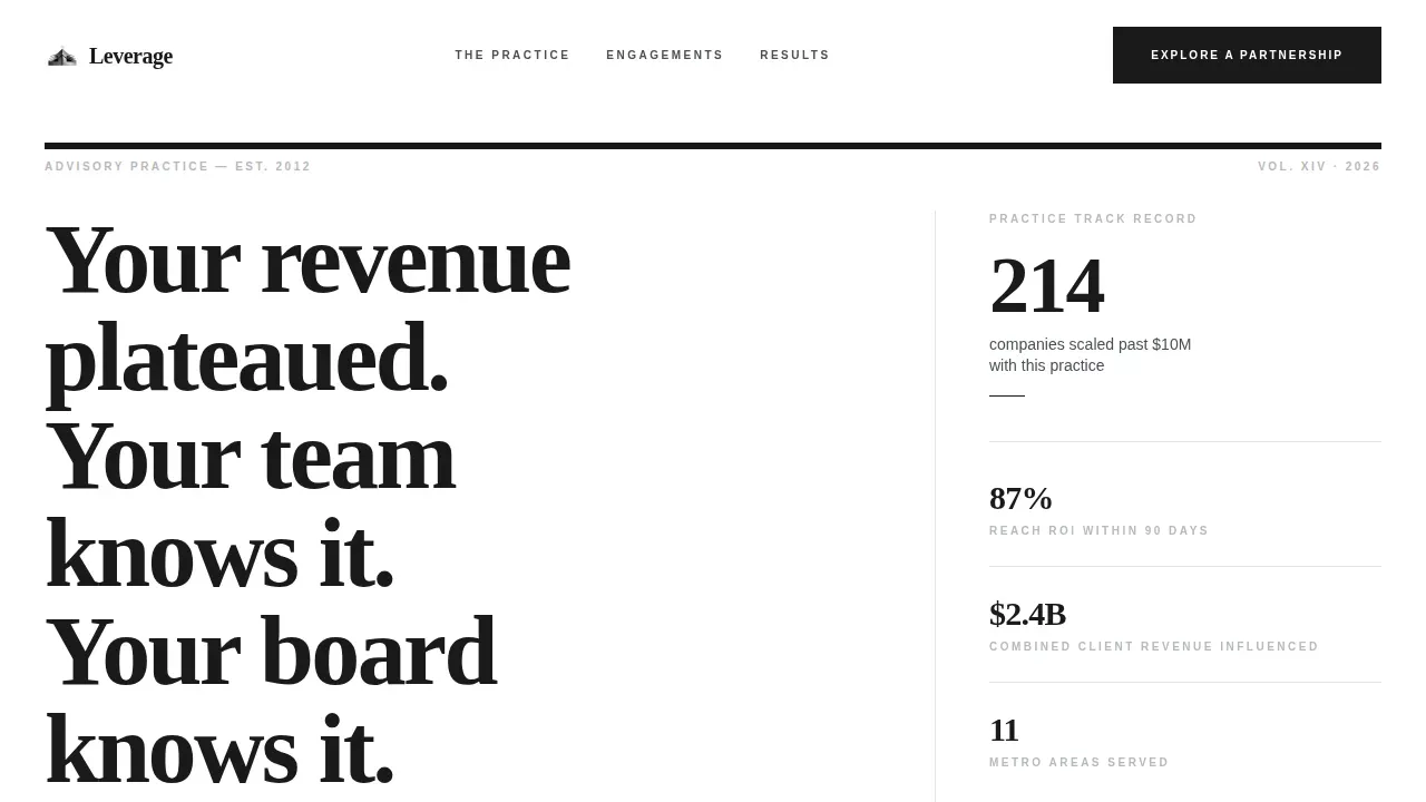
The hero section opens with an 80-pixel-plus flush-left editorial headline that renders each line like a separate sentence in a closing argument. The right sidebar holds a single quiet stat, set small and deliberate, the way a magazine runs a caption beside a full-page image. There is no hero image, no gradient, and no background videos competing for attention. Just black type on white space, with enough white space to let the primary message land cleanly. The hero section is the most important part of any landing page, and this one treats that responsibility seriously with a direct headline and a clear value statement that speaks directly to mid-market founders.
Stats-First Impact Scroll Architecture
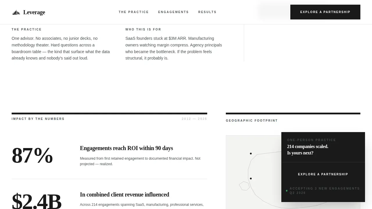
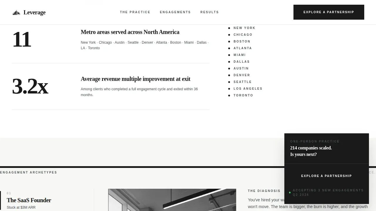
Every scroll depth in the main column opens with a number before it offers narrative. The visitor reads "87% of engagements reach return on investment within 90 days" before encountering a single paragraph about methodology. Then "11 metro areas served" with a minimal dot map. Then "$2.4 billion in combined client revenue influenced" beside a rolling testimonial column in the sidebar. This sequence is one of the best landing page examples of how to turn visitors into qualified inquiries by proving competence with data before asking for trust with words. The stats-first approach also keeps visitors engaged through each scroll depth because the next number creates genuine anticipation.
Client Archetype Tab Switcher
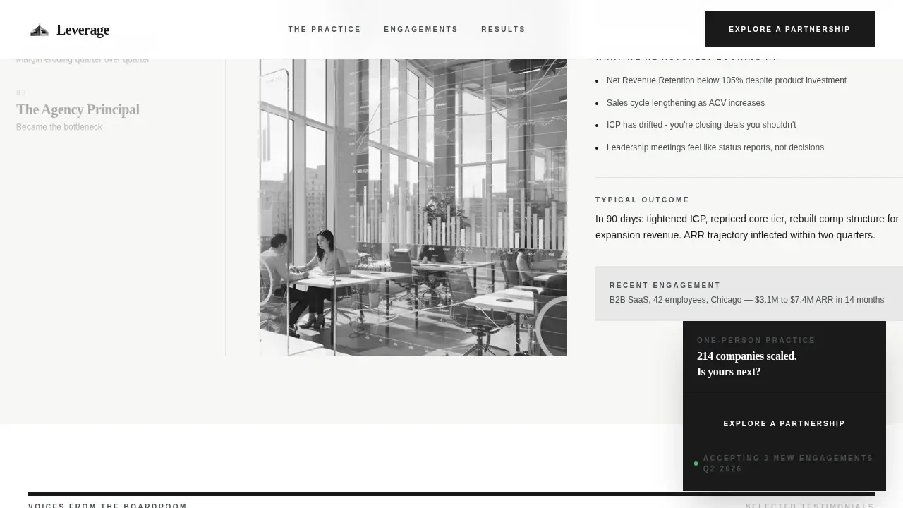
The third section uses an interactive tab switcher to present three distinct client archetypes: SaaS founders stuck at $3M in annual recurring revenue who cannot identify why hiring is not fixing growth, manufacturing owners watching margin erode quarter over quarter, and agency principals who have become the bottleneck they swore they would never be. Each tab delivers targeted copy that speaks directly to a specific set of pain points. This focused approach lets the template serve multiple segments of the target audience without creating three separate landing pages, and it helps first time visitors self-identify quickly.
Pull-Quote Testimonial Layout
The testimonial section uses a magazine portrait format that treats client testimonials like editorial content rather than generic review blocks. Curated quotes are set as pull quotes, styled the way industry publications handle verdicts from credible sources. Client logos appear beside the quotes to reassure visitors through recognisable social proof. This approach uses trust building elements that go beyond a standard star rating, drawing on the editorial context of the entire page to give each endorsement more weight. The sidebar companion column runs a rolling testimonial module that keeps social proof visible throughout the scroll.
Partnership Qualifying Form and Gated Download
The fifth section delivers the primary call to action through a short qualifying form. Fields include company name, annual revenue range via dropdown, biggest current constraint in open text capped at 140 characters, and preferred contact method. A secondary path offers a gated download of the 2024 Impact Report in exchange for an email address and company size. Both paths serve lead generation goals: the form captures ready buyers, and the download links capture earlier-stage visitors who need more proof before committing. This dual-path structure turns a single landing page into an effective lead generation tool without cluttering the layout with competing calls to action.
Persistent Sidebar Conversion Module
After the second scroll depth, the sidebar locks a "Explore a Partnership" call to action button in a fixed position. The sidebar also displays client logos, engagement statistics, location markers, and a compact contact details module. This persistent layout means the clear call to action remains visible regardless of how deep into the main column a visitor reads. The sidebar companion format is one of the most effective landing page design patterns for a consulting business because it keeps conversion options present without interrupting the long-form narrative in the main column.
Page sections overview
| Section | Purpose |
|---|---|
| Hero Headline Left | Opens with a flush-left editorial headline and a single sidebar stat to establish authority immediately |
| Stats and Dot Map | Delivers three headline metrics and an eleven-metro location marker before any methodology copy |
| Client Archetype Tabs | Tab switcher lets visitors self-identify across three mid-market founder profiles |
| Pull-Quote Testimonials | Magazine-style social proof layout with client logos and curated endorsements |
| Partnership Form Module | Qualifying form plus gated PDF download to capture both ready buyers and research-stage visitors |
Design & branding system
The Monochrome Steel color system is the visual identity for this landing page. It uses four defined values applied across every element, and the absence of decorative color is itself the brand identity statement. The landing page design feels like a Monocle issue on a steel-and-glass coffee table: restrained, authoritative, and visually appealing in a way that requires no embellishment. Typography follows a two-family system, with Fraunces handling all display and headline roles and DM Sans managing body copy, form labels, and interface elements.
Key design specifications:
- Deep editorial black (#1A1A1A) for primary text and section backgrounds, gunmetal (#4A4F54) for secondary typography and divider rules, cold silver (#D1D5DB) for sidebar backgrounds and card surfaces, and molten chrome (#E8E8E8) as a single hover and active-state accent
- Fraunces serif display at 80px or above for the hero headline with tight leading; DM Sans at comfortable reading sizes for all body paragraphs and form elements
- The dark background in key sections and the deliberate use of white space across the entire page create a visually appealing, high-contrast layout that keeps the primary message dominant without overwhelming visitors
Mobile & speed optimization
The Leverage template is designed desktop-first, reflecting the reality that boardroom decision-makers review advisory partnership proposals on laptops. Mobile fallback is included to ensure the layout remains readable and navigable on mobile devices, reducing bounce rates for visitors arriving from social media posts or referral links on smaller screens. The sidebar companion structure adapts to a stacked layout on mobile devices so the persistent conversion module stays accessible.
Mobile and speed considerations include:
- Desktop-first column layout collapses gracefully to a single stacked flow on mobile devices, keeping contact details and the call to action reachable without excessive scrolling
- Scroll-linked reveal animations and staggered number counters are built with medium animation intensity, delivering visual appeal on desktop while remaining legible and functional on smaller screens
- Server Components handle all static content for fast initial load; Client Components manage the qualifying form, counter animations, and sticky sidebar to maintain a seamless user experience
How this template helps you convert
This landing page is built around a single goal: turning a qualified founder's attention into a partnership inquiry. Every design and copy decision supports that goal. The sidebar companion format keeps the primary call to action visible while the main column builds the argument. The stats-first scroll architecture means the value proposition lands through evidence before narrative, which is how effective landing page design earns trust from skeptical mid-market decision-makers.
- The hero section delivers a compelling headline and a single sidebar stat immediately, giving first time visitors a clear value statement within just a few seconds of arriving, before they decide whether to keep reading
- The stats, archetype tabs, and pull-quote testimonials build a layered case across the scroll, using social proof and real world benefits to reassure visitors and address the pain points of each client archetype before they reach the form
- The dual-path conversion structure at the bottom of the page captures both ready buyers through the qualifying form and research-stage visitors through the gated download, making the final landing section an effective lead generation asset rather than a single-bet call to action
Other information about this template
The Leverage template is built as a sidebar companion landing page, which is a specific landing page design pattern that keeps contextual proof always visible beside a long-form editorial main column. This pattern is particularly effective for a consulting business because it mirrors how industry professionals consume evidence: reading an argument in the main column while scanning supporting data in a peripheral zone. The template falls within the broader category of consulting landing pages, which are focused page experiences designed to convert visitors into leads by showcasing expertise and using action-oriented messaging.
Landing pages can be categorized into different types based on their specific goals, such as lead generation, click-through, and app promotion. The Leverage template is primarily a lead generation landing page. Lead generation landing pages are designed to collect visitor information through a form in exchange for something valuable, like a downloadable resource or consultation. The gated Impact Report download follows this model precisely. Consulting landing pages are focused, single-page websites that aim to convert visitors into leads by showcasing expertise and using action-oriented messaging, which is exactly what this template delivers.
A well optimized landing page can transform prospects into leads by gathering information that helps you understand, market to, and serve visitors better. The qualifying form in this template collects company name, revenue range, biggest current constraint, and preferred contact method, giving the advisor qualified context before the first call. This is one of the key benefits of a structured form over a generic contact box.
Additional notes for buyers and builders:
- The template is built for landing page design patterns used in B2B advisory and partnership conversion contexts, not for app landing page or e-commerce use cases
- Leveraging an editorial advisory partnership on a landing page is a powerful trust-signaling strategy that converts expert authority into visitor confidence, and this template is structured around that principle
- Using testimonials and reviews on landing pages can significantly enhance trust and credibility, leading to higher conversion rates; the pull-quote layout here treats client testimonials as editorial content rather than generic endorsements
- A well-structured landing page can improve conversion rates by providing a frictionless path to a single, clear action; the Leverage template keeps its primary call to action simple and qualifies visitors before they reach it
- Landing pages can help track user interest and behavior, allowing for continuous improvement based on analytics; the form fields and download gate in this template produce structured data that supports ongoing refinement of your marketing strategy
- Video testimonials and background videos are not included in this template, keeping the landing page design clean and load-efficient; the editorial authority comes from typography, numbers, and copy rather than media
- The template can support your own marketing campaigns across referral channels, direct outreach, and professional network shares, since the landing page design is consistent enough to match messaging from multiple sources
- Tools like Unbounce and HubSpot's Landing Page Builder offer drag-and-drop environments where advisors can create landing pages from existing templates quickly; this template is built to the same structural standards those platforms encourage, making it straightforward to adapt if you are already using one of those environments to build your own landing pages
- The app landing page category, including app landing and app solves-focused layouts, represents a different conversion goal from this template; Leverage is specifically designed for professional services partnership conversion, not application downloads
- Industry publications use the same editorial restraint this template embodies: restrained palettes, strong typography, and social proof that feels curated rather than aggregated
- The all in one platform concept applies here in the sense that the Leverage landing page consolidates hero, proof, archetype targeting, testimonials, and both conversion paths into a single coherent page experience without requiring separate pages for each function
- A/B testing is a crucial method for optimizing landing pages; buyers can test headline variants in the hero section or swap stat callouts to discover what resonates best with their specific target audience
- Service-specific landing pages can be created to showcase individual consulting services, allowing for targeted messaging; the Leverage template can support that use case by adapting the archetype tab section to reflect different service offerings
- Clear and compelling headlines are critical for capturing attention and communicating the core value of the landing page; the Giant Headline Left concept in this template is built around that principle from the first pixel
- Using audience insights to craft messaging and visuals that resonate with their priorities and pain points can enhance engagement; the three archetype tabs in this template do exactly that for each defined buyer segment
Theme
Editorial Magazine
Creative direction
Stats-First Impact
Color system
Monochrome Steel
Style
Sidebar Companion
Direction
Partnership/B2B
Page Sections
Giant Headline Left Hero Section
Stats-first Scroll Architecture
Client Archetype Tab Switcher
Pull-quote Testimonial Layout
Partnership Qualifying Form and Gated Download
Persistent Sticky Sidebar Module
Related questions
Is this template suitable for a solo advisor or does it require a team?
Can I adapt the client archetype tab section for different industries?
What conversion paths does this landing page include?
Does the template include testimonial and stats content, or do I supply my own?
Is this template appropriate for professional services beyond advisory consulting?



