Regional & Ethnic Restaurant Professional Website Template
Liming is a neo-retro Caribbean restaurant landing page template built around a masonry photo gallery, animated vintage illustration header, and three distinct conversion paths. It serves homesick islanders, food adventurers, and catering coordinators with a warm, rum-bar mood. The design blends sun-baked terracotta, molasses brown, and sorrel red into a hand-painted, travel-poster aesthetic that feels alive from the first scroll.
by Rocket studio
Quick summary
Liming is a single-page Caribbean restaurant template with a neo-retro soul. It opens with a panoramic vintage travel-poster illustration and flows through a masonry food gallery, a catering yard, and a rum bar section before landing on three bold conversion cards. Every design decision, from the sticky header to the spice-level slider, serves one goal: get visitors to taste the story before they fill out a single form.
Who this template is for
This template is built for Caribbean restaurant owners, pop-up chefs, and catering operators who want a landing page that does serious commercial work without feeling corporate. It suits anyone who needs visitors to move from browsing to booking in one scroll.
- Restaurant owners serving multi-island Caribbean food, Trinidadian, Jamaican, Bajan, or Guyanese plates, who want a page that matches the warmth of their kitchen.
- Catering coordinators and event planners who need one clear space to show group menu options, take headcount inquiries, and sign up new clients fast.
- Food entrepreneurs entering a competitive market who understand that a memorable first impression and a strong visual brand story are the most important thing between them and their next table.
What problem this template solves
Most food and beverage landing pages fail at atmosphere. They post a PDF menu, list an address, and hope visitors figure out the rest. That is not good enough for a restaurant whose entire value is rooted in culture, flavor, and the feeling of arriving somewhere special.
- A generic template cannot carry the story of a kitchen where scotch bonnet spices smoke slow and coconut milk simmers thick. Liming is built specifically to replace flat, lifeless food pages with an immersive visual journey.
- Visitors leave before they book because the path from interest to action is too complicated. This template removes that friction by showing food first and placing clear conversion options directly after the dish gallery.
- Operators running pickup orders, table bookings, and catering events from the same kitchen need one page that handles all three. Liming provides three distinct illustrated action cards, each pointing to a different conversion path, so no customer segment gets lost.
What you get with this template
You get a fully structured, single-page layout that functions as a complete restaurant presence. Every section is designed and positioned. You do not need to source a layout from scratch or test a dozen combinations before something feels right.
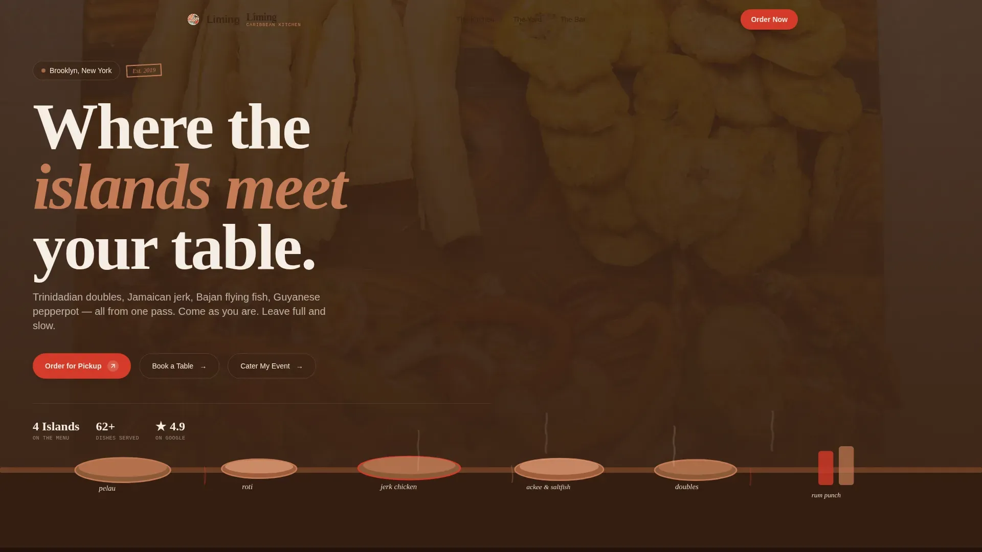
- A panoramic custom illustration header with animated steam wisps, a vintage travel-poster color story, and three call-to-action pills for pickup, table booking, and catering, all above the fold.
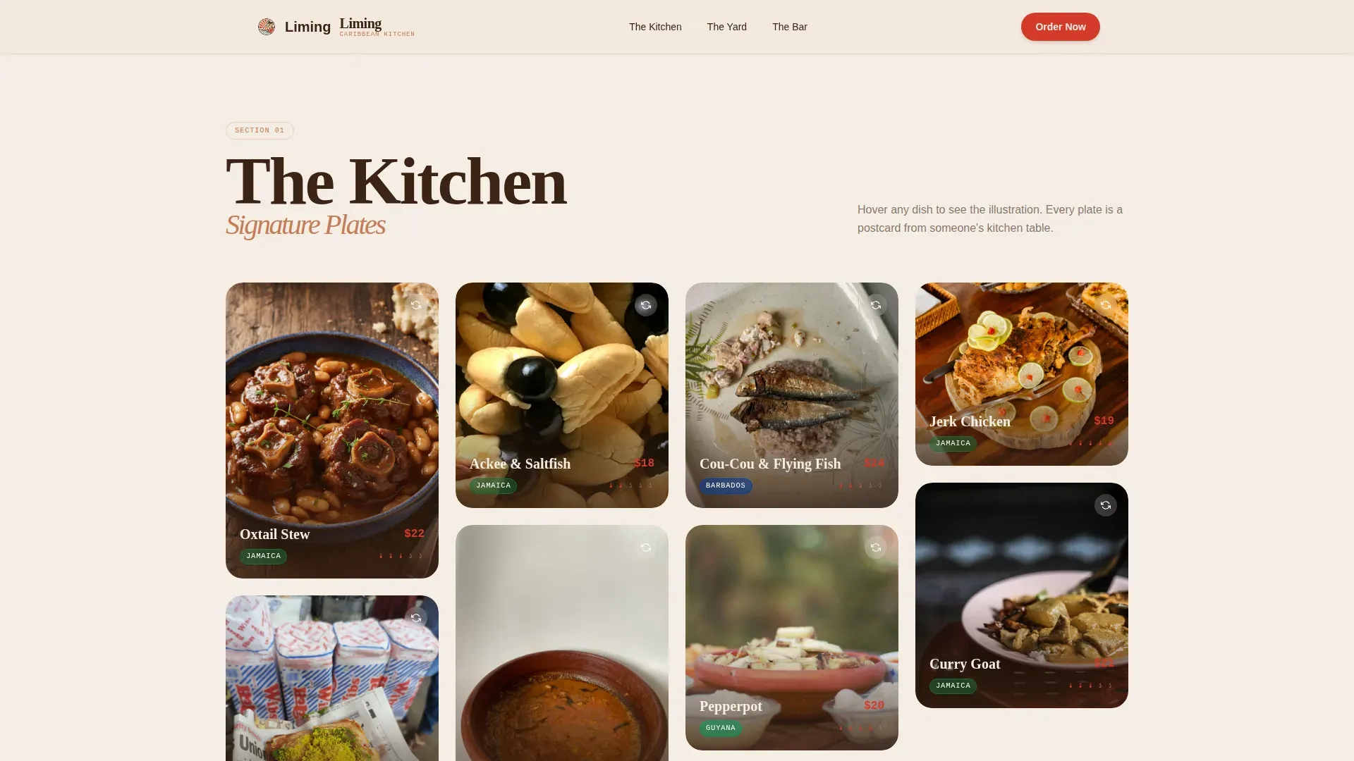
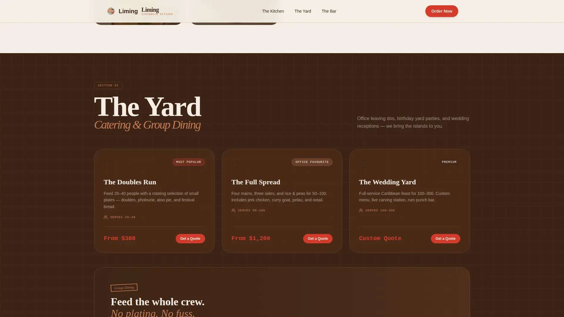
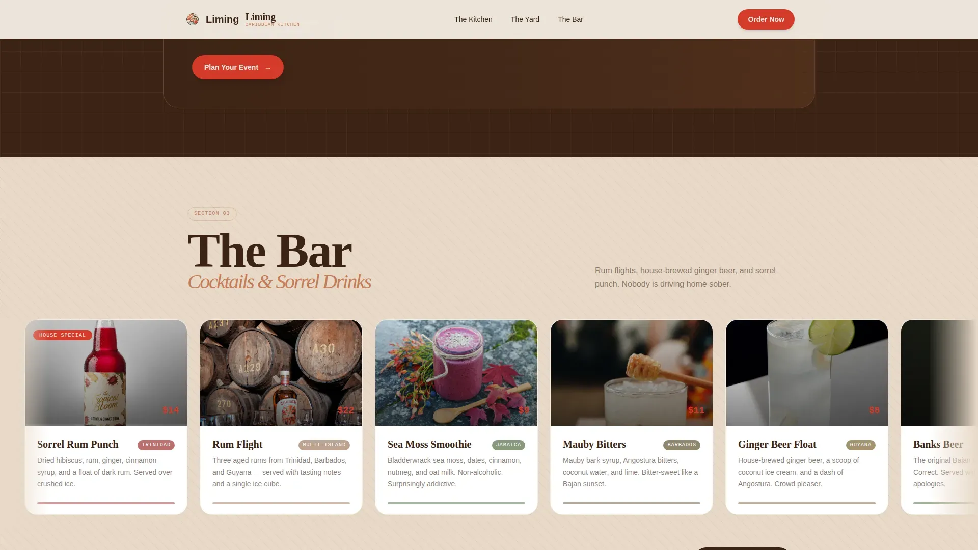
- A masonry photo and illustration gallery called The Kitchen, a catering bento grid called The Yard, a horizontal scroll cocktail section called The Bar, and a footer following the Arc Browser Split pattern with logo and links.
- A suite of interactive components including a modal-style menu browser sorted by island origin, a table booking form with rum flight pre-order option, and a catering inquiry form with a spice tolerance slider running from mild to Trini hot.
Feature list
This section walks through the core built-in components that make the Liming template work as both a restaurant story and a conversion machine.
Panoramic Illustrated Hero Header
The hero spans the full viewport width and is rendered in a vintage travel-poster style with modern linework. A long illustrated table stretches across the scene, loaded with labeled dishes including oxtail, roti, ackee and saltfish, and a rum punch bowl. Animated steam wisps rise from the food. Characters around the table span generations, from a grandmother spooning rice to a couple clinking bottles, giving the header an emotional connection that photography alone rarely achieves. Three conversion pills sit below, sign-posting the three paths forward.
Masonry Dish Gallery with Photo and Illustration Flip
The Kitchen section uses a masonry, Pinterest-style grid of overhead dish photos shot on mismatched ceramic plates. Hovering any card flips it from real food photography to the illustration version of that same dish. This photo-to-illustration transition bridges the nostalgic, retro art style with genuine food photography. The gallery functions as an edible wall of inspiration, making visitors feel like they are flipping through a well-loved recipe book before they have typed a single character into a form.
Three-Zone Section Architecture
The page is divided into three named zones beyond the hero. The Kitchen covers signature plates and the masonry menu gallery. The Yard handles catering and group dining, presented in a bento grid layout. The Bar features cocktails, falernum-based drinks, sorrel drinks, and shaken rum cocktails in a horizontal scroll card row. Each zone opens with a new illustrated vignette that widens the world of the restaurant and keeps the scroll feeling like a tour through a living cookbook.
Three-Path Conversion Cards
At the base of the page, three large illustrated cards rendered in sorrel red offer distinct actions: Order for Pickup, Book a Table, and Cater My Event. Each card shows the food context first and the action second. The pickup path opens a compact menu browser with add-to-cart functionality sorted by island origin. The table booking path asks for party size, date, and whether the visitor wants to pre-order the rum flight. The catering path triggers a short inquiry form with event type, headcount, and a spice tolerance slider, so no conversion goal gets buried or skipped.
Warm Stone Color System and Neo-Retro Typography
The entire color story runs on four values: limestone white for backgrounds, terracotta for cards and section dividers, molasses brown for all body text, and sorrel red for every action moment including buttons, price tags, and spice-level indicators. The typography pairing uses Fraunces for serif display headings, DM Sans for body copy, and JetBrains Mono for menu labels and price points, a combination that feels like a hand-lettered menu board brought into a modern browser.
Social Proof and Authenticity Signals
Island-origin labels appear on every dish card, so visitors know whether a recipe comes from Trinidad, Jamaica, Barbados, or Guyana. A scrolling customer quote marquee runs across the page as a living testimony to the food. Catering headcount stats appear in The Yard to help office coordinators and event planners understand scale before they send a form inquiry.
Page sections overview
| Section | Purpose |
|---|---|
| Hero Illustration Header | Panoramic travel-poster scene with animated steam, dish labels, and three conversion pills |
| The Kitchen Gallery | Masonry dish grid with photo-to-illustration hover flip and island-origin labels |
| The Yard Bento Grid | Catering and group dining overview with headcount stats |
| The Bar Scroll Cards | Horizontal rum cocktail and sorrel drinks row with falernum and shaken cocktail cards |
| Conversion Action Cards | Three large illustrated sorrel-red cards for pickup, table booking, and catering |
| Customer Quote Marquee | Scrolling social proof strip with guest testimonials |
| Arc Split Footer | Logo and tagline left, navigation links right, brand pattern seven layout |
Design & branding system
The visual identity runs on a Warm Stone palette that feels like a hand-painted menu board left outside a beach shack since 1979, faded by salt air but still readable from across the street. The mood is deliberately unhurried, like a rum bar at golden hour where nobody is in a rush and the steel pan plays somewhere just out of sight.
- The four core colors are limestone white (#F5EDE3) for backgrounds, terracotta (#C47B56) for cards and dividers, molasses brown (#3B2314) for body text, and sorrel red (#D43A2A) for every call to action. Pink-adjacent tones appear as warmth accents in illustrated figures and dish card overlays.
- Typography uses Fraunces as the serif display face for section headings, DM Sans for body paragraphs, and JetBrains Mono for menu item labels and price tags. Together, the typography choices signal craft and authenticity without feeling nostalgic in a stiff way.
- Illustrations follow a vintage travel-poster style with intentionally oversaturated color, inspired by postcards mailed home in the early 1970s. The sky in the hero is rendered in warm amber gradients, and every section vignette is designed to feel like a new room opening as you scroll.
Mobile & speed optimization
The template is built mobile-first, which reflects how most Caribbean food and beverage customers actually arrive at a restaurant page, on a phone, often mid-week, craving something specific. The pickup and table booking flows are designed to work cleanly on small screens without requiring the visitor to pinch, zoom, or wait.
- The masonry grid reconfigures for mobile viewports, so the dish gallery remains browsable on a phone without losing the photo-to-illustration hover story. Menu browsing and the spice slider are touch-friendly.
- Animations including the steam wisps and scroll-reveal effects use GPU-accelerated transforms and native CSS scroll behavior, keeping the experience smooth without heavy JavaScript overhead. The IntersectionObserver pattern drives section reveals as the visitor scrolls down.
How this template helps you convert
The Liming template does not ask visitors to commit before they are ready. It earns each click by letting the food and story do the selling first. The conversion architecture is deliberate and sequential: you see the dish, you feel the atmosphere, and then the action appears.
- The hero immediately communicates the restaurant's value through a bold illustrated scene and positions three clear next steps, pickup, table, or catering, so every visitor type can find their path within seconds of arriving on the page.
- The masonry dish gallery and zone-by-zone scroll build appetite and trust before any form appears, so when visitors reach the three conversion cards at the bottom, they have already spent meaningful time inside the brand story and are far more likely to act.
- Each conversion path is scoped to reduce friction: the menu browser sorts food by island origin for fast decision-making, the table booking form is short and includes one upsell option (the rum flight), and the catering form uses a slider instead of a free-text field to make spice preference easy to sign off quickly.
Other information about this template
The Liming landing page draws on a wide range of Caribbean food culture references, from falernum syrups shaken into tiki bar-style cocktails to the origin story of liming itself. The term liming refers to the Caribbean art of doing nothing while hanging out with friends, a cultural value that the template's unhurried scroll rhythm and illustrated warmth are designed to reflect. Understanding this cultural depth helps operators position the page authentically against competitors who treat Caribbean food as a surface-level aesthetic rather than a living tradition.
- The template's neo-retro direction draws influence from vintage travel-poster art of the kind that spread across Caribbean tourism boards through the 1960s and 1970s. Designers working in cities like Chicago and New Orleans who are inspired by that era will recognize the visual language immediately. The style is bold enough to dominate a phone screen and warm enough to hold attention without feeling like a hard sell.
- The three-zone structure, The Kitchen, The Yard, and The Bar, maps directly to how Caribbean restaurant customers actually think about a meal together. Parents bringing family for a Sunday pelau will look for The Kitchen. Office coordinators planning an event will go straight to The Yard. A group of friends celebrating in July will head to The Bar to sign up for the rum flight. The page gives each group a clear track forward.
- Operators can associate the page's social media presence with the template's visual identity by carrying the illustration style into post graphics shared on Facebook and other platforms. Supporting local bars and restaurants through engaged social communities helps spread the story beyond the page itself. Bars and restaurants that opt into community-led marketing often track stronger returning customer numbers than those who rely only on paid acquisition. Engaging with local bars and restaurants through social media can help raise awareness and support for their efforts significantly.
- The catering inquiry section is particularly useful for operators who want to reach office coordinators in busy urban markets. Catering groups can arrive at the page, note the headcount capacity, test the spice slider, and send an inquiry without ever leaving the landing page experience. This replaces the back-and-forth effort of email threads and PDF menus.
- This template is fully editable, allowing users to customize fonts, colors, images, and text to match their brand. Customizable food and beverage templates of this kind can help restaurants create eye-catching menus that complement a tropical or Caribbean ambiance. Resources like free, customizable tropical menu template collections, including those offering designs that feature palm leaves, exotic fruits, and sunset colors, can serve as starting references for photo and illustration assets before a shoot. Tropical menu templates are suitable for various dining establishments, from casual smoothie bars to upscale resort dining, and the Liming template sits confidently in the upper range of that spectrum.
- A memorable brand story is the most important thing a Caribbean restaurant can carry into a new market. Building a restaurant brand requires a clear understanding of the target market and customer personas, and the Liming template is structured to reflect exactly three personas from day one. Digital presence, including a mobile-friendly page and active social media engagement, is vital for modern restaurant branding. Essential information such as the restaurant's location and hours should be easily visible, and this template places that detail in the sticky header zone so it is never more than a glance away. Interactive and searchable menus should replace PDFs to enhance user experience, and the modal menu browser built into this template does precisely that.
Theme
Neo-Retro
Creative direction
Immersive Visual
Color system
Warm Stone
Style
Masonry/Pinterest
Direction
Marketplace/Multi
Page Sections
Panoramic Illustrated Hero with Animated Steam
Masonry Dish Gallery with Illustration Flip
Three-zone Scroll Architecture
Three-path Conversion Card System
Warm Stone Color System and Neo-retro Typography
Social Proof and Island-origin Authenticity Labels
Related questions
Can I adapt this template for a restaurant that serves only one Caribbean island's cuisine?
Does this template support all three conversion paths at once, or do I pick one?
Is the spice tolerance slider a real interactive component?
Can I use this template for a tiki bar or cocktail-forward concept rather than a full food menu?
How does the template handle social proof without a review platform integration?



