Bold Biolink Landing Page Template
Linkframe is a bold, single-page biolink landing page template built for creator-economy managers, direct-to-consumer brand leads, and agency founders. It stacks social profiles, booking links, product drops, and press coverage into one tap-friendly hub. The Electric Indigo color system and overlapping translucent card layout give every link the visual weight it deserves.
by Rocket studio
Quick summary
Linkframe turns a single bio link into a fully designed brand hub. It uses a Lens and Frame visual theme, deep indigo layers, and a manifesto-style scroll to move visitors from philosophy to conversion. The page is built for partnership and B2B outreach, with a qualifying lead form and an inline video path for prospects who need proof first.
Who this template is for
This template is designed for professionals who manage link-in-bio pages at scale or who need a biolink page that actually earns attention. It speaks directly to people who know a plain list of URLs is costing them results.
- Creator-economy managers handling multiple talent accounts at once
- Direct-to-consumer brand leads who need a link-in-bio that converts traffic into action
- Agency founders ready to pitch or onboard partners through a polished, qualifying page
What problem this template solves
Generic biolink pages leak traffic. Visitors land, feel nothing, and leave. The template solves the gap between having links and having a brand presence behind those links.
- No visual hierarchy means visitors do not know where to tap first
- A plain URL list signals low effort, which erodes trust before a single click happens
- Scattered links across multiple tools make it hard to manage or pitch at scale
What you get with this template
You get a complete single-page layout that combines design conviction with a practical lead-capture flow. Every section is purpose-built, not assembled from generic parts.
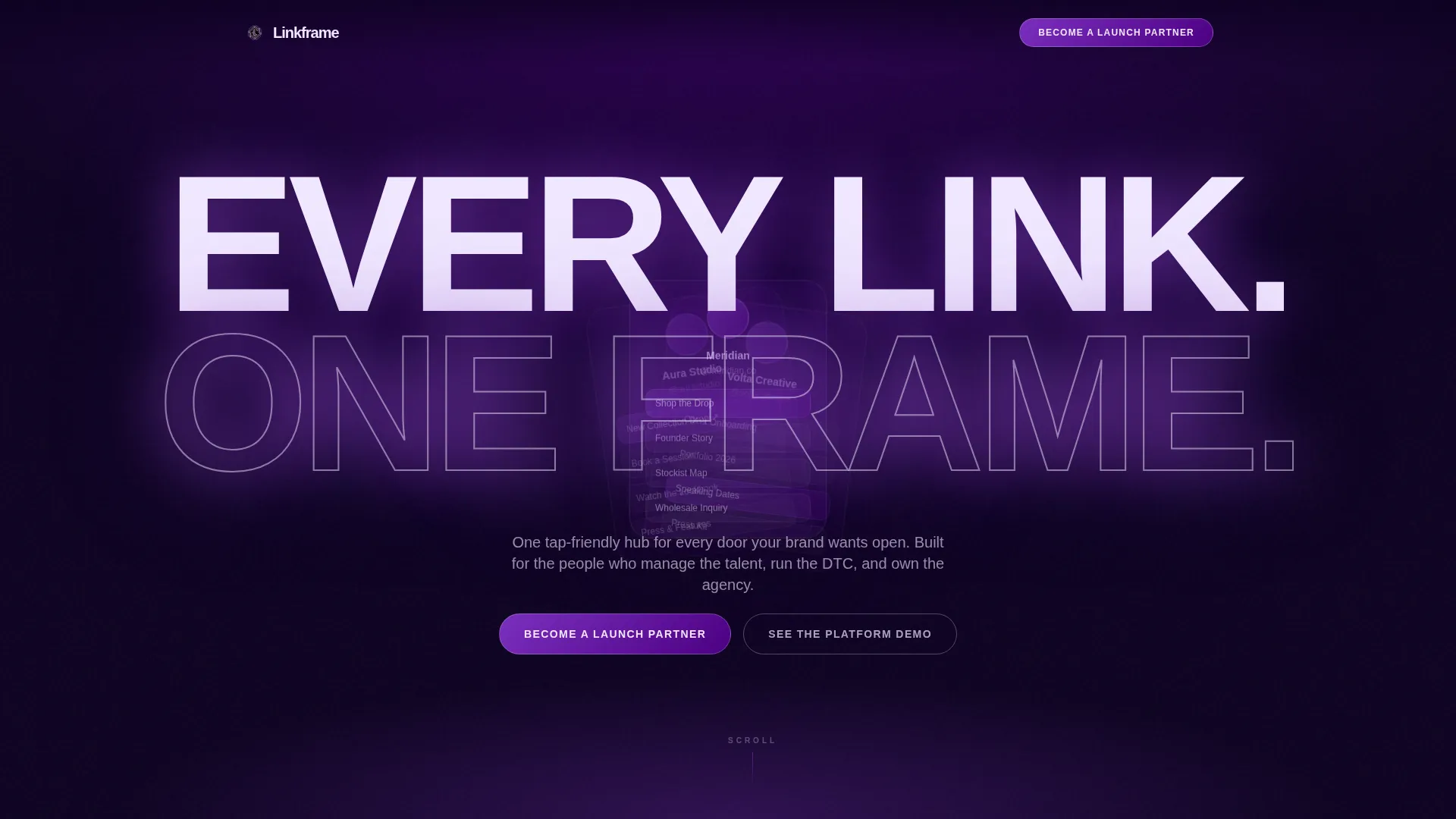
- A full-bleed header with an ultra-bold condensed headline and layered product mockups behind it
- A manifesto-style scroll that moves from philosophy to social proof to a qualifying partner form
- A sticky bottom bar with a primary call to action and a secondary inline video path
Feature list
This template delivers a focused set of layout and interaction features drawn directly from its creative brief. Each one serves the goal of converting a bio click into a meaningful brand moment.
Giant Headline Header
The header centers one oversized, ultra-bold condensed headline: "Every Link. One Frame." The letterforms are scaled so large they bleed past the viewport edges. Three translucent link-page mockups overlap at staggered angles behind the text, like contact-sheet slides held to the light.
Manifesto Scroll Structure
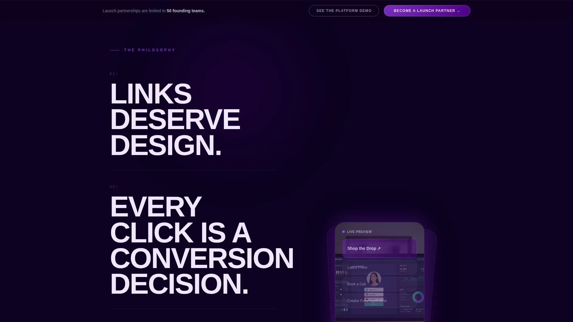
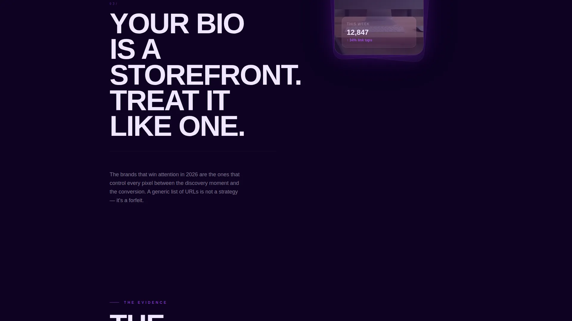
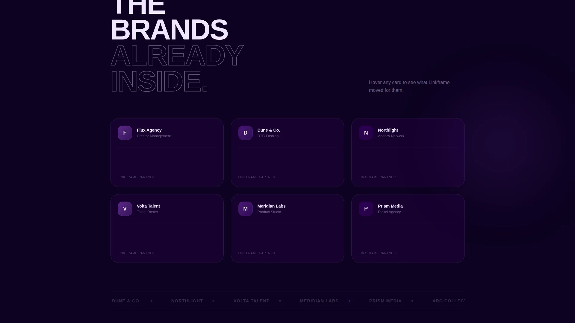
The page reads like a declaration, not a feature list. The first fold states a design philosophy. The second fold layers a translucent product screenshot over a single bold conviction sentence. The third fold presents partner logos in overlapping hover-lift cards that reveal case-study stats beneath.
Sticky Partner call to action Bar
A sticky bottom bar appears after the second scroll beat. The primary call to action reads "Become a Launch Partner." It stays anchored in view so the conversion path is never out of reach as visitors read through the manifesto content above.
Qualifying Lead Form
The form inside the sticky bar collects company name first, then monthly active link-page volume, then a single open-text field labeled "What are you building?" This sequence qualifies both scale and intent without adding friction or unnecessary fields.
Inline Video Overlay Path
A secondary link reads "See the Platform Demo" and opens an inline video overlay directly on the page. Prospects who need proof before committing to a partner conversation can stay on the page rather than leaving for an external call or link.
Overlap and Layered Card System
Every section is built as a translucent card floating above the one beneath it. Indigo washes layer as overlapping frames. Cards lift on hover to reveal content beneath, creating visual density that mirrors the rhetorical weight of the manifesto copy.
Page sections overview
| Section | Purpose |
|---|---|
| Hero Header Block | Anchors brand authority with oversized headline and staggered mockup layers |
| Philosophy First Fold | States the design conviction that links deserve intentional visual treatment |
| Product Screenshot Fold | Pairs a bold single-sentence claim with a translucent product visual |
| Partner Logos Fold | Stacks social proof in overlapping hover-lift cards with case-study stats |
| Sticky call to action Bar | Keeps the "Become a Launch Partner" action anchored throughout the scroll |
| Qualifying Lead Form | Captures company name, link-page volume, and open intent in three fields |
| Inline Video Overlay | Offers a demo path for prospects not yet ready for a direct conversation |
Design & branding system
The visual identity follows a Lens and Frame theme. Every design decision reinforces a single idea: the thing worth looking at should be impossible to miss.
- Color system uses four values: deep exposure black (#0D0221), vivid indigo (#4B0082), hot iris purple (#7B2FBE), and electric white (#F0E6FF) for headlines, borders, and hover states
- Translucent indigo card layers overlap and float, creating a stacked-frame effect where each section slides over the last
- Electric white is reserved for text and call-to-action borders so they cut through the dark layered background like a flash burst
Mobile & speed optimization
The layout is designed for tap-first use. A biolink page lives in a mobile context almost exclusively, so the template treats small-screen behavior as the default, not an afterthought.
- Tap-friendly link elements and call-to-action targets sized for thumb interaction
- Single-column stacked card layout collapses cleanly from the overlapping desktop composition
- Sticky bottom bar remains accessible on scroll without obscuring primary content on small screens
How this template helps you convert
The page is structured to move a visitor through a deliberate emotional and logical arc. Every scroll beat serves the conversion goal.
- The manifesto scroll builds rhetorical weight from ideology to evidence, so by the time the lead form appears, the visitor already believes the premise
- The sticky call to action bar keeps the "Become a Launch Partner" action visible without interrupting reading, lowering the effort needed to commit
- The inline video overlay gives hesitant prospects a proof-first path that keeps them on the page rather than sending them away to decide later
Other information about this template
This template sits in the Personal and Resume category under the Linktree and link-in-bio subcategory, with a niche focus on business link pages. It is built specifically for the overlap and layered template style, meaning the visual architecture is intentional, not decorative.
- The template style is classified as Overlap and Layered, making it distinct from flat or card-grid biolink layouts
- The creative direction is Manifesto, meaning the copy rhythm and section order are designed to escalate from belief to evidence to action
- The header concept is Giant Headline Centered, a deliberate choice to assert authority before the visitor scrolls a single pixel
Theme
Lens & Frame
Creative direction
Manifesto
Color system
Electric Indigo
Style
Overlap/Layered
Direction
Partnership/B2B
Page Sections
Giant Headline Centered Header
Manifesto-style Scroll Structure
Sticky Bottom Call to Action Bar
Three-field Qualifying Lead Form
Inline Video Overlay Path
Overlap and Layered Card Layout
Related questions
Who is this template designed for?
What makes this different from a basic biolink page?
Can this template support a partnership or B2B pitch flow?
What does the qualifying lead form collect?
Is this a multi-page template?



