Linktree & Link-in-Bio Professional Website Template
Linklens is a single-page creator link landing page template built for partnership and business-to-business conversion. It uses an Overlap/Layered layout with a Lens and Frame visual identity to present every creator revenue stream as a browsable, interactive card stack. Designed for talent managers, creator economy startups, and media agencies, it turns a link page into a serious media kit.
by Rocket studio
Quick summary
Linklens is a single-page template that transforms a creator's link page into a partnership-ready media kit. Built on an Ink and Paper color system with a Lens and Frame visual identity, it stacks layered creator page mockups that reveal real attribution data on scroll. The goal is simple: by the time a media buyer reaches the form, the business case is already made.
Who this template is for
This template is built for the business side of the creator economy. It speaks to people who need to prove a creator's reach is worth real investment.
- Talent managers who present brand partnership decks to sponsors and agencies
- Creator economy startups that build white-label link tools for their clients
- Media agencies that need to show a creator's full content ecosystem at a glance
What problem this template solves
Most creator link pages feel like a list of URLs. They do not communicate value, show proof, or give a media buyer a reason to write a check. Linklens fixes that gap.
- A scattered creator presence with no unified, professional pitch surface
- No visible attribution data or conversion evidence for brand partners
- A weak first impression that undersells a creator's actual revenue potential
What you get with this template
You get a fully structured single-page layout built around partnership conversion. Every section is designed to accumulate proof points, not just display links.
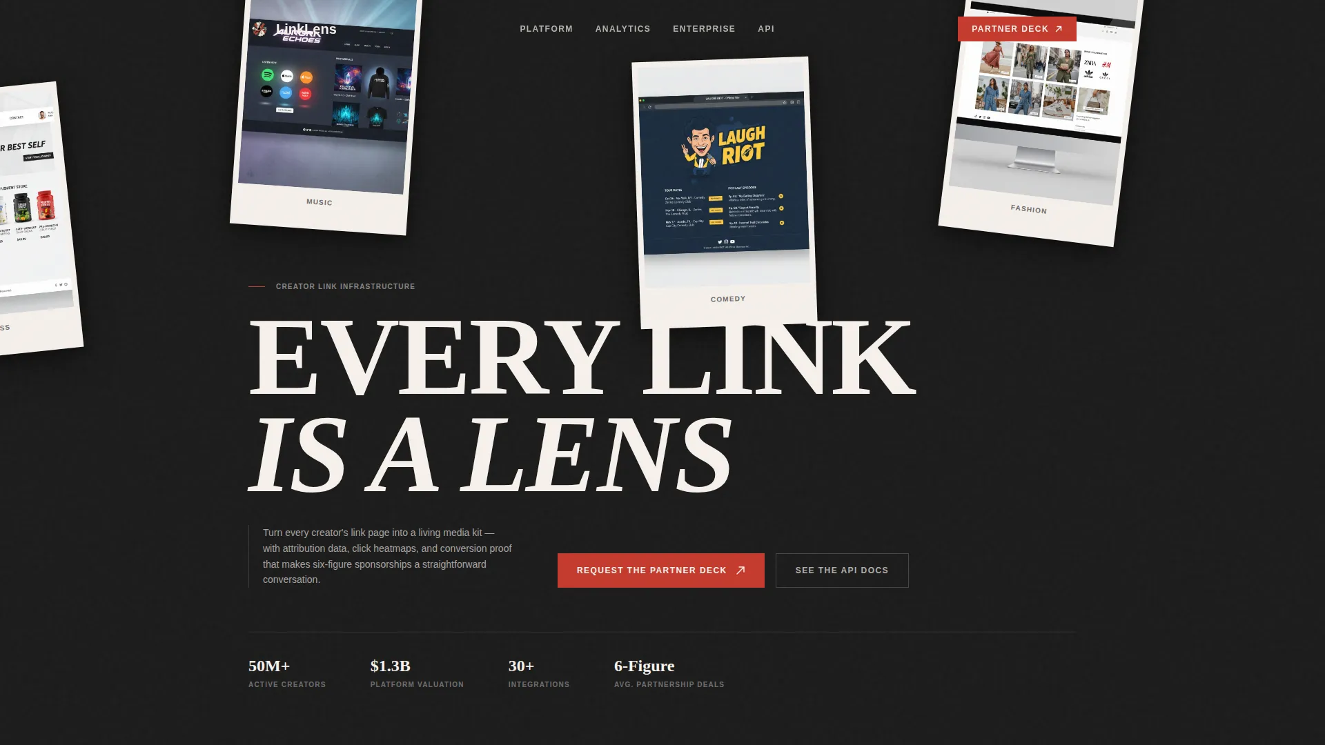
- A Type Over Image header with an oversized condensed serif set over a mosaic of creator page captures
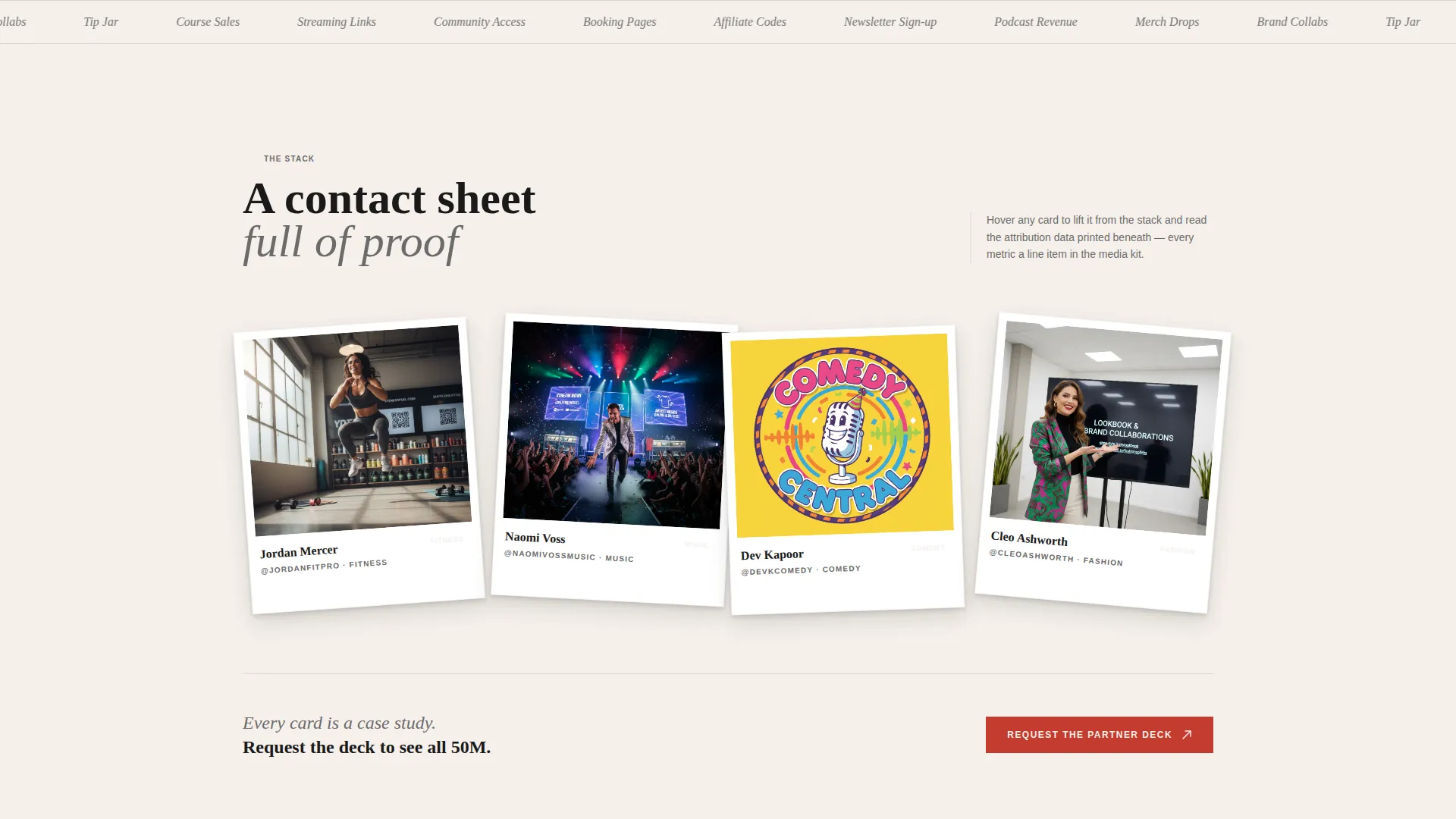
- An interactive scroll-driven card stack that fans out creator page mockups with visible engagement metrics and click-through data
- A partnership form section with company name, role selector, budget slider, and work email fields
- A secondary call-to-action text link pointing technical evaluators toward API documentation
Feature list
This template is built around one clear idea: every visible element should earn the conversion. The features below reflect what the brief specifies as delivered components.
Type Over Image Header
The header sets the word "EVERY LINK IS A LENS" in an oversized condensed serif, punched directly over a mosaic of creator page captures. The images are slightly rotated and overlapping, showing different creator verticals like fitness, music, comedy, and fashion. No animation plays on load; the stillness is intentional, like a gallery wall.
Scroll-Driven Layered Card Stack
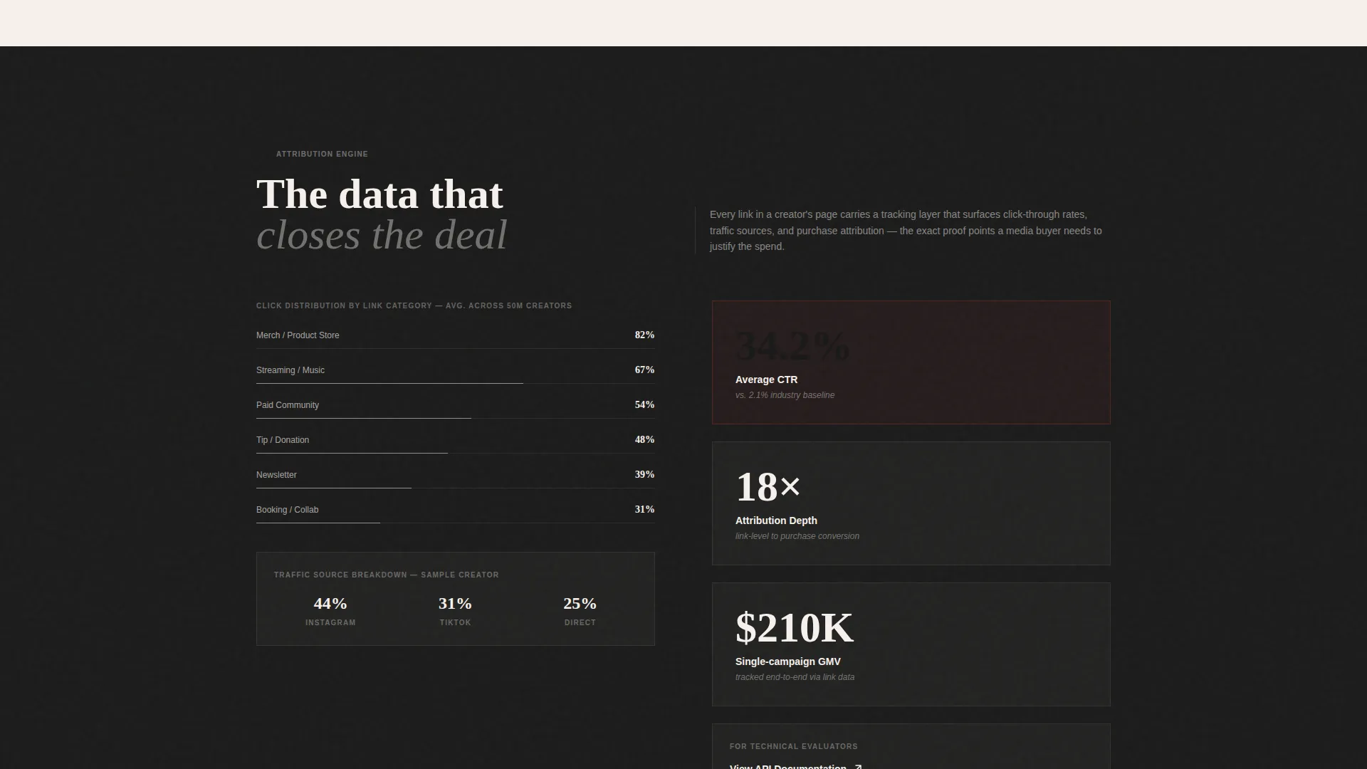
Below the header, a stack of creator page mockups fans out as the visitor scrolls. Each card slides forward to reveal engagement metrics, click-through heatmaps, and conversion data annotated in graphite gray. Hovering any card lifts it above the stack and expands a brand-partnership case study beneath it.
Brand-Partnership Case Study Expansion
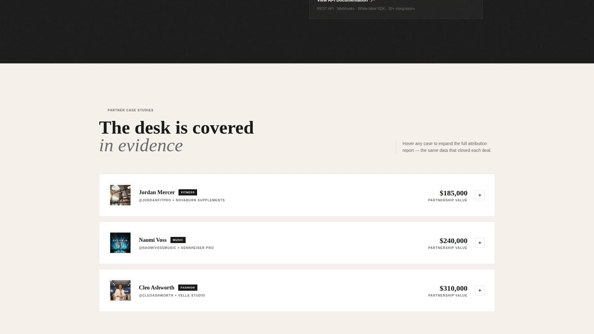
Every interactive card carries a hidden case study that expands on hover. This turns passive browsing into active discovery, letting a media buyer build the business case themselves before reaching the form.
Midpoint and Final call to action Placement
The primary call to action, "Request the Partner Deck," appears at two points: once after the first interactive card stack and again at the final section. This dual placement catches both early-convinced buyers and those who needed the full scroll.
Structured Partnership Form
The form collects company name, role (brand, agency, or platform), a monthly creator budget slider, and work email. The field order is deliberate, starting with company context before asking for contact details.
Secondary Technical Path
A text link reading "See the API Docs" sits alongside the primary call to action. It gives technical evaluators a direct route without cluttering the main conversion flow.
Page sections overview
| Section | Purpose |
|---|---|
| Type Over Image Header | Opens with editorial impact and immediate category recognition |
| Interactive Card Stack | Demonstrates creator page depth through scroll-driven proof |
| Hover Case Studies | Expands brand partnership evidence on card interaction |
| Midpoint call to action Block | Captures early-decided buyers with the partner deck request |
| Attribution Data Display | Shows click-through and conversion metrics per creator card |
| Partnership Request Form | Collects qualified lead details through a structured four-field form |
| Final call to action Section | Re-presents the partner deck offer after full evidence accumulation |
Design & branding system
The visual identity follows a Lens and Frame theme built on an Ink and Paper color system. The palette feels like flipping through a photographer's printed portfolio: matte, tactile, and deliberately lo-fi against a world of glowing screens.
- Four-color palette: deep editorial black (#1A1A1A), warm uncoated stock (#F5F0EB), graphite annotation gray (#6B6B6B), and darkroom red (#C43B2E) reserved for calls to action and hover states
- Backgrounds alternate between warm stock and true black; text lives in graphite on light sections and stock-white on dark sections
- Layered cards cast subtle shadows as if physically stacked on a desk, reinforcing the tactile, print-inspired aesthetic
Mobile & speed optimization
The Overlap/Layered template style is built with the scroll interaction as its core mechanic. The design accounts for how that experience translates across screen sizes.
- Card stack fanning and hover expansions are structured to adapt to touch-based scrolling on smaller screens
- The form's four-field structure stays compact and usable at mobile viewport widths
- Typography uses a condensed serif that maintains editorial impact without requiring large horizontal space
How this template helps you convert
The page is engineered as an accumulation engine. Each scroll step adds another proof point until the visitor has already convinced themselves before they reach the form.
- The interactive card stack surfaces real attribution data and case studies during the scroll, so a media buyer arrives at the form already holding evidence rather than just a pitch.
- The dual placement of the "Request the Partner Deck" call to action catches buyers at two decision moments, reducing the chance of a convinced visitor leaving without converting.
Other information about this template
This template sits at the intersection of the Personal and Resume category and the Linktree and Link-in-Bio subcategory, with a specific focus on the Creator Link Page niche. It is worth noting the broader context for buyers evaluating similar tools.
- The template is designed as a white-label-ready layout, making it suitable for creator economy platforms that want to offer branded link page experiences to their own clients
- The Intersection Match Score for this template is 13, reflecting a tightly aligned combination of theme, creative direction, color system, template style, and landing page direction
- Buyers comparing link-in-bio tools like Linktree will find this template addresses a gap that standard link page builders do not: the ability to present a creator's ecosystem as a credible, data-backed sponsorship asset
Theme
Lens & Frame
Creative direction
Interactive Explorer
Color system
Ink & Paper
Style
Overlap/Layered
Direction
Partnership/B2B
Page Sections
Type Over Image Editorial Header
Scroll-driven Layered Card Stack
Hover-expand Case Studies
Dual-placement Partner Deck Call to Action
Structured Four-field Partnership Form
Related questions
Who is this template built for?
What kind of content goes into the interactive card stack?
Can this template support a white-label creator tool product?
What information does the partnership form collect?
Is there a path for technical buyers who are not ready to request a partner deck?



