Audiology Practice Landing page Template
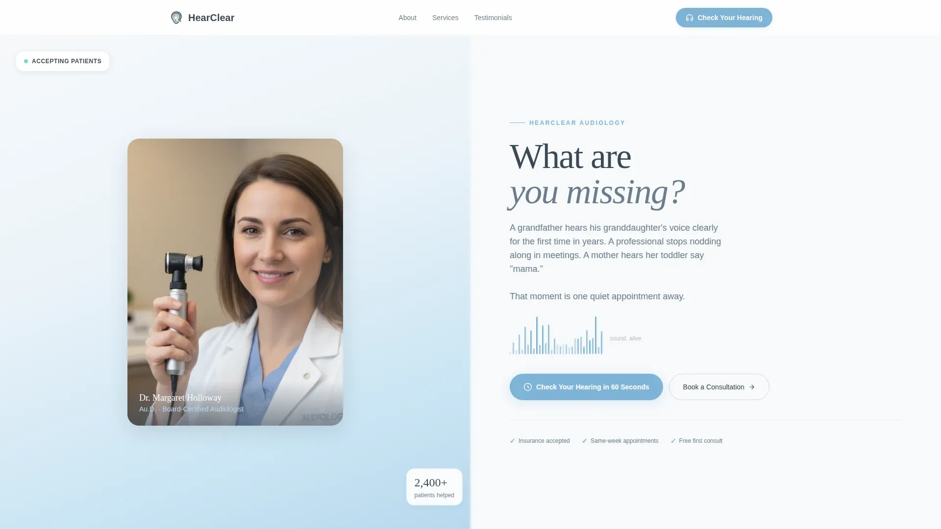
A split-screen landing page built for audiologist practices. One side holds a warm portrait of the lead clinician; the other opens with the question "What are you missing?" A five-question hearing screener, an emotionally layered testimonial mosaic, and a frictionless booking form work together to turn first-time visitors into confirmed consultation appointments.
by Rocket studio
Quick summary
This is a single-page audiology clinic landing page built on a 50/50 split-screen layout. It pairs emotional storytelling with clinical credibility, then guides visitors through a 60-second interactive hearing screener before presenting a low-friction scheduling form. The design feels calm, trustworthy, and human from the first scroll to the final booking step.
Who this template is for
This template is designed for independent audiologist practices and hearing clinics that serve adult patients across multiple life stages. If your practice needs to convert web visitors into booked consultations without overwhelming them with forms or jargon, this page was built for that exact purpose.
- Audiologists and hearing clinic owners who want a patient-focused online presence
- Practice managers looking to replace outdated clinic websites with a conversion-ready landing page
- Healthcare marketers serving retirees, working professionals, and parents of young children
What problem this template solves
Many audiology clinic pages ask too much too soon. They present dense service lists, complex navigation, and long intake forms before the visitor has even decided they have a hearing problem worth addressing. That friction kills momentum.
- Visitors leave before they recognize their own need for a hearing evaluation
- Generic clinic pages fail to connect emotionally with patients who feel uncertain or embarrassed about hearing loss
- Long booking forms discourage the follow-through that a warm, engaged visitor would otherwise complete
What you get with this template
You get a fully structured landing page layout that handles both emotional engagement and clinical trust in a single scroll. Every section has a defined role, and the order is intentional: draw the visitor in, validate their experience, prove your expertise, guide them to self-assess, then invite them to book.
- A portrait-centered hero split with an animated waveform and a single compelling headline
- A testimonial mosaic that alternates patient stories with clinical proof elements
- A five-question interactive hearing screener with a live visual risk meter and a booking form
Feature list
This template's core value comes from five purposefully designed components. Each one does a specific job in the patient conversion journey.
Portrait-Centered Split Hero
The hero section divides the screen equally. The left panel holds a warmly lit, shoulders-up portrait of the lead audiologist with direct eye contact. The right panel presents a single question in charcoal type alongside a gently pulsing animated waveform SVG that suggests sound is alive on the page.
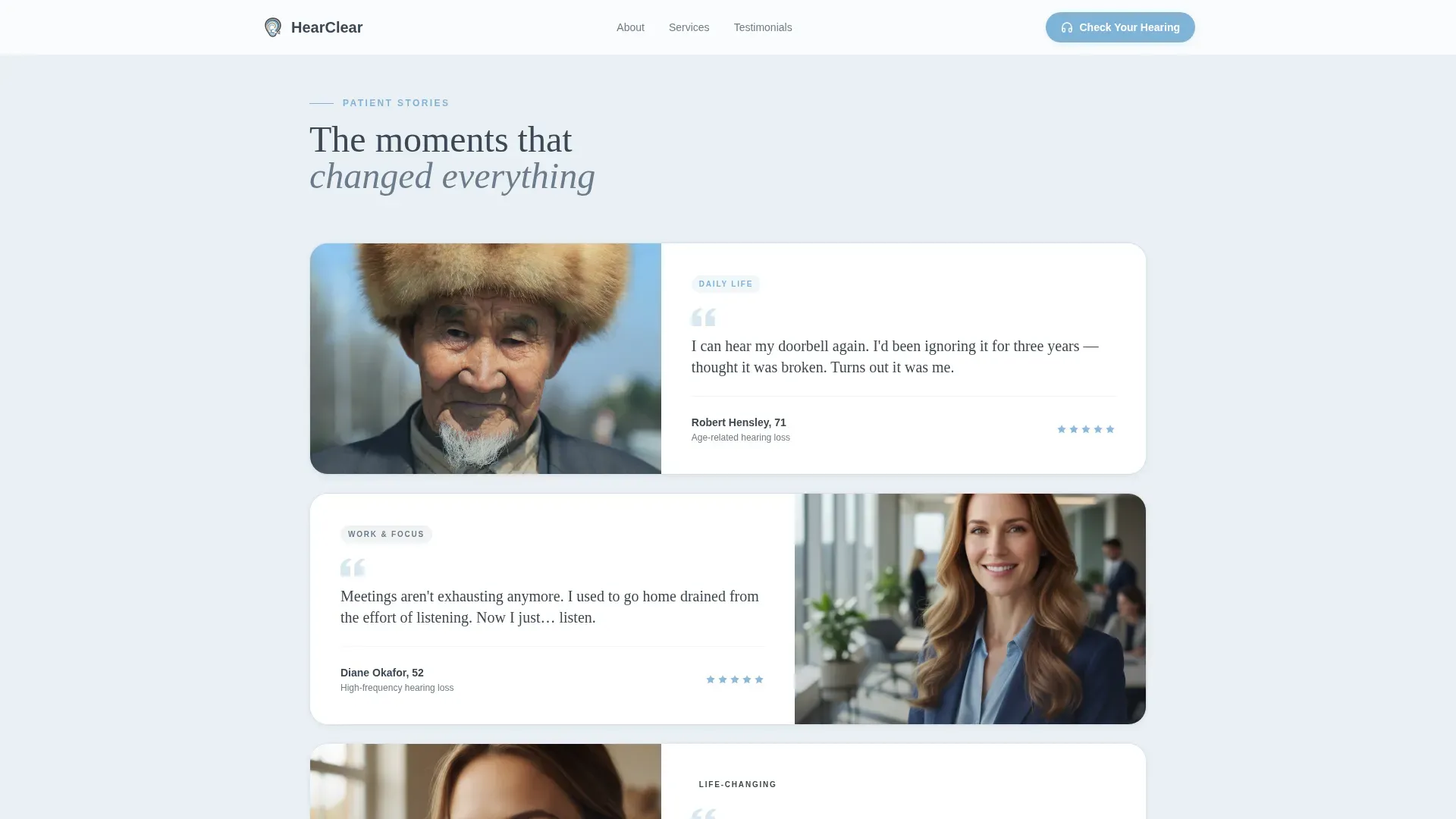
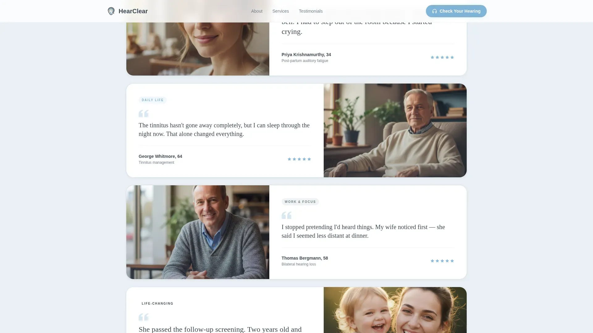
Testimonial Mosaic with Emotional Escalation
Patient stories appear in a scrolling grid, each tile split between a portrait and a short quote. The tiles are ordered to build emotional impact: a practical win, a professional relief, then a deeply personal moment. Between rows, clinical proof elements such as audiogram graphics, device close-ups, and insurance logos slide in to alternate heart and evidence.
Interactive Five-Question Hearing Screener
The primary call to action launches a 60-second self-assessment covering difficulty in noisy rooms, television volume habits, phone ear preference, tinnitus frequency, and family history. Each answer updates a sky-blue visual risk meter in real time, creating a sense of personal discovery that carries the visitor forward.
Low-Friction Booking Form
On completing the screener, a results panel recommends a consultation tier and surfaces a scheduling form. The form asks only for name, phone number, and preferred morning or afternoon slot. No lengthy intake questions, no account creation, no unnecessary steps.
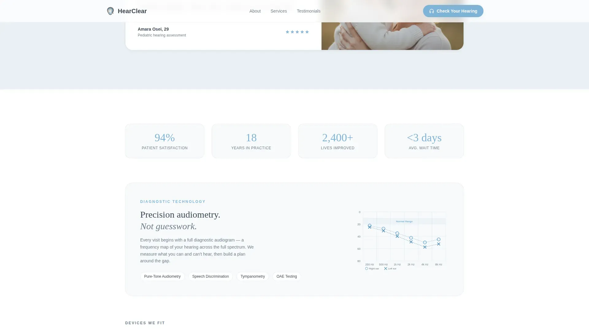
Clinical Credibility Layer
Woven between the emotional mosaic tiles, this layer includes audiogram graphics, hearing device close-ups, and insurance logo badges. It answers the unspoken question every first-time patient has: "Can I trust this practice?" without interrupting the emotional flow of the page.
Page sections overview
| Section | Purpose |
|---|---|
| Hero Split Screen | Introduce the audiologist and pose the core emotional question |
| Animated Waveform | Signal that sound and care are present on the page |
| Testimonial Mosaic | Build emotional trust through real, escalating patient stories |
| Clinical Credibility Row | Reinforce expertise with audiograms, devices, and insurance logos |
| Hearing Screener Quiz | Guide visitors to self-identify their hearing risk in 60 seconds |
| Results and Booking Form | Convert screener momentum into a confirmed consultation slot |
| Footer Row | Provide contact details and essential practice links |
Design & branding system
The visual identity follows a Medical Clarity theme. The palette is precise enough to signal a clinical environment yet warm enough to feel approachable. Typography pairs DM Sans for body text with Fraunces for emotional headlines, creating a clear hierarchy between information and feeling.
- Charcoal (#3B4856) for primary text, warm slate (#6B7D8D) for secondary surfaces, open-sky blue (#7FB3D8) for interactive elements and the risk meter, and cotton white (#F7F9FB) for all backgrounds
- Fraunces headlines deliver emotional weight on key moments; DM Sans keeps supporting copy clean and easy to read
- Scroll-reveal animations and smooth quiz state transitions maintain a calm, unhurried pace throughout the page
Mobile & speed optimization
Although the template is designed desktop-first to serve the retiree demographic well on larger screens, it includes full mobile support so no visitor is left behind. Static sections use server-rendered components for fast initial loads, while the interactive screener and booking form run as client components.
- Desktop-first layout with a responsive structure that adapts cleanly to tablet and mobile screen sizes
- Static page sections rendered server-side; quiz and form logic handled client-side to keep the experience smooth
- Medium animation level with scroll reveals and waveform SVG kept lightweight to avoid slowing the page
How this template helps you convert
Conversion on this page is not accidental. The structure was built to move a hesitant visitor through three stages: emotional recognition, clinical trust, and low-barrier action.
- The hero question and testimonial mosaic create an emotional mirror, helping visitors recognize their own experience in the stories they read, which increases the likelihood they stay on the page long enough to take the screener.
- The interactive screener transforms passive reading into active self-discovery. When a visitor sees their personal risk level update in real time, the motivation to book a consultation shifts from abstract to immediate.
- The post-screener booking form captures that momentum with a three-field form and a simple time preference, removing every possible reason to delay the decision.
Other information about this template
This template is ready to be customized with your practice's own photography, patient quotes, audiogram samples, and insurance partner logos. The layout accommodates a single lead audiologist profile or a small team introduction depending on your practice structure. The footer follows a linear single-row pattern, keeping the page's clean close consistent with the overall Medical Clarity aesthetic.
- Localized for English-language markets with United States date formats and USD pricing context where applicable
- Color tokens, typography settings, and animation timing are all editable to match your existing brand guidelines
- The page is structured around a single conversion goal, a booked consultation, so every section points toward that outcome without distraction
Theme
Medical Clarity
Creative direction
Testimonial Mosaic
Color system
Slate & Sky
Style
Split Screen (50/50)
Direction
Quiz/Assessment
Page Sections
Portrait-centered Split Hero
Emotional Testimonial Mosaic
Interactive Hearing Screener
Low-friction Booking Form
Clinical Credibility Layer
Related questions
Can I use this template for a multi-provider hearing clinic?
Does the hearing screener store patient responses?
Can I replace the placeholder testimonials with real patient stories?
Is the booking form connected to a live scheduling system?
Can I update the color system to match my clinic's existing branding?



